你先注意到的是蛋糕。令人难忘之处在于,条纹延续到了蛋糕之外。
分享链接 · https://openimages.ajiang.me/p/2100861937706021321/
color_palette · high-contrastcolor_palette · warm-tonescomposition · centeredcomposition · close-uplighting · studio-lightquality_flags · embedded-text
提示词(原文,逐字保留)
You notice the cake first. What makes it memorable is that the stripes continue beyond the cake.
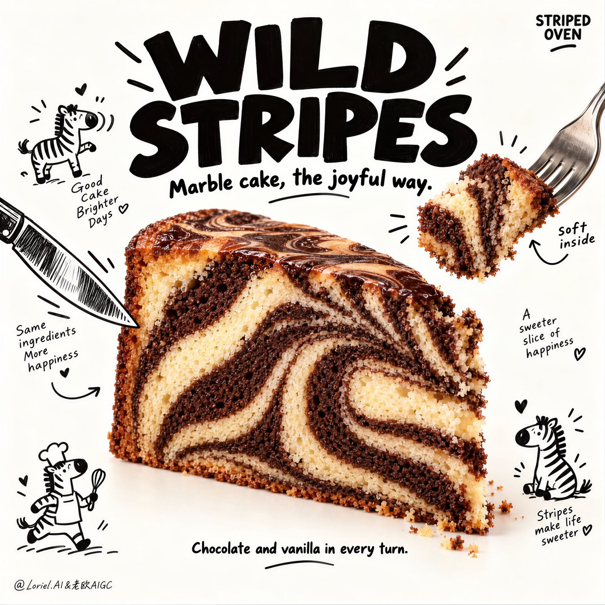
🍊 tight, high-contrast chocolate-and-vanilla swirl bands across the full cut face
The slice reads clearly from a distance, with a pattern strong enough to carry the whole poster.
🪽 lift one bite on a fork and show the same striped interior, softly torn and slightly compressed
This proves the swirl is inside the cake, turning a static food shot into an edible moment.
GPT- image 2.5 prompt👇
A hyper-real premium dessert poster advertisement for a fictional bakery brand called STRIPED OVEN, refined in a pure Orbit direction where the original poster skeleton stays intact but the hero product becomes more irresistible, the title heavier, and the edible moment more vivid. One large zebra marble cake slice sits slightly below center in a clean warm-white studio field, shown in a front three-quarter angle with the full cut face visible. The cake displays strong alternating chocolate and vanilla swirl bands with tighter, richer zebra striping, deeper contrast between dark cocoa and pale vanilla crumb, a moist tender interior, slightly crisp baked outer edge, and a glossy chocolate-marble top crust. A small bite-sized piece is lifted away on a fork from the upper right, making the “soft bite” moment more explicit and appetizing.
Framing and composition: vertical poster layout, oversized bold black headline typography dominating the upper third, central photoreal cake wedge as the clear hero, and hand-drawn black cutlery illustrations entering from the edges like playful framing arrows. Preserve the original structure exactly: large title at top, cake in the center, fork-and-knife graphic elements surrounding it, and small doodle scenes distributed around the dessert. Keep generous negative space and a clean warm-white background so the product remains sharply readable. The cake slice must be slightly larger than before, with stronger central emphasis.
Product design: the zebra marble cake is a generous triangular bakery slice with a dense but tender crumb, dramatic curved chocolate-and-vanilla stripes, naturally baked pores, subtle crumb scatter at the cut edge, and a softly glossy marbled top surface. The swirl pattern must be the main delight factor, reading instantly from a distance. The lifted bite on the fork should clearly show the same striped interior, with a soft torn texture and believable crumb compression. The knife on the left should point inward more decisively, helping drive the eye into the central cut face.
Illustration system: surround the cake with clean black hand-drawn doodles including tiny zebra icons, short curved arrows, cheerful miniature food characters, and small chef-like sketches. In this Orbit pass, keep the doodles slightly more energetic and better placed to reinforce the product rhythm, but still clean and sparse. They should support the cake and title, never compete with them. The line quality remains light, playful, and packaging-like.
Lighting and color: bright premium studio food lighting from upper front-left with soft wraparound fill, crisp crumb readability, delicate shadow beneath the cake, and slightly stronger contrast than before so the chocolate stripes feel richer and the vanilla crumb feels softer. Palette balance: 60% warm off-white and vanilla tones, 30% deep cocoa brown and black headline mass, 10% tiny warm bakery accents and doodle notes. The frame should feel cheerful, tactile, and clean, with no muddy whites or flat low-contrast cake texture.
Materials and finish: hyper-real bakery photography fused with clean illustrated poster design. Show moist crumb texture, fine chocolate density, realistic marbled top crust, delicate cake pores, tiny loose crumbs near the cut, and crisp ink-clean doodle lines. The final finish should feel like a Cannes-level bakery campaign: playful, memorable, product-led, and commercially magnetic.
Typography: all visible text in English only, integrated as premium graphic design. The main headline at the top reads exactly: "WILD STRIPES" in large heavy playful black lettering. A smaller secondary line beneath it reads exactly: "Marble cake, the joyful way." Add a subtle small brand mark in an upper corner reading exactly: "STRIPED OVEN". Near the lifted bite add a tiny handwritten-style note reading exactly: "soft inside". Near the lower area add a small support line reading exactly: "Chocolate and vanilla in every turn." Typography should feel heavier, bolder, and more immediate than before while staying clear of the cake silhouette.
Output and constraints: polished premium dessert poster, product-first hierarchy, no copied source text, no real brand names, no people, no cluttered props, no table scene, no excessive crumb mess. Keep utensils natural and well-angled, the lifted bite believable, the zebra striping bold and clean, and the doodle system controlled. Avoid warped cake geometry, muddy crumb texture, unreadable text, messy sketch overload, plastic-looking cake surface, broken cutlery perspective, AI gibberish text, dead whites, or drift away from high-end commercial food realism.
中文译文
你先注意到的是蛋糕。令人难忘之处在于,条纹延续到了蛋糕之外。
🍊 紧密、高对比度的巧克力和香草漩涡带,贯穿整个切面
从远处就能清晰读出这一片蛋糕,图案强烈到足以撑起整张海报。
🪽 用叉子叉起一小块,展示同样的条纹内部,柔和撕裂并略微压缩
这证明了漩涡纹路深藏于蛋糕内部,将静态的食物镜头变成可食用的瞬间。
GPT- image 2.5 prompt👇
一张超写实的优质甜品海报广告,为一家名为 STRIPED OVEN 的虚构烘焙品牌打造,沿纯 Orbit 方向精炼——保留原海报骨架,但让主角产品更令人无法抗拒,标题更厚重,可食用的瞬间更生动。一大切片的大理石斑马蛋糕置于干净暖白影棚背景中略低于中心的位置,以前四分之三角度展示,完整切面可见。蛋糕呈现强烈的巧克力和香草交替漩涡带,斑马纹更紧致、更丰富,深可可与浅香黄蛋糕体之间对比更深,内部湿润柔软,烤制外缘微脆,顶部覆盖光润的巧克力大理石酥皮。从右上方用叉子叉起一小块,让"柔软一口"的瞬间更加明确诱人。
框架与构图:竖版海报布局,超大粗体黑色标题字体占据上三分之一,中央照片写实的蛋糕楔形作为绝对主角,手绘黑色餐具插画从边缘进入,如同俏皮的引导箭头。精确保留原始结构:顶部大标题,中心蛋糕,叉刀图形元素环绕四周,小涂鸦场景分布于甜点周围。保持充裕的负空间与干净暖白背景,使产品保持锐利的可读性。蛋糕切片需比之前略大,并强化中心焦点。
产品设计:这块斑马大理石蛋糕为丰盛的三角形烘焙切片,组织紧密而松软,拥有戏剧性弯曲的巧克力与香草条纹、真实烤制的孔洞、切面边缘细微的碎屑散布,以及柔和光泽的大理石顶部表面。漩涡纹必须是主要的愉悦元素,从远处即可瞬间识别。叉子上叉起的那一口必须清晰呈现同样的条纹内部,带有柔软的撕裂质感和逼真的蛋糕体压缩感。左侧的刀应更加果断地指向内部,引导视线聚焦到中央切面。
插画系统:以干净黑色手绘涂鸦环绕蛋糕,包括微小斑马图标、短促弯曲箭头、欢快的迷你食物角色,以及小型厨师类素描。在本次 Orbit 优化中,保持涂鸦略微更有活力且排布更合理,以强化产品节奏,但仍保持干净稀疏。它们应衬托蛋糕与标题,绝不与之争夺视觉。线条质感保持轻盈、俏皮,具有包装感。
光线与色彩:来自左上前方的高级影棚食品光线,带柔和环绕补光,蛋糕体可读性清晰,蛋糕下方有精致阴影,对比度比之前略强,使巧克力条纹更浓郁、香黄蛋糕体更柔软。色彩平衡:60% 暖米白与香草色调,30% 深可可棕与黑色标题体量,10% 微小暖色烘焙点缀与涂鸦笔触。整体画面应令人愉悦、有触感、干净,无浑浊的白色或平淡低对比的蛋糕质感。
材质与质感:超写实烘焙摄影与干净插画海报设计的融合。展现湿润蛋糕体质感、细腻巧克力密度、真实大理石顶部酥皮、精致蛋糕气孔、切面附近的微小散落碎屑,以及墨线清晰的涂鸦线条。最终成品应如戛纳级别的烘焙广告:俏皮、难忘、产品主导、具有商业磁性。
字体:所有可见文字仅为英文,作为高级平面设计融入。顶部主标题精确写作:"WILD STRIPES",采用大型厚重俏皮的黑色字体。其下方较小的副标题精确写作:"Marble cake, the joyful way." 在上方一角添加一个微妙的小品牌标识,精确写作:"STRIPED OVEN"。在叉起的小块旁添加一处微小手写风格注释,精确写作:"soft inside"。在下方区域添加一行小型辅助文字,精确写作:"Chocolate and vanilla in every turn." 字体应比之前更厚重、更粗犷、更直接,同时避开蛋糕剪影。
输出与约束:精致的高级甜品海报,产品优先的层级,无复制的源文本,无真实品牌名,无人物,无杂乱道具,无桌面场景,无过多碎屑杂乱。保持餐具自然且角度恰当,叉起的一口真实可信,斑马条纹粗犷干净,涂鸦系统有序。避免扭曲的蛋糕几何、浑浊的蛋糕体质感、不可读的文本、凌乱的草图过载、塑料感的蛋糕表面、餐具视角破损、AI 乱码文字、死白,或偏离高端商业食物写实风格。
来源与署名
原文由 @ou_zhen599 发布在 X:查看原推文。 本页逐字保留原文并提供机器翻译的中文解读;版权归原作者所有。
同工具的更多提示词
- 你首先会注意到大虾。让这张海报保持整体的,是字体像一个第二深度平面一样发挥作用。 �超大号窄体酸橙色大标题置于食物之后,字母被大虾选择性遮住和露出 食物感觉悬…@ou_zhen599
- 想让飞溅海报感觉有序?别在每个空隙都塞配料。 🪽 两条向上飞起的液体弧线——一条奶油色,一条莓果红——环绕杯子交织,但不穿过正面标签 它们在产品周围形成光环…@ou_zhen599
- 以上传的图像作为主体参考,创作一幅精致的16:9 macOS桌面构图。 主体: 识别参考中的主要主体或角色,并保留其可识别的外观、面部特征、发型、服装、配饰、…@Mayz1169
- 2x2 网格,16:9,为 4 家财富 500 强公司执行此操作:概念锚点 1:"被一种物理力量改造的城市——天际线被塑造成波浪、漩涡、飞溅、滴落、压力爆发、…@Gdgtify
- 你看到一个热带场景;这段提示实际上是在控制一种材质过渡。 🌿 在罐体后方做一道受控的水平纸张撕裂效果,卷曲的纤维状边缘框住露出部分 这样做可以在不增加额外背景…@ou_zhen599
- 创作一幅高度逼真的日系和纸胶带旅行拼贴画,以[CITY]的地标建筑为主题,设计为高级手工旅行手帐页面。该地标应一眼可辨,并展现出准确的建筑细节、真实的比例、自…@Goodmanprotocol