你看到一个热带场景;这段提示实际上是在控制一种材质过渡。
分享链接 · https://openimages.ajiang.me/p/2100856769023201601/
color_palette · earthycomposition · centeredlighting · soft-lightmood · elegantquality_flags · embedded-textquality_flags · typography-heavy
提示词(原文,逐字保留)
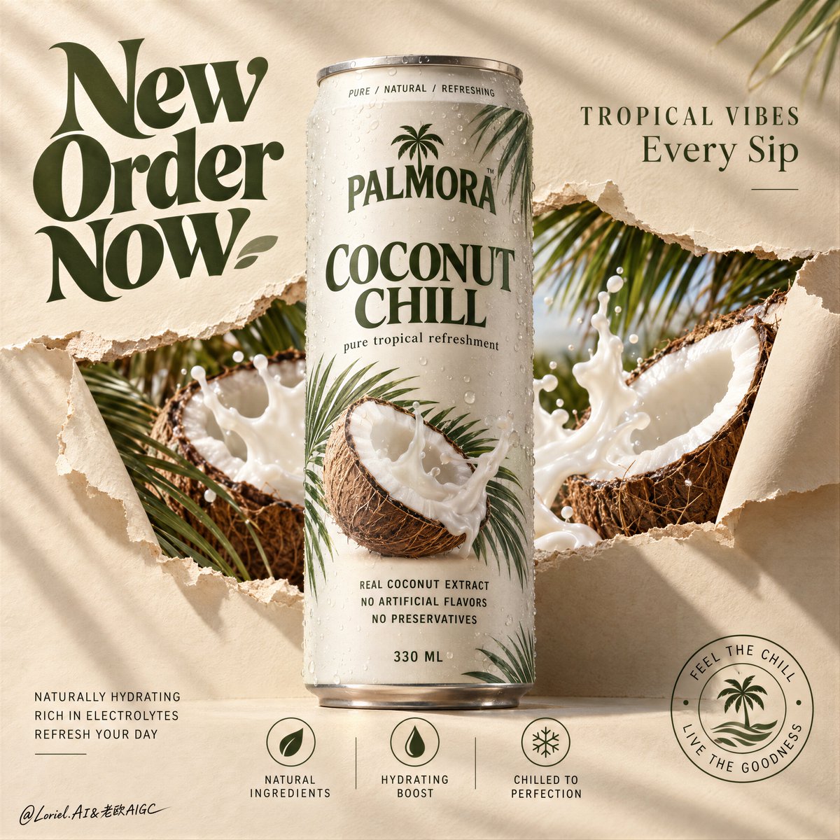
You see a tropical scene; the prompt is really controlling a material transition.
🌿 a controlled horizontal paper rupture behind the can, with curled fibrous edges framing the reveal
This creates depth without adding a separate background scene. The paper feels physically opened, not digitally layered.
🧊 keep the can silhouette untouched and fully readable; place coconuts, milk splash, and palm fronds only behind or around it
The tropical elements feel abundant, but the eye still lands on the product first.
GPT- image 2.5 prompt👇
A hyper-real premium beverage poster advertisement for a fictional tropical drink brand called PALMORA, designed as a clean Orbit-plus-Port key visual where the real can remains the absolute hero and the supporting world is reduced into elegant, high-impact structural layers. A tall slim beverage can stands perfectly centered and upright against a warm sand-beige paper backdrop, front-facing and dominant. The can is chilled with fine condensation, subtle aluminum texture, and crisp premium print design. Behind and partially around the can, the paper surface appears torn open in a controlled horizontal rupture, revealing a vivid inner tropical layer of split coconuts, creamy coconut splash, and palm fronds. The tear feels designed rather than chaotic, like a branded reveal window cut through the surface.
Framing and composition: vertical poster layout, strict central hierarchy, oversized hero can in the middle, broad negative space in the upper-left for a large graphic headline, smaller premium copy in the upper-right, and a minimal icon-information system aligned along the lower area. Keep the can silhouette untouched and clearly readable. The torn-paper reveal should sit behind the can as a sculptural horizontal band, with curled paper edges on the left and right creating depth and tactile material contrast. Preserve the reference logic of central product, torn reveal, large graphic headline, and bottom icon strip, but simplify and refine every peripheral element for a more curated poster feel.
Product design: create a premium tropical coconut drink can with a matte off-white body, deep olive-green brand typography, soft warm-grey metal rim, natural condensation droplets, and a restrained botanical print system featuring palm leaf shadows and one clean coconut visual. Main front label reads exactly: "COCONUT CHILL". Small top ring text reads exactly: "PURE / NATURAL / REFRESHING". Subline beneath the main title reads exactly: "pure tropical refreshment". Ingredient copy in the lower body reads exactly: "REAL COCONUT EXTRACT", "NO ARTIFICIAL FLAVORS", "NO PRESERVATIVES". Bottom volume mark reads exactly: "330 ML". The can must feel globally market-ready, tactile, and beautifully branded.
Reveal layer and supporting elements: inside the torn-paper opening, show hyper-real split coconuts with fibrous brown shells, bright white flesh, and dynamic but controlled coconut milk splash forms. Add a few palm fronds entering from the top-right and lower-left edges, but keep them sparse and elegant. This inner reveal should feel like a distilled tropical world, not a cluttered collage. The splash and coconuts must support the can, never overpower it. Keep the overall sensation fresh, breezy, creamy, and premium.
Lighting and color: soft directional commercial key light from upper left, warm natural fill from front, subtle shadows cast by palm leaves across the paper background, and refined highlight roll-off on the can body and splash edges. Palette balance: 60% warm sand-beige paper and off-white can body, 30% coconut brown and creamy white splash, 10% olive green typography and botanical accents. Build enough contrast so the can volume, paper tear edges, and coconut textures feel dimensional, while avoiding muddy neutrals or dead shadow patches.
Materials and finish: hyper-real product photography fused with tactile paper-set design. Show soft matte paper fibers and curled torn edges, realistic chilled aluminum, tiny condensation beads, fibrous coconut husk detail, smooth white coconut flesh, glossy milk splash, and clean print fidelity on the can. The final image should feel like a Cannes-level beverage launch campaign: minimal, tactile, tropical, and sharply art-directed.
Typography: all visible ad copy in English only, integrated into the poster as premium graphic design. Upper-left oversized graphic headline reads exactly: "New Order Now" in a bold retro-organic display style, large and sculptural. Upper-right premium tagline reads exactly: "TROPICAL VIBES" and beneath it exactly: "Every Sip". Lower-left small support copy reads exactly: "NATURALLY HYDRATING", "RICH IN ELECTROLYTES", "REFRESH YOUR DAY". Bottom-center icon labels read exactly: "NATURAL INGREDIENTS", "HYDRATING BOOST", "CHILLED TO PERFECTION". Lower-right circular seal reads exactly: "FEEL THE CHILL / LIVE THE GOODNESS". Keep typography art-directed, spacious, and harmonized with the can branding, always clear of the core product silhouette.
Output and constraints: polished premium beverage poster, product-first composition, no copied original brand names, no people, no unrelated props, no cluttered tropical overload. Keep the can geometry correct, typography crisp, tear edges believable, coconut anatomy realistic, splash physics controlled, and the overall visual language calm, premium, and clean. Avoid warped can proportions, unreadable label text, excessive palm leaves, muddy beige cast, dirty whites, chaotic splashes, broken paper physics, cheap stock-ad aesthetics, AI gibberish text, or drift away from high-end commercial realism.
中文译文
你看到一个热带场景;这段提示实际上是在控制一种材质过渡。
🌿 在罐体后方做一道受控的水平纸张撕裂效果,卷曲的纤维状边缘框住露出部分
这样做可以在不增加额外背景场景的前提下创造纵深。纸张给人的感觉是被物理性地打开,而非数字叠加。
🧊 保持罐体轮廓完整且完全清晰可读;椰子、奶液飞溅和棕榈叶只放在罐体后方或周围
热带元素虽然丰富,但视觉焦点仍然首先落在产品上。
GPT- image 2.5 提示词👇
一张超写实的优质饮料海报广告,为一个名为 PALMORA 的虚构热带饮品品牌设计,作为一张干净的 Orbit-plus-Port 主视觉图,其中真实的罐体是绝对的视觉主角,辅助世界被压缩成优雅的、具有强烈冲击力的结构化层次。一个高挑纤细的饮料罐完美居中、垂直站立在温暖沙米色纸质背景前,正面朝向镜头并占据主导。罐体带有细密的冷凝水珠、细腻的铝质纹理和清晰的优质印刷设计。在罐体后方并部分环绕罐体处,纸面呈现出一道受控的水平撕裂,露出内部生动的热带层次——裂开的椰子、奶油般的椰奶飞溅和棕榈叶。撕裂感是经过设计的,而非杂乱的,像是穿过表面的品牌化揭示窗口。
构图与版式:竖版海报布局,严格的中央主次结构,中间为超大的主角罐体,左上方留出大块负空间用于放置大型图形化标题,右上方放置较小的优质文案,底部沿水平线对齐一套极简的图标信息体系。保持罐体轮廓完整且清晰可读。撕纸揭示应作为一条雕塑感的水平带置于罐体后方,左右两侧卷起的纸边创造纵深与触觉材质的对比。保留参考逻辑——中央产品、撕纸揭示、大型图形标题、底部图标条——但简化并精炼每一个外围元素,使其更具策展感的海报气质。
产品设计:打造一款优质热带椰子饮品罐,哑光米白色罐身,深橄榄绿品牌字体,柔和的暖灰色金属罐口边缘,自然的冷凝水珠,以及一套克制的植物印刷系统,包含棕榈叶阴影和一处干净的椰子视觉。主正面标签准确读取:"COCONUT CHILL"。顶部小环形文字准确读取:"PURE / NATURAL / REFRESHING"。主标题下方的副标题准确读取:"pure tropical refreshment"。罐身下方的成分文案准确读取:"REAL COCONUT EXTRACT"、"NO ARTIFICIAL FLAVORS"、"NO PRESERVATIVES"。底部容量标识准确读取:"330 ML"。罐体须具有全球上市就绪、触感佳、品牌呈现精美的感觉。
揭示层与辅助元素:在撕开的纸洞内部,展示超写实的裂开椰子,带纤维感的褐色外壳、洁白的椰肉,以及动感但受控的椰奶飞溅形态。从右上和左下边缘引入数片棕榈叶,但保持稀疏而优雅。内部揭示应感觉像是一个经过提炼的热带世界,而非杂乱的拼贴。飞溅与椰子必须衬托罐体,绝不能压过它。整体感受保持清新、微风感、奶油感与高级感。
光影与色彩:来自左上方柔和定向的商业主光,正面的温暖自然补光,棕榈叶在纸背景上投下的细微阴影,以及罐身和飞溅边缘上精细的高光过渡。配色平衡:60% 温暖沙米色纸张与米白色罐身,30% 椰壳褐与奶油白飞溅,10% 橄榄绿字体与植物点缀。建立足够的对比,使罐体体积、撕纸边缘和椰子质感具有立体感,同时避免浑浊的中性色或死黑阴影区域。
材质与工艺:超写实产品摄影与触觉纸质场景设计的融合。展示柔软的哑光纸纤维与卷曲的撕边、真实的冰冷铝材、细小的冷凝水珠、椰壳纤维细节、光滑洁白的椰肉、带光泽的奶液飞溅,以及罐身上干净的印刷还原度。最终图像应像 Cannes 级别的饮料发布campaign:极简、触感丰富、热带感强、艺术指导锐利。
字体排版:所有可见广告文案仅使用英文,作为高级平面设计融入海报。左上方超大图形化标题准确读取:"New Order Now",采用粗体复古有机展示风格,体型巨大且具雕塑感。右上方优质标语准确读取:"TROPICAL VIBES",其下准确读取:"Every Sip"。左下方小型辅助文案准确读取:"NATURALLY HYDRATING"、"RICH IN ELECTROLYTES"、"REFRESH YOUR DAY"。底部居中图标标签准确读取:"NATURAL INGREDIENTS"、"HYDRATING BOOST"、"CHILLED TO PERFECTION"。右下方圆形徽章准确读取:"FEEL THE CHILL / LIVE THE GOODNESS"。字体排版应具有艺术指导感、留白充足、与罐体品牌相协调,始终避开核心产品轮廓。
输出与约束:精致的高级饮料海报,产品优先的构图,无复制任何现有品牌名称,无人物,无不相关道具,无杂乱的热带过载。保持罐体几何正确、字体清晰、撕边真实可信、椰子解剖结构真实、飞溅物理受控,整体视觉语言平静、高级、干净。避免罐体比例扭曲、标签文字不可读、棕榈叶过多、浑浊米色偏色、脏白、混乱的飞溅、破损的纸张物理感、廉价的图库广告美学、AI 乱码文字,或偏离高端商业写实风格。
来源与署名
原文由 @ou_zhen599 发布在 X:查看原推文。 本页逐字保留原文并提供机器翻译的中文解读;版权归原作者所有。
同工具的更多提示词
- 2x2 网格,16:9 比例,AI 推断可引发病毒式传播的主题:创建一个令人难忘、极简的 3D 可视化,表现因 [TOPIC] 而被遗漏、失去、回避、延迟或抹…@Gdgtify
- 以上传的图像作为主体参考,创作一幅精致的16:9 macOS桌面构图。 主体: 识别参考中的主要主体或角色,并保留其可识别的外观、面部特征、发型、服装、配饰、…@Mayz1169
- 将我上传的女性面部作为主模特唯一的身份参考。保留她精确的面部身份、自然的面部结构、肤色、眼睛、眉毛、鼻子、嘴唇、颧骨、下颌线、面部比例、发际线和自然皮肤纹理…@aniyaintel
- 你首先会注意到大虾。让这张海报保持整体的,是字体像一个第二深度平面一样发挥作用。 �超大号窄体酸橙色大标题置于食物之后,字母被大虾选择性遮住和露出 食物感觉悬…@ou_zhen599
- [LOCATION] - 高品质 4:5 电影感旅行立体模型 创建一个高品质 4:5 电影感旅行立体模型,描绘 [LOCATION],以手工制作的印度漆木玩具…@Goodmanprotocol
- 你先注意到的是蛋糕。令人难忘之处在于,条纹延续到了蛋糕之外。 🍊 紧密、高对比度的巧克力和香草漩涡带,贯穿整个切面 从远处就能清晰读出这一片蛋糕,图案强烈到足…@ou_zhen599