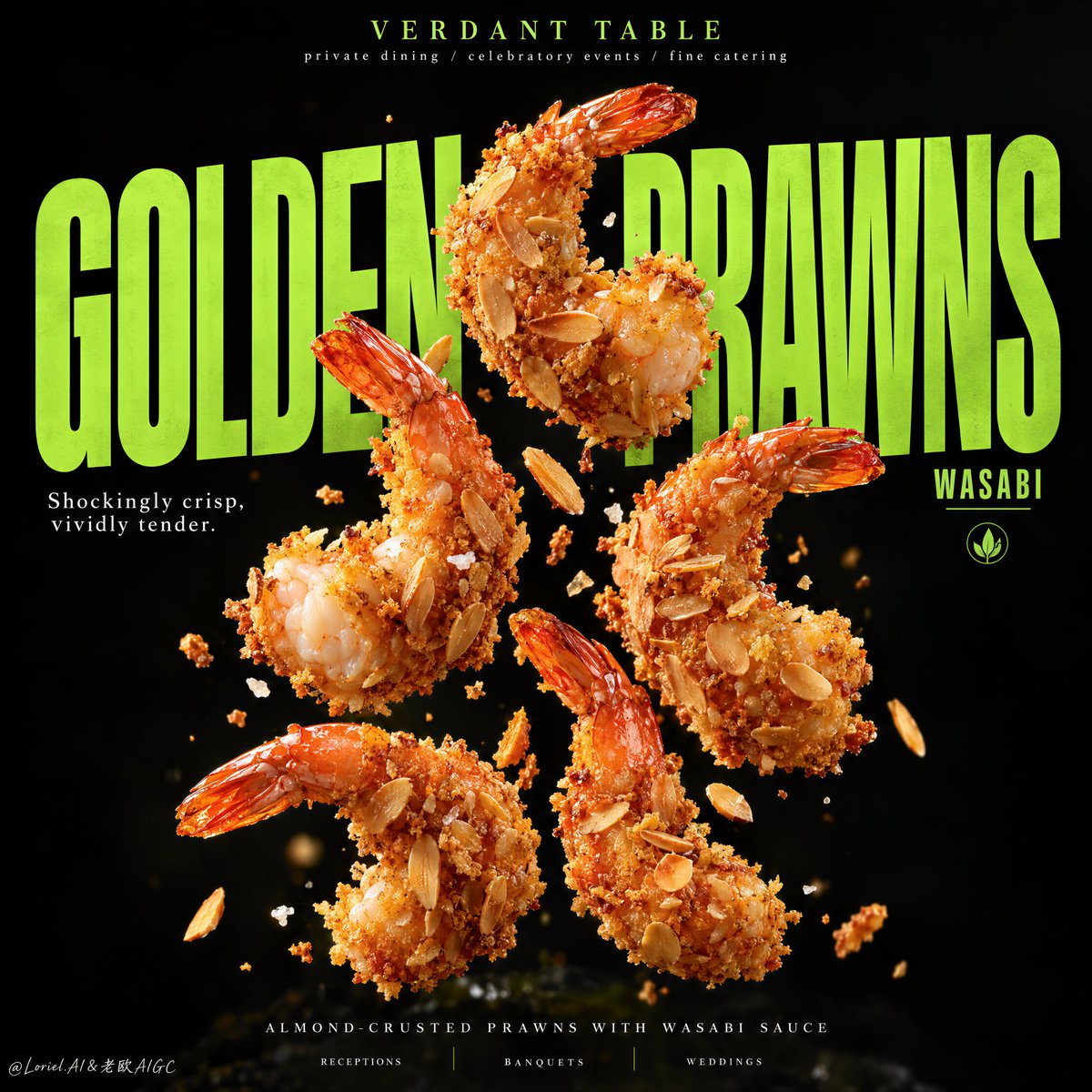
你首先会注意到大虾。让这张海报保持整体的,是字体像一个第二深度平面一样发挥作用。
分享链接 · https://openimages.ajiang.me/p/2100856966889574900/
color_palette · dark-moodycolor_palette · high-contrastcomposition · centeredmood · luxuriousquality_flags · embedded-textquality_flags · typography-heavy
提示词(原文,逐字保留)
You notice the prawns first. What holds the poster together is the type acting like a second depth plane.
🪽 oversized condensed lime-green headline placed behind the food, with letters selectively hidden and revealed by the prawns
The food feels suspended inside the typography instead of pasted over it.
✨ five large prawns arranged as a disciplined vertical cluster, with deliberate gaps and only a few drifting crumbs
This gives each prawn its own silhouette and keeps the composition sharp rather than noisy.
GPT- image 2.5 prompt👇
A hyper-real premium food poster advertisement for a fictional catering and event-dining brand called VERDANT TABLE, refined into an Orbit-plus-Port direction where the food and typography lock into one cleaner, more iconic visual system. The hero product is almond-crusted fried prawns with wasabi sauce, presented as the absolute visual focus. Five large golden prawns float in a disciplined vertical cluster against a deep midnight-black background, suspended with dynamic spacing and subtle upward energy. Each prawn is coated in crisp toasted almond flakes and fine golden crumb, with vivid orange-red tail shells, tiny salt crystals, and a few restrained crumb fragments drifting around them. The image must feel luxurious, sharp, and highly memorable.
Framing and composition: vertical poster layout, central floating prawn cluster, giant lime-green headline typography occupying most of the middle plane behind the food. The typography acts as structure, not decoration: bold, tall, condensed letters partially hidden and revealed by the prawns, creating depth and a strong editorial rhythm. Keep the top area minimal with a small refined brand line, one short white support phrase crossing the middle-left field, and an ultra-clean footer line at the bottom. Reduce visual noise compared with a more conventional food ad. The shrimp-to-type relationship should feel almost architectural.
Subject design: the prawns are premium, large, naturally curled, and perfectly fried, with crisp almond crust, layered toasted slices, irregular crunchy edges, realistic fried granularity, and subtle juicy flesh visible in one or two broken-open pieces. The coating must feel dry-crisp and luxurious, never greasy. Wasabi appears only as a tightly controlled accent: a minimal green cue in copy, a tiny emblem, or the faintest sauce implication, but not as a messy splash. At the very bottom, if needed, allow only a barely visible soft-focus grounding shape, heavily subdued and secondary.
Lighting and color: strong directional key light from upper front-right, subtle soft fill from lower left, sharp highlights on the almond flakes, fine edge shimmer on the tails, and sculptural contrast against the black background. Palette balance: 60% black and deep charcoal field, 30% golden crust and warm seafood orange, 10% electric lime-green typography and wasabi accents. Build high tonal separation so the floating prawns feel luminous and tactile while the typography reads with aggressive clarity. No muddy blacks, no dead voids, no greasy brown haze.
Materials and finish: hyper-real food photography fused with premium graphic poster design. Show delicate almond-slice layering, crisp breadcrumb texture, realistic salt specks, glossy shell detail on the tail, and refined typography edges that feel printed and intentional. The final finish should feel like a Cannes-level hospitality campaign: bold, minimal, aggressive, and editorially controlled.
Typography: all visible text in English only, art-directed and integrated into the poster. Top brand mark reads exactly: "VERDANT TABLE". Small top descriptor reads exactly: "private dining / celebratory events / fine catering". Main giant central headline reads exactly: "GOLDEN PRAWNS" in oversized condensed lime-green uppercase lettering. Secondary word placed near the right side of the title reads exactly: "WASABI". Small support line at mid-left reads exactly: "Shockingly crisp, vividly tender." Bottom footer line reads exactly: "ALMOND-CRUSTED PRAWNS WITH WASABI SAUCE". Along the very bottom place three minimal service tags reading exactly: "RECEPTIONS", "BANQUETS", "WEDDINGS". Typography must be bold, clean, geometric, and spatially aware, never covering the key edible surfaces of the prawns.
Output and constraints: polished premium food poster, product-first hierarchy, no copied source text, no real brand names, no people, no cluttered props, no restaurant interior, no excessive garnish. Keep prawn anatomy correct, tails natural, crust physically believable, floating arrangement balanced, crumbs restrained, text crisp, and the whole page clean and high-end. Avoid malformed prawns, duplicate tails, broken crust geometry, greasy surfaces, unreadable typography, muddy black background, chaotic debris, cheap fast-food styling, or drift away from high-end commercial realism.
中文译文
你首先会注意到大虾。让这张海报保持整体的,是字体像一个第二深度平面一样发挥作用。
�超大号窄体酸橙色大标题置于食物之后,字母被大虾选择性遮住和露出
食物感觉悬停在字体之内,而不是被贴在它上面。
✨五只大虾以严谨的纵向簇状排列,留有刻意的间隙,仅有少量飘落的面包屑
这让每只大虾拥有自己的剪影,使构图保持锐利而不是杂乱。
GPT- image 2.5 提示词👇
一个超写实的优质食品海报广告,为一个名为 VERDANT TABLE 的虚构餐饮与活动宴会品牌打造,提炼为 Orbit 加 Port 的方向,让食物与字体锁入一个更干净、更有标志性的视觉体系。主角产品为杏仁脆皮炸虾配芥末酱,作为绝对的视觉焦点呈现。五只巨大的金色大虾在深午夜黑色背景前以严谨的纵向簇状漂浮悬浮,以富有动感的间距和微妙的上扬能量排列。每只大虾裹着酥脆的烤杏仁片和细金色面包屑,配以鲜艳的橙红虾尾壳、微小的盐粒,以及几片克制地飘散的面包屑碎。画面必须感觉奢华、锐利且高度难忘。
构图与框架:纵向海报布局,中央漂浮的大虾簇,巨大的酸绿色大标题字体占据食物后方大部分中景。字体作为结构而非装饰:粗体、细高、窄体的字母部分被大虾遮住和露出,制造深度和强烈的编辑节奏。保持顶部区域极简,使用一条小巧精致的品牌行、一条简短的白色辅助文案横穿中左区域,以及一条极致干净的页脚行置于底部。相比更常规的食品广告,要减少视觉噪音。虾与字体之间的关系应近乎建筑感。
主体设计:大虾品质上乘、体型饱满、自然卷曲、炸制完美,杏仁脆皮酥脆、分层烤制切片、边缘不规则而脆硬、炸制颗粒感逼真,并在一两块掰开的虾体中露出隐约的汁嫩虾肉。裹层必须感觉干酥而奢华,绝不油腻。芥末仅作为严格克制的强调元素出现:文案中最小的绿色提示、一个极小的徽记、或最淡的酱汁暗示,但绝不是杂乱的飞溅。在最底部如有需要,仅允许出现几乎不可见的柔和焦距落地形状,必须被大幅压低并退居次要。
光影与色彩:来自右上前方的强方向性主光,来自左下方的微妙柔补光,杏仁片上的锐利高光、虾尾上细腻的边缘闪光,以及与黑色背景之间的雕塑式对比。配色平衡:60% 黑色与深炭灰底色,30% 金色脆皮与温暖海鲜橙,10% 电光酸绿色用于字体与芥末点缀。建立高调性分离,使悬浮大虾感觉发光而有触感,同时字体以攻击性的清晰度可读。无浑浊黑色,无死黑空洞,无油腻棕雾。
材质与完成:超平面食品摄影与高端图形海报设计融合。呈现细腻的杏仁片层次、酥脆的面包屑质感、逼真的盐粒斑点、虾尾上光泽的壳体细节,以及感觉印刷精良而刻意的字体边缘。最终完成应像戛纳级别的酒店业传播活动:大胆、极简、攻击性强、受编辑管控。
字体:所有可见文字仅使用英文,由美术指导设计并融入海报。顶部品牌标识须精确为:"VERDANT TABLE"。小型顶部描述须精确为:"private dining / celebratory events / fine catering"。中央巨型主标题须精确为:"GOLDEN PRAWNS",使用超大号窄体酸绿色大写字母。位于标题右侧附近的副词须精确为:"WASABI"。位于中左的小型辅助行须精确为:"Shockingly crisp, vividly tender." 底部页脚行须精确为:"ALMOND-CRUSTED PRAWNS WITH WASABI SAUCE"。在最底部放置三个极简服务标签,须精确为:"RECEPTIONS"、"BANQUETS"、"WEDDINGS"。字体必须粗体、干净、几何化且具有空间感知,绝不遮挡大虾的关键食用表面。
输出与约束:精致的优质食品海报,产品优先层级,无复制的源文本,无真实品牌名,无人物,无杂乱道具,无餐厅内景,无过度装饰。保持大虾解剖正确、虾尾自然、脆皮物理可信、漂浮排列平衡、面包屑克制、文字锐利、整页干净高端。避免畸形大虾、重复虾尾、碎裂的脆皮几何、油腻表面、不可读的字体、浑浊黑色背景、杂乱碎屑、低廉价快餐风格,或偏离高端商业写实主义。
来源与署名
原文由 @ou_zhen599 发布在 X:查看原推文。 本页逐字保留原文并提供机器翻译的中文解读;版权归原作者所有。
同工具的更多提示词
- 以上传的图像作为主体参考,创作一幅精致的16:9 macOS桌面构图。 主体: 识别参考中的主要主体或角色,并保留其可识别的外观、面部特征、发型、服装、配饰、…@Mayz1169
- 你先注意到的是蛋糕。令人难忘之处在于,条纹延续到了蛋糕之外。 🍊 紧密、高对比度的巧克力和香草漩涡带,贯穿整个切面 从远处就能清晰读出这一片蛋糕,图案强烈到足…@ou_zhen599
- 你看到一个热带场景;这段提示实际上是在控制一种材质过渡。 🌿 在罐体后方做一道受控的水平纸张撕裂效果,卷曲的纤维状边缘框住露出部分 这样做可以在不增加额外背景…@ou_zhen599
- 想让飞溅海报感觉有序?别在每个空隙都塞配料。 🪽 两条向上飞起的液体弧线——一条奶油色,一条莓果红——环绕杯子交织,但不穿过正面标签 它们在产品周围形成光环…@ou_zhen599
- 2x2 网格,16:9 比例,AI 推断可引发病毒式传播的主题:创建一个令人难忘、极简的 3D 可视化,表现因 [TOPIC] 而被遗漏、失去、回避、延迟或抹…@Gdgtify
- 2x2 网格,16:9,为 4 家财富 500 强公司执行此操作:概念锚点 1:"被一种物理力量改造的城市——天际线被塑造成波浪、漩涡、飞溅、滴落、压力爆发、…@Gdgtify