想让飞溅海报感觉有序?别在每个空隙都塞配料。
分享链接 · https://openimages.ajiang.me/p/2100862259966996938/
color_palette · warm-tonescomposition · centeredlighting · studio-lightmood · luxuriousquality_flags · embedded-textscene · studio
提示词(原文,逐字保留)
Want a splash poster to feel controlled? Don’t add ingredients to every gap.
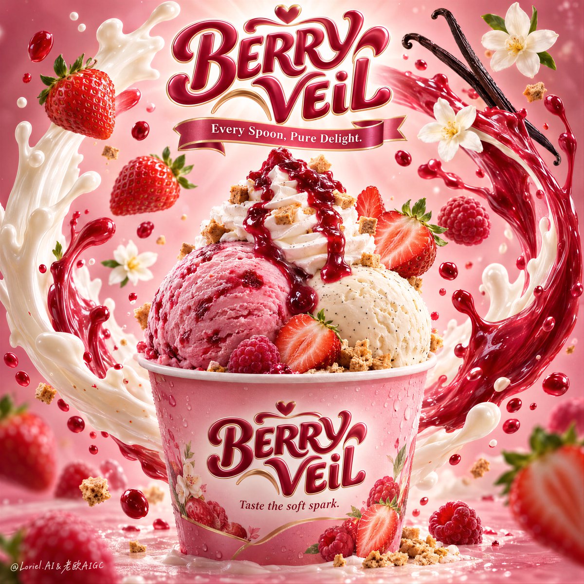
🪽 two upward liquid arcs—one cream, one berry-red—intertwining around the cup without crossing its front label
They create a halo around the product, so the motion adds energy while the cup stays readable.
🍓 floating strawberries, raspberries, blossoms, and vanilla pods placed at varied depths only along the outer orbit
The flavor cues feel abundant, but the center stays clear enough for the scoops and branding to lead.
GPT- image 2.5 prompt👇
A hyper-real premium dessert poster for a fictional international ice cream brand called BERRY VEIL, refined in an Orbit-plus-Transit direction where the original hero structure stays intact but the flavor world becomes stronger, clearer, and more series-ready. A branded pink dessert cup sits in the lower center as the absolute hero, holding two large scoops of ice cream: one lush strawberry-raspberry pink scoop and one creamy vanilla-bean scoop, crowned by a tall whipped cream swirl and a glossy berry coulis cascade. The composition must feel brighter, richer, and more instantly appetizing than a standard strawberry dessert ad.
Framing and composition: vertical poster layout, centered hero cup, sculptural brand crest floating at the top center, and two sweeping liquid arcs rising from both sides of the cup to form an elegant halo-like enclosure around the product. Preserve the current skeleton exactly: top logo, central cup, two large wrapping splash curves, and floating fruit and flavor cues in balanced orbit. Sharpen the hierarchy so the cup reads first, the scoops second, the liquid choreography third, and the floating ingredients fourth. Keep the product fully readable and visually dominant.
Product design: the paper cup is premium, softly glossy, and tinted with a delicate berry-pink gradient, with subtle condensation and crisp printed branding. Front label text reads exactly: "BERRY VEIL". Beneath it, write exactly: "Taste the soft spark." The strawberry-raspberry scoop should feel creamier, juicier, and deeper in color than a basic strawberry scoop, with natural frozen fruit texture and a faint marbled richness. The vanilla-bean scoop should feel smooth, dense, and luxurious, with tiny vanilla specks visible. The whipped cream swirl must have clean, soft ridges and hold a dramatic ruby-red berry glaze. Scatter a few tiny crisp biscuit or caramelized crumble cubes around the cream and base for texture contrast.
Flavor staging and spatial choreography: keep the same central splash system, but push the fruit language slightly toward a strawberry-raspberry hybrid direction for stronger flavor identity and series flexibility. Use several ripe strawberries with realistic seeds, cut faces, and fresh green tops, alongside one or two small raspberry-like berry notes or deeper red fruit accents. Two elegant vanilla pods curve in from the upper right, and two or three soft white blossom flowers remain as airy fragrance cues. The liquid arcs should stay physically plausible: one creamy white dairy splash and one vivid berry-red fruit splash intertwining around the cup in a smooth, upward motion, with smaller droplets suspended at varying depths. The splashes must frame the cup, never bury it.
Lighting and color: luminous premium commercial lighting from upper center-front, soft wraparound fill, subtle rim accents on the scoop edges and cup rim, and a stronger radiant halo behind the top brand mark. Background grading transitions from bright blush cream in the center to richer strawberry-pink and rose-mauve toward the edges. Palette balance: 60% blush pink, milky white, and soft cream; 30% berry red and glossy coulis crimson; 10% vanilla black-brown, leaf green, and tiny golden crumble accents. Build more contrast and flavor saturation than before while keeping the overall frame elegant and premium.
Materials and finish: hyper-real food photography fused with polished fantasy splash rendering. Show creamy frozen micro-texture, juicy fruit skin, realistic strawberry seed detail, glossy coulis viscosity, soft whipped cream ridges, paper cup texture, liquid translucency, and fine reflective droplets. Keep everything tactile, luminous, and premium, with no sticky clutter or messy over-rendering. The final result should feel like a Cannes-level FMCG dessert key visual: radiant, delicious, and easy to extend into a product line.
Typography: all visible text in English only, integrated as premium confectionery branding. The floating top logo reads exactly: "BERRY VEIL" in a bold rounded custom script with a polished confectionery 3D finish. Beneath it, add a ribbon-style line reading exactly: "Every Spoon, Pure Delight." On the cup front, repeat exactly: "BERRY VEIL" and beneath it exactly: "Taste the soft spark." Typography must feel dimensional, sweet, and elegant, harmonizing with the pink-and-berry flavor system while staying clear of the scoop silhouette.
Output and constraints: premium global ice cream advertising poster, product-first hierarchy, no people, no copied source text, no Chinese text, no extra unrelated props, no hand artifacts, no cluttered table styling. Keep scoop forms natural and rounded, cup geometry correct, splash arcs believable, strawberries anatomically clean, vanilla pods elegant, and text crisp and readable. Avoid scoop collapse, muddy pinks, dirty whites, plastic-looking cream, chaotic splash overload, duplicated fruit clusters, gibberish text, warped cup perspective, dead black patches, and drift away from high-end photoreal dessert advertising.
中文译文
想让飞溅海报感觉有序?别在每个空隙都塞配料。
🪽 两条向上飞起的液体弧线——一条奶油色,一条莓果红——环绕杯子交织,但不穿过正面标签
它们在产品周围形成光环,既增加动感,又让杯子保持可读。
🍓 漂浮的草莓、树莓、花朵和香草荚,仅沿外圈轨道在不同景深分布
风味线索看起来丰富,但中心区域依然足够清晰,让冰淇淋球和品牌标识成为主角。
GPT- image 2.5 prompt👇
一张超写实高级甜品海报,为一个名为 BERRY VEIL 的虚构国际冰淇淋品牌打造,遵循 Orbit-plus-Transit 方向精炼,原有主角结构保持完整,但风味世界变得更强、更清晰、更具系列化潜力。一个品牌化的粉色甜品杯作为绝对主角置于下方中央,盛有两勺大份冰淇淋:一勺丰盈的草莓覆盆子粉色冰淇淋,一勺浓郁香草豆荚冰淇淋,顶部冠以高耸的奶油旋花和一道光泽莓果淋酱倾泻。整体构图必须比标准草莓甜品广告更明亮、更浓郁、更瞬间诱人。
取景与构图:竖版海报布局,主角杯居中,雕塑感品牌徽章漂浮于顶部中央,两道弧形液体从杯的两侧升起,在产品周围形成优雅的光环式包围。严格保留当前骨架:顶部 logo、中央杯、两条大弧度飞溅曲线、漂浮水果与风味线索呈平衡轨道。强化层级,让杯子最先被读取,冰淇淋球次之,液体编排第三,漂浮配料第四。保持产品完全可读且视觉主导。
产品设计:纸杯质感高级,柔和光泽,染有细腻的莓果粉色渐变,带有微妙的凝结水珠与清晰的印刷品牌。正面标签文字严格写为:"BERRY VEIL"。其下严格写为:"Taste the soft spark."。草莓覆盆子球应比基础草莓球更浓郁、多汁、色泽更深,呈现自然冷冻水果质感与隐约的纹理丰富感。香草豆荚球应顺滑、绵密、奢华,可见细小香草斑点。奶油旋花必须拥有干净柔和的纹路,盛放一抹夺目的宝石红莓果釉。在奶油与杯底周围散落几粒小巧酥脆饼干或焦化酥粒方块,营造质感对比。
风味编排与空间编排:保持相同的中央飞溅系统,但将水果语言略微推向草莓覆盆子混合方向,以强化风味识别与系列延展。使用数颗成熟草莓,具备真实籽粒、切面与新鲜绿蒂,并辅以一两枚小型类覆盆子浆果或更深红的红色果实点缀。两根优雅的香草荚从右上方弯入,两三朵柔软的白色花作为轻盈香气暗示。液体弧线须保持物理可信:一条奶油白乳汁飞溅与一条鲜艳莓红果汁飞溅,以平滑上升的运动在杯身交织,更小液滴在不同景深中悬浮。飞溅必须为杯子构图,绝不遮盖它。
光线与色彩:来自上方中央前方的高级商业主光,柔和环绕补光,杯沿与球体边缘的微妙轮廓光,以及顶部品牌标志后方更强的辐射光晕。背景渐变由中央明亮粉奶油色,向边缘过渡到更浓郁的草莓粉与玫瑰紫红。配色比例:60% 腮红粉、奶白与柔和奶油;30% 莓红与光泽淋酱深红;10% 香草黑褐、叶绿与微金酥粒点缀。在保持整体画面优雅高级的前提下,构建比之前更强的对比度与风味饱和度。
材质与质感:超写实食物摄影融合精致的奇幻飞溅渲染。展现奶油冷冻微纹理、多汁果皮、真实草莓籽细节、光泽淋酱黏度、柔软奶油纹路、纸杯质感、液体透光性以及细小反光液滴。一切保持触感、光感与高级感,杜绝黏腻杂乱或过度渲染。最终应如戛纳级别的 FMCG 甜品主视觉:光芒四射、美味诱人,且易于延伸为产品系列。
字体:所有可见文字仅使用英文,作为高级糖果品牌整合。顶部漂浮 logo 严格写为:"BERRY VEIL",采用粗体圆润定制手写体,带精致糖果 3D 质感。其下添加一条缎带式文字,严格写为:"Every Spoon, Pure Delight."。在杯身正面,再次严格写为:"BERRY VEIL",其下严格写为:"Taste the soft spark."。字体须具有立体感、甜美、优雅,与粉红与莓果风味体系协调,同时避开冰淇淋球轮廓。
输出与约束:全球高级冰淇淋广告海报,产品优先层级,无人物,无抄袭原文,无中文文字,无额外无关道具,无手部痕迹,无杂乱桌面造型。保持冰淇淋球形态自然圆润,杯体几何正确,飞溅弧线可信,草莓结构干净,香草荚优雅,文字清晰可读。避免冰淇淋球塌陷、粉调浑浊、白调脏污、奶油塑料感、飞溅过度杂乱、重复水果堆、混乱文字、杯体透视扭曲、死黑斑块,以及偏离高端写实甜品广告。
来源与署名
原文由 @ou_zhen599 发布在 X:查看原推文。 本页逐字保留原文并提供机器翻译的中文解读;版权归原作者所有。
同工具的更多提示词
- 你先注意到的是蛋糕。令人难忘之处在于,条纹延续到了蛋糕之外。 🍊 紧密、高对比度的巧克力和香草漩涡带,贯穿整个切面 从远处就能清晰读出这一片蛋糕,图案强烈到足…@ou_zhen599
- 2x2 网格,16:9,为 4 家财富 500 强公司执行此操作:概念锚点 1:"被一种物理力量改造的城市——天际线被塑造成波浪、漩涡、飞溅、滴落、压力爆发、…@Gdgtify
- 你首先会注意到大虾。让这张海报保持整体的,是字体像一个第二深度平面一样发挥作用。 �超大号窄体酸橙色大标题置于食物之后,字母被大虾选择性遮住和露出 食物感觉悬…@ou_zhen599
- 创作一幅高度逼真的日系和纸胶带旅行拼贴画,以[CITY]的地标建筑为主题,设计为高级手工旅行手帐页面。该地标应一眼可辨,并展现出准确的建筑细节、真实的比例、自…@Goodmanprotocol
- 以上传的图像作为主体参考,创作一幅精致的16:9 macOS桌面构图。 主体: 识别参考中的主要主体或角色,并保留其可识别的外观、面部特征、发型、服装、配饰、…@Mayz1169
- GPT Image 2.5 on ChatGPT Prompt 创作一幅超现实的创意人像:一位年轻女性站在室内一面洁净的白墙前,与一幅紧挨着她的大型黑白铅笔手…@Shorelyn_