以上传的图像作为主体参考,创作一幅精致的16:9 macOS桌面构图。
分享链接 · https://openimages.ajiang.me/p/2100856797246500988/
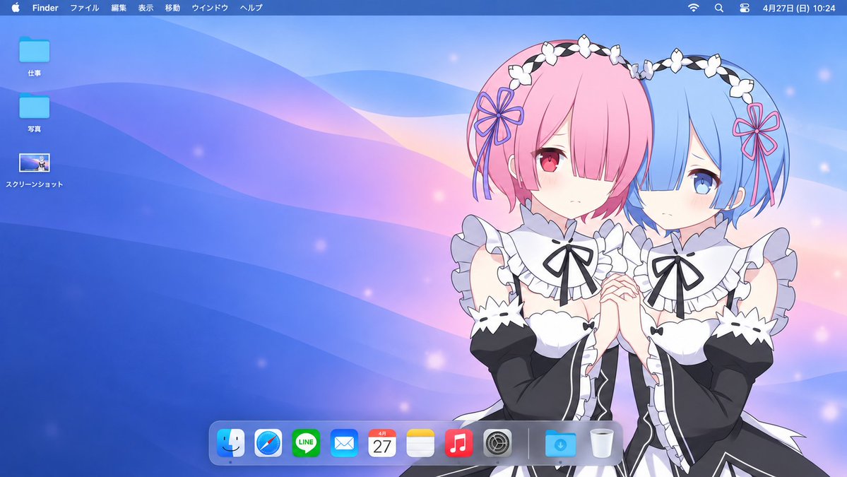
composition · medium-shothuman_attributes · headwearhuman_attributes · short-hairquality_flags · embedded-textquality_flags · screenshot-uisubject_type · character
提示词(原文,逐字保留)
Using the uploaded image as the subject reference, create a polished 16:9 macOS desktop composition.
Subject:
Identify the main subject or characters in the reference and preserve their recognizable appearance, facial features, hairstyle, clothing, accessories, proportions, and original visual style. Keep interacting characters together. If the reference is a character design sheet with multiple views of the same character, use only one main view. Remove the original background, reference-sheet panels, captions, and decorative borders.
Composition:
Place the subject on the RIGHT side, occupying approximately 35–45% of the canvas. Leave generous uncluttered space across the left and center. Keep faces and important gestures fully visible. Preserve the full body when the reference provides it; otherwise, use a natural crop without inventing unseen anatomy. Keep the subject clear of the menu bar and Dock.
Adaptive wallpaper:
Design a custom background that matches the subject’s colors, personality, clothing, and mood. Combine the broad flowing curves and smooth gradients of classic macOS wallpapers with a palette drawn from the reference.
For soft or gentle subjects, use delicate pastel gradients. For energetic subjects, use restrained vibrant accents. For elegant or mysterious subjects, use rich darker tones with subtle highlights. Make these choices based on the actual reference rather than applying the same palette to every image.
Keep the background simpler and less visually dominant than the subject. Use tonal separation so dark clothing remains visible against dark backgrounds and light hair remains visible against pale backgrounds. Add only a few subtle thematic details when appropriate.
Desktop interface:
Include a thin translucent macOS menu bar across the top, with the Apple symbol, Finder, and Japanese menu labels:
ファイル 編集 表示 移動 ウインドウ ヘルプ
Place small system status icons and a clock at the upper right.
On the upper left, arrange exactly three modestly sized desktop items in one vertical column:
• A blue folder labeled “仕事”
• A blue folder labeled “写真”
• A screenshot thumbnail labeled “スクリーンショット”
Use consistent spacing and small, readable white labels with subtle shadows.
Add a realistically sized translucent macOS Dock near the bottom center, shifting slightly left if necessary to avoid overlapping the subject. Include Finder, Safari, LINE, Mail, Calendar, Notes, Music, System Settings, followed by a separator, Downloads, and Trash.
Final appearance:
The result should look like a cohesive personalized Mac desktop screenshot, with a character-inspired wallpaper and clean, believable interface elements. Preserve the reference’s art style rather than converting every subject to anime or photorealism.
No physical laptop, monitor frame, open application windows, extra characters, duplicated subjects, large titles, or additional desktop icons. Render the desktop directly edge to edge in a wide 16:9 image.
中文译文
以上传的图像作为主体参考,创作一幅精致的16:9 macOS桌面构图。
主体:
识别参考中的主要主体或角色,并保留其可识别的外观、面部特征、发型、服装、配饰、比例以及原始视觉风格。保持互动角色在一起。如果参考是包含同一角色多个视角的角色设计表,则仅使用一个主要视角。移除原始背景、参考表面板、说明文字和装饰边框。
构图:
将主体放置在右侧,占画布约35–45%的面积。在左侧和中央留出宽敞整洁的空间。保持面部和重要手势完全可见。当参考提供全身时保留全身;否则,使用自然裁剪,不要凭空创造未见的解剖结构。保持主体避开菜单栏和Dock。
自适应壁纸:
设计一个与主体颜色、个性、服装和情绪相匹配的定制背景。将经典macOS壁纸的宽广流动曲线和平滑渐变与从参考中提取的调色板相结合。
对于柔和或温柔的主体,使用精致的粉彩渐变。对于充满活力的主体,使用克制的鲜艳色彩点缀。对于优雅或神秘的主体,使用丰富较深的色调并辅以微妙高光。根据实际参考做出这些选择,而不是对每张图像应用相同的调色板。
保持背景比主体更简单、视觉主导性更低。使用色调分离,使深色服装在深色背景上仍可见,浅色头发在浅色背景上仍可见。仅在适当时候添加少量微妙的主题细节。
桌面界面:
在顶部包含一个细长的半透明macOS菜单栏,带有Apple标志、Finder以及日文菜单标签:
ファイル 編集 表示 移動 ウインドウ ヘルプ
在右上方放置小型系统状态图标和时钟。
在左上方以一列垂直排列恰好三个大小适中的桌面项目:
• 一个标记为“仕事”的蓝色文件夹
• 一个标记为“写真”的蓝色文件夹
• 一个标记为“スクリーンショット”的截图缩略图
使用一致的间距和带细微阴影的细小可读白色标签。
在底部中央附近添加一个尺寸逼真的半透明macOS Dock,如有必要可稍微向左移动以避免与主体重叠。包括Finder、Safari、LINE、Mail、Calendar、Notes、Music、System Settings,然后是一个分隔符、Downloads和Trash。
最终外观:
结果应看起来像一幅协调的个性化Mac桌面截图,带有角色启发的壁纸和干净逼真的界面元素。保留参考的艺术风格,而不是将每个主体都转换为动漫或照片写实风格。
不要出现物理笔记本电脑、显示器边框、打开的应用程序窗口、额外角色、重复主体、大标题或额外的桌面图标。将桌面直接以宽幅16:9图像渲染到边缘。
来源与署名
原文由 @Mayz1169 发布在 X:查看原推文。 本页逐字保留原文并提供机器翻译的中文解读;版权归原作者所有。
同工具的更多提示词
- 你看到一个热带场景;这段提示实际上是在控制一种材质过渡。 🌿 在罐体后方做一道受控的水平纸张撕裂效果,卷曲的纤维状边缘框住露出部分 这样做可以在不增加额外背景…@ou_zhen599
- 你首先会注意到大虾。让这张海报保持整体的,是字体像一个第二深度平面一样发挥作用。 �超大号窄体酸橙色大标题置于食物之后,字母被大虾选择性遮住和露出 食物感觉悬…@ou_zhen599
- 2x2 网格,16:9 比例,AI 推断可引发病毒式传播的主题:创建一个令人难忘、极简的 3D 可视化,表现因 [TOPIC] 而被遗漏、失去、回避、延迟或抹…@Gdgtify
- 你先注意到的是蛋糕。令人难忘之处在于,条纹延续到了蛋糕之外。 🍊 紧密、高对比度的巧克力和香草漩涡带,贯穿整个切面 从远处就能清晰读出这一片蛋糕,图案强烈到足…@ou_zhen599
- 将我上传的女性面部作为主模特唯一的身份参考。保留她精确的面部身份、自然的面部结构、肤色、眼睛、眉毛、鼻子、嘴唇、颧骨、下颌线、面部比例、发际线和自然皮肤纹理…@aniyaintel
- 想让飞溅海报感觉有序?别在每个空隙都塞配料。 🪽 两条向上飞起的液体弧线——一条奶油色,一条莓果红——环绕杯子交织,但不穿过正面标签 它们在产品周围形成光环…@ou_zhen599