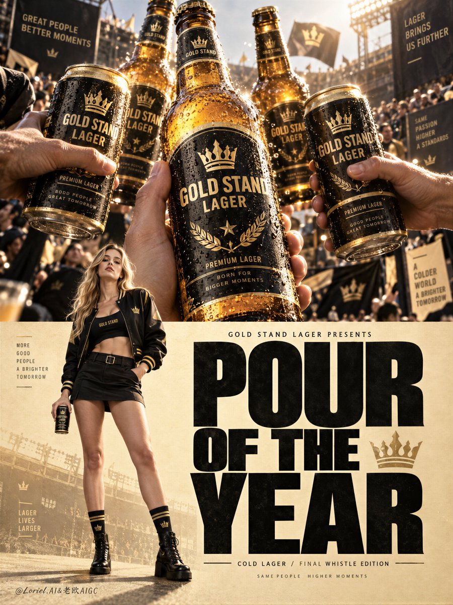
冠军海报的感觉来自对比:在上方释放能量,然后在下方给信息留出落地的空间。
分享链接 · https://openimages.ajiang.me/p/2105348131017933006/
color_palette · warm-tonescomposition · extreme-close-upcomposition · multi-panelmood · luxuriousquality_flags · embedded-textquality_flags · typography-heavy
提示词(原文,逐字保留)
The championship feeling comes from contrast: release the energy above, then give the message room to land below.
🍺 upper photo banner packed with chilled bottles and cans, one hero bottle closest to camera, condensation catching hard stadium light
The toast feels immediate and physical. A single oversized product keeps the celebration from turning into generic crowd imagery.
🏆 lower half reduced to warm paper texture, one lifestyle figure on the left, and an oversized stacked headline claiming the right
After the visual rush, the eye gets a clean landing zone. The product world stays premium while the headline delivers the campaign memory.
GPT- image 2.5 prompt👇
A Cannes-level beer campaign poster for fictional premium lager brand GOLD STAND LAGER, merging emotional celebration, material precision, and curatorial brand control into one image. Preserve the exact championship-poster structure: a cinematic photographic banner across the upper half, a warm pale-gold editorial field across the lower half, one full-body hero figure on the lower left, and one giant stacked headline dominating the lower right. The beer remains the absolute visual leader throughout.
Upper half: a tight, high-energy close-up of chilled black-and-gold beer bottles and cans brought together in a pre-celebration toast, like a ritual huddle before victory. One hero bottle or can dominates the center closest to camera, surrounded by secondary products. Show cold condensation, glowing amber lager, wet metallic highlights, crisp reflections, and dense black labels with refined golden crests. The background suggests a stadium-adjacent celebration with blurred crowd texture and sunlight, but the beer stays largest, sharpest, and brightest. The feeling is tense, triumphant, and one second before release.
Lower half: keep the editorial layout on a pale warm-gold paper-textured field. On the lower left, place one adult Western white girl as the only visible human figure, full-body, photoreal, naturally proportioned, anatomically correct, with realistic skin texture, subtle pores, natural lips, elegant hands with five normal fingers, long toned legs, mature natural body structure, and no distortion. She wears a refined black-and-gold varsity-inspired look with a cropped jacket, fitted mini skirt or tailored shorts, sleek socks or boots, and minimal sporty-luxury styling. Her pose is calm, cool, and victorious, holding one chilled can or bottle of GOLD STAND LAGER slightly lowered or subtly raised, while remaining secondary to the product system.
Typography must behave like poster architecture. In the lower right, create one giant original English headline such as “POUR OF THE YEAR” in huge bold condensed lettering, stacked and filling most of the right side. Above it, place one small premium line such as “GOLD STAND LAGER PRESENTS”. Near the lower edge, add one restrained editorial detail line such as “COLD LAGER / FINAL WHISTLE EDITION”. All wording must be original, sharp, elegant, and integrated into the composition. The tone should feel like Orbit, Transit, and Port fused together: emotionally charged, materially exact, and elevated into a global brand master poster.
Color hierarchy: 60% black, deep charcoal, and glowing amber-gold product world, 30% pale cream, paper-gold, and soft stadium light, 10% metallic highlights and controlled skin tones. Lighting is premium and layered: strong natural top light on bottles and cans, crisp speculars on wet glass and aluminum, subtle warm rim light on the girl, soft fill for anatomy and wardrobe readability, and enough contrast for volume without muddy shadows or dead blacks. Materials must feel hyperreal and tactile: chilled glass, brushed aluminum, luminous lager, condensation droplets, matte paper texture, sporty fabric, glossy labels, and subtle halftone poster grain.
The final image should feel like a global beer campaign fused with a sports-award poster and a luxury lifestyle ad: bold, premium, celebratory, product-dominant, internationally polished, and instantly memorable. No copied team names, no copied text, no real athlete names, no warped cans or bottles, no broken typography, no malformed hands, no extra fingers, no distorted female anatomy, no muddy beer color, no clutter weakening the beer.
中文译文
冠军海报的感觉来自对比:在上方释放能量,然后在下方给信息留出落地的空间。
🍺 上方照片横幅塞满冰镇啤酒瓶和罐,靠近镜头放一支主角瓶,水珠凝结捕捉硬朗的体育场灯光
干杯的感觉是即时且具象的。一支超大的产品让庆祝不会沦为千篇一律的人群画面。
🏆 下半部分简化为暖色纸质纹理,左侧一位生活方式人物,右侧用一支超大堆叠式标题占据
在视觉冲击之后,眼睛得到一个干净的落地区。产品世界保持高级感,而标题承载住这场战役的记忆。
GPT- image 2.5 prompt👇
一张戛纳级别的啤酒战役海报,用于虚构高端拉格品牌 GOLD STAND LAGER,将情感庆祝、材质精度与策展级的品牌控制融合进一张图。保留准确的冠军海报结构:上半部分一条电影感的照片横幅,下半部分一片暖色调的浅金色编辑版面,左下角一位全身主角人物,右下角一支巨型堆叠标题。啤酒自始至终都是绝对的视觉主角。
上半部分:一个紧凑、高能量的冰镇黑金啤酒瓶与罐的特写,它们聚在一起做赛前的祝酒,像胜利前的仪式性围圈。一支主角瓶或罐在靠近镜头的中央主导画面,周围环绕次要产品。展示冷凝水珠、发光的琥珀色拉格酒液、湿润的金属高光、清晰的反射、以及印有精致金色徽章的厚实黑色标签。背景暗示体育场边的庆祝氛围,模糊的人群质感和阳光,但啤酒保持最大、最锐利、最明亮。感觉是紧绷的、胜利的、释放前的一秒。
下半部分:在浅暖金色纸质纹理的编辑版面上保持版面布局。在左下角放置一位成年西方白人女孩作为唯一可见的人物,全身,照片级真实,自然比例,解剖正确,拥有真实的皮肤质感、细微毛孔、自然的嘴唇、优雅的双手各五根正常手指、修长紧致的双腿、成熟自然的身体结构,没有形变。她穿着精致的黑金学院风造型——短款夹克、修身迷你裙或定制短裤、利落的长袜或靴子,搭配极简的运动奢华风格。她的姿态冷静、酷感、胜利感,轻微下放或微微举起一罐/一瓶 GOLD STAND LAGER,但依然处于产品体系之下。
字体必须像海报建筑一样运作。在右下角创作一支巨大的原创英文标题,例如“POUR OF THE YEAR”,使用粗体压缩字形,堆叠排版并占据右侧大部分空间。在它上方放置一行小型高端引导文字,例如“GOLD STAND LAGER PRESENTS”。靠近底边加入一行克制的编辑细节行,例如“COLD LAGER / FINAL WHISTLE EDITION”。所有文字必须是原创的、锐利的、优雅的,并融入整体构图。气质应像 Orbit、Transit 和 Port 三者的融合:情绪充沛、材质精确,并被提升为一份全球品牌的大师级海报。
色彩层级:60% 黑色、深炭灰与发光的琥珀金色产品世界,30% 浅奶油色、纸面金与柔和的体育场光线,10% 金属高光与受控的肤色。光线是高级且分层的:瓶罐上有强烈的自然顶光,湿玻璃与铝罐上有清晰的高光,女孩身上有微妙的暖色边缘光,对解剖与服装可读性做柔和补光,并提供足够的对比度来塑造体积,避免浑浊的阴影和死黑。材质必须超写实且有触感:冰镇玻璃、拉丝铝、发光的拉格酒液、凝结水珠、哑光纸质纹理、运动面料、光泽标签,以及细微的海报网点颗粒。
最终图像应感觉像一份全球啤酒战役融合体育颁奖海报与奢华生活方式广告:大胆、高端、庆祝感、产品主导、国际级精修、过目不忘。不得复制球队名称、不得复制文字、不得使用真实运动员姓名、不得出现变形的瓶罐、不得出现破损的字体、不得出现畸形的手、不得有多余手指、不得扭曲女性解剖、不得浑浊的啤酒颜色、不得有任何削弱啤酒的杂乱元素。
来源与署名
原文由 @ou_zhen599 发布在 X:查看原推文。 本页逐字保留原文并提供机器翻译的中文解读;版权归原作者所有。
同工具的更多提示词
- 当产品层级如舞台般运作时,一组合海报便成为标志。 ✨ 一个位于垂直轴上的中央主角包装,由放射状光环环绕;次要包装以更小尺寸在两侧镜像呼应 主角首先作为领衔形象…@ou_zhen599
- 2x2 网格,16:9,AI 自主选择主体:INPUT: $ SUBJECT // ── 语义推断 ─────────────────────────────…@Gdgtify
- 一个四格美食广告画面之所以看起来协调统一,靠的是品牌系统的重复呈现——而不是每格都重复同一张图。 🍗 在四格中锁定相同的红橙色背景、Logo 位置、圆角卡片边…@ou_zhen599
- 为 [CITY / LANDMARK](城市 / 地标)创作一张高度精细的“建筑护照”旅行海报,设计为一份高端典藏艺术版画,融合彩色铅笔插画、精细墨线手绘、复…@Naiknelofar788
- ChatGPT / GPT Image 2.5 根据提供的四张参考图,创建一个写实风格的 2×2 联系表,尺寸 1800×2700,由四个相等的 900×13…@RougeHalo_AI
- 主题:【XXX】 围绕主题自主完成东方博物馆编辑视觉设计,自动决定主体、材质、色彩、字体、档案、构图与信息层级。 9:16竖版,极简、克制、大面积留白。以主题…@DeepBlueX0