当产品层级如舞台般运作时,一组合海报便成为标志。
分享链接 · https://openimages.ajiang.me/p/2105345428657172808/
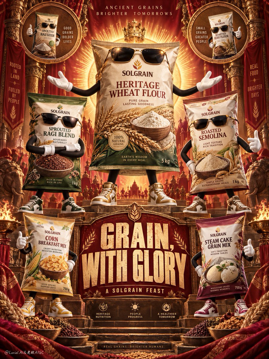
color_palette · high-contrastcolor_palette · warm-tonescomposition · full-bodycomposition · symmetrylighting · studio-lightmood · luxurious
提示词(原文,逐字保留)
An ensemble poster becomes iconic when the product hierarchy behaves like a stage.
✨ one central hero pack elevated on the vertical axis, framed by a radiant halo; secondary packs mirrored at lower scale on both sides
The hero reads first as the lead figure. The range feels expansive without becoming a row of equally loud packages.
🪿 use ornate framing, medallions, and smoke ribbons as a symmetrical border system, leaving the pack fronts clean and unobstructed
The decoration creates ceremony around the products instead of competing with their labels. The result feels mythic but still shelf-ready.
GPT- image 2.5 prompt👇
A Cannes-level food campaign poster for fictional heritage grain brand SOLGRAIN, merging emotional spectacle, material precision, and curatorial symbolism into one unified image. Preserve the exact power of an ornate festival poster: a tall symmetrical vertical composition, deep red and burnt-orange ceremonial backdrop, carved ornamental framing, radiant halo behind the central hero product, curling smoke ribbons, circular medallion insets in the upper and lower corners, anthropomorphic food packages arranged like iconic brand characters, and one monumental headline block in the lower middle. The products must remain the absolute visual leaders.
Build a premium ensemble of grain-based food packages turned into stylish anthropomorphic mascots, each keeping its real package form while gaining expressive arms, legs, gloves, shoes, and dark sunglasses. The central hero pack stands tallest and slightly elevated, arms open in a commanding celebratory gesture like the lead figure of a ritual procession. Surround it with secondary package characters in balanced symmetrical positions: crossed arms, confident hand gestures, and proud side stances. Use original English-only branding under the master brand “SOLGRAIN”, with variants such as “Heritage Wheat Flour”, “Sprouted Ragi Blend”, “Roasted Semolina”, “Corn Breakfast Mix”, and “Steam Cake Grain Mix”. Every package must feel hyperreal and premium, with crisp print, believable crinkles, tactile matte-plastic surface, sharp grain imagery, and strong shelf presence.
The central hero pack is the largest and most saturated object, framed by a radiant golden halo that makes it feel mythic and celebratory. The upper circular medallions contain supporting package portraits like sacred product icons. The lower section includes two or three smaller product characters reinforcing the family range without competing with the hero. Keep the cast product-first, never generic cartoon. Their poses should feel witty, proud, bold, and fashion-aware while preserving edible grain credibility.
Typography behaves like festival architecture. Create one huge original English headline in the lower center such as “GRAIN, WITH GLORY” or “TRADITION, TURNED LOUD”, using bold distressed condensed lettering with a slightly vintage screen-print feel. Add one short support line beneath it, such as “A SOLGRAIN FEAST”. Keep all text integrated into the vertical axis and never blocking the main package faces. The tone should feel like Orbit, Transit, and Port fused together: emotionally charged, materially exact, and culturally elevated into brand myth.
Lighting is warm, sculptural, and premium: frontal hero key light on the main package, soft side separation on secondary characters, metallic glints on sunglasses and details, and controlled highlights across the packaging so every pack reads dimensional and tactile. Color hierarchy: 60% deep festive red, burnt orange, and ceremonial gold, 30% beige grain tones, wheat creams, and pack-specific accents, 10% black sunglasses, deep shadow definition, and tiny metallic highlights. Materials must feel exact and luxurious: crinkled package plastic, matte printed labels, visible grain kernels, flour imagery, embossed ornamental surfaces, velvet-like shadow pockets, glossy sunglasses, and subtle poster-surface texture.
The final image should feel like a global FMCG masterpiece crossed with a ritual shrine poster and a fashion-ensemble campaign: bold, humorous, product-dominant, culturally rich, hyperreal, and graphically controlled. No copied brand names, no copied slogans, no human faces, no malformed limbs, no extra fingers, no warped packaging, no unreadable labels, no muddy shadows, no clutter that weakens the hero pack, no cheap cartoon feel.
中文译文
当产品层级如舞台般运作时,一组合海报便成为标志。
✨ 一个位于垂直轴上的中央主角包装,由放射状光环环绕;次要包装以更小尺寸在两侧镜像呼应
主角首先作为领衔形象被读出。产品阵列虽显辽阔,却不会沦为一行同样喧闹的包装。
🪿 使用华丽的画框、圆形勋章图案与烟带作为对称的边框系统,保持包装正面干净、不被遮挡
装饰营造围绕产品的仪式感,而非与标签争抢视觉。最终效果兼具神话感与货架就绪感。
GPT- image 2.5 prompt👇
为虚构的传承谷物品牌 SOLGRAIN 打造戛纳级别的食品宣传海报,将情感奇观、材质精度与策展象征融为一体于同一画面。保留华丽节庆海报的精确力量:高耸对称的纵向构图,深红与焦橙的仪式感背景,雕刻式装饰画框,中央主角产品背后的放射状光环,盘旋的烟带,上下角的圆形勋章内嵌小图,拟人化的食品包装如标志性品牌角色般排列,以及位于下方中央的一座纪念碑式标题块。必须确保产品始终是绝对的视觉主角。
构建一组高端的谷物基食品包装化身时尚拟人吉祥物,每个保留其真实包装形态,同时获得富有表现力的手臂、腿、手套、鞋子与深色墨镜。中央主角包装站立最高并略微抬起,双臂张开呈指挥式的庆祝姿态,如同一场仪式游行的领头形象。在其周围安排次要包装角色,置于均衡对称的位置:交叉双臂、自信的手势、傲人的侧身姿态。使用仅限英文的原创品牌表达,主品牌为“SOLGRAIN”,变体如“Heritage Wheat Flour”、“Sprouted Ragi Blend”、“Roasted Semolina”、“Corn Breakfast Mix”以及“Steam Cake Grain Mix”。每个包装必须呈现超写实与高端感:印刷清晰、褶皱可信、哑光塑料触感、谷物影像锐利、货架存在感强烈。
中央主角包装是最大且色彩最饱和的对象,由放射状金色光环包围,使其显得神话而喜庆。上方的圆形勋章中包含次级包装肖像,如同神圣的产品圣像。下部包含两到三个较小的产品角色,强化家族系列而不与主角竞争。保持角色以产品为先,绝非泛化卡通。其姿态应机智、骄傲、大胆、具时尚意识,同时保持可食用谷物的可信度。
字体排印如节庆建筑。在下方中央创作一条巨大的原创英文主标题,如“GRAIN, WITH GLORY”或“TRADITION, TURNED LOUD”,采用粗犷做旧的窄体字形,带有轻微的复古丝网印刷质感。下方添加一条简短辅助文字,如“A SOLGRAIN FEAST”。所有文字须整合于纵向轴上,绝不遮挡主要包装正面。整体基调应如 Orbit、Transit 与 Port 融合:情感充沛、材质精准、文化升华至品牌神话。
光线温暖、雕塑化且高端:主角包装上的正面主光,次要角色柔和的侧面分离光,墨镜与细节处的金属反光,包装表面的受控高光使每包都呈现立体与触感。色彩层级:60% 深节庆红、焦橙与仪式金,30% 米色谷物色调、小麦奶油色与包装专属强调色,10% 黑色墨镜、深邃阴影定义与微小金属高光。材质必须精准而奢华:褶皱的包装塑料、哑光印刷标签、可见的谷物颗粒、面粉影像、浮雕装饰表面、天鹅绒般的阴影口袋、光泽墨镜与微妙的海报表面纹理。
最终图像应感觉如同一件全球快消巨作,融合仪式神龛海报与时尚群像广告:大胆、幽默、产品主导、文化丰富、超写实且图形控制严谨。无抄袭品牌名、无抄袭标语、无人类面孔、无畸形肢体、无多余手指、无扭曲包装、无不可辨识标签、无浑浊阴影、无削弱主角包装的杂乱、无廉价卡通感。
来源与署名
原文由 @ou_zhen599 发布在 X:查看原推文。 本页逐字保留原文并提供机器翻译的中文解读;版权归原作者所有。
同工具的更多提示词
- 一个四格美食广告画面之所以看起来协调统一,靠的是品牌系统的重复呈现——而不是每格都重复同一张图。 🍗 在四格中锁定相同的红橙色背景、Logo 位置、圆角卡片边…@ou_zhen599
- 冠军海报的感觉来自对比:在上方释放能量,然后在下方给信息留出落地的空间。 🍺 上方照片横幅塞满冰镇啤酒瓶和罐,靠近镜头放一支主角瓶,水珠凝结捕捉硬朗的体育场灯…@ou_zhen599
- ChatGPT / GPT Image 2.5 根据提供的四张参考图,创建一个写实风格的 2×2 联系表,尺寸 1800×2700,由四个相等的 900×13…@RougeHalo_AI
- 2x2 网格,16:9,AI 自主选择主体:INPUT: $ SUBJECT // ── 语义推断 ─────────────────────────────…@Gdgtify
- 优雅的女性坐在一辆经典豪车内部,戴着宽檐大帽子、圆形深色墨镜、皮质手套,以及造型感十足的雕塑感珠宝。一只手优雅地轻扶帽檐。紧凑构图的时尚肖像,中景取景。 高对…@im_shahid7
- 为 [CITY / LANDMARK](城市 / 地标)创作一张高度精细的“建筑护照”旅行海报,设计为一份高端典藏艺术版画,融合彩色铅笔插画、精细墨线手绘、复…@Naiknelofar788