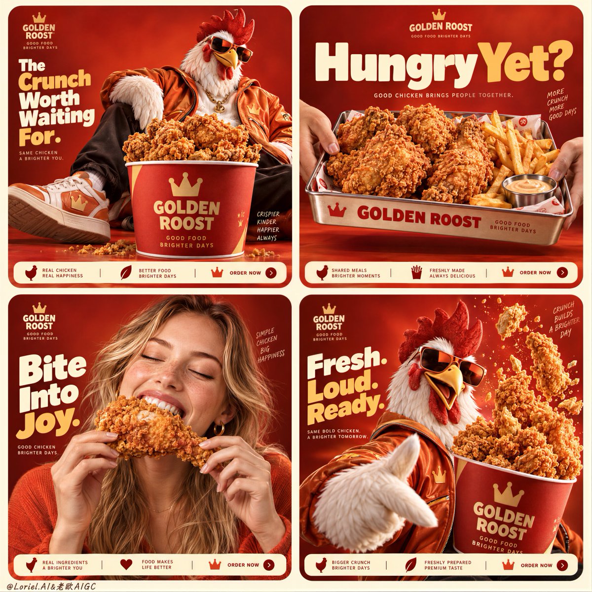
一个四格美食广告画面之所以看起来协调统一,靠的是品牌系统的重复呈现——而不是每格都重复同一张图。
分享链接 · https://openimages.ajiang.me/p/2105344464768360500/
color_palette · vibrantcolor_palette · warm-tonescomposition · multi-panellighting · studio-lightquality_flags · embedded-textquality_flags · multi-panel-layout
提示词(原文,逐字保留)
A four-panel food campaign feels cohesive when the brand system repeats—not when every panel repeats the same image.
🍗 lock the same red-orange background, logo position, rounded card frame, and bottom information strip across all four panels
These fixed anchors make the grid feel like one campaign before the viewer even notices the individual scenes.
👑 vary the appetite trigger in each card: bucket abundance, tray-sharing, first bite, then controlled food burst
Each panel earns its place with a different reason to crave the product, while the chicken remains the visual constant.
GPT- image 2.5 prompt👇
A Cannes-level fried chicken campaign poster for fictional premium fast-food brand GOLDEN ROOST, merging emotional appetite, material precision, and curatorial graphic control into one unified 2x2 social-ad grid. Preserve the exact structure: four rounded-corner square cards on a pale buttery-cream background, each set on a saturated red-to-orange studio field with the same mascot-and-product universe, product-first hierarchy, bold headline zones, and tiny bottom information strips. The food remains the absolute visual leader across all four panels.
Top-left panel: a fashion-forward anthropomorphic rooster mascot lounges beside an oversized branded bucket overflowing with hyperreal fried chicken, wearing tactile orange street-luxury outerwear and tinted sunglasses. Top-right panel: a metal tray loaded with fried chicken pieces and fries is held from both sides by entering hands, tight and direct, with a bold headline above. Bottom-left panel: replace the black person with an adult Western white girl, photoreal and internationally commercial, joyfully biting into a large piece of fried chicken; she has fair or lightly sun-kissed skin, realistic pores, natural lips and teeth, soft hair, elegant hands with five normal fingers, correct anatomy, warm orange-red styling, and genuine delight. Bottom-right panel: the rooster mascot returns larger in the foreground while a branded bucket of fried chicken tenders erupts upward in a controlled burst of crumbs and crisp fragments.
Create a fully original English-only brand system. Use a small GOLDEN ROOST logo in the upper area of each panel, with short original headlines such as “The Crunch Worth Waiting For.”, “Hungry Yet?”, “Bite Into Joy.”, and “Fresh. Loud. Ready.” Keep typography bold, rounded, well spaced, and integrated into each card without covering the hero food. Add minimal order-strip information at the bottom edge of each card only as graphic structure.
The fried chicken must be irresistibly real: thick, deeply golden, rough crisp crust, visible crumb texture, subtle seasoning dust, hot edible volume, tender interior glimpses where relevant, and rich commercial food highlights. The bucket and tray feel tactile and premium, with matte printed surfaces, believable curvature, crisp logo print, and strong object weight. The mascot feels polished and brand-iconic, with feather texture, sculptural beak, expressive pose, glossy sunglasses, and soft fabric detail.
Lighting is polished commercial food lighting fused with campaign styling: warm front-upper key light, soft fill for detail retention, subtle rim light on mascot feathers and the girl’s face, crisp highlights on breading ridges, and strong volume without muddy shadows or dead blacks. Color hierarchy: 65% fiery red-orange brand field, 25% golden-brown fried chicken texture, 10% cream, white, and soft skin highlights. The final image should feel like Orbit, Transit, and Port fused together: emotionally addictive, materially exact, internationally polished, graphically clean, playful but premium. No copied branding, no copied slogans, no extra people, no malformed hands, no extra fingers, no distorted female anatomy, no warped tray or bucket, no muddy crust texture, no weak typography, no clutter hiding the chicken, no cheap fast-food look.
中文译文
一个四格美食广告画面之所以看起来协调统一,靠的是品牌系统的重复呈现——而不是每格都重复同一张图。
🍗 在四格中锁定相同的红橙色背景、Logo 位置、圆角卡片边框以及底部信息条
这些固定锚点让排版在观众注意到各个独立场景之前,就已经像一个完整的系列。
👑 每张卡片变换食欲触发点:桶装丰盛感、托盘分享、第一口咬下,再到一个受控的食物爆发
每格都因不同的馋人理由而存在,而炸鸡始终是视觉的主角。
GPT- image 2.5 prompt👇
为虚构高端快餐品牌 GOLDEN ROOST 打造一张戛纳级别的炸鸡广告海报,将情感食欲、材质精度与策展级的画面控制力融合进一个统一的 2x2 社交广告网格中。保留精确结构:四张圆角方形卡片位于淡黄油奶油色背景之上,每张卡片都置于饱和的由红到橙的影棚色块中,使用同一套吉祥物与产品宇宙、产品优先的层级、醒目的标题区域以及小巧的底部信息条。食物在四格画面中始终是绝对的视觉主角。
左上格:一只走在时尚前沿的拟人化公鸡吉祥物斜倚在一个超大品牌桶旁,桶里堆满超写实炸鸡,它身披触感丰富的橙色街头奢华外套,戴着染色墨镜。右上格:一个装满炸鸡块和薯条的金属托盘被两侧伸入的手从两端端起,画面紧凑直接,上方放置粗体标题。左下格:将画面中的黑人替换为一位成年西方白人女性,写实且具国际化商业感,正开心地咬下一大块炸鸡;她拥有白皙或轻晒过的肤色、真实的毛孔、自然的唇部和牙齿、柔软的发质、优雅的双手(每只手五根正常手指)、正确的人体比例、暖橙红色造型,以及真挚的愉悦表情。右下格:公鸡吉祥物在前景中以更大的比例回归,同时一桶品牌炸鸡柳向上爆裂出受控的面包屑与酥脆碎片。
打造一个完全原创、仅使用英文的品牌系统。在每格上半部分放置一个小的 GOLDEN ROOST Logo,使用简短原创标题,例如 “The Crunch Worth Waiting For.”、“Hungry Yet?”、“Bite Into Joy.” 和 “Fresh. Loud. Ready.”。字体保持粗体、圆润、间距合理,并自然融入每张卡片,不能遮盖主角食物。在每张卡片底部边缘仅以图形结构的形式加入极简的点单条信息。
炸鸡必须呈现出让人无法抗拒的真实感:厚实、深金色、粗糙酥脆的外壳、清晰可见的面包屑纹理、若有若无的调料粉、热腾腾的可食用体积感、相关处可瞥见的嫩滑内里,以及丰富的商业级食物高光。桶与托盘具有触感与高端感:哑光印刷表面、可信的弧度、清晰的 Logo 印刷与强烈的物体重量感。吉祥物精致且具品牌标志性:羽毛质感、雕塑感的喙、富有表现力的姿态、光泽墨镜与柔和的布料细节。
灯光为精致的商业美食灯光与广告造型的融合:温暖的前上方主光、柔和的补光以保留细节、吉祥物羽毛与女孩面部的微妙轮廓光、面衣棱角上的清晰高光,以及在没有浑浊阴影或死黑的前提下保持强烈体积感。色彩层级:65% 火红橙的品牌色块,25% 金棕色炸鸡质感,10% 奶油色、白色与柔和肤色高光。最终画面应呈现 Orbit、Transit 与 Port 三者融合的感觉:情绪上令人上瘾、材质上精确无误、国际化的精致感、画面干净、玩味中透出高端。禁止抄袭品牌、抄袭标语、出现额外人物、畸形的手、多余的手指、扭曲的女性人体、变形的托盘或桶、浑浊的面衣质感、疲软的字体、遮挡炸鸡的杂乱元素,以及廉价的快餐观感。
来源与署名
原文由 @ou_zhen599 发布在 X:查看原推文。 本页逐字保留原文并提供机器翻译的中文解读;版权归原作者所有。
同工具的更多提示词
- ChatGPT / GPT Image 2.5 根据提供的四张参考图,创建一个写实风格的 2×2 联系表,尺寸 1800×2700,由四个相等的 900×13…@RougeHalo_AI
- 当产品层级如舞台般运作时,一组合海报便成为标志。 ✨ 一个位于垂直轴上的中央主角包装,由放射状光环环绕;次要包装以更小尺寸在两侧镜像呼应 主角首先作为领衔形象…@ou_zhen599
- 优雅的女性坐在一辆经典豪车内部,戴着宽檐大帽子、圆形深色墨镜、皮质手套,以及造型感十足的雕塑感珠宝。一只手优雅地轻扶帽檐。紧凑构图的时尚肖像,中景取景。 高对…@im_shahid7
- 冠军海报的感觉来自对比:在上方释放能量,然后在下方给信息留出落地的空间。 🍺 上方照片横幅塞满冰镇啤酒瓶和罐,靠近镜头放一支主角瓶,水珠凝结捕捉硬朗的体育场灯…@ou_zhen599
- 【主体】 × 【风格】 × 【构图】 × 【媒介 】 主体:画谁,决定画面的核心对象。 风格:用什么视觉方式表现,决定整体视觉语言。 构图:怎么组织画面,决定…@DeepBlueX0
- 2x2 网格,16:9,AI 自主选择主体:INPUT: $ SUBJECT // ── 语义推断 ─────────────────────────────…@Gdgtify