一个解压类广告不应消除混乱,而应让产品在混乱中成为唯一的平静所在。
分享链接 · https://openimages.ajiang.me/p/2105235791802937344/
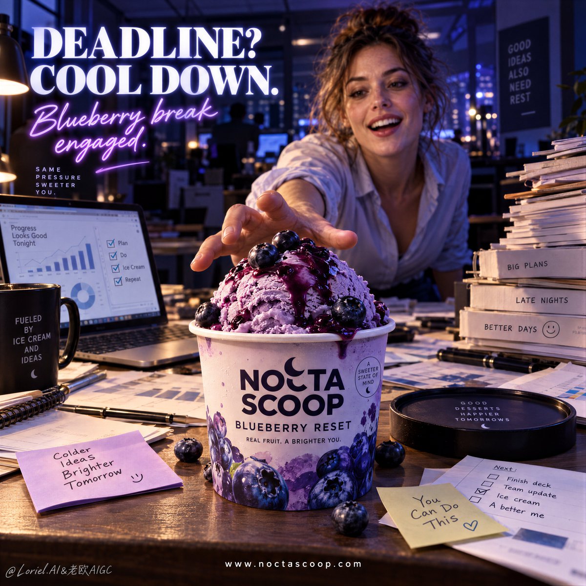
camera_lens · shallow-depth-of-fieldcolor_palette · cool-tonescomposition · extreme-close-uphuman_attributes · hands-prominentquality_flags · embedded-textscene · office-workspace
提示词(原文,逐字保留)
A stress-relief ad should not remove the chaos. It should make the product the only calm thing inside it.
🧊 extreme foreground product in sharp focus, with the reaching person and office clutter falling into soft depth behind it
The cup becomes the immediate answer before the viewer reads any copy. The workload stays present, but it cannot steal the hierarchy.
🫐 cool violet office ambience with a warm front-left hero light isolating the cup, scoop, and glossy blueberry sauce
This separates the dessert from the nocturnal desk without making the office feel staged. The cold product looks crisp; the pressure stays in the shadows.
GPT- image 2.5 prompt👇
A high-impact premium ice cream poster for fictional dessert brand NOCTA SCOOP, built with the exact logic of a modern stress-relief product ad. Preserve the full narrative: a late-night office in deep blue-violet light, a large branded ice cream cup in the extreme foreground as the absolute hero, an adult Western woman in the background reaching toward it, cluttered documents and a laptop across the desk, a bold headline block in the upper left, and a clean website line centered near the bottom.
Use a dramatic desk-height near-product perspective. The ice cream cup dominates the lower center foreground in sharp focus, while the woman stays slightly behind and softer in depth. The office should feel busy and believable: scattered charts, sticky notes, folders, stacked paperwork, a laptop with business graphs, and a dim open-office background with glowing practical lights. The woman is adult, photoreal, naturally proportioned, with a contemporary Western look, bright expressive eyes, a lightly open delighted smile, realistic skin texture, soft lips, natural hair density, correct head-neck-shoulder balance, correct hand anatomy, five normal fingers, a believable reaching gesture, rolled-up sleeves, loosened office styling, and late-work energy. If more of her body is visible, keep adult female anatomy natural, mature, and undistorted. She is not the hero; she exists to dramatize the product’s pull.
The product is the core event: a premium blueberry ice cream cup on the desk like a salvation object in chaos. The cup is fully rebranded in English: “NOCTA SCOOP” as the brand mark, “BLUEBERRY RESET” as the flavor name, plus one small premium descriptor line. It must feel tangible and hyperreal, with matte printed packaging, crisp typography, controlled condensation, and subtle office-light reflections. On top, a rounded scoop of rich blueberry ice cream rises above the rim, dense, creamy, cold, and velvety, with glossy blueberry sauce drizzled over it and a few whole blueberries resting naturally on top. The texture should show fine freeze detail, soft spoonable density, and an appetizing cold sheen without messy melting.
Lighting is cinematic and commercial: cool violet-blue office darkness overall, warm desk practicals and laptop spill, a controlled hero light on the cup from front-left, subtle rim light on the scoop and blueberries, and enough contrast for instant product read. Color hierarchy: 55% nocturnal violet and indigo office tones, 25% creamy lavender-blue dessert tones, 20% warm beige paperwork and skin highlights. Keep the atmosphere rich without muddy blacks or dirty shadows.
Typography is a major graphic layer. In the upper left, place a bold headline such as “DEADLINE? COOL DOWN.” with a second luminous script line such as “Blueberry break engaged.” Keep it striking, slightly neon-kissed, and integrated into the dark office mood. At the bottom center, add one clean website line: “https://t.co/O9YZCra5ua”. If desired, add one very small icon or badge near the bottom. The text should feel witty, international, polished, and highly legible, never covering the product or the woman’s reaching hand.
Materials must feel precise and tactile: creamy frozen texture, glossy fruit sauce, matte paper cup print, soft office paper fibers, brushed laptop metal, sticky-note paper, skin texture, shirt fabric, and slight environmental depth haze. The final image should feel like a Cannes-level FMCG ad for late-night work culture: playful, urgent, product-first, cinematic, relatable, and commercially exact. No copied wording, no malformed hands, no extra fingers, no distorted female anatomy, no warped cup, no chaotic typography, no muddy lighting, no melted texture collapse, no fake office props, no weak product hierarchy.
中文译文
一个解压类广告不应消除混乱,而应让产品在混乱中成为唯一的平静所在。
🧊 极前景产品保持锐利对焦,伸手的人与办公室杂物退入其后的柔和景深
在观众阅读任何文案之前,杯子就已经是直接的答案。工作负荷仍在,但它不能夺走主次层级。
🫐 冷调紫罗兰色办公室氛围,配以前左方暖色主光,将杯子、冰球与光泽蓝莓酱独立照亮
这让甜点从夜间办公桌中脱开,但不让办公室显得刻意。冷感产品看起来清脆利落,压力则停留在阴影之中。
GPT- image 2.5 prompt👇
一张高冲击力高端冰淇淋海报,用于虚构甜点品牌 NOCTA SCOOP,严格按照现代解压类广告的逻辑构建。保留完整叙事:深夜办公室笼罩在深蓝紫色光线下,一只大号带品牌的冰淇淋杯作为绝对主角置于极前景,背景中一位成年西方女性伸手去够它,桌上散落杂乱文件与笔记本电脑,左上方有醒目的标题块,靠近底部居中放置一条简洁的网址行。
采用戏剧性的近产品桌面高度视角。冰淇淋杯在下方中央前景占据主导并保持锐利对焦,女性则位于稍后位置,景深更柔。办公室应显得繁忙而真实:散落的图表、便签、文件夹、堆叠的文件、显示商业图表的笔记本电脑,以及昏暗开阔式办公区背景与发光的实用灯具。女性为成年人、相片级真实感、自然比例,具有当代西方外形、明亮有表现力的眼睛、微微张开的欣喜微笑、真实的皮肤质感、柔软的唇部、自然的发量、正确的头颈肩比例、正确的手部解剖结构、五根正常手指、可信的伸手姿态、卷起的袖口、放松的办公室造型,以及加班晚归的能量状态。若展现更多身体部分,需保持成年女性解剖结构自然、成熟、无扭曲。她并非主角;她的存在是为了戏剧化产品对人的吸引力。
产品是核心事件:一只高端蓝莓冰淇淋杯置于桌面,宛如混乱中的救赎之物。杯身完全以英语重新品牌化:品牌标识为 “NOCTA SCOOP”,口味名为 “BLUEBERRY RESET”,再加一条小号高端描述文字。它必须感觉触手可及并极度真实,具备哑光印刷包装、锐利的字体、可控的凝结水珠以及微妙的办公室光反射。杯口上方隆起一团圆润的浓郁蓝莓冰淇淋,致密、奶油感、冷冽、如天鹅绒般柔滑,表面淋有光泽的蓝莓酱,几颗完整蓝莓自然地搁在其上。质感应展现细腻的冷冻细节、柔软的易舀密度与诱人的冷感光泽,但不应出现凌乱的融化。
灯光应具有电影感与商业感:整体冷调紫蓝办公室暗调,温暖的桌面实用灯与笔记本溢光,前左方对杯子的受控主光,冰球与蓝莓上的微妙轮廓光,并具备足够反差以瞬间识别产品。色彩层级:55% 夜间紫与靛蓝办公室色调,25% 奶油薰衣草蓝甜点色调,20% 暖米色纸张与肤色高光。氛围保持浓郁,避免浑浊的纯黑或脏阴影。
字体是重要的图形层。左上方放置一条醒目大标题,例如 “DEADLINE? COOL DOWN.”,并搭配第二行发光手写体文字,例如 “Blueberry break engaged.”。保持其醒目、略带霓虹气息,并融入深色办公室氛围。底部居中增加一条干净的网址行:“https://t.co/O9YZCra5ua”。如需要,可在底部附近增加一个非常小的图标或徽章。文字应显得机智、国际、精致且高度易读,绝不遮挡产品或女性伸出的手。
材质应感觉精确且具触感:奶油状冷冻质感、光泽水果酱、哑光纸杯印刷、柔软的办公纸张纤维、拉丝笔记本金属、便签纸、皮肤质感、衬衫面料,以及轻微的环境景深雾气。最终图像应感觉如同戛纳级别的晚间办公文化 FMCG 广告:俏皮、紧迫、产品优先、电影化、贴近生活、商业精准。无抄袭文案、无畸形手部、无多余手指、无扭曲的女性解剖结构、无变形的杯子、无混乱的字体、无浑浊灯光、无融化质感坍塌、无虚假办公道具、无薄弱的产品主次层级。
来源与署名
原文由 @ou_zhen599 发布在 X:查看原推文。 本页逐字保留原文并提供机器翻译的中文解读;版权归原作者所有。
同工具的更多提示词
- 生活方式场景之所以显得高端,是因为它无需与产品争夺视线——两者被对角线分隔开来。 🧊 一条清晰的图形对角分割线,将上半部分旅行生活方式场景与下方超大产品区隔开…@ou_zhen599
- 当产品被允许突破信息流的框架时,一种社交风格的宣传活动就会感觉像一个品牌世界。 🌸 一个超大尺寸的瓶子居中放置在共享轴线上,叠压两张堆叠的卡片,并延伸到它们各…@ou_zhen599
- 为 [国家 / 城市 / 地点 / 主题] 创作一幅高级的 4:5 纵向概念旅游艺术海报。 仅文生图(TEXT-TO-IMAGE ONLY)—— 仅根据 [国…@Goodmanprotocol
- GPT Image 2.5 on ChatGPT 提示词; 抓拍电影感人像:一位女士坐在咖啡馆桌旁,带着温暖、俏皮、心照不宣的笑容,透过前景中两个虚化人物之间…@mehvishs25
- 你首先注意到的是水豚,但这张海报之所以有效,是因为其他每一个元素都被分配了明确的"领地"。 🪽 主角锁定在右侧前景;标题保留给左半部分;地标压缩到远处较低处的…@ou_zhen599
- 创作一张写实风格的奢华时尚人像肖像:一位美丽的年轻女子回头凝视。需严格保留参考面部中的精确五官特征:柔嫩白皙的肌肤、灵动的大眼睛呈灰绿色、纤长睫毛、轮廓分明的…@TaliaAariz