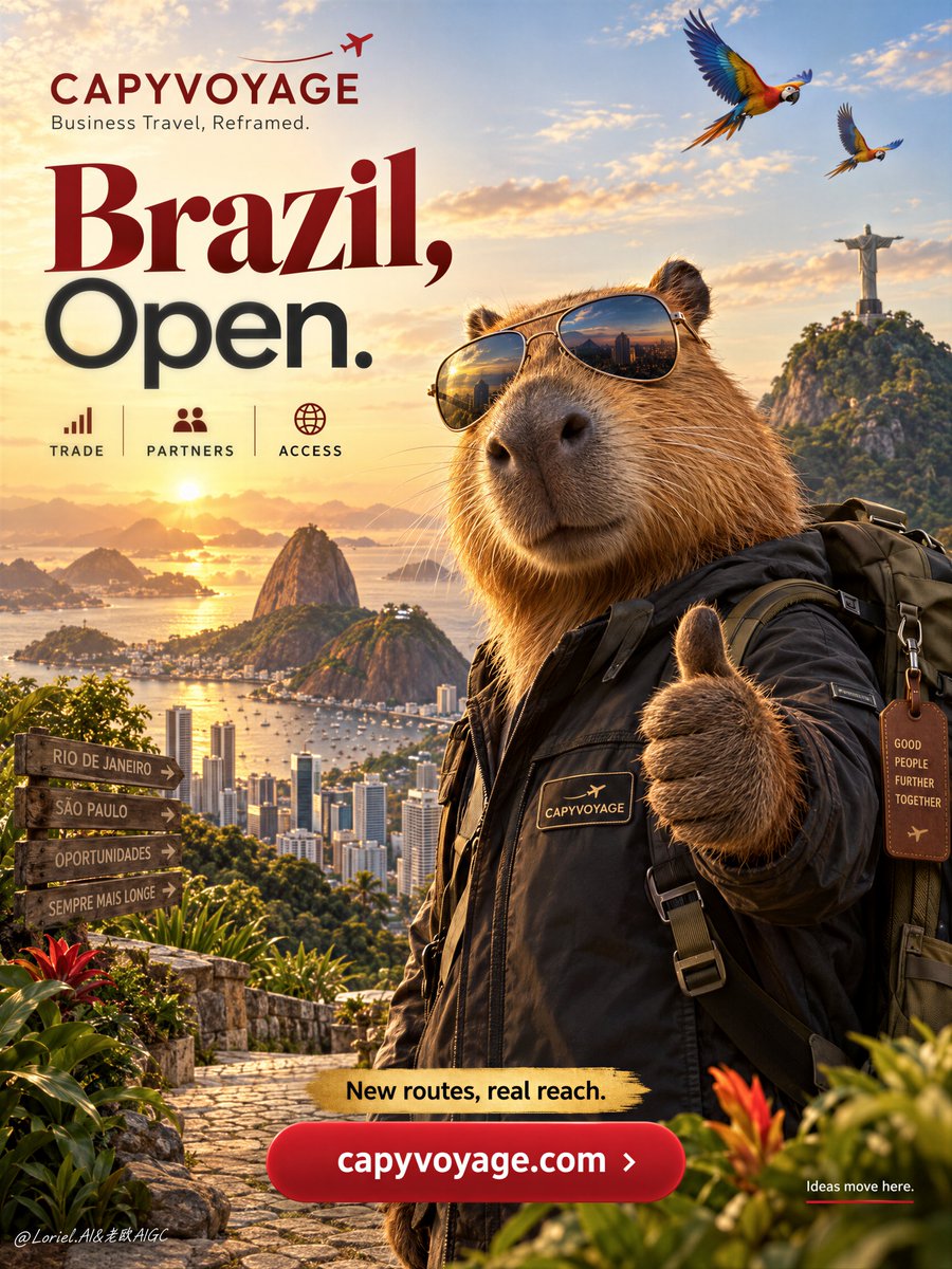
你首先注意到的是水豚,但这张海报之所以有效,是因为其他每一个元素都被分配了明确的"领地"。
分享链接 · https://openimages.ajiang.me/p/2105221406929953154/
color_palette · warm-tonescomposition · rule-of-thirdshuman_attributes · sunglasseslighting · golden-hourquality_flags · embedded-textquality_flags · typography-heavy
提示词(原文,逐字保留)
You notice the capybara first, but the poster works because every other element is assigned a clear territory.
🪽 hero character locked to the right foreground; headline reserved for the left half; landmarks compressed into the distant lower landscape
This prevents the destination story from competing with the ambassador. The eye reads character, message, then place—in that order.
🌿 large rounded CTA isolated at bottom center, with a clean visual buffer above it and no detailed foreground crossing its edges
A CTA needs its own quiet zone. It stays instantly readable even when the landscape is rich and cinematic.
GPT- image 2.5 prompt👇
A premium vertical travel poster for fictional business-travel brand CAPYVOYAGE, promoting Brazil through a bold destination campaign led by a charismatic Brazilian capybara ambassador. Preserve the exact commercial layout: small brand block with minimal airplane trail in the upper left, one large concise headline dominating the left half, dramatic Brazil skyline in back, a large capybara in the right foreground as the main anchor, layered Brazil landmarks in the lower landscape, and one strong bottom CTA button.
Use a medium-wide promotional composition with strong hierarchy, deep foreground-background separation, and generous negative space. The hero capybara is photoreal, polished, and non-cartoonish, wearing aviator sunglasses, a dark travel jacket with a small CAPYVOYAGE patch, and a travel backpack, giving a confident thumbs-up to the viewer. It must feel warm, intelligent, trustworthy, and aspirational, with realistic dense fur, subtle whiskers, glossy nose, believable paws, and correct anatomy. The character dominates the right side.
Celebrate Brazil in the background: golden sunrise or sunset over Rio de Janeiro, Christ the Redeemer in the distance, Sugarloaf Mountain, a refined modern skyline with Sao Paulo energy, and one or two macaws or toucans crossing the upper sky as discreet accents. In the lower landscape, integrate warm tropical foliage, stone pathways, and lush Brazilian terrain. The world should feel expansive, prosperous, emotionally magnetic, and clean enough for poster design.
Typography is reduced, sharp, and international. Upper-left brand line: “CAPYVOYAGE” with one short support line such as “Business Travel, Reframed.” Main headline on the left: “Brazil, Open.” with “Brazil” larger and more expressive, “Open.” clean and modern. Remove long copy blocks. Keep only three small icon labels beneath: “TRADE”, “PARTNERS”, “ACCESS”. Add one concise golden promo strip above the CTA, such as “New routes, real reach”. Place a large rounded red CTA button at the bottom center reading “https://t.co/1uCqv448u7”. If needed, add one very small lower-right side line: “Ideas move here.” All text must be elegant, globally legible, minimal, integrated into the visual flow, and never cover the capybara face or key landmarks.
Lighting is cinematic and commercial: warm golden key light from the horizon, soft frontal fill on the capybara face and jacket, reflective highlights on the sunglasses, subtle rim light on fur edges, glowing skyline atmosphere, and rich contrast without muddy blacks. Color hierarchy: 60% golden sunrise and warm tropical neutrals, 30% deep reds and terracotta brand accents, 10% cool reflective blues in skyline glass and sunglass reflections. Materials must feel hyperreal and premium: glossy lenses, textured travel fabric, dense fur, humid glowing atmosphere, crisp architectural silhouettes, polished button surfaces, and clean brand graphics.
The final image should feel like a Cannes-level global destination campaign: bold, optimistic, premium, persuasive, internationally styled, visually clean, and commercially precise, presenting Brazil as both emotional adventure and strategic opportunity. No copied source wording, no real company names, no broken text, no malformed animal anatomy, no distorted sunglasses, no chaotic landmarks, no muddy skyline, no cluttered layout, no weak CTA, no generic stock-travel look.
中文译文
你首先注意到的是水豚,但这张海报之所以有效,是因为其他每一个元素都被分配了明确的"领地"。
🪽 主角锁定在右侧前景;标题保留给左半部分;地标压缩到远处较低处的风景中
这能避免目的地的故事与"大使"争夺视觉焦点。眼睛的阅读顺序是:角色 → 信息 → 地点,依次进行。
🌿 大号圆角 CTA 按钮独立位于底部中央,上方留出干净的视觉缓冲带,且前景没有细节元素穿过它的边缘
CTA 需要自己的一片安静区域。即使风景丰富而具有电影感,它也能始终保持一眼可读。
GPT- 图像 2.5 提示词👇
为虚构的商务旅行品牌 CAPYVOYAGE 制作一张高端竖版旅行海报,通过一场由一只富有魅力的巴西水豚形象大使领衔的大胆的目的地活动来推广巴西。严格保留以下商业布局:左上角为带极简飞机尾迹的小型品牌区块,左半部分由一条简洁的大型标题占据,背景为富有戏剧感的巴西天际线,右侧前景是一只作为主视觉锚点的大型水豚,较低处的风景中叠层排列巴西地标,以及底部一个醒目的 CTA 按钮。
采用中宽幅促销构图,层次分明,前景与背景深度分离,并留出充足的负空间。主角水豚风格为写实、精致、非卡通化,戴着飞行员墨镜,穿一件带小号 CAPYVOYAGE 徽章的深色旅行夹克,背着旅行背包,自信地向观众竖起大拇指。它必须传达温暖、聪慧、可信赖、有追求感的特质,毛发浓密逼真、须毛细腻、鼻头有光泽、爪子真实可信、解剖结构正确。角色占据画面右侧的支配地位。
在背景中礼赞巴西:里约热内卢上空的日出或日落金光、远处的基督像、甜面包山、带有圣保罗气息的精致现代天际线,以及一两只金刚鹦鹉或巨嘴鸟以低调点缀的姿态掠过上空。在较低处的风景中,融入温暖的热带植物、石径小道和郁郁葱葱的巴西地貌。整个世界应给人以广阔、繁荣、情感上引人入胜的感觉,同时又足够干净以适合海报设计。
字体精简、锐利且具国际感。左上角的品牌行:"CAPYVOYAGE",配一行简短辅助文字,例如 "Business Travel, Reframed."。左侧主标题:"Brazil, Open.",其中 "Brazil" 更大、更具表现力,"Open." 干净现代。删除大段文案。标题下方仅保留三个小号图标标签:"TRADE"、"PARTNERS"、"ACCESS"。在 CTA 上方增加一条简洁的金色促销条,例如 "New routes, real reach"。在底部中央放置一个大型圆角红色 CTA 按钮,按钮上写有 "https://t.co/1uCqv448u7"。如有必要,在右下角增加一行极小的侧边文字:"Ideas move here."。所有文字必须优雅、全球可读、极简,与视觉流融为一体,且绝不遮挡水豚的面部或关键地标。
光线采用电影级商业风格:来自地平线的温暖金色主光,柔和的正面补光照亮水豚面部与夹克,墨镜上的反射高光,毛发边缘的微妙轮廓光,发光的天际线氛围,富有层次且不死黑。色彩比例:60% 金色日出与暖色调热带中性色,30% 深红与赤陶品牌点缀色,10% 天际线玻璃与墨镜反射中的冷调反光蓝。材质必须呈现超现实高端感:光泽镜片、纹理旅行面料、浓密毛发、潮湿发光的空气、清脆的建筑剪影、抛光的按钮表面、干净的品牌图形。
最终图像应呈现戛纳级别的全球目的地活动水准:大胆、乐观、高端、有说服力、国际化的视觉风格,画面干净,商业精准,把巴西同时呈现为情感上的冒险与战略性的机遇。不得出现抄袭的原文措辞、真实的品牌名称、断裂的文字、畸形的动物解剖结构、扭曲的墨镜、杂乱的地标、灰暗的天际线、拥挤的版式、弱化的 CTA,或千篇一律的图库式旅行风。
来源与署名
原文由 @ou_zhen599 发布在 X:查看原推文。 本页逐字保留原文并提供机器翻译的中文解读;版权归原作者所有。
同工具的更多提示词
- 一张低角度、特写的照片,捕捉到一位年轻女性在黄昏时分户外的场景。她有着波浪状的棕色头发。她穿着一件灰色短款T恤,上面有蓝白相间的图案文字,写着'DESTINE…@chatgptpaglu
- 为 [国家 / 城市 / 地点 / 主题] 创作一幅高级的 4:5 纵向概念旅游艺术海报。 仅文生图(TEXT-TO-IMAGE ONLY)—— 仅根据 [国…@Goodmanprotocol
- 为 [COUNTRY / LOCATION / SUBJECT](国家 / 地点 / 主题)创作一幅高级感 4:5 竖版贵族米色秋季编辑风格艺术作品。 仅文本…@Goodmanprotocol
- 生活方式场景之所以显得高端,是因为它无需与产品争夺视线——两者被对角线分隔开来。 🧊 一条清晰的图形对角分割线,将上半部分旅行生活方式场景与下方超大产品区隔开…@ou_zhen599
- 国庆黄金周 × 【地点】 × 😆😂😱😵💫🥵😩😎🤩😴🤪🥳😤🤔😭😮💨 × 超高密度立体 Emoji 式人脸人海 × iPhone抓拍 说明: 国庆黄金周真实现…@DeepBlueX0
- 一个解压类广告不应消除混乱,而应让产品在混乱中成为唯一的平静所在。 🧊 极前景产品保持锐利对焦,伸手的人与办公室杂物退入其后的柔和景深 在观众阅读任何文案之前…@ou_zhen599