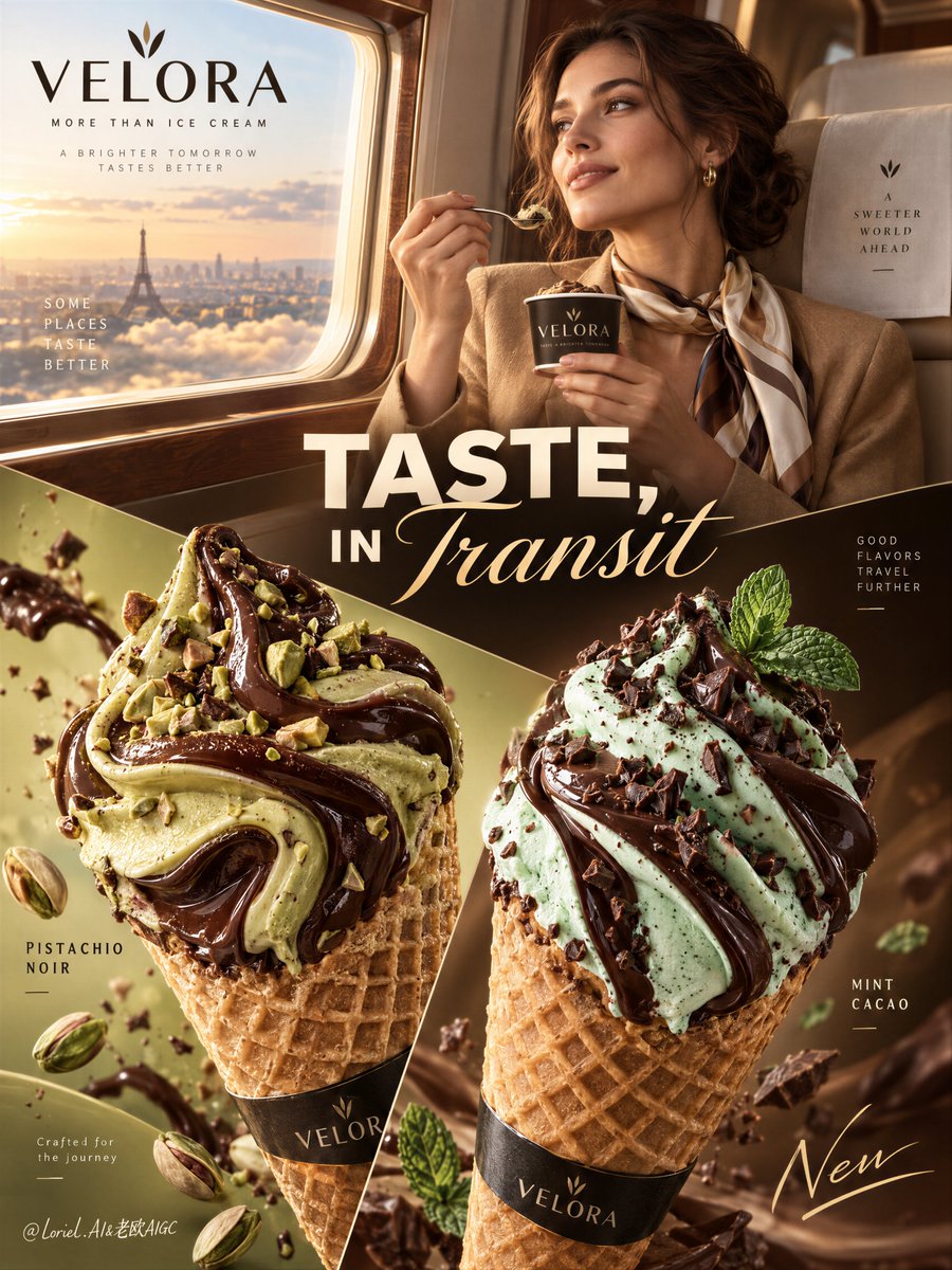
生活方式场景之所以显得高端,是因为它无需与产品争夺视线——两者被对角线分隔开来。
分享链接 · https://openimages.ajiang.me/p/2105232216330781153/
color_palette · warm-tonescomposition · dynamic-diagonalmood · luxuriousquality_flags · embedded-textquality_flags · typography-heavysubject_type · food-drink
提示词(原文,逐字保留)
The lifestyle scene feels premium because it never has to fight the product—it is separated by the diagonal.
🧊 a crisp diagonal graphic divide separating the upper travel-lifestyle scene from the oversized lower product zone
This gives the woman a clear role: she creates aspiration above, while the cones own the purchase decision below.
🍫 two oversized cones crossing the lower field with independent flavor color worlds, each framed by a minimal label placed outside the cream silhouette
The flavors stay readable at a glance. You see distinct products, not one crowded dessert pile.
GPT- image 2.5 prompt👇
A premium international ice cream campaign poster for fictional dessert brand VELORA, built with the exact logic of a high-end global FMCG lifestyle ad. Preserve the full structure: an upper lifestyle zone with an elegant adult woman seated beside a first-class travel window, enjoying the product from a branded mini cup; a large central headline across the middle; and a lower product zone dominated by two oversized waffle cones as the absolute visual focus. Keep the diagonal graphic split, dual-flavor presentation, and editorial-commercial balance, while making the image feel more global, polished, and internationally styled.
Use a vertical composition with strong hierarchy, refined negative space, medium-close lifestyle framing in the upper half, and bold hero product scale below. In the upper right quadrant, the woman sits against a soft cream premium seat near a smooth wood-and-metal window frame, wearing a camel-toned luxury travel look with a fluid neck scarf, lightly smiling while holding a spoon and branded cup. She is adult, photoreal, naturally proportioned, anatomically correct, with realistic skin texture, subtle pores, soft lips, natural hair density, elegant hands, five normal fingers, and a calm cosmopolitan expression. She serves only as a mood anchor and never overtakes the product.
The lower half is dominated by two sculptural ice cream cones for a global launch campaign. Left cone: pistachio and dark chocolate swirl, dense and glossy, with pistachio-green ribbons folding into deep chocolate glaze, subtle pistachio fragments, and one split pistachio near the base. Right cone: mint and dark chocolate swirl, silky mint cream intertwined with glossy chocolate ribbons, topped with restrained cacao crumble and a refined mint leaf accent. Both cones must feel hyperreal, cold, creamy, thick, and luxurious, with believable soft-serve folds, glossy syrup behavior, subtle frost, crisp waffle texture, and immaculate dessert styling. They occupy most of the lower field and remain the clear product leaders.
Create an original English-only premium brand system. Place a refined VELORA logo in the upper left. Reimagine the central headline as “TASTE, IN TRANSIT” or “THE FLAVOR MOVES” using bold modern sans serif with one contrasting elegant italic script layer. Keep wording concise, legible, and visually clean. Add minimal flavor labels near each cone: “PISTACHIO NOIR” and “MINT CACAO”. Include one very small premium origin line in the lower left such as “Crafted for the journey”. Add one restrained handwritten-style accent word in the lower right, such as “New”, integrated as a graphic gesture. All text must feel editorial, elegant, globally styled, and never cover the product recognition zones.
Lighting is polished, global-beauty commercial, and tightly controlled. The upper lifestyle zone receives soft golden travel-window light with clean facial modeling, luminous highlights on the cup, and subtle seat texture. The lower product zone uses sculptural beauty lighting: soft frontal key, delicate side fill, refined gloss on chocolate ribbons, crisp highlights on cream folds, and clear volume without muddy shadows. Color hierarchy: 50% warm caramel, cream, and champagne tones, 30% pistachio and mint accents, 20% dark chocolate and gold-brown waffle tones. Materials must feel precise and tactile: smooth cream, dense syrup, crisp cone lattice, soft premium upholstery, polished wood trim, and subtle print-finish sophistication.
The final result should feel like a Cannes-level global dessert campaign: international, aspirational, product-first, graphically sophisticated, emotionally inviting, and highly sellable. No copied branding, no copied headline wording, no broken anatomy, no malformed hands, no extra fingers, no warped cones, no muddy cream texture, no chaotic layout, no unreadable text, no cheap regional ad feel, no clutter weakening the premium global identity.
中文译文
生活方式场景之所以显得高端,是因为它无需与产品争夺视线——两者被对角线分隔开来。
🧊 一条清晰的图形对角分割线,将上半部分旅行生活方式场景与下方超大产品区隔开
这赋予女性明确角色:她在上方营造向往感,而甜筒则在下方主导购买决策。
🍫 两个超大甜筒横跨下方画面,拥有各自独立的配色风味世界,每个都由极简标签框定,放置在奶油轮廓之外
风味一眼可辨。你看到的是独立的产品,而不是堆在一起的甜品。
GPT- image 2.5 prompt👇
一张高端国际冰淇淋广告海报,为虚构甜品品牌 VELORA 打造,遵循高端全球快消生活方式广告的精确逻辑。保留完整结构:上方生活方式区中,一位优雅的成年女性坐在头等舱旅行窗边,从品牌迷你杯中享用产品;中部横贯一条大型中央标题;下方产品区由两个超大华夫甜筒主导,构成绝对的视觉焦点。保持对角图形分割、双重风味呈现以及编辑与商业之间的平衡,同时让画面更具全球化、精致感和国际风格。
采用竖构图,具有强烈的层级感、精炼的留白,上半部分采用中近景生活方式取景,下方采用大胆的主产品尺度。在右上象限,女性背靠柔软的米色高端座椅,旁边是光滑的木质与金属窗框,身穿驼色奢华旅行装,佩戴飘逸的颈部丝巾,微笑浅淡,手持勺子和品牌杯。她是成年人,写实,自然比例,解剖正确,具备真实的皮肤纹理、细腻毛孔、柔软双唇、自然发量、优雅双手、五根正常手指,神情冷静而国际化。她仅作为情绪锚点,绝不抢产品风头。
下半部分由两个雕塑般的冰淇淋甜筒主导,用于全球发布活动。左侧甜筒:开心果与黑巧克力旋绕,浓稠有光泽,开心果绿色丝带折叠融入深巧克力釉面,点缀细腻开心果碎,底部附近一颗裂开的开心果。右侧甜筒:薄荷与黑巧克力旋绕,丝滑薄荷奶油与光泽巧克力丝带交织,顶部点缀内敛的可可碎和精致的薄荷叶装饰。两个甜筒都必须呈现超写实、冷感、奶油般、厚实、奢华的质感,具备可信的软冰淇淋折叠、光泽糖浆表现、细微霜感、酥脆华夫纹理以及无可挑剔的甜品造型。它们占据下方画面的大部分区域,并保持明确的产品主导地位。
创建一套仅使用英文的原创高端品牌系统。在左上角放置精致的 VELORA 标志。将中央标题重新演绎为 "TASTE, IN TRANSIT" 或 "THE FLAVOR MOVES",使用粗体现代无衬线字体搭配一层对比鲜明的优雅斜体手写体。措辞保持简洁、可读、视觉干净。在每个甜筒旁添加极简风味标签:"PISTACHIO NOIR" 和 "MINT CACAO"。在左下角添加一行非常小巧的产地信息,如 "Crafted for the journey"。在右下角添加一个克制的、手写风格的点缀词,例如 "New",作为图形手法融入。所有文字必须呈现编辑感、优雅、国际风格,绝不遮挡产品识别区域。
光线经过精心打磨,呈现全球化美妆商业广告质感,控制严密。上方生活方式区接收柔和的金色旅行窗光,面部造型清晰,杯身带有明亮高光,座椅纹理细腻。下方产品区使用雕塑般的美妆布光:柔和正面主光、精细侧面补光、巧克力丝带上精致光泽、奶油折叠上的清晰高光、清晰体积感而不出现浑浊阴影。色彩层级:50% 暖焦糖、奶油与香槟色调,30% 开心果与薄荷点缀色,20% 深巧克力与金棕华夫色调。材质必须精准而具触感:顺滑奶油、浓稠糖浆、酥脆甜筒网格、柔软高端内饰、光滑木质饰边,以及细微的印刷工艺精致感。
最终成品应呈现戛纳级别的全球甜品广告质感:国际化、令人向往、产品优先、图形精致、情感动人、高度畅销。无抄袭品牌、无抄袭标题措辞、无崩坏解剖结构、无畸形双手、无多余手指、无扭曲甜筒、无浑浊奶油质感、无混乱布局、无难以辨认的文字、无廉价地域广告感、无任何削弱高端全球身份的杂乱元素。
来源与署名
原文由 @ou_zhen599 发布在 X:查看原推文。 本页逐字保留原文并提供机器翻译的中文解读;版权归原作者所有。
同工具的更多提示词
- 为 [国家 / 城市 / 地点 / 主题] 创作一幅高级的 4:5 纵向概念旅游艺术海报。 仅文生图(TEXT-TO-IMAGE ONLY)—— 仅根据 [国…@Goodmanprotocol
- 一个解压类广告不应消除混乱,而应让产品在混乱中成为唯一的平静所在。 🧊 极前景产品保持锐利对焦,伸手的人与办公室杂物退入其后的柔和景深 在观众阅读任何文案之前…@ou_zhen599
- 你首先注意到的是水豚,但这张海报之所以有效,是因为其他每一个元素都被分配了明确的"领地"。 🪽 主角锁定在右侧前景;标题保留给左半部分;地标压缩到远处较低处的…@ou_zhen599
- 当产品被允许突破信息流的框架时,一种社交风格的宣传活动就会感觉像一个品牌世界。 🌸 一个超大尺寸的瓶子居中放置在共享轴线上,叠压两张堆叠的卡片,并延伸到它们各…@ou_zhen599
- 一张低角度、特写的照片,捕捉到一位年轻女性在黄昏时分户外的场景。她有着波浪状的棕色头发。她穿着一件灰色短款T恤,上面有蓝白相间的图案文字,写着'DESTINE…@chatgptpaglu
- GPT Image 2.5 on ChatGPT 提示词; 抓拍电影感人像:一位女士坐在咖啡馆桌旁,带着温暖、俏皮、心照不宣的笑容,透过前景中两个虚化人物之间…@mehvishs25