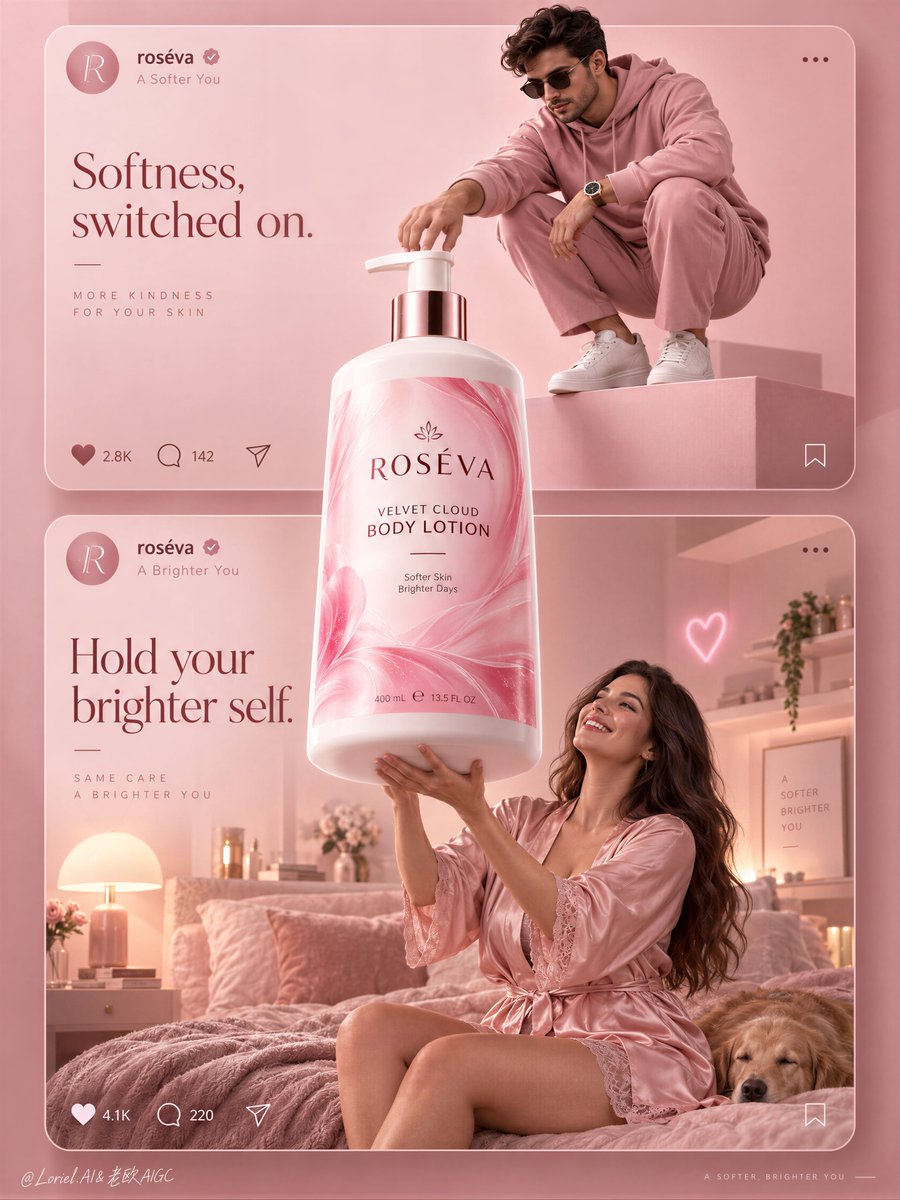
当产品被允许突破信息流的框架时,一种社交风格的宣传活动就会感觉像一个品牌世界。
分享链接 · https://openimages.ajiang.me/p/2105266331432141031/
color_palette · pastelcomposition · multi-panelhuman_attributes · long-hairhuman_attributes · sunglasseslighting · high-keymood · elegant
提示词(原文,逐字保留)
A social-style campaign feels like a brand world when the product is allowed to break the feed.
🌸 one oversized bottle centered on the shared axis, overlapping both stacked cards and extending beyond their internal scene boundaries
The bottle becomes the bridge between two moods instead of a product pasted into two separate posts.
✨ keep interface bars and interaction icons thin, low-contrast, and pinned to the card edges—not the product center
The UI reads as structure, not decoration. Your eye stays on the label, while the cards still feel instantly social-native.
GPT- image 2.5 prompt👇
A premium social-first beauty campaign poster for fictional body-care brand ROSÉVA, merging emotional lifestyle softness, material precision, and curated minimalism into one image. Preserve the exact structure: two large stacked social-media-style cards inside a monochrome blush-pink world, one oversized hero pump bottle breaking through the center and overlapping both cards, simplified interface bars at the top of each card, and minimal interaction icons below. The product is the absolute visual leader and bridges the two scenes.
Top card: a stylish adult man in a monochrome rose-pink fashion look crouches on a clean pink pedestal in a minimal editorial studio, reaching toward the giant bottle as if switching it on or claiming it. He wears a refined pink hoodie, tailored pink trousers, clean white sneakers, dark sunglasses, and a polished modern watch. His pose is sculptural, compact, controlled, and fashion-led, with strong negative space. Bottom card: an adult woman in a silky blush-pink robe or pajama set lifts both arms toward the giant bottle in a dreamy bedroom scene, smiling with real delight. She is photoreal, adult, naturally proportioned, anatomically correct, with realistic skin texture, subtle pores, natural tonal variation, elegant hands, five normal fingers, long healthy hair, mature body softness, believable gravity, natural lower-body volume, and no plastic AI skin. The bedroom is softly styled with a blush bed, warm bedside lamp, restrained shelf objects, one tiny neon heart accent, and minimal feminine decor without clutter.
The hero product dominates the center axis: one oversized premium body-lotion pump bottle floating or standing between the cards, visibly larger than life and brighter than everything else. Redesign it fully in English with an original premium system: brand name “ROSÉVA”, product name “VELVET CLOUD BODY LOTION”, one short support line only, clean elegant hierarchy, and no excess claims. The bottle must feel hyperreal and luxurious: soft-touch white plastic body, satin sheen, crisp shoulder geometry, polished pump, luminous pink label with fluid marbling or petal-like gradient movement, sharp fine print, subtle reflected highlights, and strong volumetric presence. The label is vivid but controlled, acting as the most saturated element in the composition.
Use a vertical campaign composition with clear rule-of-thirds balance, refined top-middle-bottom rhythm, and enough negative space to breathe. The social-post UI should be premium and reduced: circular profile icon, English handle, tiny verification mark, minimal like/comment/share icons, and one or two very short caption lines treated as graphic architecture rather than app clutter. Reimagine the copy in an international tone: top card line such as “Softness, switched on.” and bottom card line such as “Hold your brighter self.” Keep all text minimal, elegant, globally legible, and integrated into the pink system.
Lighting is soft, layered, and beauty-commercial: clean high-key pink studio light in the top card, warm blush ambient practical light in the bottom bedroom card, and a brighter hero light on the central bottle so it reads as the campaign core. Add soft contour light on the bottle edges, subtle glow on the label, gentle fabric sheen on the satin robe, and readable depth without muddy shadows. Color hierarchy: 70% blush pink, rose, powder, and cream tones, 20% soft white and skin highlights, 10% hot-pink label energy and tiny neon accents. Materials must feel exact and tactile: satin fabric, matte pedestal paint, soft-touch bottle plastic, polished pump, velvet bedding, glassy neon, clean interface graphics, and subtle premium print finish.
The final result should feel like Orbit, Transit, and Port fused together: emotionally inviting, materially precise, socially fluent, and elevated into a campaign-board beauty image rather than a literal feed screenshot. Hyperreal, international, graphically unified, soft yet sharp, minimal yet persuasive. No copied branding, no broken typography, no malformed hands, no extra fingers, no distorted anatomy, no warped bottle, no cluttered UI, no muddy pinks, no chaotic props, no cheap influencer aesthetic.
中文译文
当产品被允许突破信息流的框架时,一种社交风格的宣传活动就会感觉像一个品牌世界。
🌸 一个超大尺寸的瓶子居中放置在共享轴线上,叠压两张堆叠的卡片,并延伸到它们各自的内部场景边界之外
瓶子成为两种情绪之间的桥梁,而不是被粘贴到两条独立帖子里的一款产品。
✨ 界面栏和互动图标保持纤细、低对比度,并固定在卡片边缘——而不是产品中心
界面被阅读为结构,而不是装饰。视线停留在标签上,同时卡片依然立刻具有原生社交感。
GPT- 图像 2.5 提示词👇
一个高端的社交优先美妆宣传海报,为虚构的身体护理品牌 ROSÉVA 设计,将情感化的生活方式柔和感、材质精度与策展式极简主义融合在同一张图中。保留确切的结构:在单色裸粉色世界中,两张大型堆叠的社交媒体风格卡片,一个超大尺寸的主角按压瓶从中心破出并叠压两张卡片,每张卡片顶部有简化的界面栏,底部有极简的互动图标。产品是绝对的视觉主角,并连接两个场景。
上方卡片:一位时尚的成年男性身着单色玫瑰粉色时装造型,在极简编辑工作室中一个干净的粉色基座上蹲下,朝巨型瓶子伸手,仿佛在开启它或宣告占有。他身穿精致的粉色连帽衫、剪裁讲究的粉色长裤、干净的白色运动鞋、深色墨镜,以及一只抛光现代手表。他的姿态雕塑感强、紧凑、受控且以时尚为主导,留白强烈。下方卡片:一位成年女性身穿丝质裸粉色睡袍或睡衣套装,在梦幻卧室场景中向巨型瓶子举起双臂,带着真实的喜悦微笑。她是照片级真实的、成年、自然比例、解剖学正确,具有真实的皮肤纹理、细微的毛孔、自然的色调变化、优雅的手、五根正常手指、浓密健康的长发、成熟的身体柔和度、可信的引力、自然的下半身体积,没有塑料感的 AI 皮肤。卧室以柔和风格布置:一张裸粉色床、一盏温暖的床头灯、克制的架上物件、一处微小的霓虹心形点缀,以及无杂乱的极简女性化装饰。
主角产品占据中心轴:一个超大尺寸的高端身体乳按压瓶悬浮或矗立在卡片之间,视觉上明显大于生活且比一切更亮。在英文中完全重新设计一个原创的高端体系:品牌名 “ROSÉVA”,产品名 “VELVET CLOUD BODY LOTION”,仅一行简短辅助文案,干净优雅的层级,无多余宣称。瓶子必须感觉超真实且奢华:柔软触感的白色塑料瓶身、缎面光泽、利落的肩部几何、抛光按压头、带流体大理石纹或花瓣状渐变律动的发光粉色标签、清晰的小号字体、细微的反光高光,以及强烈的体积存在感。标签鲜明但克制,是整幅构图中最饱和的元素。
使用竖版宣传构图,清晰的三分法平衡,精炼的上中下节奏,并留出足够的负空间呼吸。社交帖文界面应高端而精简:圆形头像图标、英文用户名、极小的认证标记、极简的点赞/评论/分享图标,以及一两行极短的文案,作为图形结构而非应用界面杂讯来对待。以国际化的语气重新构想文案:上方卡片文案例如 “Softness, switched on.”,下方卡片文案例如 “Hold your brighter self.”。所有文字保持极简、优雅、全球可读,并融入粉色体系。
光线柔和、有层次,且具有美妆商业感:上方卡片采用干净的粉调高调工作室光,下方卧室卡片采用温暖的裸粉环境实用光,中央瓶子采用更亮的主角光,使其成为宣传核心。在瓶子边缘添加柔和轮廓光,标签上添加微妙辉光,缎面睡袍呈现轻柔面料光泽,并在无浑浊阴影的前提下保持可读深度。色彩层级:70% 裸粉、玫瑰、粉雾与奶油色调,20% 柔白与肤色高光,10% 热粉色标签能量与微小霓虹点缀。材质必须感觉精确且有触感:缎面面料、哑光基座漆面、柔软触感的瓶身塑料、抛光按压头、天鹅绒床品、玻璃质感霓虹、干净的界面图形,以及微妙的高级印刷质感。
最终成品应感觉像 Orbit、Transit 与 Port 三者融合:情感上引人、材质上精确、社交上流畅,并升格为宣传板级的美妆图像,而非直白的信息流截图。超真实、国际化、图形统一、柔中带锐、极简却具说服力。无抄袭品牌、无破损字体、无畸形手部、无多余手指、无扭曲解剖、无变形瓶身、无杂乱界面、无浑浊粉调、无混乱道具、无廉价网红感。
来源与署名
原文由 @ou_zhen599 发布在 X:查看原推文。 本页逐字保留原文并提供机器翻译的中文解读;版权归原作者所有。
同工具的更多提示词
- 一个解压类广告不应消除混乱,而应让产品在混乱中成为唯一的平静所在。 🧊 极前景产品保持锐利对焦,伸手的人与办公室杂物退入其后的柔和景深 在观众阅读任何文案之前…@ou_zhen599
- GPT Image 2.5 on ChatGPT 提示词; 抓拍电影感人像:一位女士坐在咖啡馆桌旁,带着温暖、俏皮、心照不宣的笑容,透过前景中两个虚化人物之间…@mehvishs25
- 生活方式场景之所以显得高端,是因为它无需与产品争夺视线——两者被对角线分隔开来。 🧊 一条清晰的图形对角分割线,将上半部分旅行生活方式场景与下方超大产品区隔开…@ou_zhen599
- 创作一张写实风格的奢华时尚人像肖像:一位美丽的年轻女子回头凝视。需严格保留参考面部中的精确五官特征:柔嫩白皙的肌肤、灵动的大眼睛呈灰绿色、纤长睫毛、轮廓分明的…@TaliaAariz
- 为 [国家 / 城市 / 地点 / 主题] 创作一幅高级的 4:5 纵向概念旅游艺术海报。 仅文生图(TEXT-TO-IMAGE ONLY)—— 仅根据 [国…@Goodmanprotocol
- 【主体】 × 【风格】 × 【构图】 × 【媒介 】 主体:画谁,决定画面的核心对象。 风格:用什么视觉方式表现,决定整体视觉语言。 构图:怎么组织画面,决定…@DeepBlueX0