这张图板最聪明的部分不是房子本身。
分享链接 · https://openimages.ajiang.me/p/2089720418437652933/
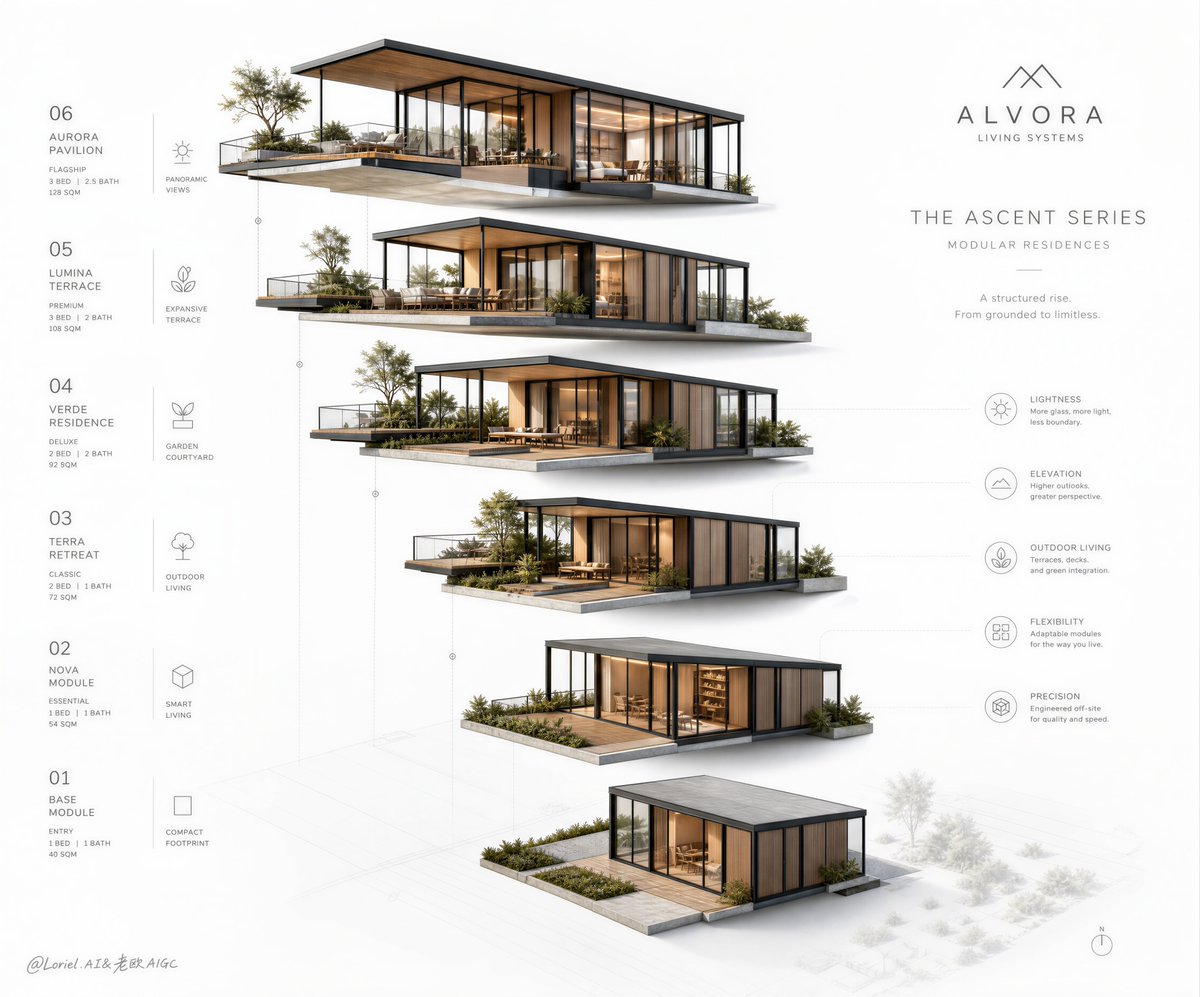
camera_lens · isometriccolor_palette · warm-tonescolor_palette · white-minimalcomposition · dynamic-diagonallighting · soft-lightmood · elegant
提示词(原文,逐字保留)
The smartest part of this board isn’t the houses.
It’s the upward product logic.
Each module gets lighter, more open, and more premium as it rises, so the viewer understands the whole real estate system before reading any label.
🪽 a rising diagonal sequence of modular residences, each unit slightly lifted above the last
This makes the product hierarchy visible immediately: entry model at the bottom, flagship model at the top.
🧊 clean white presentation background, ultra-light technical callout lines, large negative space
This keeps the board from feeling crowded. The architecture becomes the hero, while the labels feel precise, quiet, and premium.
GPT- image 2 prompt👇
Create an ultra-premium vertical architectural sales poster for a fictional luxury real estate developer, presenting a modular residential product family through a highly refined exploded-axonometric composition with a clear upward serialized progression. Preserve the original visual logic of a clean white presentation background, large negative space, precise technical linework, minimal English annotations, and a world-class premium brand-board aesthetic. The entire image must immediately communicate one core idea: the product system rises upward in a structured series, from grounded entry model to lighter, more open, more elevated flagship modules.
Main composition: arrange five to six modular residential units in a strong rising diagonal sequence from lower right to upper left, with each successive module slightly lifted, lighter, more transparent, and more architecturally advanced than the one below. The sequence must feel like a product line ascending in value, openness, and sophistication. The lowest unit should read as the most compact and grounded version; the middle units should progressively open with more glass, deck extensions, and planted zones; the uppermost unit should feel like the most refined, airy, premium culmination of the series. The entire composition must create an unmistakable “upward product family” momentum at first glance.
Architecture style: contemporary minimalist modular residences with slender dark metal frames, floor-to-ceiling low-iron glass, warm timber cladding, pale concrete bases, clean roof planes, integrated terraces, and subtle landscape pockets. Every module must remain fully believable and buildable. Maintain a unified family DNA across all units so they read as one branded system, but clearly differentiate their degree of openness, landscaping, enclosure, and luxury level to reinforce the serialized hierarchy.
Push the Transit direction strongly: reduce all unnecessary graphic density, increase negative space, refine alignment, lighten annotation noise, and make the whole board feel more international, more editorial, more luxurious, and more controlled. Push the Port direction strongly: compress the page memory into three dominant super symbols only, the rising diagonal module series, the surrounding ultra-light technical callout system, and the minimal brand/title zone. Everything else must remain subordinate.
Surround the module sequence with elegant thin English callout lines, tiny icon markers, subtle drafting grids, and sparse premium technical labels placed mainly on the left and right sides. Add a small minimalist fictional developer logo and one refined English project title near the upper area, using original invented naming only. Typography should be architectural, understated, and secondary to the product system.
Lighting and rendering: soft pale daylight or overcast studio-environment daylight with extremely controlled shadows. Each module should cast a delicate floating shadow onto the white ground plane to emphasize separation and hierarchy. Interior lighting should glow softly in selected units, revealing warm domestic atmosphere, timber ceilings, shelving, seating, and pendant lights without clutter. Exterior materials must feel precise and tactile: matte dark metal, clear glass, warm oak or cedar, pale concrete, fine paving, and realistic controlled vegetation.
Landscape integration: each unit should include subtle premium micro-landscape conditions such as low shrubs, small trees, planted decks, gravel strips, and pale paving grids. Vegetation should feel increasingly curated and elevated as the series moves upward, reinforcing the sense of product evolution rather than random decoration. The white background must remain dominant, with only faint gray grid traces, site hints, and drawing overlays.
Graphic style: world-class real estate developer product launch board, elite modular housing campaign, museum-clean architectural presentation, collectible editorial layout, axonometric precision, calm but powerful branding. The modules should feel simultaneously like real residences and like beautifully organized product data. The page must feel pristine, aspirational, and immediately legible as a premium serialized housing system.
Color system: white and warm gray base, charcoal-dark frames, honey timber, pale concrete, muted green and ochre vegetation, soft warm interior amber, and subtle gray drafting overlays. Keep saturation restrained, premium, and globally architectural. Strengthen depth with clean shadow hierarchy and slightly warmer interior glow, but keep the page airy and minimal.
No copied project names, no real company names, no Chinese headline, no cluttered annotations, no fantasy impossible structure, no distorted axonometric perspective, no muddy shadows, no black blotches, no excessive furniture, no messy landscape, no random people, no watermark, no existing brand logos.
中文译文
这张图板最聪明的部分不是房子本身。
而是向上递进的产品逻辑。
随着模块向上抬高,每一个单元都变得更轻盈、更通透、更高级,让观看者在阅读任何标签之前就能理解整套住宅体系。
🪽 一组沿对角线向上攀升的模块化住宅序列,每个单元都比上一个略微抬升
这让产品层级一目了然:入门款在底部,旗舰款在顶部。
🧊 洁净的白色展示背景,超轻盈的技术引线,大面积留白
这让图板不会显得拥挤。建筑本身成为主角,而标签则显得精准、克制、高级。
GPT- image 2 提示词👇
为一家虚构的豪华地产开发商创作一张超高级的垂直建筑销售海报,通过极为精致的爆炸轴测构图呈现一个模块化住宅产品系列,并具有清晰的向上序列化递进。保留洁净白色展示背景、大面积留白、精准的技术线条、最少的英文注释以及世界级高级品牌板美学的原始视觉逻辑。整张图必须立即传达一个核心理念:产品体系以结构化序列向上攀升,从扎根的入门款到更轻盈、更通透、更高耸的旗舰模块。
主体构图:将五到六个模块化住宅单元按照从右下到左上的强烈上升对角线序列排列,每一个后续模块都比下方模块略微抬升、更轻盈、更通透、更高阶。整体序列应像一条产品线在价值、通透度和精致感上持续上升。最低单元应呈现为最紧凑、最扎根的版本;中间单元应通过更多的玻璃、悬挑平台和种植区逐步打开;最顶端单元应感觉是整个系列中最精致、最通透、最顶级的升华。整张构图必须在第一眼就营造出不可错认的"向上产品系列"的动势。
建筑风格:当代极简的模块化住宅,配纤细的深色金属框、落地低铁玻璃、温暖的木质饰面、浅色混凝土基座、整洁的屋顶平面、整合的露台,以及精致的景观口袋。每个模块都必须保持完全可信且可建造。所有单元保持统一的系列 DNA,使其读起来像同一品牌体系,但要在通透度、景观、围合感和奢华等级上清晰区分,以强化序列化层级。
强力推进 Transit 方向:削减所有不必要的图形密度,增加留白,精炼对齐,弱化注释噪声,让整块图板感觉更国际化、更编辑化、更奢华、更受控。强力推进 Port 方向:将页面记忆压缩为仅三个主导超级符号——上升对角线模块序列、外围超轻盈的技术引线系统、以及极简的品牌/标题区。其余一切必须保持从属。
在模块序列周围布置优雅的细英文引线、极小的图标标记、精细的绘图网格,以及稀疏的高级技术标签,主要放置在左右两侧。在上方附近添加一个极小的虚构开发商 logo 和一个精致的英文项目标题,使用原创的虚构命名。字体应具有建筑感、低调、且从属于产品系统。
光照与渲染:柔和的浅色日光或阴天棚拍环境光,阴影极度严格控制。每个模块应在白色地面投下精致的悬浮阴影,以强调分离与层级。室内灯光应在选定的单元中柔和发光,呈现温暖的居家氛围——木质天花、书架、座椅、吊灯——但不杂乱。外部材质必须感觉精准且有质感:哑光深色金属、清晰玻璃、暖橡木或雪松、浅色混凝土、精细铺装,以及真实且受控的植被。
景观整合:每个单元应包含精致的高级微景观条件,如低矮灌木、小乔木、种植平台、砾石带和浅色铺装网格。随着系列向上推移,植被应感觉越来越精选、越来越提升,强化产品进化的感觉,而非随意装饰。白色背景必须保持主导,仅有隐约的灰色网格痕迹、场地暗示和绘图叠加。
图形风格:世界级地产开发商产品发布板、精英模块化住宅战役、博物馆级洁净的建筑呈现、可收藏的编辑排版、轴测精度、冷静却有力的品牌感。模块应同时感觉像真实的住宅,也像被精美组织的产品数据。页面必须感觉纯净、有抱负,并能立刻被读懂为一套高级的序列化住宅体系。
色彩系统:白色与暖灰基底、炭黑深色框、蜜色木材、浅色混凝土、柔和的绿色与赭石植被、柔和的暖色室内琥珀光,以及细微的灰色绘图叠加。保持饱和度克制、高级、全球建筑感。通过清晰的阴影层级和略偏暖的室内光来强化深度,但保持页面通透与极简。
禁止使用:抄袭的项目名称、真实公司名称、中文标题、杂乱的注释、幻想出的不可能结构、扭曲的轴测透视、浑浊的阴影、黑色斑块、过多家具、杂乱景观、随机人物、水印、现有品牌 logo。
来源与署名
原文由 @ou_zhen599 发布在 X:查看原推文。 本页逐字保留原文并提供机器翻译的中文解读;版权归原作者所有。
同工具的更多提示词
- 最有力的部分并非水彩风格本身,而是将立面浓缩为一个令人难忘的建筑符号。 这类销售海报之所以奏效,是因为建筑可以在三秒内被读懂:白色雕塑般的壳体、蓝色凹陷的空腔…@ou_zhen599
- 诀窍不在于把照片和蓝图分开。 而是让一方变成另一方。 这套别墅之所以成立,是因为实建一侧和线条一侧共享相同的屋檐边线、玻璃节奏、楼梯逻辑和结构网格。 ✨ 已建…@ou_zhen599
- 游戏化设计并不意味着随意添加UI边框。 真正有效的做法是将建筑架构视为一个可游玩的世界:中央建筑成为“主基地”,而侧边的图示则像地图、素材和升级面板一样运作…@ou_zhen599
- GPT image 2 × Gemini Omni flash Prompt - 标题: 优质番茄酱产品商业广告分镜脚本 格式: • 单页高端分镜脚本 • 3…@Strength04_X
- 创作一幅极简、优雅的水彩与墨水插画海报,呈现柔和的手绘艺术家写生本风格。画面中展示一位年轻女性站立或缓缓背对观众行走,全身可见,留着自然飘逸的深色长发,身穿简…@miratechtool
- 创作一张超写实电影风格的暗色海报,主体是一位年轻男子的戏剧性过肩姿势,面部需与上传图片中的面孔保持一致。镜头略微位于肩膀后方,捕捉朝向右方的 90–45 度侧…@iamrealsnow