游戏化设计并不意味着随意添加UI边框。
分享链接 · https://openimages.ajiang.me/p/2089713078581801206/
color_palette · warm-tonescomposition · centeredlighting · soft-lightmood · elegantmood · luxuriousquality_flags · embedded-text
提示词(原文,逐字保留)
Game-style design does not mean adding random UI frames.
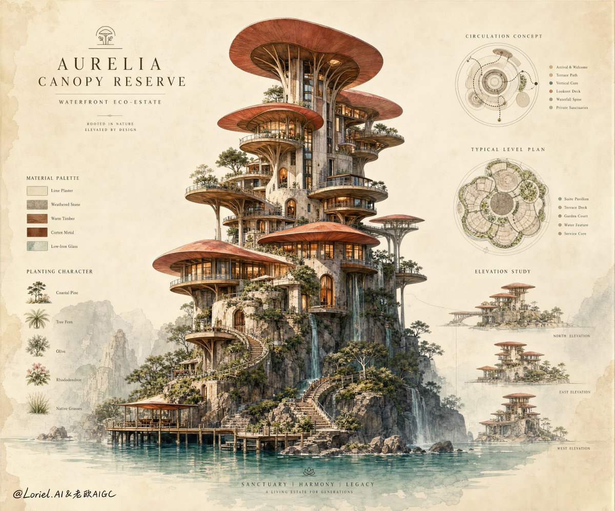
The useful move is to treat the architecture like a playable world: the central building becomes the “main base,” while the side diagrams behave like map, materials, and upgrade panels.
🎮 fantasy eco-estate presented like a premium game world hub, with the main tower as the central landmark
This makes the building feel explorable. You see the stacked terraces, bridges, stairs, water, and gardens as a world system, not just a real estate render.
🗺️ archive-style layout with material panels, circular plan maps, and elevation thumbnails as game-like information modules
This adds game flavor without cheapening the board. The diagrams feel like interface panels, but the paper texture and restrained typography keep it luxury and collectible.
GPT- image 2 prompt👇
Create an ultra-premium vertical architectural sales poster for a fictional luxury real estate developer, preserving the refined watercolor architectural-board effect while pushing the image toward a more international flagship presentation and a more distilled iconic symbol system. The composition must remain highly structured and collectible: one single central landmark eco-estate dominates the page, surrounded by only a restrained amount of elegant technical drawings, circular plan studies, small elevation modules, and minimal English architectural annotations on a warm aged ivory paper ground. The entire image must feel like a master architect’s watercolor presentation transformed into a world-class branded real-estate launch visual.
Design one unforgettable waterfront eco-estate rising from a rocky island base, composed of vertically stacked boutique hospitality and residential volumes connected by terraces, stairs, decks, bridges, and lookout platforms. The architectural identity is inspired by giant mushroom-canopy forms, but translated into credible, buildable, high-end biomorphic architecture. The central composition should read instantly as one super symbol: layered reddish terracotta canopy roofs, warm illuminated suites, timber-and-stone platforms, and a tall organically ascending core rooted into the island. The structure must feel luxurious, site-specific, and architecturally persuasive, not whimsical fantasy.
Push the Port direction strongly: compress the full-page memory into three dominant symbols only, the central mushroom-canopy landmark complex, the surrounding ultra-light architectural drawing system, and the warm watercolor paper field. Push the Transit direction strongly: reduce decorative noise, simplify the diagram density, enlarge negative space, refine typography and spacing, and make the whole board feel more international, more editorial, more luxurious, and more controlled. The property must remain the unquestioned visual protagonist.
Preserve the watercolor effect clearly and elegantly: transparent pigment washes, delicate ink contour lines, pencil construction traces, soft foliage blooms, controlled paper absorbency, subtle mist layers, and gentle edge feathering. The rendering must feel like an elite architectural watercolor board, not a children’s fantasy illustration. Materials must still read believably for premium real-estate marketing: weathered stone retaining walls, warm timber decks, pale plaster and limewashed surfaces, low-iron glass, dark metal railings, lush planted terraces, moist rock textures, and luminous amber interiors.
The island base should be elegant and integrated, not cluttered: layered rock shelves, one or two refined piers, controlled planting, subtle paths, and a few waterfalls or water channels descending into calm teal water. The circulation should visibly spiral or terrace upward through the estate, reinforcing a strong sense of vertical hierarchy and premium ascent. Distant background context should remain soft and secondary, with misty cliffs, sparse trees, and atmospheric sky washes that never compete with the central development.
Graphic board system: place one original English project title in the upper zone, with a refined fictional name such as “VERDANT CROWN ESTATE” or “AURELIA CANOPY RESERVE,” plus a minimal English subtitle and only a few restrained technical labels. Around the main hero, include light architectural modules such as small elevation sketches, circular plan diagrams, and a tiny material or planting legend, all highly reduced and elegantly spaced. Use only original invented English wording, never copied text.
Lighting should be soft, luminous, and naturally diffused, like mist-filtered early morning or calm late-afternoon watercolor sunlight. Use gentle warm-cool contrast: warm glowing interiors, creamy daylight on canopy roofs and plaster, cool shadow pockets beneath decks and bridges, soft green planting, and luminous teal water below. Shadows must remain transparent and painterly, never muddy, while still giving the architecture enough depth and luxury presence to function as a persuasive sales poster.
Style: world-class architectural watercolor presentation, luxury eco-resort branding, visionary yet buildable hospitality real estate campaign, elite masterplan board aesthetics, premium sales-poster clarity, collectible and globally premium. The final image must feel iconic, poetic, architecturally credible, and immediately recognizable.
Color system: warm ivory paper, terracotta-red canopy roofs, creamy plaster, warm timber brown, restrained moss and sage greens, stone gray, amber interior glow, soft mist blue, and clear teal water. Keep saturation rich but disciplined, elegant, and internationally premium.
No copied titles, no real company names, no Chinese headline, no cartoon fantasy look, no messy sketch clutter, no black blotches, no muddy shadows, no distorted architecture, no chaotic diagrams, no excessive people, no modern skyline, no watermark, no existing logos.
中文译文
游戏化设计并不意味着随意添加UI边框。
真正有效的做法是将建筑架构视为一个可游玩的世界:中央建筑成为“主基地”,而侧边的图示则像地图、素材和升级面板一样运作。
🎮 奇幻生态庄园以高端游戏世界中枢的方式呈现,主塔作为中央地标
这让建筑具有可探索感。你看到的堆叠露台、桥梁、阶梯、水景与花园,是一个世界系统,而非仅仅是一张地产渲染图。
🗺️ 档案式布局,配以材质面板、圆形平面图和立面缩略图,作为游戏化的信息模块
这为图纸增添了游戏风格,却不会拉低其档次。图示感觉像界面面板,但纸张质感和克制的排版仍保持奢华与收藏感。
GPT- image 2 prompt👇
为一家虚构的豪华地产开发商创作一张超高端的竖版建筑销售海报,保留精致的水彩建筑展板效果,同时将图像推向更具国际旗舰感的方向,并提炼出更纯粹的标志性符号系统。构图必须高度结构化且具收藏性:单一一座中央地标生态庄园占据画面主导地位,仅由少量克制的优雅技术图纸、圆形平面研究、小型立面模块以及极简的英文建筑注解环绕,铺底为温暖的陈年象牙色纸张。整张图像必须如同一位建筑大师的水彩汇报,被转化为世界级的品牌地产发布视觉。
设计一座令人难忘的水滨生态庄园,崛起于一座岩石岛屿基座之上,由垂直堆叠的精品酒店和居住体量组成,通过露台、阶梯、平台、桥梁和观景平台彼此连接。建筑身份灵感来自巨型蘑菇伞盖形态,但转化为可信、可建造、高端的生物拟态建筑。中央构图应瞬间被识别为一个超级符号:层叠的红陶色伞盖屋顶、暖光照明套房、木石平台,以及一根高耸有机向上攀升、扎入岛屿的核心。建筑必须传达奢华、场地专属与建筑可信感,而非异想天开的奇幻。
强烈推进Port方向:将整页记忆压缩为仅三个主导符号——中央蘑菇伞盖地标建筑群、外围极轻盈的建筑制图系统、温暖水彩纸面底色。强烈推进Transit方向:减少装饰噪声,简化图示密度,放大留白,精炼排版与间距,让整张展板感觉更国际化、更编辑化、更奢华、更克制。建筑本体必须保持毫无争议的视觉主角地位。
清晰而优雅地保留水彩效果:透明颜料渲染、细腻的墨线轮廓、铅笔构造痕迹、柔和的枝叶晕染、受控的纸张吸水、隐约的雾气层次与温和的边缘虚化。整体渲染必须像一张精英建筑水彩展板,而非儿童奇幻插画。材质仍需在高端地产营销中可信读图:风化石材挡墙、温暖木质平台、浅色灰泥与石灰洗表面、低铁玻璃、深色金属栏杆、葱郁种植露台、湿润岩石肌理与琥珀色室内光。
岛屿基座应优雅而整体,不显凌乱:层叠岩架、一两座精致的码头、受控的种植、隐约的小径,以及数道瀑布或水道跌落汇入平静的青绿水体。流线应明显以螺旋或退台方式向上贯穿庄园,强化强烈的垂直层级与尊贵攀升感。远景背景应保持柔和与次要,雾化的悬崖、稀疏的树木与氛围化的天空渲染,绝不能与中央开发争夺视觉。
图形展板系统:在上部区域放置一条原创英文项目标题,使用精致的虚构名称,如“VERDANT CROWN ESTATE”或“AURELIA CANOPY RESERVE”,再加一条极简的英文字副标题以及少量克制的技术标签。在主形象周围,加入轻盈的建筑模块,例如小型立面草图、圆形平面图与一个微小的材质或种植图例,整体高度简化、间距优雅。仅使用原创自创的英文措辞,绝不抄袭既有文本。
光线应柔和、明亮且自然漫射,如同雾霭过滤的清晨或静谧的午后水彩阳光。运用温和的冷暖对比:温暖发光的室内、奶油色日光下的伞盖屋顶与灰泥、平台与桥下的冷色阴影口袋、柔和的绿色植被,以及下方明亮的青绿水体。阴影必须保持透明而具绘画感,绝不浑浊,同时仍赋予建筑足够的深度与奢华气场,以胜任一张有说服力的销售海报。
风格:世界级建筑水彩表现、奢华生态度假村品牌、既具远见又可建造的酒店地产宣传、精英总体规划展板美学、高端销售海报的清晰度、可收藏且全球顶级。最终图像必须感觉标志性、诗意、建筑可信且一眼可辨。
色彩系统:温暖象牙纸色、红陶色伞盖屋顶、奶油色灰泥、温暖木材棕、克制的苔藓与鼠尾草绿、石灰灰、琥珀色室内光、柔和雾蓝、澄澈青绿水色。饱和度保持浓郁而有节制,优雅而具国际高端感。
不得使用抄袭的标题、真实的公司名称、中文大标题、卡通奇幻风格、凌乱的草图堆叠、黑色墨块、浑浊阴影、扭曲的建筑、混乱的图示、过多的人物、现代天际线、水印或既有的标志。
来源与署名
原文由 @ou_zhen599 发布在 X:查看原推文。 本页逐字保留原文并提供机器翻译的中文解读;版权归原作者所有。
同工具的更多提示词
- 创作一幅极简、优雅的水彩与墨水插画海报,呈现柔和的手绘艺术家写生本风格。画面中展示一位年轻女性站立或缓缓背对观众行走,全身可见,留着自然飘逸的深色长发,身穿简…@miratechtool
- 最有力的部分并非水彩风格本身,而是将立面浓缩为一个令人难忘的建筑符号。 这类销售海报之所以奏效,是因为建筑可以在三秒内被读懂:白色雕塑般的壳体、蓝色凹陷的空腔…@ou_zhen599
- GPT image 2 on chatgpt Prompt Create a high-quality cinematic 3D mini-me scene…@AiwithLariab
- 这张图板最聪明的部分不是房子本身。 而是向上递进的产品逻辑。 随着模块向上抬高,每一个单元都变得更轻盈、更通透、更高级,让观看者在阅读任何标签之前就能理解整套…@ou_zhen599
- 柔和、真实的室内生活方式人像照:一位年轻女性,留着长而微卷的深棕色头发和轻盈的碎发刘海,戴着大型白色头戴式耳机,温柔地微笑。她双手握着耳机两侧,目光略微看向一…@Aqsahere_
- 诀窍不在于把照片和蓝图分开。 而是让一方变成另一方。 这套别墅之所以成立,是因为实建一侧和线条一侧共享相同的屋檐边线、玻璃节奏、楼梯逻辑和结构网格。 ✨ 已建…@ou_zhen599