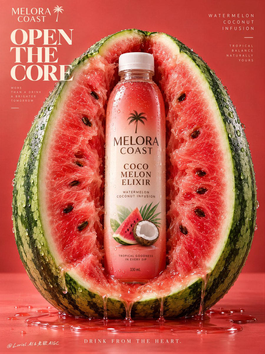
西瓜不是道具——它是产品的展示架构。
分享链接 · https://openimages.ajiang.me/p/2106433807943606725/
color_palette · warm-tonescomposition · centeredlighting · studio-lightquality_flags · embedded-textscene · studiosubject_type · food-drink
提示词(原文,逐字保留)
The watermelon is not a prop—it is the product’s display architecture.
🍉 one upright half watermelon cut toward camera, with its inner flesh curving inward to create a clean central chamber for the bottle
The fruit gives the bottle scale, flavor, and instant recognition without competing with the label. You see the drink as the core of the fruit, not something placed in front of it.
✨ keep the bottle pristine and vertically isolated inside the lighter fruit center; limit juice trails to the lower cut edge and one small pool beneath
This preserves the contrast between controlled premium packaging and juicy organic texture. The result feels fresh and tactile, never messy.
GPT- image 2.5 prompt👇
Create a Cannes-level commercial beverage poster for fictional premium tropical drink brand MELORA COAST, unifying lush fruit realism, sculptural product staging, and clean gallery-grade advertising design into one highly controlled hero image. The central concept is flavor architecture: a monumental half watermelon becomes a natural display chamber for a single chilled bottle, turning the fruit into packaging, environment, and taste narrative. The product must remain the absolute visual leader.
Use a vertical full-bleed poster with a frontal studio shot, centered and nearly symmetrical composition. A giant upright half watermelon dominates the frame, cut cleanly toward the camera and filling most of the height and width. At its exact center, a single slim beverage bottle stands vertically embedded within the fruit core, fully readable and visually isolated by the lighter inner flesh around it. Keep controlled negative space in the upper field for elegant brand typography and in the lower strip for a concise campaign line. The image should feel bold, simple, iconic, and instantly legible from distance.
Design a premium ready-to-drink bottle with a matte white cap, clear chilled plastic, and a radiant liquid gradient shifting from coral-red to soft coconut cream and fresh fruit blush. Use the fictional brand name “MELORA COAST”, the product line “COCO MELON ELIXIR”, and the descriptor “WATERMELON COCONUT INFUSION”. The label should feel contemporary and collectible, with vertically stacked brand typography, a restrained tropical emblem, and a small refined watermelon-coconut illustration integrated into the graphic system. The bottle must look manufacturable, premium, tactile, and shelf-perfect.
The bottle is nested precisely into the central split of the watermelon as if the fruit opened naturally to reveal it. The surrounding flesh curves inward with believable depth, pressure, and organic irregularity. A few clean juice trails descend from the lower cut edge into a glossy puddle beneath the fruit. Keep the bottle pristine and dominant, never swallowed by the fruit texture. Seeds remain naturally distributed but controlled, supporting rhythm rather than clutter. No hand, no straw, no extra garnish, no secondary products.
Build a minimal premium studio field with a seamless warm coral-to-watermelon-red background, slightly graded for depth but still graphically clean. The fruit and product create almost all the spatial hierarchy. Use rind thickness, wet flesh translucency, seed placement, bottle silhouette, and subtle liquid pooling to establish depth. The world remains stripped back and poster-clean, letting the fruit-object relationship carry the entire idea.
Lighting is bright controlled studio light with a soft frontal key, delicate upper-left freshness lift, and gentle lateral shaping to define bottle curves and fruit volume. Palette hierarchy: 60% coral-red, watermelon pink, and juicy rose flesh; 30% coconut white, bottle highlights, and liquid reflections; 10% rind green, seed brown-black, and tiny cool specular accents. Keep the reds luminous and expensive, never muddy; keep contrast crisp but soft-edged; avoid dead shadows and dirty saturation. The emotional tone is juicy, tropical, radiant, fresh, and premium.
Materials must feel extremely photoreal: dense fibrous watermelon flesh, subtle translucency near wet edges, realistic seed gloss, natural rind pores, fine droplets on the outer skin, cold plastic reflectance on the bottle, fine condensation beads, internal liquid refraction, sharp label print, and premium commercial finishing. Juice at the base must feel clean, glossy, and physically convincing. Maintain a polished print-ready finish with restrained luxury refinement and no cheap CGI appearance.
Integrate refined English typography without copying existing wording. Place “MELORA COAST” in the upper left as a custom elegant wordmark. Add a bold sculptural campaign title in the left upper field: “OPEN / THE / CORE”, stacked with strong spatial rhythm and premium letter spacing. In the upper right, place a lighter editorial support line reading “WATERMELON COCONUT INFUSION”. At the bottom center, add the concise line “DRINK FROM THE HEART”. Typography must feel embedded into the poster architecture, balanced against the fruit mass, and kept away from the bottle recognition zone.
Output: a full-bleed premium beverage poster with product-first hierarchy, exact label readability, hyper-clean commercial realism, minimal clutter, strong graphic order, and elegant tropical identity. Avoid extra bottles, messy splashes, random props, chaotic seeds, warped fruit anatomy, distorted bottle proportions, unreadable text, muddy reds, dead black blocks, overbuilt decoration, low-quality AI texture, stock-ad genericity, or resemblance to existing real beverage packaging.
中文译文
西瓜不是道具——它是产品的展示架构。
🍉 一个直立的半颗西瓜,切面朝向镜头,内部果肉向内弯曲,形成一个干净的中央腔室用于放置瓶子
水果为瓶子提供了比例、风味和即时的识别度,又不会与标签争抢视觉。你看到的饮品是品牌同一结构中的核心,而不是放置在品牌同一结构前面的东西。
✨ 保持瓶身纯净,在较浅的果肉中心垂直隔离;将果汁流痕限制在下切边缘和下方一个小水洼内
这保留了受控的高端包装与多汁有机质感之间的对比。成片感觉清新、有触感,绝不凌乱。
GPT- image 2.5 prompt👇
为虚构的高端热带饮品品牌 MELORA COAST 创作一幅戛纳级商业饮品海报,将奢华水果质感、自制式的产品造型和洁净的画廊级广告设计统一在一张高度受控的主视觉中。核心概念是风味架构:一颗巨大的半颗西瓜成为一个冷藏瓶子的天然展示腔室,将水果本身变成包装、环境和味觉叙事。产品必须保持绝对的视觉主导地位。
采用纵向满版海报,正面棚拍,居中且近乎对称的构图。一颗巨大的直立半颗西瓜主导画面,整齐地切向镜头,填满画面大部分的高度和宽度。在其正中央,一支细长的饮料瓶垂直嵌入水果核心,完全可读,被周围较浅的果肉在视觉上隔离开。上方保留受控的负空间用于优雅的品牌字体,下方保留一条狭窄的负空间用于简短的广告语。画面应感觉大胆、简洁、标志性,在远处也能瞬间识别。
设计一款高端即饮饮料瓶,配哑光白色瓶盖、透明冷藏塑料瓶身,以及从珊瑚红渐变到柔和椰子奶油和清新水果绯红的辐射状液体渐变。使用虚构品牌名“MELORA COAST”、产品系列“COCO MELON ELIXIR”和产品描述“WATERMELON COCONUT INFUSION”。标签应感觉现代且具有收藏感,垂直堆叠品牌字体,搭配克制的热带徽章,并将一个精致小巧的西瓜—椰子插画整合进整体图形系统。瓶子必须显得可生产、高端、有触感,完美适合货架展示。
瓶子精确地嵌入西瓜的中央切口中,仿佛水果自然裂开露出瓶身。周围的果肉向内弯曲,具有可信的深度、张力和自然的不规则感。少量干净的果汁流痕从下切边缘流入水果下方一个光滑的水洼。保持瓶身纯净且主导,绝不被水果质感吞没。瓜籽自然分布但受到控制,支撑节奏而不造成杂乱。不要出现手、吸管、额外装饰或第二件产品。
构建极简的高端棚拍背景,采用无缝的暖珊瑚色到西瓜红渐变背景,略有渐变以增加深度但仍保持图形化的洁净感。水果和产品几乎构成所有的空间层级。使用瓜皮厚度、湿润果肉的半透明感、瓜籽位置、瓶身轮廓和微妙的液体汇聚来营造深度。世界保持极简并海报化干净,让水果—物体的关系承载整个概念。
光线采用明亮受控的棚拍灯光,带柔和的正面主光、来自左上方的精致清新提光和柔和的侧面塑形光,以定义瓶身曲线和水果体积。色彩层级:60% 珊瑚红、西瓜粉和多汁玫瑰色果肉;30% 椰子白、瓶身高光和液体反射;10% 瓜皮绿、瓜籽棕黑色和细微的冷色高光。保持红色明亮且昂贵,绝不浑浊;保持对比清晰但边缘柔和;避免死黑和脏污饱和。情感基调是多汁、热带、辐射、清新和高端。
材质必须感觉极度照片写实:密集纤维感的西瓜果肉、湿润边缘附近的微妙半透明感、真实的瓜籽光泽、自然的瓜皮气孔、外皮的细微水珠、瓶身的冷塑料反射、细微的凝结水珠、内部液体折射、清晰的标签印刷和高端商业精修。底部的果汁必须感觉干净、光滑且物理可信。保持精致的印刷级质感,带有克制的高级感精修,绝无廉价 CGI 痕迹。
整合精致的英文字体排版,不复制任何已有文案。在左上角放置“MELORA COAST”作为定制的优雅品牌标志。在左上方添加一个大胆、自制式的广告主标题:“OPEN / THE / CORE”,垂直堆叠,具有强烈的空间节奏和高级的字距。在右上方放置一行较轻的编辑辅助文案“WATERMELON COCONUT INFUSION”。在底部中央添加简洁的一行“DRINK FROM THE HEART”。字体排版必须感觉嵌入海报整体架构中,与水果体量平衡,并远离瓶身识别区。
输出:一幅满版高端饮品海报,具有产品优先的层级、精确的标签可读性、超干净的商业写实感、最小化杂乱感、强烈的图形秩序和优雅的热带身份。避免出现额外的瓶子、凌乱的飞溅、随机道具、混乱的瓜籽、扭曲的水果解剖、变形的瓶身比例、不可读的文本、浑浊的红色、纯黑色色块、过度的装饰、低质量的 AI 质感、素材图常见般感,或类似现有真实饮料包装的外观。
来源与署名
原文由 @ou_zhen599 发布在 X:查看原推文。 本页逐字保留原文并提供机器翻译的中文解读;版权归原作者所有。
同工具的更多提示词
- 压力感之所以真实,是因为泡沫顺着手指的抓握形态流动,而不是遮住产品本体。 🫧 浓密的泡沫在罐口翻涌成冠,然后沿着罐身侧边向下溢出,并流淌过选定的几根手指,同时…@ou_zhen599
- 电影感全身广角镜头,将她的每一部分——从珊瑚王冠的顶端到沾满盐霜、踏在地面上的靴子——都纳入构图中。一位美丽的年轻潮汐女神,面容年轻无瑕,眼眸覆着一层薄薄的水…@TraffAlex
- 超写实 IMAX 级 Netflix 风格水彩肖像插画,9:16 竖版。以所上传的图片作为主要视觉参考,保留完全一致的面部身份、比例和标志性特征。塑造一位身穿…@imGopalTiwari
- 侧面视角的中景镜头,描绘一位美丽的年轻女性半机械人。她由哑光象牙色骨状铠甲和华丽的黄铜花丝工艺构成,头部冠以一个精巧的结构,将有机珊瑚、机械齿轮与书法般的金属…@TraffAlex
- 放大镜只有在放大食欲时才起作用——而不是沦为噱头时。 🔍 大号放大镜从左下角进入,以真实的光学放大效果放大一块紧凑的脆皮鸡肉与光泽酱汁的区域 你得到了一个清晰…@ou_zhen599
- 【主体】 × 无人机航拍 × tilt-shift 摄影 × 微缩模型错觉 × 横版3:1 https://t.co/sB9mhEajW5@DeepBlueX0