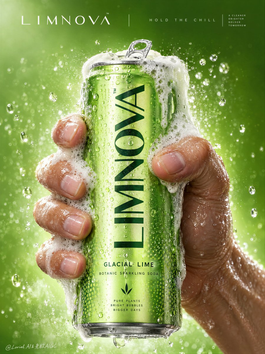
压力感之所以真实,是因为泡沫顺着手指的抓握形态流动,而不是遮住产品本体。
分享链接 · https://openimages.ajiang.me/p/2106430649666351267/
composition · centeredcomposition · extreme-close-uphuman_attributes · hands-prominentlighting · studio-lightquality_flags · embedded-textsubject_type · food-drink
提示词(原文,逐字保留)
The pressure feels real because the foam follows the hand’s grip instead of hiding the product.
🫧 dense foam cresting at the rim, then spilling down the can’s side edges and across selected fingers while leaving the main logo and flavor line clear
This gives you a true release moment without sacrificing pack recognition. The foam looks active, but the brand still reads instantly.
🧊 one wet hand wrapping from the right and lower rear, with visible knuckle tension, natural finger spacing, and slight skin compression against the can
The grip adds force without crushing the can or making the anatomy feel artificial. Product, hand, and foam become one tightly controlled central mass.
GPT- image 2.5 prompt👇
Create a Cannes-level commercial poster for fictional premium sparkling soda brand LIMNOVA, merging tactile product realism, pressure-driven human interaction, and ultra-clean gallery-grade graphic design into one unified hero image. The core concept is controlled release: a cold lime soda can gripped at peak tension, overflowing with foam and condensation, turning an ordinary beverage moment into a sculptural event of freshness, pressure, and desire.
Use a vertical full-bleed poster in extreme close-up, rule-of-thirds disciplined but visually centralized. Preserve the exact structure: a single slim can dominates the center, held tightly by one wet human hand wrapping from the right and lower rear; dense foam crowns the top and spills down the can; broad negative space remains above for elegant brand typography. The hand, can, and foam should read as one compressed central mass, surrounded by a luminous citrus atmosphere with no extra props. The can must remain the undisputed focal point and fully legible.
The subject is a hyperreal slim aluminum soda can in radiant glacial lime green, with crisp pull-tab geometry, subtle printed microtexture, dense condensation droplets, and refined premium branding. Use the fictional text “LIMNOVA” as the main vertical logo, “GLACIAL LIME” as the flavor line, and “BOTANIC SPARKLING SODA” as the descriptor. The identity should feel bold, contemporary, and luxury-clean, with strong custom letterforms and exact print clarity. The can should look manufacturable, collectible, and ice-cold.
One realistic human hand grips the can firmly with correct five-finger anatomy, natural finger spacing, believable knuckle tension, realistic nail beds, subtle skin compression, and wet highlights. The grip communicates force and freshness, not aggression. Foam surges over the top rim and flows across the fingers and can in airy dense clusters, while suspended micro-droplets and faint carbonation mist activate the space. The can remains undeformed except for natural optical tension created by the grip and liquid pressure. No extra hands, no anatomy drift.
Build a minimal studio field rather than a literal location. The background is a luminous acid-lime to chilled-chartreuse gradient with suspended droplets, vapor-like fizz haze, and a soft freshness halo around the product. Keep the space clean and abstract, letting the product, hand, and foam generate all depth. No fruit slices, no ice cubes, no bar setup, no clutter. The world should feel like a distilled atmosphere of citrus pressure and cold carbonation.
Lighting is a premium studio setup with a bright frontal key, cool upper-left freshness lift, and narrow specular edge highlights on wet aluminum and skin. Palette hierarchy: 60% glacial lime and electric citrus green, 30% white foam and bright condensation highlights, 10% natural warm skin tone as tactile counterpoint. Contrast should be crisp yet soft-edged, with no dead blacks, dirty grey mud, or cartoon oversaturation. The emotional tone is icy, alive, compressed, clean, and addictive.
Materials must feel extremely photoreal: sharp reflective aluminum edges, chilled metallic bloom, droplets merging into trails, subtle ink adhesion texture; foam that feels light, wet, aerated, and creamy with translucent bubble variation and convincing thickness at the rim and fingers; and a real, de-AI hand with accurate anatomy, realistic skin texture, natural moisture sheen, crease detail, true finger joints, and no swollen or fused forms. Apply restrained high-end commercial polish, keeping hero detail sharp and print-ready.
Integrate a minimalist top header as a refined brand system, not ad clutter. Place “LIMNOVA” on one side of the top band and a secondary studio-style signature or edition mark on the other, separated by a thin elegant divider. If an extra micro-headline is used, keep it very restrained, such as “HOLD THE CHILL” or “PRESS THE FIZZ”, set small outside the can recognition zone. Typography must feel architected into the negative space, aligned with the product axis, and never heavy or crude.
Output: a premium beverage poster with product-first hierarchy, hyper-clean execution, strong tactile realism, elegant negative space, and exact brand readability. No extra cans, no fruit garnish, no ice props, no chaotic splash overload, no warped can geometry, no broken tab, no malformed hand, no extra or merged fingers, no unreadable text, no muddy shadows, no large dead black blocks, no low-quality AI artifacts, no clutter, no style drift, and no resemblance to existing real soda branding.
中文译文
压力感之所以真实,是因为泡沫顺着手指的抓握形态流动,而不是遮住产品本体。
🫧 浓密的泡沫在罐口翻涌成冠,然后沿着罐身侧边向下溢出,并流淌过选定的几根手指,同时保留主 Logo 和风味文字的清晰可读
这能给你一个真正的“释放瞬间”,却不牺牲包装识别度。泡沫看起来活跃,但品牌依然一眼可读。
🧊 一只沾湿的手从右下方与后方包覆上来,可见指关节张力、自然的指间距,以及指腹紧贴罐壁时轻微的皮肤挤压感
握持带来力度,却没有压瘪罐身,也没有让解剖结构显得失真。产品、手、泡沫共同组成一个被严密控制的中心团块。
GPT- image 2.5 prompt👇
为虚构的高端气泡苏打品牌 LIMNOVA 创作一幅戛纳级商业海报,将触感级产品写实感、压力驱动的人机交互,以及画廊级超洁净图形设计,融合为一张统一的主视觉。核心概念是“受控释放”:一罐冰镇青柠苏打在被握持到张力峰值时,泡沫与凝结水一同溢出,将一个普通的饮用瞬间升华为关于新鲜感、压力与欲望的雕塑式事件。
使用一张全出血的竖版海报,采用极近景特写构图,遵循三分法却保持视觉居中。严格保留以下结构:一支纤细罐体居于画面正中,被一只沾湿的人手从右侧与后下方紧紧握住;浓密泡沫在顶部形成冠盖并向下溢出;罐体上方保留宽阔的负空间,用于优雅的品牌字体排布。手、罐、泡沫应共同读作一个被压缩的中心整体,外围环绕一层发光的柑橘色氛围,不出现任何多余道具。罐体必须无可争议地成为焦点,并保持完全清晰可读。
主体是一支超写实的纤细铝制苏打罐,呈耀眼的冰川青柠绿色,拉环几何结构清晰,印刷微纹理细腻,凝结水珠密集,品牌呈现精致高端。将虚构文字“LIMNOVA”作为主要的竖排 Logo,“GLACIAL LIME”作为风味行文字,“BOTANIC SPARKLING SODA”作为描述行文字。整体识别需显得大胆、当代且奢华洁净,配以强势的定制字形与精准的印刷清晰度。罐体应看起来可生产、可收藏、且冰冷十足。
一只写实的人手以正确的五指解剖结构、真实的指间距、可信的指节张力、逼真的甲床、轻度的皮肤挤压以及湿润的高光,紧紧握住罐体。握持传递的是力度与清新,而非攻击性。泡沫从顶部罐口汹涌而下,以轻盈而致密的团簇流过手指与罐身,同时悬浮的微滴与隐约的碳酸雾气激活整个空间。除因握持与液体压力所产生的自然光学张力外,罐体不得出现变形。不得出现多余的手部,也不得出现解剖偏差。
构建一个极简的影棚场域,而非具象场景。背景为明亮的酸青柠至冰感黄绿色渐变,悬浮着水珠、蒸气般的碳酸薄雾,以及产品周围一圈柔和的清新光晕。保持空间洁净、抽象,让产品、手与泡沫自行生成全部纵深。不出现水果切片、冰块、吧台陈设或杂乱堆叠。整个世界应像柑橘压力与冷感碳酸被蒸馏后的纯粹氛围。
打光采用高端影棚配置:明亮的前方主光、冷调的左上方清新提光,以及在湿润铝面与皮肤上呈现窄幅高光边缘。色彩层级:60% 冰川青柠与电光柑橘绿,30% 白色泡沫与明亮的凝结高光,10% 自然暖肤色作为触感对照。对比应保持锐利却柔边过渡,避免死黑、浑浊的脏灰或卡通式过饱和。情绪基调是冰爽、鲜活、压缩、洁净、上瘾。
材质必须极致照片写实:锋利反光的铝制边缘、冷感金属辉光、水珠汇聚成流痕、细腻的油墨附着纹理;泡沫需轻盈、湿润、充气、绵密,呈现半透明气泡变化,并在罐口与指间具有可信的厚度;以及一只“去 AI 化”的真实之手,具备准确的解剖、真实的皮肤纹理、自然的水润光泽、褶皱细节、真实的指关节,且无肿胀或粘连形态。施加克制的高端商业润色,保持主视觉细节锐利、可直接付印。
将极简的顶部页眉作为一套精致的品牌系统来整合,而非广告堆砌。在顶部条带的一侧放置“LIMNOVA”,另一侧放置次级影棚风格签名或版本标记,中间以一条纤细优雅的分隔线分开。若使用额外的微型标语,需极度克制,例如“HOLD THE CHILL”或“PRESS THE FIZZ”,字号小,置于罐体识别区之外。字体应如同被嵌入负空间中、与产品轴线对齐,绝不显粗重或粗陋。
输出:一张以产品为先的层级、极致洁净的执行力、强触感写实感、优雅负空间与精准品牌可读性的高端饮品海报。不出现多余的罐体、水果装饰、冰块道具、混乱的飞溅堆叠、变形的罐体几何、破损的拉环、畸形的手、多余或粘连的手指、无法辨认的文字、浑浊的阴影、大面积死黑、低质量 AI 瑕疵、杂乱元素、风格漂移,也不得与任何现存真实苏打品牌相似。
来源与署名
原文由 @ou_zhen599 发布在 X:查看原推文。 本页逐字保留原文并提供机器翻译的中文解读;版权归原作者所有。
同工具的更多提示词
- 超写实 IMAX 级 Netflix 风格水彩肖像插画,9:16 竖版。以所上传的图片作为主要视觉参考,保留完全一致的面部身份、比例和标志性特征。塑造一位身穿…@imGopalTiwari
- 西瓜不是道具——它是产品的展示架构。 🍉 一个直立的半颗西瓜,切面朝向镜头,内部果肉向内弯曲,形成一个干净的中央腔室用于放置瓶子 水果为瓶子提供了比例、风味和…@ou_zhen599
- 放大镜只有在放大食欲时才起作用——而不是沦为噱头时。 🔍 大号放大镜从左下角进入,以真实的光学放大效果放大一块紧凑的脆皮鸡肉与光泽酱汁的区域 你得到了一个清晰…@ou_zhen599
- 电影感全身广角镜头,将她的每一部分——从珊瑚王冠的顶端到沾满盐霜、踏在地面上的靴子——都纳入构图中。一位美丽的年轻潮汐女神,面容年轻无瑕,眼眸覆着一层薄薄的水…@TraffAlex
- 当触手像产品构图一样行动,而不是怪物装饰时,一个生物概念就变成了一则奢侈广告。 🐙 触手仅限于罐身的下三分之一和后侧,前景中有一道曲线,左上方有一道弧线,每个…@ou_zhen599
- 侧面视角的中景镜头,描绘一位美丽的年轻女性半机械人。她由哑光象牙色骨状铠甲和华丽的黄铜花丝工艺构成,头部冠以一个精巧的结构,将有机珊瑚、机械齿轮与书法般的金属…@TraffAlex