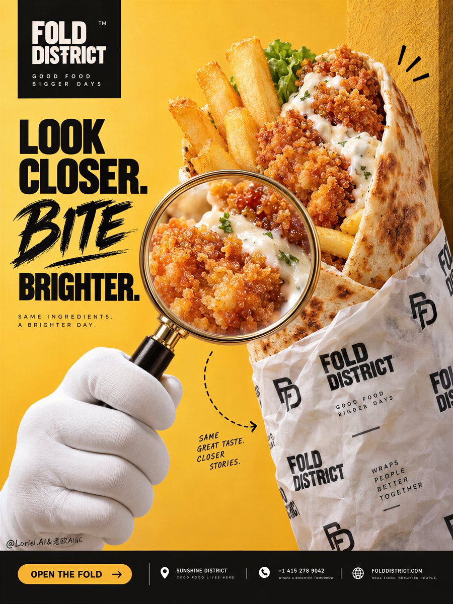
放大镜只有在放大食欲时才起作用——而不是沦为噱头时。
分享链接 · https://openimages.ajiang.me/p/2106428807142117635/
color_palette · warm-tonescomposition · close-upcomposition · negative-spacelighting · studio-lightquality_flags · embedded-textscene · studio
提示词(原文,逐字保留)
The magnifying glass works when it enlarges appetite—not when it becomes a gimmick.
🔍 large magnifying glass entering from the lower left, enlarging one tight section of crispy chicken and glossy sauce with true optical magnification
You get a clear reason to look closer: sharper crumb, richer sauce, more texture. The food feels more tangible without being distorted.
🌯 upright wrap anchored along the right third, with the branded paper sleeve covering only the lower half and the open filling kept fully visible
The packaging builds brand presence while the exposed top still does the selling. Product, paper, and headline each keep their own territory.
GPT- image 2.5 prompt👇
Create a Cannes-level commercial food poster for fictional premium wrap brand FOLD DISTRICT, merging tactile real food photography, bold graphic advertising, and subtle gallery-like art direction into one unified hero image. The core idea is discovery through appetite: an oversized loaded wrap as the dominant edible object, inspected through a magnifying glass, with every element reinforcing curiosity, craving, and brand precision. The result must feel witty, premium, contemporary, and highly publishable.
Use a vertical full-bleed poster with a front-facing studio setup and slightly close hero framing. Preserve the exact structure: the wrap emerges from the right side as the main visual pillar, partially overlapping a tall warm-toned vertical panel at the far right edge; a large magnifying glass enters from the lower middle-left and enlarges the most seductive food detail; broad controlled negative space fills the left side for headline typography; a clean bottom information strip spans the full width. Add one restrained curved dashed motion line in the lower half to connect the rhythm. The wrap must remain the clear primary subject.
Design an oversized open-top chicken wrap with highly realistic toasted flatbread, visible golden fries, crisp fried chicken fillets, creamy white garlic-style sauce, and a small fresh green accent near the top opening. The tortilla should show soft blistering, gentle browning, believable thickness, natural fold stress, and subtle elasticity. The fried chicken must look extremely appetizing, with irregular crunchy crumb texture, rich amber-gold tones, fine oil sheen, and believable density. Fries should feel freshly fried, lightly salted, and firm. Sauce should read as thick, glossy, and freshly layered. The food must feel edible, premium, and physically present, never plastic.
The lower half of the wrap is enclosed in premium branded white paper with repeated black FOLD DISTRICT typography and a minimalist emblem system. The wrapper should feel like a custom fast-casual identity: graphic, modern, urban, and elegant. Show realistic paper crumpling, fold memory, slight translucency in compressed zones, printed ink variation, and shadowed wrinkles where hand and food mass create pressure. The repeated graphics should support the poster rhythm without overwhelming the hero read.
A smooth white mascot-like gloved hand rises from the lower center-left, holding the magnifying glass with correct finger anatomy, natural grip tension, elegant wrist angle, and believable object weight. The magnifying glass should enlarge one delicious section of crispy chicken and sauce with convincing optical magnification, not surreal distortion. The wrap remains upright, slightly angled toward camera, with the filling clearly visible. Keep one or two very small playful accent marks near the upper right of the wrap to suggest surprise and delight.
The background is a luminous saffron-yellow studio field with soft tonal modulation, paired with a slightly darker textured golden vertical panel on the right for depth and framing. No restaurant interior, furniture, or clutter. Depth comes from overlap, scale hierarchy, the foreground magnifying glass, wrapper folds, and the right structural plane. The space must stay bold, minimal, and graphically disciplined.
Lighting is bright premium studio light with a soft frontal key, subtle upper-left lift, and delicate shadows preserving dimensionality without heaviness. Palette hierarchy: 60% saturated saffron and warm golden yellow, 30% black and creamy white for graphic contrast, 10% toasted beige, fried amber, and small fresh green accents. The image should feel energetic and appetizing, but also clean, expensive, and globally contemporary. Keep blacks rich but not dead, highlights creamy but not blown, and shadows clean rather than greasy.
Materials must feel hyperreal and tactile: tortilla blister texture, crisp crumb structure, slight salt crystals on fries, moist sauce sheen, subtle wrapper paper grain, a polished warm metallic magnifying-glass rim, and a matte soft-touch glove surface. Keep hero zones highly sharp and readable, with controlled micro-contrast and restrained premium poster polish. The finish should sit between bold mass-market food advertising and a more elevated design-forward campaign.
Integrate original English typography as part of the composition. Main headline on the left: “LOOK CLOSER. BITE BRIGHTER.” Use a mixed system where one word receives expressive brush-script emphasis and the supporting lines are set in a sharp heavy sans-serif with elegant spacing. Place the FOLD DISTRICT logo inside a black brand block near the upper left. In the bottom full-width bar, include a refined CTA capsule reading “OPEN THE FOLD”, followed by minimalist brand metadata such as district location, contact line, and website in clean editorial alignment. Typography must feel sculpted into the poster flow, avoid the food recognition zone, and remain visually premium.
Output: a premium food poster with product-first hierarchy, strong graphic rhythm, minimal clutter, highly readable food detail, clean commercial realism, a witty but controlled concept, and elegant brand unity. Avoid extra limbs, malformed fingers, duplicated fries, warped tortilla geometry, broken magnifying glass, unreadable text, random props, greasy mess, muddy lighting, cheap stock-poster styling, chaotic backgrounds, floating ingredients, distorted packaging, low-grade AI texture, or off-brand visual noise.
中文译文
放大镜只有在放大食欲时才起作用——而不是沦为噱头时。
🔍 大号放大镜从左下角进入,以真实的光学放大效果放大一块紧凑的脆皮鸡肉与光泽酱汁的区域
你得到了一个清晰的理由去凑近看:更锐利的面包屑、更浓郁的酱汁、更丰富的质感。食物显得更触手可及,却没有被扭曲。
🌯 直立的卷饼固定在右侧三分之一处,印有品牌的纸套只包裹下半部分,敞开的馅料完全可见
包装建立了品牌存在感,而露出的顶部仍在负责“卖货”。产品、纸张和标题各自守住自己的领域。
GPT- image 2.5 prompt👇
为虚构的高端卷饼品牌 FOLD DISTRICT 创作一张戛纳级别的商业美食海报,将触感强烈的真实食物摄影、大胆的图形广告与克制的画廊式美术指导融合为一个统一的英雄画面。核心概念是通过食欲驱动发现:一个超大号的饱满卷饼作为主导的可食用主体,通过放大镜被检视,每个元素都在强化好奇心、渴望与品牌精度。最终成品需感觉机智、高端、当代,且高度具备可发布性。
使用纵向满版海报,正面摄影棚布景,略带紧凑的英雄构图。请严格保留以下结构:卷饼从右侧作为主要视觉支柱出现,部分遮挡在最右缘一道高耸的暖色调竖向面板前;大号放大镜从左下中部进入,放大最诱人的食物细节;左侧留出大面积受控的负空间用于标题排版;底部一条干净的信息条横贯整个宽度。在下半部分加入一条克制的弧形虚线动势线来串联节奏。卷饼必须保持明确的主体地位。
设计一只超大号开口朝上的鸡肉卷饼,包含高度逼真的烤制扁面包、可见的金黄薯条、酥脆的炸鸡片、奶油白蒜香酱汁,以及顶部开口附近的一小撮新鲜绿色点缀。玉米饼应呈现柔和的起泡、轻微的焦黄、可信的厚度、自然的折叠张力以及细微的弹性。炸鸡必须看上去极其诱人,带有不规则的酥脆面包屑质地、浓郁的琥珀金调、细微的油光以及可信的密度。薯条应感觉刚出锅、轻度撒盐、紧实。酱汁应呈现浓稠、光亮、刚淋上的层次感。食物必须感觉可食用、高端、物理感十足,绝不能显得像塑料。
卷饼的下半部分被高端品牌白纸包裹,纸上重复印有黑色 FOLD DISTRICT 字体与极简的徽标系统。包装纸应像定制快餐休闲品牌的视觉——图形化、都市感、现代、优雅。需呈现真实的纸张褶皱、折叠记忆、受压区域的微透光、墨色微差,以及因手部与食物重量造成压力而产生的阴影皱纹。重复的图形应支撑海报节奏,又不压过主体阅读。
一只顺滑的白色吉祥物风格戴手套的手从左下中部升起,正确的手指解剖结构、自然的握持张力、优雅的手腕角度以及可信的物体重感地握住放大镜。放大镜应以令人信服的光学放大效果放大一块美味的脆皮鸡肉与酱汁区域,而不是超现实的扭曲。卷饼保持直立,略微朝向镜头,馅料清晰可见。在卷饼右上角附近保留一两个非常小的俏皮点缀符号,以暗示惊喜与愉悦。
背景是明亮的藏红花黄色摄影棚空间,具有柔和的色阶过渡,搭配右方一块略深的带纹理的暖金色面板以营造纵深与框架感。不要出现餐厅内部、家具或杂乱。纵深感来自层叠、尺度层级、前景放大镜、包装纸褶皱以及右侧的结构平面。空间必须保持大胆、极简、图形上克制。
光线为明亮的高端摄影棚光,带柔和的正面主光、细微的左上方提光,以及精致的阴影以保留体积感而不显沉重。配色层级:60% 为饱和的藏红花黄与暖金黄,30% 为黑色与奶油白以形成图形对比,10% 为烤制米色、油炸琥珀色,以及小量新鲜绿色点缀。整体感觉既要充满活力与食欲,又要干净、昂贵、全球当代感。保持黑色浓郁但不沉闷,高光奶油色但不过曝,阴影干净而非油腻。
材质必须呈现超真实与触感强烈的质感:玉米饼起泡纹理、酥脆面包屑结构、薯条上细微的盐粒、湿润的酱汁光泽、包装纸的细微纹理、抛光的暖金属放大镜边框,以及哑光柔软的触感手套表面。主体区域保持高度清晰可读,配以受控的微观对比与克制的高级海报润色。整体完成度应介于大众市场大胆美食广告与更高端的设计导向活动之间。
将原创英文排版作为整体构图的一部分。左侧主标题:“LOOK CLOSER. BITE BRIGHTER.” 采用混合字体系统,其中一个单词以表现力的手写花体强调,其余支撑文字使用锋利厚重的无衬线字体并配以优雅的字距。将 FOLD DISTRICT logo 置于左上方的黑色品牌块中。在底部横贯整宽的条带中,加入一个精致的 CTA 胶囊按钮,文案为 “OPEN THE FOLD”,其后是极简风格的品牌元数据,例如区域地址、联系电话与官网,编辑式对齐排布。排版应感觉是被雕刻进海报流动中的,避开食物识别区域,并保持视觉上的高端感。
输出:一张以产品为先导层级、图形节奏强烈、极少杂乱、食物细节高度可读、商业写实感干净、概念机智而克制、品牌统一感优雅的高端美食海报。避免多余的肢体、畸形的手指、重复的薯条、扭曲的玉米饼几何、损坏的放大镜、不可读的文字、随机道具、油腻的杂乱、浑浊的光线、低廉的素材海报风格、混乱的背景、漂浮的食材、变形的包装、低级 AI 纹理,或偏离品牌的视觉噪点。
来源与署名
原文由 @ou_zhen599 发布在 X:查看原推文。 本页逐字保留原文并提供机器翻译的中文解读;版权归原作者所有。
同工具的更多提示词
- 当触手像产品构图一样行动,而不是怪物装饰时,一个生物概念就变成了一则奢侈广告。 🐙 触手仅限于罐身的下三分之一和后侧,前景中有一道曲线,左上方有一道弧线,每个…@ou_zhen599
- 超写实 IMAX 级 Netflix 风格水彩肖像插画,9:16 竖版。以所上传的图片作为主要视觉参考,保留完全一致的面部身份、比例和标志性特征。塑造一位身穿…@imGopalTiwari
- 创作3:4竖版梦幻实验海报,天空蓝上部、玫瑰粉中部、薄荷绿底部,以喷枪柔染自然融接,表面覆盖细密半色调与细颗粒。顶部巨大的白色高对比斜体衬线标题“moon m…@listudio
- 压力感之所以真实,是因为泡沫顺着手指的抓握形态流动,而不是遮住产品本体。 🫧 浓密的泡沫在罐口翻涌成冠,然后沿着罐身侧边向下溢出,并流淌过选定的几根手指,同时…@ou_zhen599
- 创作3:4竖版梦幻实验平面海报。背景为喷枪与湿染形成的连续色域:左下明亮青蓝和薄荷绿,中央柔粉,右侧珊瑚红,带细密半色调和均匀纸张颗粒。顶部四分之一用白色大小…@listudio
- 西瓜不是道具——它是产品的展示架构。 🍉 一个直立的半颗西瓜,切面朝向镜头,内部果肉向内弯曲,形成一个干净的中央腔室用于放置瓶子 水果为瓶子提供了比例、风味和…@ou_zhen599