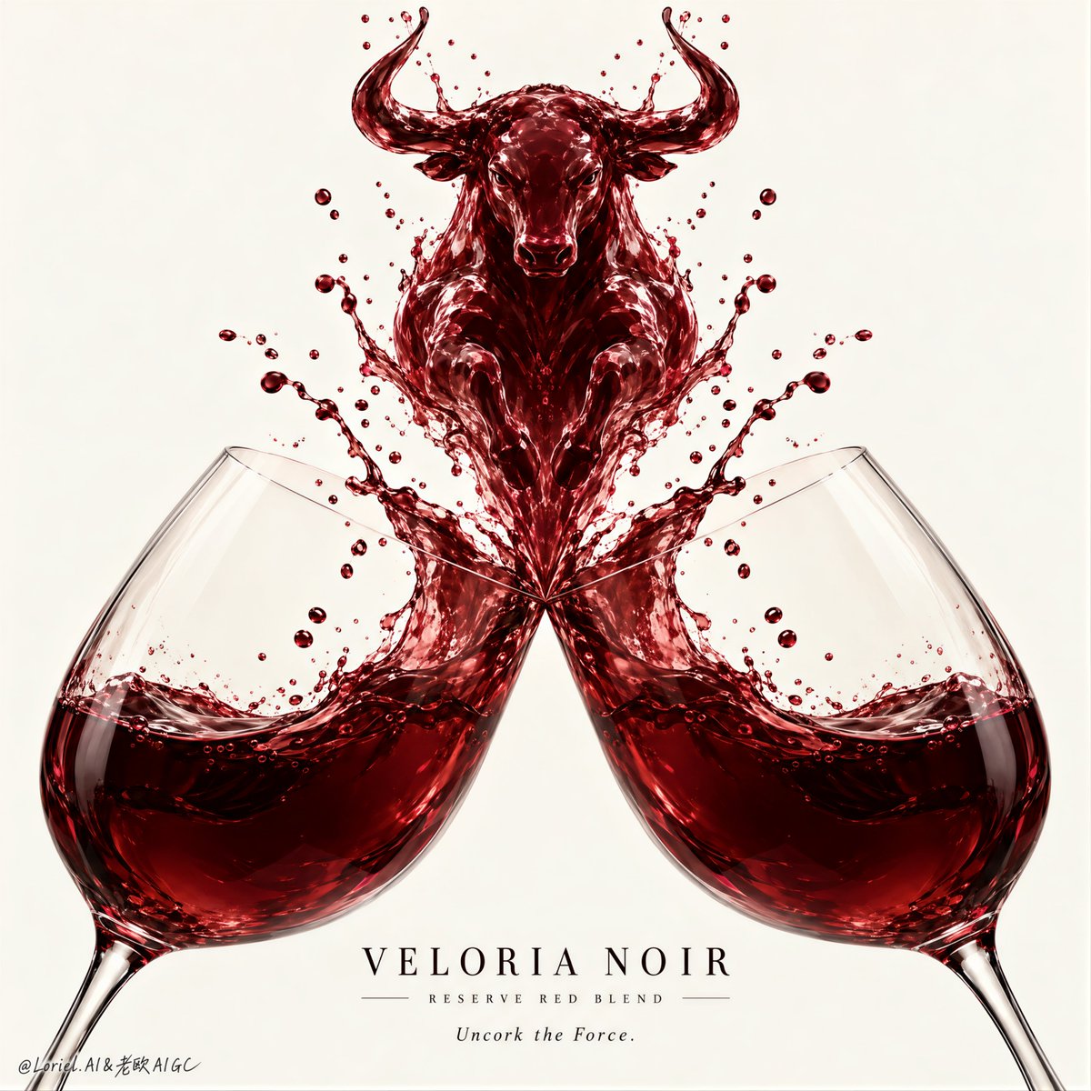
公牛之所以让人感觉是刻意设计的,是因为碰撞首先是以对称性来构建,其次才是象征意义。
分享链接 · https://openimages.ajiang.me/p/2106049433804956146/
color_palette · warm-tonescomposition · symmetrylighting · studio-lightmood · luxuriousquality_flags · embedded-textsubject_type · product
提示词(原文,逐字保留)
The bull only feels intentional because the collision is engineered as symmetry first, symbolism second.
🍷 two mirrored wine glasses with identical bowl size, tilt angle, rim height, wine level, and distance from the central axis
This makes the impact feel ceremonial rather than accidental. The viewer trusts the symmetry before noticing the liquid sculpture.
🐂 liquid force lines rising equally from both rims into one centered bull silhouette: clear horns, head, chest, then a tapering body dissolving back into splash strands
The bull reads as wine transformed by the collision—not an animal pasted into a splash. Keep the outer droplets mirrored and the central form clean.
GPT- image 2.5 prompt👇
A luxury wine poster for fictional house VELORIA NOIR, designed as a minimalist high-impact advertising image built around two perfectly symmetrical red-wine glasses colliding at the center. Preserve the exact structure: a front-facing, centered, rigorously balanced composition where one crystal glass rises from the lower left and the other from the lower right, mirrored in angle, height, bowl size, wine level, rim position, and splash force. Their rims meet exactly on the center axis, launching a sculptural burst of dark ruby wine upward into a single iconic liquid totem. The wine is the absolute visual leader.
Use a pale warm ivory or refined stone-white background with strong negative space and museum-level stillness. The glasses are large, elegant, hyperreal, and partially cropped by the lower frame, but perfectly mirrored across the vertical centerline. Their bowls hold deep red wine with clean curved surfaces, visible meniscus, realistic refraction, thin crystal edges, and equal liquid volume. The collision point is precisely centered. From that midpoint, the wine erupts into the unmistakable silhouette of a charging bull or horned wine-spirit. The bull must feel born from the liquid itself: strong neck, lifted chest, clear head angle, subtle horn definition, fluid shoulder mass, and a tapering lower body dissolving into splash strands and droplets. It should stay elegant, premium, and physically plausible, never cartoonish or muddy.
The wine material is the emotional core: dark garnet, ruby, and black-cherry tones with translucent edges, glossy highlights, dynamic thickness variation, suspended droplets, and fine splash mist. Freeze the impact at the perfect instant, with mirrored force lines rising from both glasses into the central liquid creature. Keep the splash controlled, clean, and premium, with symmetrical energy and no chaotic scatter. The glasses remain elegant supporting anchors, while the liquid-born bull becomes the heroic symbol of force, taste, and identity.
Create a fully original English-only luxury wine identity. External typography must stay minimal and secondary. If text is used, place one short elegant serif headline below the collision zone, centered on the same axis, such as “Uncork the Force.” or “Taste the Charge.” Add a tiny VELORIA NOIR wordmark with a subtle support line like “Reserve Red Blend”. Typography must be discreet, refined, and perfectly aligned, never competing with the liquid sculpture. If text weakens the symmetry, omit the headline and let the visual carry the campaign.
Lighting is clean, soft, and sculptural: a large diffused frontal key with slight side shaping kept symmetrical, crisp highlights tracing both glass rims equally, soft internal glow in the red wine, delicate reflections across the splash surfaces, and enough tonal contrast to define the liquid bull without dirty shadows or muddy buildup. Color hierarchy: 70% pale ivory background and clear glass transparency, 20% rich ruby-crimson wine body, 10% deep burgundy shadow accents and black text details. Materials must feel hyperreal and tactile: thin crystal glass, liquid refraction, suspended droplets, splash membranes, and premium editorial smoothness.
The final result should feel like a Cannes-level wine campaign: minimal, iconic, perfectly symmetrical, product-dominant, materially seductive, symbolically powerful, and graphically unforgettable. No copied branding, no copied title, no asymmetrical glass placement, no uneven wine levels, no warped glass geometry, no broken liquid anatomy, no muddy wine color, no cheap surrealism, no unnecessary props.
中文译文
公牛之所以让人感觉是刻意设计的,是因为碰撞首先是以对称性来构建,其次才是象征意义。
🍷 两面镜像的酒杯,杯肚大小、倾斜角度、杯口高度、酒液水位以及距中心轴的距离完全一致
这使得冲击力显得庄重而非偶然。观者会先信任这种对称感,然后才会注意到液体雕塑。
🐂 从两侧杯口等量上升的液体力线汇聚成居中的公牛轮廓:清晰的牛角、头部、胸部,然后是逐渐收窄的躯体,消融回飞溅的水柱
这头公牛读起来是碰撞中被葡萄酒重塑的形象——不是一张被贴进水花里的动物图片。保持外侧飞沫的镜像对称,中央造型保持干净。
GPT- image 2.5 提示词👇
为虚构酒庄 VELORIA NOIR 设计的奢华葡萄酒海报,作为一张极简、高冲击力的广告图像,构建于两只完美对称的红酒杯在中央碰撞之上。保持精确结构:正面、居中、严格均衡的构图,一只水晶杯从左下方升起,另一只从右下方升起,在角度、高度、杯肚大小、酒液水位、杯口位置和飞溅力度上完全镜像。两杯杯口恰好在中心轴相接,将暗红宝石色的葡萄酒以雕塑般的爆发向上抛起,形成一座标志性的液体图腾。酒液是绝对的视觉主角。
使用淡暖象牙白或精致石白背景,配合强烈的负空间与博物馆级的静谧感。酒杯硕大、优雅、超写实,下边框对它们进行部分裁切,但严格沿垂直中线左右镜像。杯肚装有饱满的红酒,曲面干净,可见弯月面(meniscus),折射真实,水晶边缘纤细,两杯酒液体积相等。碰撞点精准居中。从该中点起,酒液炸裂为一只冲锋的公牛,或有角的酒灵——那是不容误认的轮廓。公牛必须感觉是从液体中诞生的:颈部强健、胸部扬起、头部角度清晰、角部线条微妙、肩部富有流动质感、下半身渐窄并消融为飞溅的水柱与液滴。整体保持优雅、高级、符合物理真实,绝不卡通,绝不浑浊。
酒液材质是情感核心:深石榴石色、红宝石色与黑樱桃色调,半透明边缘,光泽高光,动态厚度变化,悬浮液滴,细腻的飞溅薄雾。在最完美的瞬间冻结冲击,使镜像的力线从两侧酒杯升入中央的液体生灵。飞溅受控、干净、高级,能量对称、不混沌四散。酒杯保持优雅的支撑锚点,而由液体诞生的公牛则成为力量、风味、认同感的英雄象征。
打造一个完全原创、仅使用英语的奢华葡萄酒品牌形象。外部字体必须保持极简与次要地位。若使用文字,在碰撞区域下方放置一句简短的优雅衬线大标题,居中于同一中轴线,例如 “Uncork the Force.” 或 “Taste the Charge.” 添加一个微小的 VELORIA NOIR 字标,配以一条细微的辅助说明,如 “Reserve Red Blend”。字体必须含蓄、精致、完美对齐,绝不能与液体雕塑争抢视觉。如果文字削弱了对称感,则省略标题,让视觉本身承载整个广告。
光线干净、柔和、富有雕塑感:大型柔光正面主光,略带侧向塑形且保持对称,锐利高光沿两侧杯口等量描出,红酒内部散发柔和的内发光,飞溅表面有细腻反光,并具备足够的色调对比以刻画液体公牛,却不出现脏阴影或浑浊堆积。色彩比例:70 % 淡象牙白背景与透明玻璃,20 % 浓郁的红宝石—深红酒体,10 % 深酒红阴影点缀与黑色文字细节。材质必须超写实、可触摸:纤薄水晶玻璃、液体折射、悬浮液滴、飞溅膜面,以及高端编辑级的精致顺滑。
最终成果应如同戛纳级别的葡萄酒广告大片:极简、标志性、完美对称、产品主导、材质魅惑、象征有力、画面难忘。禁止抄袭品牌,禁止抄袭标题,禁止酒杯左右不对称,禁止酒液水位不均,禁止玻璃几何扭曲,禁止液体形态崩坏,禁止酒色浑浊,禁止廉价超现实,禁止多余道具。
来源与署名
原文由 @ou_zhen599 发布在 X:查看原推文。 本页逐字保留原文并提供机器翻译的中文解读;版权归原作者所有。
同工具的更多提示词
- 极简主义只有在材质效果开始之前轮廓就已无可误认时才真正奏效。 🍾 添加金色漆面之前,需先有正面香槟酒瓶造型:圆润的肩部、收窄的瓶颈、可辨识的瓶帽顶部 这样物体…@ou_zhen599
- 创作一张超写实电影级8K时尚人像,呈现出高端《Vogue》编辑大片的精致质感。 使用上传的人物作为准确的面部参考。严格保留她的身份特征与面部结构——不得改变她…@mehvishs25
- 单色海报不需要更多颜色。它只需要一次足够强势的物质事件来制造对比。 🟡 满版饱和黄色色域延伸到每一条边缘,没有边框、画框或次要背景色 这去掉了逃避路径。画面成…@ou_zhen599
- 两格饮品广告只有当第二张图改变瞬间而非改变身份时,才真正构成一个系统。 🍫 在两个画面中重复同一只洛克杯、同样的红转琥珀酒体、同样的浅色奶油顶饰,以及同一块对…@ou_zhen599
- 超写实 IMAX 级 Netflix 电影风格浪漫钢琴人像,9:16 竖版。以上传的图片作为主要视觉参考,精确保留面部身份、比例与标志性特征。画面中一对情侣亲…@imGopalTiwari
- 东亚传统螺钿镶嵌艺术四联画,置于光面黑色漆底之上。4 块竖向面板呈现四季景象,每季各具独特色彩搭配,同时保持统一的艺术风格。浅浮雕 3D 效果,每一片贝壳元素…@churvikv