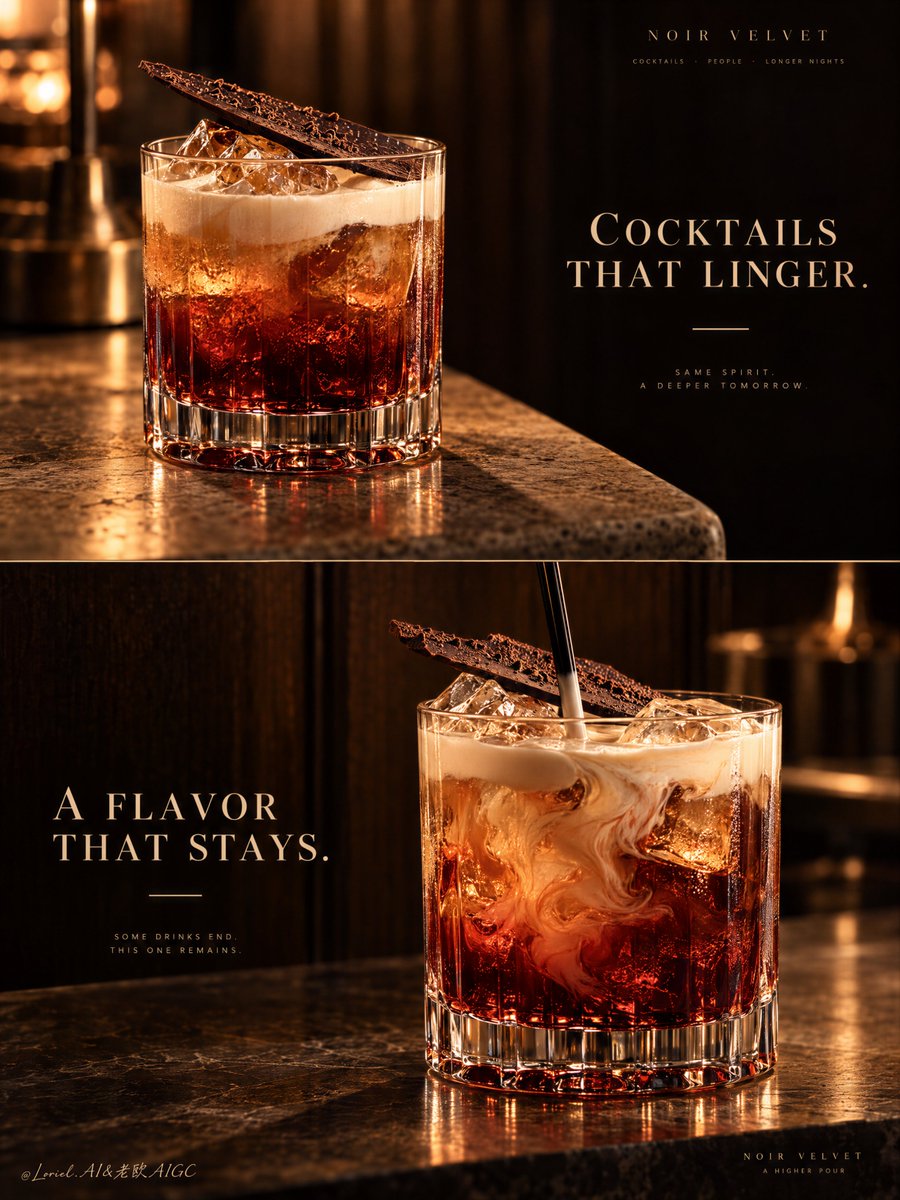
两格饮品广告只有当第二张图改变瞬间而非改变身份时,才真正构成一个系统。
分享链接 · https://openimages.ajiang.me/p/2106056498120179716/
camera_lens · shallow-depth-of-fieldcolor_palette · dark-moodycolor_palette · warm-tonescomposition · close-upcomposition · multi-panellighting · low-key
提示词(原文,逐字保留)
A two-panel drink campaign becomes a system when the second image changes the moment, not the identity.
🍫 repeat the same rocks glass, red-to-amber liquid body, pale cream top, and diagonal chocolate shard in both panels
The viewer recognizes one signature serve instantly. The campaign gains range without looking like two unrelated cocktails.
🌀 keep the upper panel still; reserve motion for the lower panel, where a black stirrer folds cream slowly into the amber-red drink
The contrast creates a visual sequence: first the object of desire, then the ritual of making it. The motion stays elegant because everything else remains controlled.
GPT- image 2.5 prompt👇
A premium cocktail campaign poster for fictional bar brand NOIR VELVET, merging emotional atmosphere, material precision, and curatorial restraint into one unified two-panel vertical advertising image. Preserve the exact luxury-drinks structure: two stacked horizontal panels, warm low-key bar atmosphere, dark wood and amber light language, one hero cocktail per panel, elegant text zones in negative space, and a strict campaign-wide product identity. Both cocktails must feel like the same brand family, bar program, and visual universe.
Top panel: a close three-quarter beauty shot of a short crystal rocks glass on a softly lit stone or travertine bar edge. The cocktail is the hero: deep garnet-red at the base, glowing amber through the middle, topped with soft pale cream foam, with clear ice catching warm highlights. A thin crisp chocolate shard or cocoa tuile rests diagonally on top as the unmistakable signature garnish. The glass is heavy, premium, and hyperreal, with thick base refraction, subtle condensation, and rich liquid glow. On the right side, keep a calm dark negative-space zone for elegant English typography such as “COCKTAILS THAT LINGER.” in refined serif capitals, with one thin accent line beneath. This panel should feel quieter, stiller, and more seductive.
Bottom panel: a second hero variation from the same drink family, larger and more front-facing, placed slightly right of center on a polished bar or stone surface against a deep dark wood backdrop. Keep the same short crystal glass, same red-to-amber body, same pale cream top note, and same chocolate garnish language. The liquid is shown in a fresh stirring moment, with cream folding into the amber-red body, visible ice, and a black stirrer descending from above. The motion should feel hypnotic but controlled, never messy. On the left side, preserve a clean text zone for a secondary English line such as “A FLAVOR THAT STAYS.” in the same typography system, with the same minimal accent.
This is a tightly controlled product-promotion image, so the drinks must dominate at all times. No human figures, cluttered props, random garnish drift, or extra fruit unless extremely restrained. The signature identity must stay absolute across both panels: same glassware family, color hierarchy, cream signature, chocolate accent, warm cinematic bar light, typography discipline, and editorial quietness. The result should feel like Orbit, Transit, and Port fused together: emotionally warm, materially exact, and elevated into a global luxury hospitality campaign.
Lighting is the key mood engine: warm directional amber key light from the upper side, soft fill preserving crystal, foam, and ice detail, deep brown-black background separation, glowing reflections through the red base, and smooth highlights on the cream and garnish. Color hierarchy: 60% dark espresso brown, black walnut, and shadowed bar tones, 30% garnet, burnt amber, and cognac-red liquid glow, 10% ivory foam and warm highlights. Materials must feel hyperreal and tactile: thick crystal glass, melting ice edges, silky cream foam, glossy liqueur body, delicate chocolate texture, polished stone, and dark timber depth.
Typography must be original, elegant, and integrated like luxury hospitality branding. Use English only. Keep it minimal, serif-led, widely spaced, and never touching the core recognition area of the drinks. If needed, place “NOIR VELVET” subtly in one corner or between the panels. The final result should feel like a Cannes-level cocktail poster: sensual, warm, product-dominant, graphically disciplined, globally polished, and unforgettable. No copied text, no messy splashes, no muddy shadows, no broken glass geometry, no cheap nightclub look, no clutter.
中文译文
两格饮品广告只有当第二张图改变瞬间而非改变身份时,才真正构成一个系统。
🍫 在两个画面中重复同一只洛克杯、同样的红转琥珀酒体、同样的浅色奶油顶饰,以及同一块对角摆放的巧克力片
观者一眼就能认出一个标志性的出品方式。广告在不显得像两款毫不相关的鸡尾酒的前提下,获得了更广的表达范围。
🌀 保持上面一格静止;将动态留给下面一格——黑色的搅拌棒缓缓将奶油折入琥珀红色的酒液中
这种对比构成了一个视觉序列:先是欲望的对象,再是调制它的仪式。动态保持优雅,因为其他一切都依然受控。
GPT- image 2.5 prompt👇
为虚构酒吧品牌 NOIR VELVET 设计的高级鸡尾酒广告海报,将情感氛围、材质精度和策展式克制融为一体,形成一幅统一的双格竖版广告图像。保留精确的奢华饮品结构:上下两块横向叠放的画面,温暖低调的酒吧氛围,深色木调和琥珀光语言,每格一位主角鸡尾酒,负空间中优雅的排版区,以及严格贯穿整个广告的产品识别。两款鸡尾酒必须让人感觉来自同一个品牌家族、同一套酒吧出品体系和同一个视觉宇宙。
上面一格:一只短款水晶洛克杯放在柔和打光的石材或洞石吧台边缘上,呈现近距离四分之三角度的精美特写。鸡尾酒是主角:底部为深石榴红,中段散发琥珀光辉,顶层覆以柔和的浅奶油泡沫,清澈的冰块捕捉着温暖的高光。一片纤薄清晰的巧克力片或可可薄脆以对角方式置于顶部,作为不可错认的标志性装饰。杯体厚重、奢华、超写实,具有厚实的杯底折射、细微的水珠凝结和浓郁的酒液光泽。在右侧保留一块宁静的深色负空间,用于放置优雅的英文字体,例如精致衬线大写字母组成的 “COCKTAILS THAT LINGER.”,下方配一条纤细的装饰线。此格应更安静、更静止、更具诱惑感。
下面一格:同一鸡尾酒家族的第二款主角变化,体积更大、更正面呈现,置于抛光的吧台或石材台面上,靠右略偏中心,背景为深邃的深色木墙。保持同一只短款水晶杯、同样的红转琥珀酒体、同样的浅奶油顶层风味语言,以及同样的巧克力装饰语言。酒液呈现全新的搅拌瞬间,奶油折入琥珀红色的酒体中,可见冰块,以及一根自上方垂落的黑色搅拌棒。动态应具有催眠感但又受控,绝不凌乱。在左侧保留一块干净的排版区,用于放置次要的英文文案,例如 “A FLAVOR THAT STAYS.”,沿用同一字体系统,并配以同样的极简装饰。
这是一张严格控制的产品推广图像,因此饮品必须始终占据主导。没有人形、杂乱的道具、随意的装饰漂移或额外的水果,除非极度克制。两个画面之间的标志识别必须绝对统一:同一套杯具家族、同一色彩层级、同样的奶油标志、同样的巧克力点缀、同样温暖的电影感酒吧光线、同样的排版纪律和编辑式的安静。最终结果应让人感觉像 Orbit、Transit 和 Port 三者融合:情感上温暖、材质上精确,并升华为一场全球奢华酒店餐饮级别的广告活动。
光线是核心情绪引擎:来自上方的温暖定向琥珀主光,柔和补光保留水晶、泡沫和冰块的细节,深褐黑色的背景分离感,透过红色酒底的发光反射,以及奶油和装饰上平滑的高光。色彩层级:60% 深浓缩咖啡棕、黑胡桃与阴影中的吧台色调,30% 石榴红、燃烧的琥珀与干邑红的酒液光辉,10% 象牙色泡沫与温暖高光。材质必须呈现超写实和触感:厚实的水晶玻璃、正在融化的冰块边缘、如丝的奶油泡沫、光泽的利口酒酒体、精致的巧克力质地、抛光的石材以及深色木材的纵深。
排版必须原创、优雅,并像奢华酒店餐饮品牌一样自然融入。仅使用英文。保持极简、以衬线为主、字距宽松,并且绝不触碰饮品的核心识别区域。如有需要,可在某一角落或两格之间低调地放置 “NOIR VELVET”。最终结果应像一张戛纳级别的鸡尾酒海报:感性、温暖、产品主导、画面克制、全球品质、令人难忘。不复制文字、不凌乱的飞溅、不浑浊的阴影、不破碎的玻璃几何、不廉价的夜店感、不杂乱。
来源与署名
原文由 @ou_zhen599 发布在 X:查看原推文。 本页逐字保留原文并提供机器翻译的中文解读;版权归原作者所有。
同工具的更多提示词
- 创作一张超写实电影级8K时尚人像,呈现出高端《Vogue》编辑大片的精致质感。 使用上传的人物作为准确的面部参考。严格保留她的身份特征与面部结构——不得改变她…@mehvishs25
- 东亚传统螺钿镶嵌艺术四联画,置于光面黑色漆底之上。4 块竖向面板呈现四季景象,每季各具独特色彩搭配,同时保持统一的艺术风格。浅浮雕 3D 效果,每一片贝壳元素…@churvikv
- 公牛之所以让人感觉是刻意设计的,是因为碰撞首先是以对称性来构建,其次才是象征意义。 🍷 两面镜像的酒杯,杯肚大小、倾斜角度、杯口高度、酒液水位以及距中心轴的距…@ou_zhen599
- 我需要修复提示词 超写实 IMAX 级 Netflix 风格电影感青橙色调室内人像,9:16 竖版。使用上传的角色参考表作为主要身份参考,并一致地保留她确切的…@imGopalTiwari
- 极简主义只有在材质效果开始之前轮廓就已无可误认时才真正奏效。 🍾 添加金色漆面之前,需先有正面香槟酒瓶造型:圆润的肩部、收窄的瓶颈、可辨识的瓶帽顶部 这样物体…@ou_zhen599
- 90年代中国生活影像 × 彩色胶片快照 × 主题:【XXX】 随机元素:随机场景、随机人物、随机服装、随机动作与表情、随机实验镜头与构图。 视觉关键词:旧公交…@DeepBlueX0