单色海报不需要更多颜色。它只需要一次足够强势的物质事件来制造对比。
分享链接 · https://openimages.ajiang.me/p/2106040919241937295/
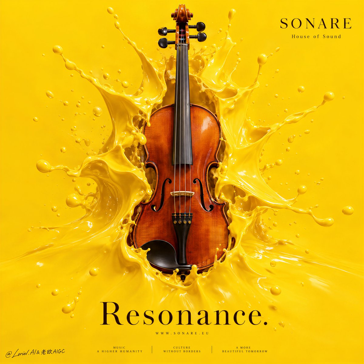
color_palette · vibrantcolor_palette · warm-tonescomposition · centeredlighting · studio-lightmood · luxuriousquality_flags · embedded-text
提示词(原文,逐字保留)
A monochrome poster does not need more colors. It needs one material event strong enough to create the contrast.
🟡 full-bleed saturated yellow field extending to every edge, with no border, frame, or secondary background color
This removes the escape hatch. The image becomes one total immersive environment, so the violin feels iconic rather than placed on a backdrop.
✨ thick lacquer-like yellow liquid torn open around the violin, with stretched membranes, tension lines, and droplets following the rupture outward
The splash becomes a controlled physical reaction to the instrument’s silhouette. You see “sound made visible” without losing the violin’s clean form.
GPT- image 2.5 prompt👇
A luxury cultural-poster advertisement for fictional music brand SONARE, merging emotional immersion, material precision, and curatorial minimalism into one unified full-bleed image. Preserve the exact immersion-poster structure: one uninterrupted field of saturated lacquered yellow filling the entire frame edge to edge, no border or inset, one central polished violin emerging through a violent rupture of thick yellow liquid, and extremely sparse typography placed with precision. The violin is the absolute visual leader.
Use a front-facing centered composition with strong negative space, calm vertical balance, and iconic object focus. The violin stands vertically in the center, partially submerged within the torn liquid opening, its silhouette sharply readable through the yellow rupture. The liquid behaves like dense satin lacquer or high-density paint: glossy, thick, elastic, with stretched membranes, splash crowns, torn sheets, suspended droplets, and clean tension lines radiating from the violin. The splash must feel physically convincing, sculptural, and controlled, never messy. The yellow runs full bleed to every edge.
The violin must be hyperreal and luxurious: warm varnished wood, rich reddish-brown body, subtle grain, ebony fingerboard, delicate strings, bridge, tailpiece, and polished chinrest, all lit with premium clarity. It reads as a refined cultural object and the source of a sensory detonation, as if sound has burst through the yellow surface.
The background is a single immersive yellow field, slightly modulated by soft light yet still graphic and clean. Yellow functions as both background and liquid world, turning the full frame into one total chromatic environment. The tone should feel like Orbit, Transit, and Port fused together: emotionally charged, materially exact, and elevated into a museum-grade cultural campaign.
Typography is extremely restrained. In the lower center, place one large elegant English headline such as “Resonance.” or “Immersion.” in a refined serif, calm, widely spaced, and integrated into the yellow field without touching the splash. In the upper right, place a minimal SONARE logo with one small descriptor such as “House of Sound” or “Contemporary Music Series”, aligned cleanly and kept secondary. If needed, add one tiny centered web line and two or three micro sponsor-style marks along the lower edge, crisp and visually quiet. All text is original, deep brown-black, clean, and never competes with the violin.
Lighting is premium and sculptural: soft frontal key light with subtle side modeling, clean highlights on the lacquer splash, delicate warm reflections on the violin varnish, and enough contrast to give volume without muddy shadows, black blotches, dirty buildup, or dead edges. Color hierarchy: 70% immersive saturated yellow, 20% warm violin wood and amber varnish tones, 10% deep brown-black text and instrument detail. Materials must feel hyperreal and tactile: thick lacquer paint, polished wood, taut strings, liquid stretch, suspended droplets, and premium print-finish smoothness.
The final result should feel like a Cannes-level cultural poster: full-bleed, iconic, immersive, object-focused, visually clean, emotionally powerful, and graphically unforgettable. No outer white border, no copied logo, no copied text, no warped violin anatomy, no broken strings, no muddy yellow, no chaotic splash clutter, no dirty edges, no unnecessary props.
中文译文
单色海报不需要更多颜色。它只需要一次足够强势的物质事件来制造对比。
🟡 满版饱和黄色色域延伸到每一条边缘,没有边框、画框或次要背景色
这去掉了逃避路径。画面成为一个完整的沉浸式环境,使小提琴显得具有标志性,而非被放置在某个底板上。
✨ 围绕小提琴撕裂开的浓稠漆状黄色液体,带有拉伸的膜、张力线,以及沿破裂向外飞溅的液滴
飞溅成为对小提琴轮廓的一种受控的物理反应。你看到"被看见的声音",同时不失去小提琴的干净形态。
GPT- image 2.5 prompt👇
为虚构音乐品牌 SONARE 打造的高端文化海报广告,将情感沉浸、物质精度与策展式极简主义融合为一张统一的满版图像。保持精确的沉浸式海报结构:一整片无中断的饱和漆面黄色充满整幅画面,边缘到边缘,无边框或内边;中央一把抛光的现代小提琴从浓稠黄色液体的剧烈爆裂中浮现;排版极为克制、精准放置。小提琴是绝对的视觉主导。
采用正面居中构图,带有强烈的负空间、沉稳的纵向平衡与标志性的物件焦点。小提琴垂直立于中央,部分浸没在撕裂的液体开口之内,其轮廓通过黄色破裂处清晰可读。液体的行为如同致密的缎面漆或高密度颜料:光泽、浓稠、富有弹性,带有拉伸的膜、飞溅冠、撕裂的薄片、悬浮的液滴,以及从琴体放射出的清晰张力线。飞溅必须感觉物理可信、雕塑感且受控,绝不凌乱。黄色满版延伸至每一条边缘。
小提琴必须超现实且奢华:温暖的漆木、浓郁的深红褐色琴身、细腻的银线纹理、乌木指板、精致的琴弦、琴桥、琴尾与抛光的下颌托,全部以顶级清晰度打光。它应被读作一件精致的文化物件,以及感官爆裂的源头,仿佛声音已冲破黄色表面。
背景是一片单一的沉浸式黄色色域,被柔光轻微调制,却仍保持图形化与洁净。黄色同时充当背景与液体世界,使整个画面成为一个完整的色彩总调。明调应感觉像 Orbit、Transit 与 Port 三者融合:情感充盈、物质精确,并提升至博物馆级别的文化活动。
排版极为克制。在下方中央放置一行优雅的大型英文标题,如"Resonance."或"Immersion.",采用精致的衬线体,沉稳、字距开阔,与黄色色域融为一体且不接触飞溅。在右上角放置一个极简的 SONARE logo,配以一行小描述如"House of Sound"或"Contemporary Music Series",对齐利落并保持次要地位。如有需要,可沿下边缘添加一行居中的极小网址行与两至三个微型的赞助商标记,清晰且视觉安静。所有文字均为原创的深棕黑色,干净,且绝不与小提琴争抢视觉。
打光为顶级且具雕塑感:柔和正面主光配以轻微的侧面建模,漆面飞溅处的干净高光,全身漆面反光的精致暖调反射,并有足够对比以呈现体积感,而不会出现浑浊阴影、黑色斑块、肮脏堆积或死边。色彩层次:70% 沉浸式饱和黄色,20% 暖调小提琴木材与琥珀漆面,10% 深棕黑色文字与乐器细节。材质必须感觉超现实且具触感:浓稠的漆面颜料、抛光木材、紧绷的琴弦、液体拉伸、悬浮液滴,以及高级印刷饰面般的平滑。
最终成果应感觉如同戛纳级别的文化海报:满版、标志性、沉浸、物件焦点、视觉洁净、情感强大、图形难忘。无外部白色边框,无抄袭 logo,无抄袭文字,无扭曲的小提琴解剖结构,无断裂的琴弦,无浑浊的黄色,无混乱的飞溅杂物,无肮脏边线,无多余道具。
来源与署名
原文由 @ou_zhen599 发布在 X:查看原推文。 本页逐字保留原文并提供机器翻译的中文解读;版权归原作者所有。
同工具的更多提示词
- 超写实 IMAX 级 Netflix 电影风格浪漫钢琴人像,9:16 竖版。以上传的图片作为主要视觉参考,精确保留面部身份、比例与标志性特征。画面中一对情侣亲…@imGopalTiwari
- 极简主义只有在材质效果开始之前轮廓就已无可误认时才真正奏效。 🍾 添加金色漆面之前,需先有正面香槟酒瓶造型:圆润的肩部、收窄的瓶颈、可辨识的瓶帽顶部 这样物体…@ou_zhen599
- 翻译以下源提示,用于阅读和搜索。请仅调用一次 translate_prompt。按原文保留 URL、JSON 键、命令标志、方括号、占位符、代码和参数值。不要…@Just_Anika_Here
- 公牛之所以让人感觉是刻意设计的,是因为碰撞首先是以对称性来构建,其次才是象征意义。 🍷 两面镜像的酒杯,杯肚大小、倾斜角度、杯口高度、酒液水位以及距中心轴的距…@ou_zhen599
- 超写实 IMAX 级 Netflix 风格电影感紫色霓虹夜景人像,9:16 竖版。以上传的图片作为主要视觉参考,精确保留面部身份、比例和标志性特征。塑造一位女…@imGopalTiwari
- 创作一张超写实电影级8K时尚人像,呈现出高端《Vogue》编辑大片的精致质感。 使用上传的人物作为准确的面部参考。严格保留她的身份特征与面部结构——不得改变她…@mehvishs25