丰富感并不意味每一个红色元素都要获得同等的对比度。
分享链接 · https://openimages.ajiang.me/p/2100968898325827759/
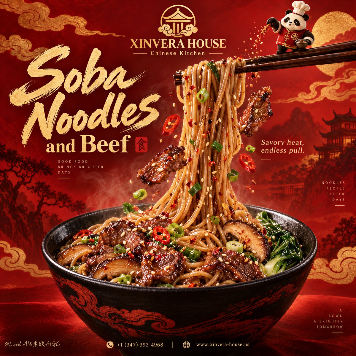
color_palette · warm-tonescomposition · centeredlighting · studio-lightmood · luxuriousquality_flags · embedded-textsubject_type · food-drink
提示词(原文,逐字保留)
Richness doesn’t mean every red element gets equal contrast.
🧧 layer deep crimson, vermilion, and ember-orange fields with low-contrast cloud-scroll and architectural silhouettes
The background feels deep and ceremonial, but it stays behind the food instead of turning into visual noise.
✨ reserve the brightest gold and strongest highlights for the dish title, glossy noodle lift, and lacquered beef
Your eye gets a clear route through the red: title first, noodles second, bowl third.
GPT- image 2.5 prompt👇
A hyper-real premium Asian noodle poster advertisement for a fictional restaurant brand called XINVERA HOUSE, designed as a flagship red-and-gold commercial key visual where product impact, series flexibility, and curated brand polish are fused into one unified composition. The absolute hero is a large black ceramic bowl of glossy beef soba noodles placed in the lower center, while a dramatic bundle of noodles is lifted vertically upward by dark wooden chopsticks near the upper right, creating the main force line of the poster. The lifted noodles must feel springy, weighted, silky, and richly seasoned, forming a strong visual cascade from the bowl into the upper brand zone.
The overall structure preserves a bold Chinese festive poster logic: a premium gold emblem and brand mark at the top center, a large expressive dish title on the upper left, the noodle lift traveling through the middle, a richly filled bowl grounding the bottom, and a tiny brand mascot near the chopsticks adding character without stealing focus. The red background should be built from layered tonal fields rather than flat color: deep crimson, vermilion, ember orange, and subtle cloud-scroll forms arranged in a more refined, graphic, flagship manner. The design must feel more controlled and more premium than a typical restaurant flyer, with clear hierarchy and broad breathing room.
Food design: the bowl contains premium soba noodles coated in a savory soy-chili glaze, mixed with caramelized beef slices, shiitake mushroom slices, bright scallions, red chili rings, leafy greens, sesame seeds, and a restrained dusting of spice. The beef should appear juicy, lacquered, tender, and slightly charred at the edges. The noodles must feel like the main appetite trigger, with believable strand tension, varied spacing, and natural clumping where gravity pulls them together. Around the lifted noodle stream, suspend a few highly controlled floating ingredients: one or two beef slices, a few chili rings, scallion rounds, sesame seeds, and tiny spice flecks. The bowl should be a matte-to-satin black ceramic vessel with elegant dark-red wave or brush motifs, rich and tactile but not overly ornate.
Brand system and series logic: this poster should feel like the master key visual for a food brand system that can later adapt to black pepper beef noodles, garlic soy ramen, spicy miso udon, or citrus chili soba without changing the fundamental composition. Build the current version as the strongest core edition: beef soba with red-gold heat and festive richness. At the top center place an elegant gold emblem with the brand name exactly: "XINVERA HOUSE". Beneath it place the descriptor exactly: "Chinese Kitchen". The tiny illustrated mascot stands on the chopsticks near the top right, sprinkling seasoning into the noodle lift. The mascot should be a clean, premium, simplified brand asset, charming and iconic, not childish.
Typography: all visible text in English only, art-directed and spatially integrated. Main dish headline on the upper left reads exactly: "Soba Noodles". Supporting line beneath it reads exactly: "and Beef". Add a small flavor descriptor near the lifted noodles reading exactly: "Savory heat, endless pull." At the bottom footer line add exactly: "+1 (347) 392-4968" and "https://t.co/5lqqumtnBZ". Typography should combine a luxurious brush-like script for the main dish name with a more refined high-contrast display style for secondary lines. The type must feel premium, energetic, and beautifully balanced with the bowl and noodle silhouette.
Lighting and color: warm premium commercial food lighting with a soft key from upper front-right, gentle fill from the left, clean specular highlights on the noodle strands, rich gloss on the beef, and controlled separation between the bowl and the red backdrop. Palette balance: 60% deep crimson, vermilion, and warm red-orange field; 30% soy-brown noodles, black ceramic, and golden beef glaze; 10% green scallions, pale sesame highlights, and chili-red punctuation. Increase contrast enough to give the noodles and bowl sculptural authority while keeping the background luxurious and clean.
Materials and finish: hyper-real food advertising photography fused with polished festive poster graphics. Show noodle gloss, lacquered beef texture, ceramic bowl sheen, mushroom moisture, sesame detail, faint steam warmth, and premium print-level finish. The image should feel like a Cannes-level restaurant flagship campaign: rich, bold, brandable, craveable, and elegant.
Output and constraints: premium noodle-brand poster, food-first hierarchy, no copied source text, no real brand names, no real people, no cluttered props, no extra tableware, no messy particles. Keep noodle geometry natural, beef slices believable, bowl perspective correct, floating garnishes restrained, mascot simple and clean, typography crisp, and the red-gold system luxurious. Avoid malformed noodles, greasy muddy sauce, warped bowl shape, unreadable text, broken mascot anatomy, overbusy background graphics, AI gibberish text, dead shadows, and any drift away from high-end commercial food realism.
中文译文
丰富感并不意味每一个红色元素都要获得同等的对比度。
🧧 用低对比度的云纹和建筑剪影,分层铺设深红、朱红与余烬橙色色块
背景应当显得深沉而有仪式感,但始终退居食物之后,避免变成视觉噪音。
✨ 将最亮的金色与最强的高光留给菜品标题、富有光泽的挑面与漆亮牛肉
视线在红色中拥有清晰的行进路线:先看标题,再看面条,最后落到碗。
GPT- image 2.5 prompt👇
一张超写实的亚洲高端面条海报广告,为虚构餐饮品牌 XINVERA HOUSE 设计,作为红金配色的旗舰商业主视觉,将产品冲击力、系列延展性与精心打磨的品牌质感融合为统一的整体构图。绝对主角是置于画面下方中央的一只大型黑陶碗,盛着油润发亮的牛肉荞麦面;同时在画面右上方,深色木筷将一束面条垂直向上挑起,形成海报的主牵引线。挑起的面条必须呈现弹韧、坠手、丝滑、浓郁入味的感觉,在视觉上形成从碗部向上方品牌区跃升的强烈瀑布。
整体结构延续大气中式节庆海报的逻辑:顶部中央为高端金色徽标与品牌字标,左上方为醒目而富有表现力的菜品大标题,挑面贯穿画面中部,下方以一只盛满食材的碗稳稳压住画面,筷子旁再以一只小巧的品牌吉祥物点缀,增添性格却不抢戏。红色背景应由层层叠叠的色调面构成,而非平涂:以更精致、更图形化、更旗舰感的方式,安排深红、朱红、余烬橙与隐约的云纹形态。整体设计应比一般餐厅传单更克制、更高级,层次清晰,留白充足。
食物设计:碗中盛有以咸鲜辣酱油挂汁的优质荞麦面,搭配焦糖化牛肉片、香菇片、鲜亮葱花、红辣椒圈、绿叶蔬菜、芝麻以及克制的香料细粉。牛肉应显得多汁、漆亮、柔嫩,边缘略带焦化。面条必须担当最核心的食欲触发器,拥有可信的线条张力、疏密变化,以及在重力作用下自然聚拢成束的形态。围绕挑起的面柱,悬浮若干高度克制的漂浮食材:一两片牛肉、少量辣椒圈、葱花圈、芝麻与极细的香料碎点。碗应为哑光至缎面质感的黑陶器皿,饰以雅致的暗红水波或笔触纹样,质感厚重却不显繁复。
品牌系统与系列逻辑:这张海报应像一套餐饮品牌体系的母版主视觉,日后可延展为黑椒牛肉面、蒜香酱油拉面、辣味味噌乌冬或柑橘辣椒荞麦面,而无需改变基础构图。当前版本作为最核心的旗舰款:红金热力、节庆丰盈的牛肉荞麦面。顶部中央放置一枚雅致的金色徽标,品牌名严格写作:"XINVERA HOUSE"。其下方副标题严格写作:"Chinese Kitchen"。小巧的插画吉祥物立于右上方筷子之上,向挑面中撒入调味料。吉祥物应作为干净、高级、简化的品牌资产,讨喜而具标志性,绝不幼稚。
字体规范:所有可见文字仅使用英文,经艺术指导并与画面空间融为一体。左上方主菜品大标题严格写作:"Soba Noodles"。其下辅助行严格写作:"and Beef"。在挑面附近加入一句小巧风味描述,严格写作:"Savory heat, endless pull."。底部页脚行严格加入:"+1 (347) 392-4968" 与 "https://t.co/5lqqumtnBZ"。字体应将奢华的毛笔式手写体用于主菜品名,辅助行则采用更精致的高对比展示字体。字体气质需呈现高级、充满活力、与碗及面条剪影之间构图平衡。
光影与色彩:温暖而高级的商业美食灯光,主光从右前上方柔光打下,左侧辅以温和补光,面条线条呈现干净的高光,牛肉富有润泽的光泽,碗与红色背景之间形成克制的分离感。配色比例:60% 深红、朱红与暖红橙色面;30% 酱油棕面条、黑陶与金色牛肉酱光;10% 翠绿葱花、淡色芝麻高光与辣椒红点状提色。需提高对比,使面条与碗具有雕塑般的分量,同时保持背景的奢华与干净。
材质与质感:超写实美食广告摄影与精致的节庆海报图形语言相融合。表现面条的光泽、漆亮牛肉的质感、陶碗的釉光、香菇的水分、芝麻的细节、若有若无的热气,以及高端印刷级完成度。画面应如同戛纳级别的餐厅旗舰大片:浓郁、大气、可品牌化、诱人、雅致。
输出与限制:高端面条品牌海报,食物优先的层级,不使用任何抄袭的源文本、不出现真实品牌名、不出现真人、不堆砌杂乱的道具、不增加多余餐具、不撒放凌乱的颗粒。面条线条保持自然,牛肉片可信,碗的透视正确,悬浮的点缀克制,吉祥物简洁干净,字体清晰,红金体系奢华。规避扭曲的面条、油腻浑浊的酱汁、变形的碗型、不可辨识的文字、吉祥物比例崩坏、过于繁杂的背景图形、AI 乱码文字、死黑阴影,以及任何偏离高端商业美食写实风格的表现。
来源与署名
原文由 @ou_zhen599 发布在 X:查看原推文。 本页逐字保留原文并提供机器翻译的中文解读;版权归原作者所有。
同工具的更多提示词
- 两张食物卡片不等于一场 campaign(营销战役)。可复用的视觉语法才算。 🪿 两张超大、倾斜的白色帖子卡片,使用同一账号名(handle),减少界面元素…@ou_zhen599
- 超写实 IMAX 级 Netflix 风格电影感人像,9:16 竖构图。以上传的图片作为主要视觉参考,并保留整体构图与自然比例。打造一对美丽的恋人,紧紧相依坐…@imGopalTiwari
- 一个照片级真实感的庭院。一个双足机器人,白色聚合物材质,头部是食火鸡那样的骨质头盔,呈电光蓝色,并配有红色的肉垂,看起来栩栩如生。一只真实的狗试图与机器人的腿…@TraffAlex
- 这是一条由寂静与光芒交织而成的道路,延伸至夜色深处 创建于 @gmi_cloud model: GPT Image 2 GPT Image 2.5 Sunbu…@churvikv
- 一个照片般逼真的屋顶泳池,正午时分。水面上漂浮着大量的柑橘类水果切半——橙子、青柠、西柚——一位身着黑衣的女子站在泳池边缘,双脚浸在水果中。强烈的阳光,折射的…@TraffAlex
- 悉尼歌剧院,丝网印刷机刚出炉 GPT Image 2.5 STACK ────────────────────────────────────────────…@sebatheepan