两张食物卡片不等于一场 campaign(营销战役)。可复用的视觉语法才算。
分享链接 · https://openimages.ajiang.me/p/2100968570406748433/
color_palette · high-contrastcolor_palette · warm-tonescomposition · dynamic-diagonallighting · studio-lightquality_flags · embedded-textquality_flags · multi-panel-layout
提示词(原文,逐字保留)
Two food cards don’t make a campaign. A repeated visual grammar does.
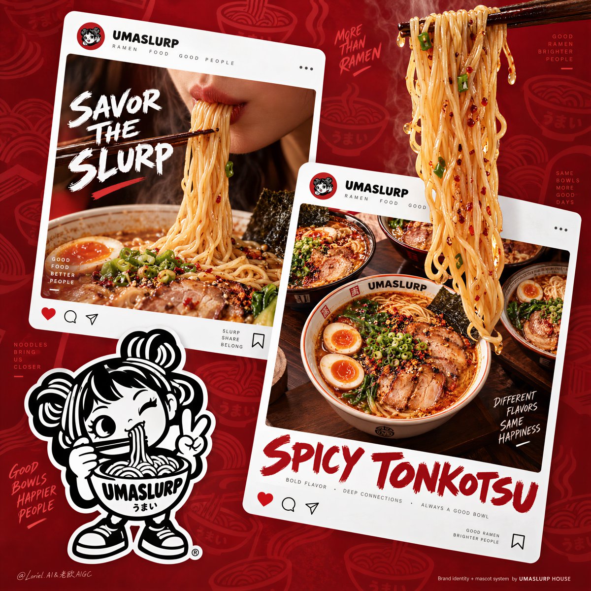
🪿 two oversized tilted white post cards using the same handle, reduced interface cues, and distinct food crops
One card sells the slurp; the other sells the bowl. Together, they feel like editions of one system.
✨ a single glossy noodle bundle breaking out from the upper-right edge, outside both cards
This stops the layout from reading like a flat feed. The food crosses into the poster’s real space and becomes the hero.
GPT- image 2.5 prompt👇
A hyper-real premium ramen brand poster for a fictional restaurant concept called UMASLURP, designed in an Orbit-plus-Transit-plus-Port direction where the original red campaign logic remains intact, the food impact becomes stronger, the system is easy to expand into multiple flavor editions, and the overall graphic language is cleaner and more flagship-level. The composition is built on a saturated deep-crimson background with a subtle tonal pattern of ramen bowls, steam swirls, and noodle motifs. Two oversized tilted white social-post cards dominate the middle field, one large suspended noodle lift breaks out from the top-right edge into real space, and a bold monochrome mascot sticker anchors the lower left. The ramen remains the absolute hero, while the poster reads as a fully formed brand world.
Framing and composition: vertical poster layout with strong diagonal pacing. The upper-left social card shows a close-up slurp moment: a partial lower-face crop interacting with lifted noodles, intimate and craveable. The right-center social card shows multiple ramen bowls from an overhead sharing angle, giving the campaign a social, repeatable product system. From the upper-right edge of the poster, outside both cards, a bundle of glossy noodles hangs downward from dark wooden chopsticks, breaking the card boundary and acting as the main vertical tension line. The lower-left mascot sticker overlaps the card and background plane like a collectible brand asset. Preserve the original structure exactly, but make the cards cleaner, the spacing sharper, and the overall hierarchy more controlled.
Food design: the noodles must be thin, springy, premium, and lustrous, with a warm golden-beige tone, light broth sheen, and believable weight. The right-side bowls should present a rich flagship ramen flavor system that can flex across editions: in this main version, use a spicy tonkotsu-style profile with amber-red broth, tender pork slices, halved eggs, scallions, greens, and restrained garnish. In the left slurp card, the lifted noodles should catch highlights beautifully and feel immediate, hot, and delicious. The entire food language should be series-ready so the same poster system can later adapt to black garlic, miso butter, or citrus-spicy variants without changing the core structure.
Brand system: the poster introduces a fictional ramen identity with a collectible mascot and social-first visual language. Use the handle exactly: "UMASLURP". The background pattern stays subtle and tonal, more like branded wallpaper than decoration. The mascot sticker is a bold black-and-white cartoon noodle character with a ramen-bowl body, stylized noodle hair-buns, one hand lifting noodles to the mouth, the other making a peace sign. The sticker must feel iconic, die-cut, highly brandable, and simple enough to work as packaging, signage, and social avatar. It supports the campaign but never outranks the food.
Typography and card content: all visible text in English only, art-directed and integrated into the cards. On the left card, the handle line reads exactly: "UMASLURP". The main headline reads exactly: "SAVOR THE SLURP". On the right card, the handle line also reads exactly: "UMASLURP". The main headline reads exactly: "SPICY TONKOTSU". At the lower right of the poster, add a small clean footer line reading exactly: "Brand identity + mascot system by UMASLURP HOUSE". Typography should feel playful, custom, slightly hand-shaped, and brand-owned, with a clean sans-serif support layer. Keep the UI reduced: only enough social cues to read as a branded post, not a literal app screenshot.
Lighting and color: warm premium food lighting with soft highlights on noodles, broth, eggs, and pork, contrasted against the deep red ground and crisp white cards. Palette balance: 60% deep crimson and campaign red, 30% noodle gold, broth amber, pork warmth, and bowl neutrals, 10% black-and-white mascot contrast plus tiny green garnish accents. Increase the contrast between the white cards and red background, and give the suspended noodle bundle a stronger gloss and silhouette so it becomes a true hero-breakout element.
Materials and finish: hyper-real food advertising photography fused with polished brand-poster graphics. Show glossy noodle strands, ceramic bowl shine, soft broth reflectivity, realistic egg texture, crisp pork detail, printed paper-card texture, clean sticker-cut mascot edges, and high-end poster finish. The final result should feel like a Cannes-level ramen launch campaign: young, memorable, systemized, and visually addictive.
Output and constraints: premium food-brand poster, ramen-first hierarchy, no copied source text, no real platform names, no real brand names, no cluttered extra props, no chaotic layout. Keep noodle geometry natural, bowls proportionally correct, food texture realistic, mascot readable, text crisp, and the red palette controlled and luxurious. Avoid malformed noodles, warped bowls, greasy muddy broth, unreadable card text, random hand artifacts, plastic-looking eggs, broken mascot anatomy, excessive UI clutter, AI gibberish text, dead shadows, or drift away from high-end commercial food realism.
中文译文
两张食物卡片不等于一场 campaign(营销战役)。可复用的视觉语法才算。
🪿 两张超大、倾斜的白色帖子卡片,使用同一账号名(handle),减少界面元素,呈现截然不同的食物裁切
一张卡片卖的是“嗦”的动作,另一张卖的是碗本身。两者合在一起,让人感觉是同一套系统的不同版本。
✨ 一束光泽感十足的面条从右上边缘突破而出,位于两张卡片之外
这避免了画面看起来像一条扁平的信息流。食物跨越到海报的真实空间里,成为主角。
GPT-图像 2.5 提示词👇
为一家名为 UMASLURP 的虚构餐厅概念设计一张超写实、高端拉面品牌海报,采用 Orbit+Transit+Port 方向,让原本的红色 campaign 逻辑保持完整、食物冲击感更强、系统易于扩展为多种口味版本,整体图形语言更干净、更具旗舰感。画面以饱和的深绯红背景打底,其上带有由拉面碗、热气漩涡与面条纹样构成的细微同色调图案。画面中央由两张超大、倾斜的白色社交帖子卡片主导,右上边缘有一大束悬空的面条挑起、突入真实空间,左下角以一枚醒目的单色吉祥物贴纸作锚点。拉面始终是绝对主角,海报整体读起来像一个完整成型的品牌世界。
构图与版式:竖版海报版式,对角线节奏强烈。左上方的社交卡片呈现一个“嗦面”特写瞬间:截取下半张脸与挑起的面条互动,亲密而诱人。右中位置的社交卡片则从俯视的共享角度展示多碗拉面,让 campaign 具备社交化、可重复延展的产品体系。在海报右上边缘、位于两张卡片之外的位置,一束光泽感十足的面条从深色木筷上垂下,突破卡片边界,构成主要的纵向张力线。左下角的吉祥物贴纸与卡片及背景平面交叠,如同可收藏的品牌资产。需在严格保留原始结构的基础上,让卡片更整洁、留白更利落、整体层级更克制。
食物设计:面条必须纤细、Q弹、高端、有光泽,呈温暖的金米色调,带有清亮的汤汁光泽与可信的重量感。右侧碗组应呈现一套丰富、可拓展的旗舰拉面口味体系,以适配不同版本:在本主版本中,使用一款辣味豚骨风格——琥珀红汤、嫩猪肉片、对半切开的溏心蛋、葱花、青菜、克制的点缀。左侧“嗦面”卡片中的挑起面条应漂亮地捕获高光,让人感觉即刻、滚烫、味美。整套食物语言需具备系列延展性,让同一海报系统日后可在不改变核心结构的前提下,灵活适配黑蒜、味噌黄油或柑橘辣等变体。
品牌系统:海报介绍一款具备收藏感吉祥物与社交优先视觉语言的虚构拉面身份。账号名(handle)需严格使用:"UMASLURP"。背景图案保持微妙、同色调,更像品牌墙纸而非装饰。吉祥物贴纸为一个醒目的黑白卡通面条角色:身体是一只拉面碗,头部有风格化的面条发髻,一只手将面条举到嘴边,另一只手比出剪刀手(peace sign)。贴纸须具备辨识度强、模切感、品牌化程度高、简洁到足以用于包装、招牌与社交头像。它服务于 campaign,但绝不凌驾于食物之上。
字体与卡片内容:所有可见文字仅使用英文,需艺术指导并融入卡片之中。左侧卡片上,账号名一行严格写作:"UMASLURP"。主标题严格写作:"SAVOR THE SLURP"。右侧卡片上,账号名一行同样严格写作:"UMASLURP"。主标题严格写作:"SPICY TONKOTSU"。在海报右下角,加一行干净小巧的页脚,严格写作:"Brand identity + mascot system by UMASLURP HOUSE"。字体应感觉俏皮、定制、略带手绘感并属于品牌自有字体,搭配一套干净的无衬线辅助字体。UI 元素需做减法:仅保留足以读出“品牌帖子”感的社交提示,避免做成一个写实 App 截图。
光影与色彩:温暖的高端食物打光,面条、汤汁、鸡蛋与猪肉上带柔和高光,与深红底色及利落白色卡片形成对比。配色比例:60% 深绯红与 campaign 红,30% 面条金、汤汁琥珀、猪肉暖色与碗器中性色,10% 黑白吉祥物对比色加上零星的绿色点缀。需进一步拉大白卡片与红背景之间的对比,并让悬空的那束面条具有更强的光泽与剪影,使其成为真正的“主角突围”元素。
材质与工艺:超写实的食物广告摄影与精致的品牌海报图形融合呈现。需展现光泽的面条丝、陶瓷碗器的反光、柔和的汤汁反光、真实的蛋体纹理、清脆的猪肉细节、印刷纸张卡片的纹理、干净模切的吉祥物边缘,以及高端海报的质感。整体成品应如同一场戛纳级别的拉面发布 campaign:年轻、有记忆点、系统化、视觉上令人上瘾。
输出与限制:高端食物品牌海报,拉面优先的层级,无抄袭的源文本,无真实平台名,无真实品牌名,无杂乱的多余道具,无混乱的版式。保持面条形态自然、碗器比例正确、食物质感真实、吉祥物易读、文字清晰、红色调受控且奢华。需避免面条畸形、碗器扭曲、汤汁油腻浑浊、卡片文字不可读、随机的手部瑕疵、塑料感的鸡蛋、吉祥物结构错乱、过多 UI 元素、AI 乱码文字、呆板的阴影,或偏离高端商业食物写实风格。
来源与署名
原文由 @ou_zhen599 发布在 X:查看原推文。 本页逐字保留原文并提供机器翻译的中文解读;版权归原作者所有。
同工具的更多提示词
- 一个照片级真实感的庭院。一个双足机器人,白色聚合物材质,头部是食火鸡那样的骨质头盔,呈电光蓝色,并配有红色的肉垂,看起来栩栩如生。一只真实的狗试图与机器人的腿…@TraffAlex
- 丰富感并不意味每一个红色元素都要获得同等的对比度。 🧧 用低对比度的云纹和建筑剪影,分层铺设深红、朱红与余烬橙色色块 背景应当显得深沉而有仪式感,但始终退居食…@ou_zhen599
- 一个照片般逼真的屋顶泳池,正午时分。水面上漂浮着大量的柑橘类水果切半——橙子、青柠、西柚——一位身着黑衣的女子站在泳池边缘,双脚浸在水果中。强烈的阳光,折射的…@TraffAlex
- 超写实 IMAX 级 Netflix 风格电影感人像,9:16 竖构图。以上传的图片作为主要视觉参考,并保留整体构图与自然比例。打造一对美丽的恋人,紧紧相依坐…@imGopalTiwari
- GPT image 2.5 on chatGpt 提示 👇 以上传的图片作为主要参考。准确保留参考图的整体构图、主体位置、姿态、比例、镜头角度以及视觉叙事…@MahnoorAi12
- 这是一条由寂静与光芒交织而成的道路,延伸至夜色深处 创建于 @gmi_cloud model: GPT Image 2 GPT Image 2.5 Sunbu…@churvikv