悉尼歌剧院,丝网印刷机刚出炉
分享链接 · https://openimages.ajiang.me/p/2101034408253837454/
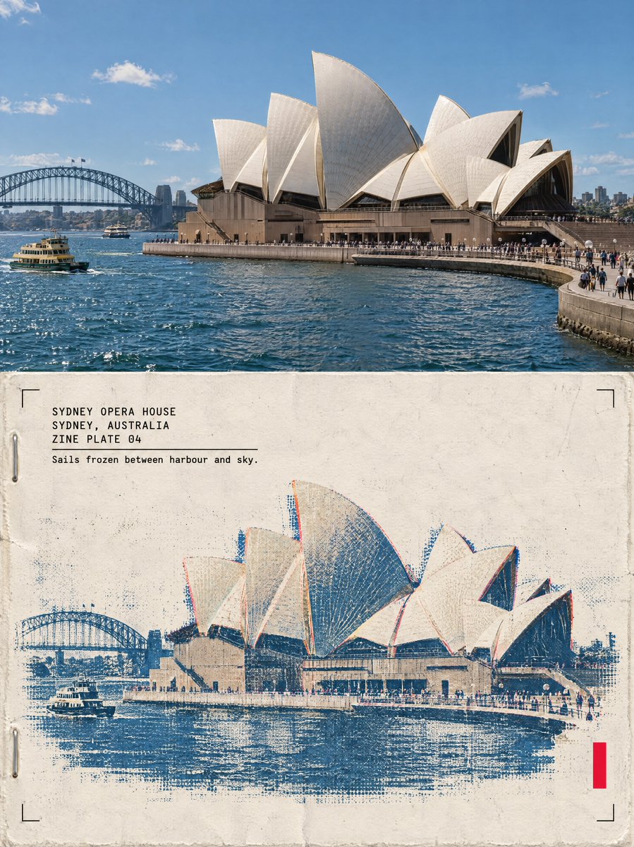
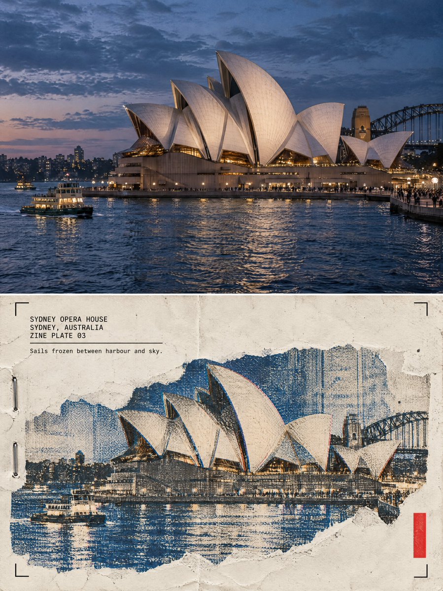
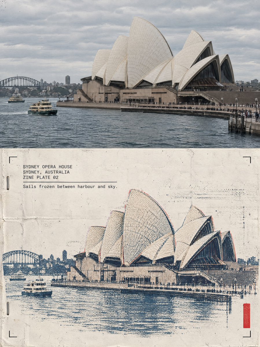
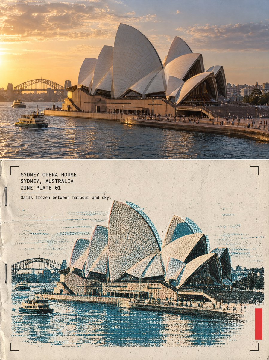
color_palette · mutedcomposition · multi-panelcomposition · wide-shotlighting · natural-daylightquality_flags · embedded-textquality_flags · multi-panel-layout
提示词(原文,逐字保留)
Sydney Opera House, hot off the risograph
GPT Image 2.5
STACK
──────────────────────────────────────────────
Model: GPT Image 2.5 · variant: sunburst · quality: high · resolution: 4K · aspect: 3:4
One poster per structure — never merge two structures into one frame.
If you supply a real photo, put it in the TOP HALF role: the prompt preserves it faithfully.
To reuse: replace {STRUCTURE DESCRIPTION}, {NAME}, {CITY, COUNTRY} and {CAPTION}. Keep every other line unchanged.
─────────────────────
MASTER PROMPT
─────────────────────────
One poster, 3:4 vertical canvas. Split into two roughly equal zones — a realistic photograph on top, a printed reconstruction below — divided by one clean sharp horizontal line. The structure must not be stretched, warped, tilted or repositioned unnaturally.
TOP HALF — THE REAL SHOT
{STRUCTURE DESCRIPTION}. {PLATE LIGHT}. Preserve the structure faithfully: same architecture, proportions, perspective, distinctive details, natural light and shadow. Add only a subtle high-end color grade and the faintest film grain. Never redesign or reinterpret the architecture.
BOTTOM HALF — THE PRINTED RECONSTRUCTION
Rebuild the same structure as a two-color risograph zine print: bold flat spot-color shapes (one deep ink layer plus the structure's muted colors as a second spot layer), visible misregistration offsets between the layers, drum streaks, coarse layered ink-grain, halftone texture from overlapping dots, a zine masthead bar, two staple marks and paste-up edges. The photograph dissolves outward into flat spot-color shapes, misaligned layers and grainy ink. The structure must remain immediately recognizable. {PLATE DENSITY}.
Texture: cheap zine paper, layered soy ink, misregistration, drum streaks, folded-edge wear, cut-and-paste edges, restrained crop marks, one small fluorescent red calibration bar. Color: cream zine paper, black ink, one deep spot color, the structure's original muted colors, a single fluorescent red accent. Never fully desaturate the structure.
The structure occupies roughly 60-88% of the frame width. Leave 22-38% of the paper visibly untouched and empty — generous negative space so the poster reads as an archival specimen, not a packed screen.
TYPOGRAPHY — a clean fixed-width architectural title block, pinned top-left at a small fixed inset, black ink, monospaced technical typeface, verbatim, each line in caps:
"{NAME}"
"{CITY, COUNTRY}"
"ZINE PLATE 0N"
A thin horizontal rule under the third line, then one short observational caption verbatim:
"{CAPTION}"
A solid vertical red rectangle — the only red in the poster — is pinned to the bottom-right corner zone about 12% from the bottom and right edges. Four thin black crop marks sit in the four corners of the bottom half at identical insets. Red bar, crop marks and text block keep exactly the same position and size relative to the frame.
MOOD: underground zine crossed with an architecture fanzine — young, tactile, collectible. Sophisticated, minimal, tactile, intellectual, slightly mysterious, highly collectible.
AVOID: solid black terminal backgrounds, dense walls of code, cyberpunk neon, excessive decorative glyphs, distorted architecture, impossible geometry, invented architectural details, fake technical specifications, random meaningless symbols, garbled text, extra colors, brand logos, QR codes, watermarks, author credits, tourist-poster clichés.
Priority: preserve the structure's identity and architectural accuracy first. The experimental print treatment enhances the architecture, never hides it.
──────────────────────────────────────────────
THE FOUR VARIATIONS (one axis change per plate)
──────────────────────────────────────────────
PLATE 01 — DENSE · light: "Golden-hour sunlight with long warm shadows" · density: "The print treatment is at its densest and richest: layered marks, full system detail"
PLATE 02 — LINEWORK · light: "Soft overcast daylight, muted flat tones" · density: "The print is linework-forward: thin drafting lines and technical geometry dominate the reconstruction"
PLATE 03 — FRAGMENT · light: "Blue-hour dusk with cool tones, the shells glowing warm against the dusk" · density: "The print is fragment-forward: torn photographic fragments dominate, with fewer system marks around them"
PLATE 04 — MINIMAL · light: "Bright midday sunlight with crisp shadows" · density: "The print is the minimal plate of the set: sparse marks, maximum untouched paper"
中文译文
悉尼歌剧院,丝网印刷机刚出炉
GPT Image 2.5
STACK
──────────────────────────────────────────────
Model: GPT Image 2.5 · variant: sunburst · quality: high · resolution: 4K · aspect: 3:4
One poster per structure — never merge two structures into one frame.
If you supply a real photo, put it in the TOP HALF role: the prompt preserves it faithfully.
To reuse: replace {STRUCTURE DESCRIPTION}, {NAME}, {CITY, COUNTRY} and {CAPTION}. Keep every other line unchanged.
─────────────────────
MASTER PROMPT
─────────────────────────
One poster, 3:4 vertical canvas. Split into two roughly equal zones — a realistic photograph on top, a printed reconstruction below — divided by one clean sharp horizontal line. The structure must not be stretched, warped, tilted or repositioned unnaturally.
TOP HALF — THE REAL SHOT
{STRUCTURE DESCRIPTION}. {PLATE LIGHT}. Preserve the structure faithfully: same architecture, proportions, perspective, distinctive details, natural light and shadow. Add only a subtle high-end color grade and the faintest film grain. Never redesign or reinterpret the architecture.
BOTTOM HALF — THE PRINTED RECONSTRUCTION
Rebuild the same structure as a two-color risograph zine print: bold flat spot-color shapes (one deep ink layer plus the structure's muted colors as a second spot layer), visible misregistration offsets between the layers, drum streaks, coarse layered ink-grain, halftone texture from overlapping dots, a zine masthead bar, two staple marks and paste-up edges. The photograph dissolves outward into flat spot-color shapes, misaligned layers and grainy ink. The structure must remain immediately recognizable. {PLATE DENSITY}.
Texture: cheap zine paper, layered soy ink, misregistration, drum streaks, folded-edge wear, cut-and-paste edges, restrained crop marks, one small fluorescent red calibration bar. Color: cream zine paper, black ink, one deep spot color, the structure's original muted colors, a single fluorescent red accent. Never fully desaturate the structure.
The structure occupies roughly 60-88% of the frame width. Leave 22-38% of the paper visibly untouched and empty — generous negative space so the poster reads as an archival specimen, not a packed screen.
TYPOGRAPHY — a clean fixed-width architectural title block, pinned top-left at a small fixed inset, black ink, monospaced technical typeface, verbatim, each line in caps:
"{NAME}"
"{CITY, COUNTRY}"
"ZINE PLATE 0N"
A thin horizontal rule under the third line, then one short observational caption verbatim:
"{CAPTION}"
A solid vertical red rectangle — the only red in the poster — is pinned to the bottom-right corner zone about 12% from the bottom and right edges. Four thin black crop marks sit in the four corners of the bottom half at identical insets. Red bar, crop marks and text block keep exactly the same position and size relative to the frame.
MOOD: underground zine crossed with an architecture fanzine — young, tactile, collectible. Sophisticated, minimal, tactile, intellectual, slightly mysterious, highly collectible.
AVOID: solid black terminal backgrounds, dense walls of code, cyberpunk neon, excessive decorative glyphs, distorted architecture, impossible geometry, invented architectural details, fake technical specifications, random meaningless symbols, garbled text, extra colors, brand logos, QR codes, watermarks, author credits, tourist-poster clichés.
Priority: preserve the structure's identity and architectural accuracy first. The experimental print treatment enhances the architecture, never hides it.
──────────────────────────────────────────────
THE FOUR VARIATIONS (one axis change per plate)
──────────────────────────────────────────────
PLATE 01 — DENSE · light: "Golden-hour sunlight with long warm shadows" · density: "The print treatment is at its densest and richest: layered marks, full system detail"
PLATE 02 — LINEWORK · light: "Soft overcast daylight, muted flat tones" · density: "The print is linework-forward: thin drafting lines and technical geometry dominate the reconstruction"
PLATE 03 — FRAGMENT · light: "Blue-hour dusk with cool tones, the shells glowing warm against the dusk" · density: "The print is fragment-forward: torn photographic fragments dominate, with fewer system marks around them"
PLATE 04 — MINIMAL · light: "Bright midday sunlight with crisp shadows" · density: "The print is the minimal plate of the set: sparse marks, maximum untouched paper"
来源与署名
原文由 @sebatheepan 发布在 X:查看原推文。 本页逐字保留原文并提供机器翻译的中文解读;版权归原作者所有。
同工具的更多提示词
- 这是一条由寂静与光芒交织而成的道路,延伸至夜色深处 创建于 @gmi_cloud model: GPT Image 2 GPT Image 2.5 Sunbu…@churvikv
- 超写实 IMAX 级 Netflix 风格电影感人像,9:16 竖版。请将上传的图片作为主要视觉参考,精确保留两位主体的面部身份、比例与显著特征。打造一对充满…@imGopalTiwari
- 超写实 IMAX 级 Netflix 风格电影感人像,9:16 竖构图。以上传的图片作为主要视觉参考,并保留整体构图与自然比例。打造一对美丽的恋人,紧紧相依坐…@imGopalTiwari
- 超写实 IMAX 级 Netflix 风格的电影感人像,9:16 竖版。请使用上传的图片作为主要视觉参考,精确保留面部身份、比例和标志性特征。画面中是一位美丽…@imGopalTiwari
- 丰富感并不意味每一个红色元素都要获得同等的对比度。 🧧 用低对比度的云纹和建筑剪影,分层铺设深红、朱红与余烬橙色色块 背景应当显得深沉而有仪式感,但始终退居食…@ou_zhen599
- 严格1:1保留参考对象的外貌特征:面部细节、年龄、眼睛颜色、头发与肤色,不做任何美化。 写实风格生活方式摄影,9:16 竖构图,在明亮现代的厨房中,取景框到大…@mehvishs25