最强的一招,是让每一个包装都能被读成一个食物符号,而不是仅仅是一组版面布局。
分享链接 · https://openimages.ajiang.me/p/2089674526007464364/
color_palette · high-contrastcolor_palette · vibrantcomposition · close-upcomposition · multi-panellighting · studio-lightmood · luxurious
提示词(原文,逐字保留)
The strongest move is making each pack readable as one food symbol, not just a package layout.
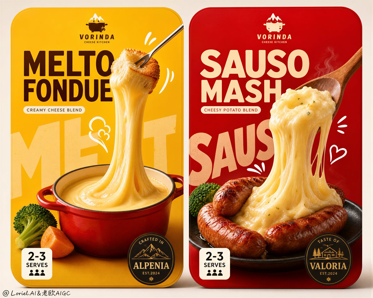
Left is “yellow + red pot + vertical cheese ribbon.” Right is “red + browned sausages + lifted creamy cheese mass.” That compression is what gives the pair shelf memory.
🧀 giant molten cheese pull as the central vertical product symbol
This gives the package instant appetite. The cheese is not a small garnish; it becomes the main shape, stretching from utensil to pot or plate with believable weight and gloss.
📦 two matching rounded-rectangle package fronts with different color fields and food heroes
This keeps the line extension clear. The branding system feels unified, but yellow signals fondue and red signals sausage mash before the viewer reads any text.
GPT- image 2 prompt👇
Create an ultra-premium dual-package food campaign key visual showing two side-by-side retail package fronts for a gourmet cheese product line, designed with stronger visual impact, sharper product-symbol memory, and a more international flagship FMCG aesthetic. Preserve the original structural logic exactly: two rounded-rectangle package panels placed next to each other on a clean neutral background, each package following the same branding system but built around a different hero food scene. The left package uses a powerful molten-cheese yellow field and centers on a fondue concept; the right package uses a rich heated red field and centers on a sausage-and-cheese mash concept. Both package fronts must feel bold, shelf-dominant, highly appetizing, instantly legible, and launch-ready for a world-class premium supermarket brand.
Push the impact strongly while also applying Transit and Port refinement: simplify the page, reduce unnecessary small information, make the food larger, make the cheese pull more dramatic, strengthen the color-block contrast, and compress each package into a few unforgettable super symbols. The left package should read immediately as “yellow field + red pot + giant molten cheese ribbon”; the right package should read immediately as “red field + browned sausages + lifted creamy cheese mass.” The image must feel cleaner, more expensive, and more iconic than an ordinary package mockup.
Left package: a vivid deep golden-yellow background with a small premium red fondue pot placed low-center, filled with glossy thick melted cheese. A slim fork lifts a bread cube high above the pot, creating an exaggerated but physically believable vertical cheese pull that stretches smoothly down into the pot like a sculptural ribbon. Add only a few supporting ingredients, such as one broccoli floret and one or two warm vegetable accents, kept tightly clustered so the composition remains clean. Behind the food, place oversized pale background typography as a graphic block, partially obscured by the cheese and pot. Add a few small white hand-drawn doodle marks near the fork and cheese pull to amplify heat and motion.
Right package: a rich premium red background with several browned sausages grouped near center-lower area on a dark plate. A wooden spoon lifts a dense creamy mound of cheese mashed potato upward, forming a heavy elastic flowing cheese mass that droops back toward the sausages with strong appetizing tension. Add only minimal green garnish like one or two broccoli accents to keep balance. Behind the food, place oversized pale background typography as a large compositional block, partially hidden by the spoon and cheese mass. Add a few restrained white doodle marks to reinforce warmth and deliciousness.
Typography and branding must feel like a highly polished Japanese-inspired FMCG packaging system, but use only newly invented wording and fictional branding. No copied text. Use a small brand mark at the top, one large bold main product name in the upper center, one compact subtitle, one small serving badge block near the lower left, and one dark round or oval taste-origin medallion near the lower right. Keep type bold, rounded, friendly, and shelf-powerful, but with cleaner spacing and more premium hierarchy than ordinary mass-market packaging.
Style: premium packaging design, realistic gourmet food photography, playful hand-drawn graphic integration, Japanese convenience-food sophistication, international flagship FMCG art direction, Cannes-level product branding. The hand-drawn style must be perfectly fused with the food and typography rather than feeling pasted on. Lighting should be soft frontal studio lighting with precise highlights on the cheese, subtle grounded shadows, excellent food volume, and crisp print-ready edges. Materials must feel highly edible and tactile: glossy molten cheese, soft bread texture, browned sausage skin, creamy mashed potato density, fresh broccoli surface, matte printed packaging, and clean flat background fields.
Color system: saturated cheese yellow, warm cream, vivid premium red, deep sausage brown, broccoli green, white doodle accents, dark medallions, and pale oversized background type. Strong hierarchy, strong appetite appeal, high contrast, clean negative space, and maximum retail recognition.
No copied brand names, no copied Japanese text, no watermark, no existing logos, no messy composition, no low-detail food, no broken cheese physics, no plastic-looking cheese, no random props, no dirty shadows, no black blotches, no overcrowded typography, no chaotic doodles, no weak shelf impact.
中文译文
最强的一招,是让每一个包装都能被读成一个食物符号,而不是仅仅是一组版面布局。
左侧是“黄底 + 红锅 + 垂直奶酪丝带”;右侧是“红底 + 焦褐香肠 + 提起的奶油奶酪团”。正是这种压缩感,让这对包装在货架上拥有记忆度。
🧀 以巨型融化奶酪拉丝作为中央垂直的产品符号
这让包装瞬间勾起食欲。奶酪不是小小的点缀,而是成为主体形态,从餐具一直延伸到锅或盘中,具有可信的重量感和光泽感。
📦 两个相匹配的圆角矩形包装正面,使用不同色彩区块和不同食物主角
这让产品线延伸清晰明了。品牌系统感觉统一,但黄色暗示芝士火锅,红色暗示香肠土豆泥,观看者甚至在阅读任何文字之前就能识别出来。
GPT- 图片 2 提示词👇
创作一幅超高端的双包装食品 Campaign 主视觉,展示一个美食奶酪产品系列的两个并排零售包装正面,设计具有更强的视觉冲击力、更锐利的产品符号记忆,以及更具国际旗舰 FMCG 美学。严格保留原始结构逻辑:两个圆角矩形包装面板并排放置在干净的中性背景上,每个包装遵循同一品牌系统,但围绕不同的主角食物场景构建。左侧包装使用强有力的融化奶酪黄色区块,中心围绕芝士火锅概念;右侧包装使用浓郁的加热红色区块,中心围绕香肠与奶酪土豆泥概念。两个包装正面都必须感觉大胆、货架主导、极度诱人、一目了然,并为世界级高端超市品牌做好上市准备。
强力提升冲击力的同时,应用 Transit 与 Port 精修:简化页面,减少不必要的小信息,把食物放大,把奶酪拉丝做得更戏剧化,加强色块对比度,并把每个包装压缩成几个令人难忘的超级符号。左侧包装应让人一眼读出“黄底 + 红锅 + 巨型融化奶酪丝带”;右侧包装应让人一眼读出“红底 + 焦褐香肠 + 提起的奶油奶酪团”。图像必须感觉比普通包装模型更干净、更昂贵、更具标志性。
左侧包装:鲜明深金黄色背景,置于中下部的小号高端红色芝士火锅锅,装满光泽浓郁融化奶酪。一把细长叉子将一块面包丁高高提起于锅上方,制造出夸张但物理可信的垂直奶酪拉丝,像雕塑般的丝带平滑地向下延伸到锅中。仅添加少量辅助食材,如一个西兰花小朵和一两处暖色蔬菜点缀,紧紧簇拥在一起,保持构图干净。在食物后方,放置超大的浅色背景字体作为图形块,部分被奶酪和锅遮挡。在叉子和奶酪拉丝附近添加几个小的白色手绘涂鸦标记,强化热度与动感。
右侧包装:浓郁高端红色背景,几个焦褐香肠聚集在中下部区域,放在一个深色盘子上。一把木勺将一团致密奶油状的奶酪土豆泥向上提起,形成沉重而富有弹性的流动奶酪块,垂坠地落回香肠方向,带有强烈诱人的张力。仅添加极少的绿色点缀,如一两个西兰花配菜以保持平衡。在食物后方,放置超大的浅色背景字体作为大型构图块,部分被勺子和奶酪团遮挡。添加几个克制的白色涂鸦标记,强化温暖与美味感。
字体与品牌必须感觉像一套高度精致的日式灵感 FMCG 包装系统,但仅使用全新发明的措辞和虚构品牌,不使用任何抄袭文字。在顶部使用一个小品牌标志,上中部一个大型粗体主产品名,一个紧凑的副标题,左下部附近一个小规格徽章块,右下部附近一个深色圆形或椭圆形产地风味徽章。字体保持粗体、圆润、友好、货架有力,但相比普通大众市场包装,间距更干净、层级更高端。
风格:高端包装设计、写实美食摄影、俏皮手绘图形融合、日式便利食品精致感、国际旗舰 FMCG 美术指导、Cannes 级别的产品品牌。手绘风格必须与食物和字体完美融合,而不是感觉贴上去的。光线使用柔和正面棚拍光线,奶酪上具备精确高光,微妙扎实的阴影,出色的食物体积感,印刷级别的清晰边缘。材质必须高度诱人可触:光泽融化奶酪、松软面包质地、焦褐香肠外皮、奶油土豆泥密度、新鲜西兰花表面、哑光印刷包装、干净平面背景区块。
色彩系统:饱和奶酪黄、暖奶油色、鲜艳高端红、深香肠褐、西兰花绿、白色涂鸦点缀、深色徽章、超大浅色背景字体。强烈层级,强烈食欲吸引力,高对比度,干净负空间,最大化零售识别度。
不抄袭品牌名、不抄袭日文文字、无水印、无既有标志、无杂乱构图、无低细节食物、无破裂的奶酪物理、无塑料感奶酪、无随机道具、无脏污阴影、无黑色斑块、无过度拥挤字体、无混乱涂鸦、无薄弱货架冲击力。
来源与署名
原文由 @ou_zhen599 发布在 X:查看原推文。 本页逐字保留原文并提供机器翻译的中文解读;版权归原作者所有。
同工具的更多提示词
- 这个版式之所以有效,是因为每个产品都搭配了一个图形工具,而不仅仅是彩色背景。 叉子、砍刀和勺子在承担销售任务:它们抬起香肠、固定牛排、托起谷物袋,使每个版面都…@ou_zhen599
- 创作一幅电影感十足、怀旧的金色时刻人像照:一位年轻女子站在黄昏时分的大型城市窗户或玻璃幕墙旁,身着休闲浅色上衣,肩上自然搭着一件粉色毛衣,背着双肩包。她有一头…@Taaruk_
- 一面纯净无瑕的白墙填满整个画面,仅被一扇完美居中、优雅的窗户打破构图。窗框仿佛直接雕刻在墙体之中,而郁郁葱葱的攀缘藤蔓以有机的方式在其周围交织缠绕,与数百朵精…@SheBuildsAI_
- 最强的一招,是把建筑做成情感意象,把展板做成证明体系。 塔楼在第一眼就完成说服。两侧的栏目与底部的图纸只需要以克制的方式支撑这种印象,而不是用同样的音量把一切…@ou_zhen599
- 里约热内卢基督救世主雕像的远景长镜头,雕像在壮丽满月的映衬下形成完美的剪影。月亮是一颗耀眼的金色球体,正好位于雕像的正后方,营造出雕像人物将天体高高举起的壮观…@im_shahid7
- 这张海报之所以有效,是因为它把同一个承诺呈现了两次:先以一张图纸呈现,再以一座已建成的空间呈现。 上半部分证明建筑是精确的,下半部分的渲染则让它令人向往。两者…@ou_zhen599