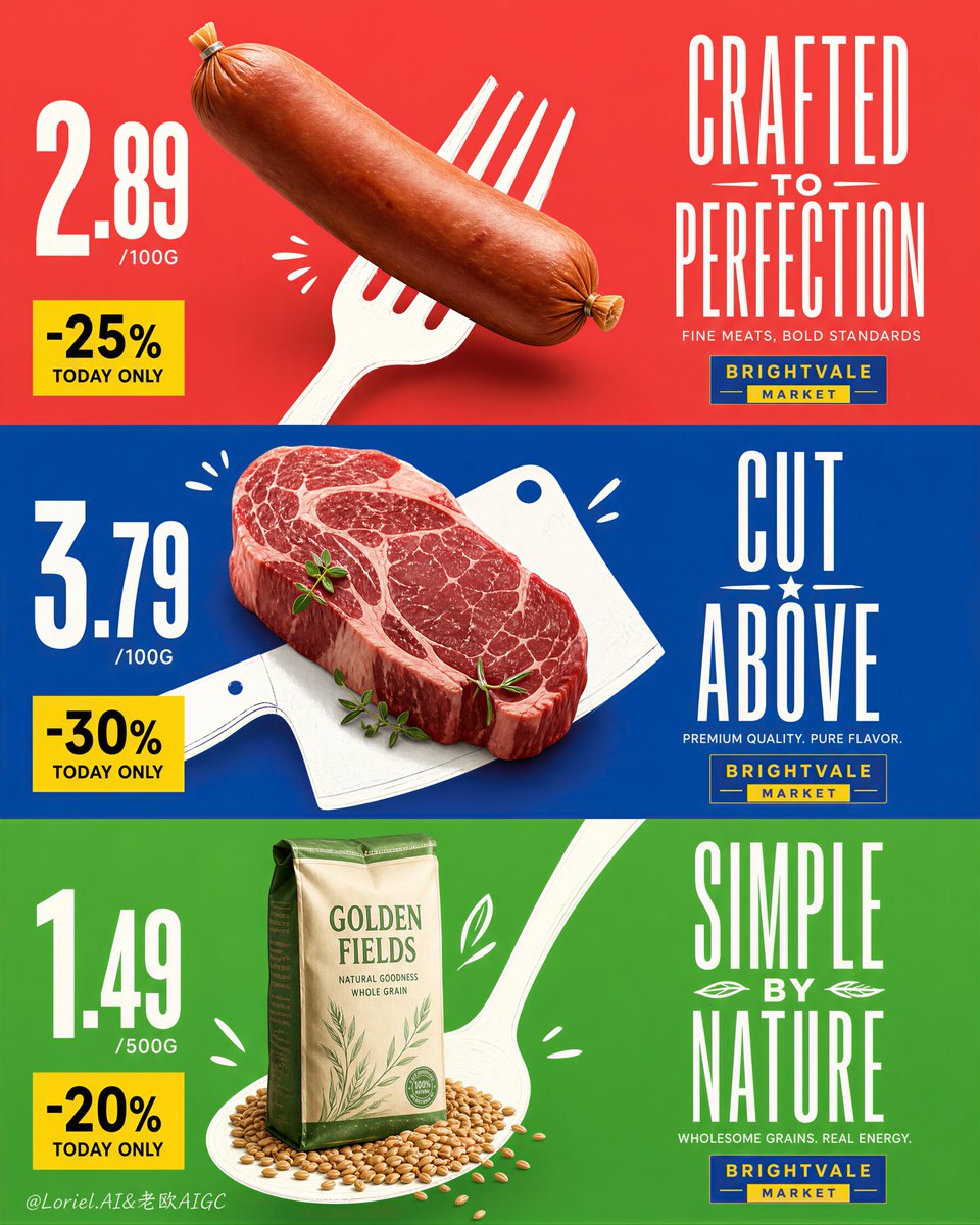
这个版式之所以有效,是因为每个产品都搭配了一个图形工具,而不仅仅是彩色背景。
分享链接 · https://openimages.ajiang.me/p/2089673971541434656/
color_palette · high-contrastcolor_palette · vibrantcomposition · multi-panelquality_flags · embedded-textquality_flags · multi-panel-layoutquality_flags · typography-heavy
提示词(原文,逐字保留)
This layout works because every product gets a graphic tool, not just a colored background.
The fork, cleaver, and spoon are doing the selling: they lift the sausage, anchor the steak, and stage the grain bag, so each panel reads as one bold retail symbol.
🍴 real grocery product physically integrated with an oversized flat white utensil silhouette
This creates immediate impact. The product still looks photographed and commercial, but the utensil gives it a simple, memorable shape from far away.
🟨 giant price numerals on the far left with a clean yellow discount block beneath
This keeps the supermarket function clear. Even with premium art direction, the shopper can scan price, discount, product, and headline in the same order across all three panels.
GPT- image 2 prompt👇
Create an ultra-premium vertical triptych supermarket campaign poster composed of three stacked horizontal promotional panels, blending bold graphic simplicity with high-end retail art direction. Preserve the original structural logic exactly: each panel contains one dominant real photographed grocery product on the left half, one oversized white hand-drawn utensil silhouette integrated behind or beneath the product, giant price numerals on the far left, a yellow discount block in the lower-left zone, and a tall elegant headline system on the right. The three panels must feel like one coherent flagship supermarket campaign, but each should have its own strong color identity and product personality.
Push both Transit and Orbit qualities together: make the composition cleaner, more international, more premium, and more controlled, while also strengthening the visual thrust between each product and its white illustrated utensil shape. The product must feel physically lifted, pinned, or propelled by the utensil silhouette, creating immediate graphic impact without losing commercial clarity. Keep the layout highly disciplined, spacious, and print-ready, with refined alignment, stronger hierarchy, and more luxurious product retouching.
Top panel: use a vivid but sophisticated coral-red field. Place one large premium deli sausage diagonally from upper-left toward center-left, photographed with soft studio realism, subtle casing tension, gathered tied end, smooth matte skin, and gentle form shadow. Behind it, integrate a large flat white fork silhouette so the sausage and fork read as one inseparable visual unit. Add only a few small white doodle accents to enhance motion. On the far left, place very large off-white price numerals with a small yellow discount block beneath. On the right, place a tall condensed original headline in elegant white display typography, plus a small fictional rectangular supermarket mark beneath it in a blue-yellow palette.
Middle panel: use a saturated but refined cobalt-blue field. Place a thick premium raw beef steak slightly left of center, hyper-real and luxurious, with rich marbling, pale fat seams, moist surface texture, and a few fresh green herb leaves. Behind it, integrate a large white illustrated cleaver silhouette as a bold structural graphic. The steak should feel anchored into the cleaver shape, with a few minimal white accent marks around it. Keep the same pricing system on the left and a newly invented headline system on the right.
Bottom panel: use a fresh but premium bright green field. Place a standing bag of high-quality grain slightly left of center, paired with a small pile of loose grains at the base. Behind it, integrate a large white spoon silhouette rising diagonally through the layout so the product and spoon become a single advertising symbol. Add a few restrained white doodle marks. Maintain the same price and discount structure on the left and a new original headline block on the right.
Style: top-tier international supermarket key visual, premium retail poster design, realistic product photography fused with flat graphic illustration, bold negative space, crisp color blocking, refined typography, playful but controlled hand-drawn energy, Cannes-level retail advertising polish. The products must remain the absolute visual heroes, with the utensil silhouettes acting as graphic amplifiers rather than competing elements.
Typography rules: use only original invented promotional wording, no copied slogans, no real brand names, no Russian text, no existing logos. Headline letters should be tall, elegant, condensed, slightly poster-like, and highly legible. Price numerals should be oversized and commanding. Discount blocks should be clean yellow rectangles with strong dark text. The fictional supermarket marks should be small and secondary.
Lighting and materials: soft premium studio lighting, realistic product textures, restrained grounded shadows, subtle highlights, clean packaging print, believable grain details, crisp herb freshness, matte white utensil silhouettes, perfectly flat saturated backgrounds, precise print-ready edges. Keep everything extremely clean, modern, sharp, and commercially powerful.
Color system: coral-red, cobalt-blue, and vivid green as dominant fields; white utensils and headline typography; yellow discount blocks; blue-yellow mini logo accents; realistic natural food colors. High contrast, excellent readability, polished hierarchy, and premium emotional tone.
No copied text, no real supermarket logos, no watermark, no clutter, no random props, no extra products, no messy texture, no muddy shadows, no dark dirty patches, no distorted utensils, no warped packaging, no low-detail food texture, no chaotic doodles, no weak hierarchy.
中文译文
这个版式之所以有效,是因为每个产品都搭配了一个图形工具,而不仅仅是彩色背景。
叉子、砍刀和勺子在承担销售任务:它们抬起香肠、固定牛排、托起谷物袋,使每个版面都能作为一个醒目的零售符号被读取。
🍴 真实杂货产品与超大扁平白色餐具剪影物理融合
这能产生立竿见影的视觉冲击。产品看起来仍然像是被拍摄的商业照片,但餐具从远处赋予它一个简单、易记的轮廓。
🟨 最左侧巨大的价格数字,下方配一个干净的黄色折扣块
这让超市的功能一目了然。即使采用高端美术指导,购物者也能按相同的顺序在三个版面上扫描价格、折扣、产品和标题。
GPT- 图像 2 提示词👇
创作一幅超高端的纵向三联超市活动海报,由三个上下堆叠的横向促销版面组成,将大胆的图形简洁感与高端零售美术指导相结合。严格保留原始结构逻辑:每个版面在左半部分包含一个主导的真实摄影杂货产品,一个超大白色手绘餐具剪影集成在产品后方或下方,最左侧是巨大的价格数字,左下区域是一个黄色折扣块,右侧是一个高挑优雅的标题系统。三个版面必须感觉像同一连贯的旗舰超市活动,但每个都应拥有自己强烈的色彩识别和产品个性。
同时推进 Transit 和 Orbit 两种特质:让构图更简洁、更国际化、更高端、更有节制,同时强化每个产品与其白色插画餐具形状之间的视觉推进力。产品必须感觉被餐具剪影物理地抬起、固定或推动,在不损失商业清晰度的前提下创造立竿见影的图形冲击力。保持版式高度克制、宽敞、可印刷,定位更精准,层级更强,产品修图更奢华。
顶部版面:使用鲜艳而精致的珊瑚红底色。将一根大型优质熟食香肠沿对角方向从左上摆向左中,以柔和的影棚写实风格拍摄,带有细微的肠衣张力、收拢的打结端、光滑哑光的表皮与柔和的形体阴影。在其后方集成一个大型扁平白色叉子剪影,使香肠与叉子读取为一个不可分割的视觉单元。仅添加少量小白涂鸦元素以增强动感。在最左侧放置非常大的米白色价格数字,下方配一个小的黄色折扣块。在右侧放置一段高挑紧凑的原创标题,使用优雅的白色展示字体,其下方再放置一个虚构的矩形超市标识,配色采用蓝黄调。
中部版面:使用饱和而精致的钴蓝底色。在略偏左中的位置放置一块厚实的优质生牛排,超写实且奢华,带有丰富的雪花纹理、淡色脂肪纹路、湿润的表面质感,以及几片新鲜的绿色香草叶。在其后方集成一个大型白色插画砍刀剪影作为醒目的结构图形。牛排应感觉被锚定在砍刀形状中,周围配有少量极简的白色点缀标记。左侧沿用相同的定价系统,右侧使用新创的标题系统。
底部版面:使用清新而高端的亮绿色底色。在略偏左中的位置放置一袋站立的高品质谷物,底部搭配一小堆散落的谷粒。在其后方集成一个大型白色勺子剪影,沿对角方向在版式中升起,使产品和勺子成为一个统一的广告符号。添加少量克制的白色涂鸦标记。左侧沿用相同的结构和折扣布局,右侧放置一段新的原创标题。
风格:顶级国际超市主视觉,高端零售海报设计,真实产品摄影与扁平图形插画融合,大胆的负空间,锐利的色块分割,考究的字体,玩味而克制的手绘能量,戛纳级别的零售广告抛光感。产品必须保持绝对的视觉主角地位,餐具剪影作为图形放大器而非竞争元素。
字体规则:仅使用原创发明的促销文案,不抄袭口号,不使用真实品牌名称,不使用俄文文字,不使用现有 logo。标题字体应高挑、优雅、紧凑、略带海报感且高度可读。价格数字应超大且具有支配力。折扣块应为干净的黄色矩形,配以醒目的深色文字。虚构的超市标识应小巧且处于次要位置。
光照与材质:柔和的高端影棚光,真实的产品质感,克制的接地阴影,细腻的高光,干净的包装印刷,可信的谷物细节,脆爽的香草新鲜度,哑光白色餐具剪影,完全平整的饱和背景,精确的可印刷边缘。整体保持极度干净、现代、锐利且具商业冲击力。
色彩系统:珊瑚红、钴蓝和鲜绿作为主导底色;白色餐具与标题字体;黄色折扣块;蓝黄色迷你 logo 点缀;真实的自然食物色彩。高对比度、出色的可读性、精致的层级和高端的情感调性。
无抄袭文字、无真实超市 logo、无水印、无杂乱、无随机道具、无多余产品、无凌乱质感、无脏阴影、无深色脏斑、无变形的餐具、无扭曲的包装、无低细节的食物质感、无混乱的涂鸦、无弱的层级。
来源与署名
原文由 @ou_zhen599 发布在 X:查看原推文。 本页逐字保留原文并提供机器翻译的中文解读;版权归原作者所有。
同工具的更多提示词
- 一面纯净无瑕的白墙填满整个画面,仅被一扇完美居中、优雅的窗户打破构图。窗框仿佛直接雕刻在墙体之中,而郁郁葱葱的攀缘藤蔓以有机的方式在其周围交织缠绕,与数百朵精…@SheBuildsAI_
- 最强的一招,是让每一个包装都能被读成一个食物符号,而不是仅仅是一组版面布局。 左侧是“黄底 + 红锅 + 垂直奶酪丝带”;右侧是“红底 + 焦褐香肠 + 提起…@ou_zhen599
- 里约热内卢基督救世主雕像的远景长镜头,雕像在壮丽满月的映衬下形成完美的剪影。月亮是一颗耀眼的金色球体,正好位于雕像的正后方,营造出雕像人物将天体高高举起的壮观…@im_shahid7
- 创作一幅电影感十足、怀旧的金色时刻人像照:一位年轻女子站在黄昏时分的大型城市窗户或玻璃幕墙旁,身着休闲浅色上衣,肩上自然搭着一件粉色毛衣,背着双肩包。她有一头…@Taaruk_
- GPT image 2 × Gemini Omni flash 提示词 - 标题: 酥脆薯片产品商业广告分镜 格式: • 单页高端分镜 • 3:4 竖版画幅比…@Strength04_X
- 最强的一招,是把建筑做成情感意象,把展板做成证明体系。 塔楼在第一眼就完成说服。两侧的栏目与底部的图纸只需要以克制的方式支撑这种印象,而不是用同样的音量把一切…@ou_zhen599