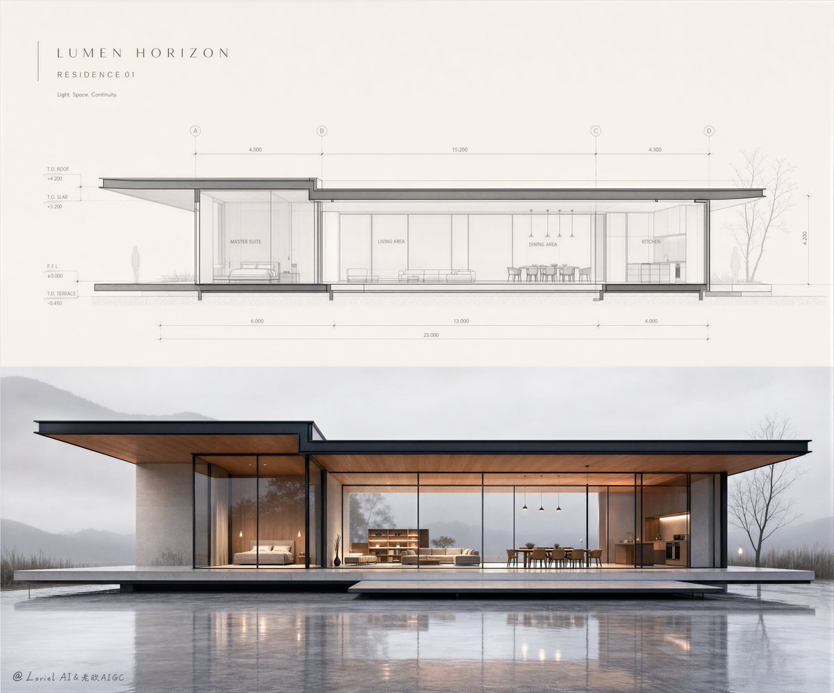
这张海报之所以有效,是因为它把同一个承诺呈现了两次:先以一张图纸呈现,再以一座已建成的空间呈现。
分享链接 · https://openimages.ajiang.me/p/2089679628273402353/
color_palette · mutedcomposition · multi-panelcomposition · wide-shotmood · calmmood · elegantquality_flags · embedded-text
提示词(原文,逐字保留)
This works because the poster makes one promise twice: first as a drawing, then as a built space.
The upper section proves the architecture is precise. The lower render makes it desirable. Both are tied together by the same long roofline and horizontal extension.
📐 upper half as a thin gray architectural section-elevation aligned directly above the residence
This gives the image discipline. The dimensions, room labels, and light drafting lines feel like evidence, not decoration.
🏠 lower half as a hyper-real glass residence with an extended cantilever roof and terrace slab
This gives the poster its emotion. You see the quiet outward reach of the house through the roof, platform, and continuous glazing, while the warm interior glow makes the space feel lived in.
GPT- image 2 prompt👇
Create an ultra-premium real estate sales poster for a fictional developer brand, designed as a minimalist architectural presentation board that fuses hyper-real built architecture with precise technical drawing language. Preserve the exact two-zone composition: the upper half is a refined architectural elevation-section drawing with ultra-thin gray drafting lines, dimension annotations, sparse English labels, and faint scale silhouettes; the lower half is the fully realized residence rendered in hyper-real front-facing architectural photography. The entire image must feel like a world-class luxury property launch visual, a collectible architect’s concept sheet, and an elite sales campaign poster at the same time.
The architecture must remain radically minimal yet possess a stronger outward-reaching force. Design a low horizontal contemporary glass residence with a disciplined rectilinear profile, but emphasize a subtle spatial thrust: the left pavilion volume projects outward more decisively, the roof plane and floor slab extend with elegant cantilever tension, the central glazed living zone stretches laterally with clean uninterrupted transparency, and the terrace plane reaches toward the viewer like a calm architectural gesture of expansion. The building must feel restrained, poised, and quiet, but also unmistakably capable of spatial extension, as if the whole composition is breathing outward into the landscape. This sense of extension should come from proportion, cantilever, slab depth, glazing continuity, and platform geometry, not from visual clutter.
The lower built view is the absolute visual anchor: one pristine residence centered in the frame, front-facing, geometrically precise, fully buildable, with blackened metal framing, floor-to-ceiling low-iron glass, warm timber-lined interiors, pale concrete or limewashed masonry walls, and a thin floating platform terrace extending forward and laterally. Interior spaces should be visible but minimal, revealing shelves, dining furniture, pendant lighting, lounge seating, and a few carefully placed objects, all highly restrained. The environment is a misty open landscape with shallow reflective ground, faint distant hills, soft cold air, and a sparse premium atmosphere that never competes with the building.
The upper drawing zone must depict the same house as an elegant section-elevation hybrid aligned directly above the built residence, reinforcing the perfect unity between concept and final product. Use exquisite technical linework, dimension strings, micro English notes, faint grid logic, and a few ghosted furniture and tree indications. The drawing should feel rigorously standardized, airy, and beautiful, with extremely light line-weight hierarchy on a warm-white background. Everything must correspond clearly to the built house below, making the poster feel like design thought transformed into reality.
Push the Transit direction strongly: reduce all unnecessary noise, increase negative space, refine graphic spacing, minimize annotation density, and make the entire page feel more international, more luxurious, and more editorial. Push the Port direction strongly: compress the whole poster into three unforgettable core symbols only, the upper architectural line drawing, the lower completed residence, and the subtle minimalist brand/title zone at the upper left. Every other element must remain highly subordinate. The page should feel quieter, cleaner, sharper, and more brand-defining than a typical architecture board.
Lighting should be refined and emotionally controlled: exterior light is soft, diffused, and cool, like pale dawn or overcast dusk, while the interior emits a warm restrained glow that defines the building’s spatial depth. Strengthen the contrast between interior warmth and exterior coolness just enough to give the architecture presence and volume without destroying the minimalist calm. Use subtle atmospheric haze, soft reflections on the wet or polished ground plane, and gentle shadow separation beneath the terrace slab and projecting volumes. The building’s outward-reaching cantilever and platform geometry must be emphasized by light and tone so the structure feels quietly dynamic even in stillness.
Material rendering must be exceptionally refined: realistic glass transparency and reflection, precise mullion depth, matte black metal frames, pale concrete and plaster with subtle microtexture, warm timber ceilings and wall panels, crisp slab edges, accurate terrace joints, and believable interior luminance. The technical drawing above must use elegant gray drafting notation, precise measurement marks, delicate line hierarchy, and clean premium print aesthetics. The transition between drawing and reality should feel seamless and conceptually fused.
Typography must be minimal and original: one fictional English project title and micro subtitle in a luxury editorial architectural style at upper left, with tiny supporting English notes only. No copied project names, no real architect names, no Chinese headline. The entire color system should remain restrained and premium: warm white, fog gray, charcoal linework, pale stone beige, muted landscape gray, matte black structure, warm timber amber, and soft golden interior light.
Style: international luxury real estate branding, hyper-real architectural visualization, elite editorial minimalism, rigorous architectural drafting aesthetics, museum-clean sales-poster clarity. The final image must feel calm, intelligent, premium, and immediately striking through its controlled sense of architectural extension.
No copied text, no real architect names, no cluttered annotations, no excessive furniture, no extra competing buildings, no fantasy structure, no distorted perspective, no muddy shadows, no black blotches, no messy landscape, no watermark, no existing logo.
中文译文
这张海报之所以有效,是因为它把同一个承诺呈现了两次:先以一张图纸呈现,再以一座已建成的空间呈现。
上半部分证明建筑是精确的,下半部分的渲染则让它令人向往。两者由同一条长屋面线和水平延伸紧密相连。
📐 上半部分:纤细的灰色建筑剖立面,直接对齐居中位于住宅正上方
这赋予了画面秩序感。尺寸标注、房间标签和轻盈的制图线条读起来像证据,而非装饰。
🏠 下半部分:超写实的玻璃住宅,带延伸的悬挑屋顶与露台板
这赋予了海报情绪。通过屋顶、平台与连续的玻璃面,你可以感受到这座住宅向外安静地伸展,而温暖的室内光让空间显得有人居住。
GPT- image 2 prompt👇
为一家虚构开发商品牌创作一张超高端房地产销售海报,以极简建筑展示板为设计基调,将超写实的建成建筑与精确的技术制图语言融为一体。严格保留这一二分区构图:上半部分为精致的建筑立面–剖面图,带超细灰色制图线条、尺寸标注、稀疏的英文标签和隐约的尺度剪影;下半部分为完全实现落地的住宅,以超写实正面建筑摄影呈现。整张图像必须同时让人感受到世界级豪宅项目的发布视觉、可收藏的建筑师概念图,以及精英级销售活动海报。
建筑必须保持极度极简,但拥有更强的向外延展的力量。设计一座低矮、水平的当代玻璃住宅,轮廓严谨呈矩形,但需强调一种微妙的空间推力:左侧的亭部体量更加果断地向前伸出,屋顶面和楼板以优雅的悬挑张力向外延伸,中央的玻璃起居区以干净不打断的透明性横向延展,露台面则像一种宁静的建筑姿态向观者方向伸出。建筑必须显得克制、沉稳、安静,但同时毫无疑问地具备空间延伸的能力,仿佛整幅构图正向景观外呼吸。这种延伸感应来自比例、悬挑、板厚、玻璃的连续性以及平台的几何关系,而非来自视觉上的繁杂。
下方建成视图是绝对的视觉锚点:一座纯净的住宅居中、正面示人、几何精确、完全可落地,配置发黑金属框、低铁落地玻璃、温暖的木质内饰、淡色混凝土或石灰洗过的砌体墙,以及一片向前与两侧延伸的轻薄悬浮平台露台。室内空间应可被看见但极度克制,仅露出书架、餐桌椅、吊灯、沙发座椅以及几件精心摆放的物件,全部高度克制。环境为迷雾弥漫的开阔景观,地面浅且有倒影,远山隐约,空气清冷,整体氛围冷峻高端,绝不与建筑争夺视线。
上方图纸区必须呈现同一座住宅,作为优雅的剖立面混合体直接对齐居中位于建成住宅正上方,强化概念与最终产品之间的完美统一。使用精湛的技术线条、尺寸链、微观英文注释、隐约的网格逻辑,以及少量虚化的家具与树形提示。图纸应显得严格标准化、通透而优美,在暖白底色上呈现极轻的线宽层级。其中的每一项都必须清晰对应下方的建成住宅,让海报呈现出“设计思考被转化为现实”的感受。
强烈推进 Transit 方向:减少一切不必要的噪点,增加留白,精炼图形间距,最小化标注密度,使整张页面感觉更国际化、更奢华、更具编辑感。强烈推进 Port 方向:将整张海报压缩为三个难忘的核心符号——上方建筑线稿、下方落成的住宅,以及左上角细微的极简品牌/标题区。其他所有元素都必须保持高度次要。页面应比典型建筑展板更安静、更干净、更锐利、更具品牌定义感。
光线应被精炼并情绪化地控制:外部光线柔和、漫射、冷调,如同浅淡的黎明或阴沉的黄昏;室内则散发温暖而克制的光晕,定义建筑的空间纵深。强化室内暖意与外部冷调之间的对比,仅至足以赋予建筑存在感与体量,又不破坏极简的宁静。使用细微的大气雾霭、湿或抛光地面层的柔和倒影,以及露台板与悬挑体量下方的柔和阴影分离。建筑向外延伸的悬挑与平台几何必须通过光与色调加以强调,使结构即便在静止中也显得静谧而富有动感。
材质表现必须极为精细:真实的玻璃透明感与反射、精确的竖挺深度、哑光黑色金属框、淡色混凝土与抹灰带细微微纹理、温暖的木质天花与墙板、清晰的板边、精确的露台接缝,以及可信的室内亮度。上方的技术图纸必须使用优雅的灰色制图注释、精确的测量标记、精致的线宽层级,以及干净的高端印刷美学。从图纸到建成效果的过渡应显得无缝、概念上融为一体。
字体排版必须极简且原创:左上角以奢华编辑级建筑风格放置一个虚构的英文项目标题与微观副标题,仅配极小的英文说明文字。不复制任何现有项目名称,不使用真实建筑师姓名,不出现中文标题。整体色彩系统应保持克制而高端:暖白、雾灰、炭黑线条、浅石灰米色、低饱和景观灰、哑光黑结构、温暖木质琥珀色,以及柔和的金色室内光。
风格:国际奢华地产品牌、超写实建筑可视化、精英编辑极简、严谨建筑制图美学、博物馆级洁净的销售海报清晰度。最终图像必须通过其受控的建筑延伸感,呈现出冷静、智慧、高端且立即抓人的气质。
不要复制任何文本,不要使用真实建筑师姓名,不要堆砌密集的注释,不要过多的家具,不要额外的竞争建筑,不要幻想式的结构,不要扭曲的透视,不要浑浊的阴影,不要黑色斑块,不要杂乱的景观,不要水印,不要已有的标志。
来源与署名
原文由 @ou_zhen599 发布在 X:查看原推文。 本页逐字保留原文并提供机器翻译的中文解读;版权归原作者所有。
同工具的更多提示词
- 最强的一招,是把建筑做成情感意象,把展板做成证明体系。 塔楼在第一眼就完成说服。两侧的栏目与底部的图纸只需要以克制的方式支撑这种印象,而不是用同样的音量把一切…@ou_zhen599
- 一幅生动的、绘画风格的旅游海报式城市景观,描绘了金色时刻的威尼斯运河,以浓郁饱和的蓝色、金色和温暖的赤陶色调渲染。主角场景聚焦于波光粼粼的阳光水面,延伸向远处…@churvikv
- 创作一幅电影感十足、怀旧的金色时刻人像照:一位年轻女子站在黄昏时分的大型城市窗户或玻璃幕墙旁,身着休闲浅色上衣,肩上自然搭着一件粉色毛衣,背着双肩包。她有一头…@Taaruk_
- 柔和、真实的室内生活方式人像照:一位年轻女性,留着长而微卷的深棕色头发和轻盈的碎发刘海,戴着大型白色头戴式耳机,温柔地微笑。她双手握着耳机两侧,目光略微看向一…@Aqsahere_
- 最强的一招,是让每一个包装都能被读成一个食物符号,而不是仅仅是一组版面布局。 左侧是“黄底 + 红锅 + 垂直奶酪丝带”;右侧是“红底 + 焦褐香肠 + 提起…@ou_zhen599
- GPT image 2 on chatgpt Prompt Create a high-quality cinematic 3D mini-me scene…@AiwithLariab