当每个瓶子都服从同一套网格时,产品家族就会显得很昂贵。
分享链接 · https://openimages.ajiang.me/p/2109322404753473690/
color_palette · warm-tonescomposition · symmetrycomposition · wide-shotlighting · studio-lightquality_flags · embedded-textquality_flags · typography-heavy
提示词(原文,逐字保留)
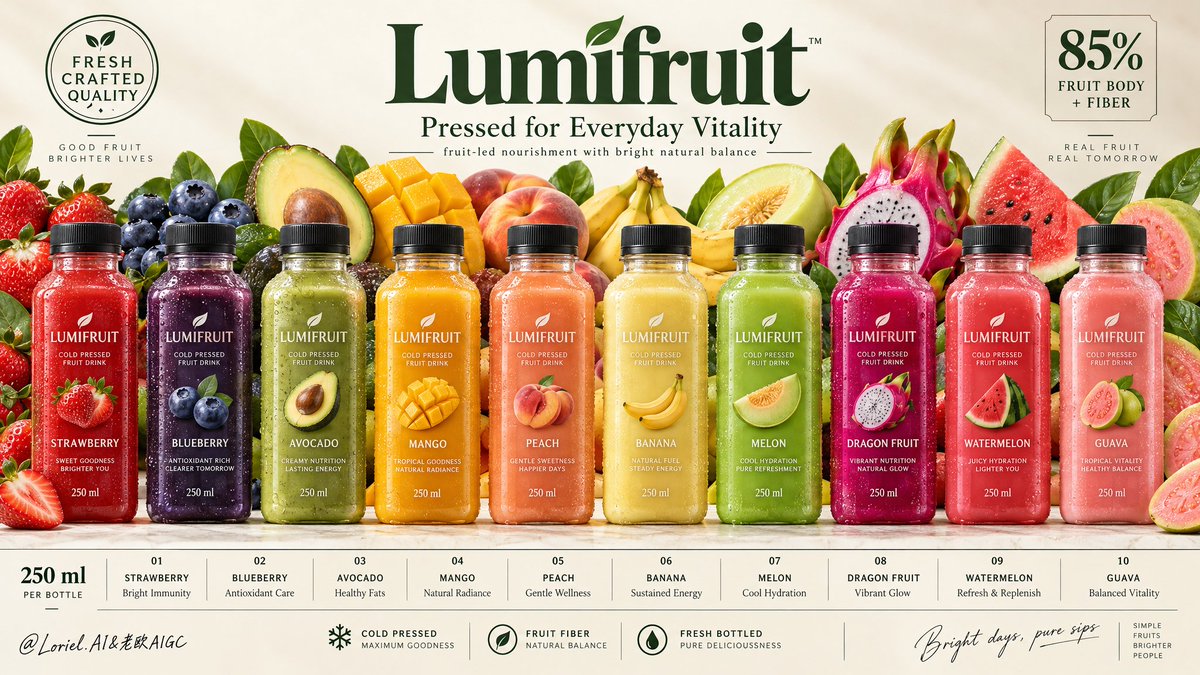
A product family looks expensive when every bottle obeys the same grid.
🍓 exactly ten identical square-shouldered bottles, evenly spaced in one horizontal lineup
Consistency is the visual promise. Matching height, cap scale, label placement, and gaps let the flavor colors read as one confident system—not ten separate products.
🧊 bottom information strip divided into ten cells, each vertically aligned to its bottle
This turns the poster into a retail-ready index. Your eye can move from bottle to flavor to benefit without searching, while the fruit wall stays where it belongs: behind the lineup, adding abundance without breaking order.
GPT- image 2.5 prompt👇
Create a premium wide commercial poster for a fictional overseas cold-pressed fruit drink brand, "LUMIFRUIT". Build it as a high-end family product campaign with strict horizontal poster architecture: a soft warm ivory background, a large elegant central brand masthead at the top, a perfectly aligned lineup of ten hyper-real chilled bottles across the middle, a lush but controlled fruit panorama behind them, refined quality seals in the upper corners, and a clean modular information strip spanning the full bottom edge. The product lineup must remain the absolute visual hero.
At the top center, place a premium botanical wordmark reading "Lumifruit", with the subtitle "Pressed for Everyday Vitality" and the supporting line "fruit-led nourishment with bright natural balance". Top-left: a circular seal reading "FRESH CRAFTED QUALITY". Top-right: a concise nutrition block reading "85% FRUIT BODY + FIBER". Typography should feel elegant, modern, healthy, and globally branded, using deep botanical green with subtle warm neutral accents.
Across the middle, show exactly ten evenly spaced upright bottles with identical premium packaging and varied liquid colors. The bottles are clear square-shouldered chilled bottles with matte black caps, visible threading, realistic label adhesion, subtle refraction, micro-condensation, varied droplets, and dense cold-pressed juice texture. Every front label must read exactly "LUMIFRUIT". Flavors from left to right: "STRAWBERRY", "BLUEBERRY", "AVOCADO", "MANGO", "PEACH", "BANANA", "MELON", "DRAGON FRUIT", "WATERMELON", "GUAVA". Each bottle should glow in its own controlled hue: strawberry red, blueberry indigo, avocado green, mango gold, peach coral, banana cream yellow, melon green, dragon-fruit magenta, watermelon pink-red, and guava blush rose. Keep all bottle heights, widths, cap scale, and label proportions perfectly consistent.
Behind the bottles, create a rich but disciplined fruit backdrop like an abundant harvest wall: strawberries, blueberries, avocado halves, mango cubes, peach halves, bananas, melon slices, dragon fruit, watermelon wedges, guava halves, and a few fresh leaf accents. The fruits should layer tightly behind the lineup, rising just enough to amplify flavor diversity and freshness without stealing dominance from the bottles. The arrangement must feel curated, with juicy cut surfaces, wet flesh, seeds, soft berry bloom, waxy skins, and subtle leaf veining rendered with high realism.
At the bottom, build a full-width information strip divided into elegant modular cells aligned with the bottles. Each cell contains a bottle number, flavor name, and a short premium benefit phrase in small refined type. Add a left-side volume note reading "250 ml". In the center, add concise quality markers such as "cold pressed", "fruit fiber", and "fresh bottled". On the far right, add a refined handwritten-style sign-off: "Bright days, pure sips". The bottom band should feel organized, retail-ready, and beautifully spaced.
Use soft premium studio lighting from the upper front-left with luminous clarity across the lineup and backdrop, minimal but believable grounding shadows under the bottles, and strong local contrast on condensation, labels, fruit flesh, seeds, and glossy cut surfaces. Control the palette tightly: 45% warm ivory and cream, 35% fruit-spectrum color energy, 20% botanical green and dark neutral accents from typography, leaves, and caps. Increase dimensional separation enough to make the bottles feel cold, tactile, and shelf-dominant while keeping the poster bright, clean, and free of muddy shadows or dead black areas.
Materials must read with exceptional precision: chilled bottle surfaces, crisp printed labels, matte caps, translucent juice density, moist fruit flesh, fibrous mango and peach texture, creamy avocado flesh, watery melon translucency, glossy dragon fruit highlights, and natural berry bloom. The final image should combine commercial abundance, material realism, and curatorial restraint in one unified visual system, feeling like a Cannes-level international beverage campaign. Maintain exact family-line coherence, product-first hierarchy, refined spacing, readable labels, clean grid rhythm, realistic fruit-to-flavor correspondence, and premium health-brand polish. Avoid extra bottles, duplicated fruit in unnatural ways, warped packaging, unreadable labels, uneven spacing, chaotic clutter, cheap font treatment, muddy contrast, distorted fruit anatomy, broken bottom-grid logic, or accidental resemblance to any real beverage brand.
中文译文
当每个瓶子都服从同一套网格时,产品家族就会显得很昂贵。
🍓 恰好十只完全相同的方形肩部瓶子,均匀水平排列成一行
一致性是视觉上的承诺。统一的高度、瓶盖比例、标签位置和间距,让各种水果的色彩读起来像一个自信的系统——而不是十个独立的产品。
🧊 底部信息条被分为十个单元格,每格与其对应的瓶子垂直对齐
这让海报变成一个零售友好的索引。视线可以从瓶子滑到口味再到卖点,无需搜索,而水果墙则留在它该在的位置:排在瓶子后方,增加丰盈感却不破坏秩序。
GPT- image 2.5 prompt👇
为一家虚构的海外冷压水果饮料品牌 "LUMIFRUIT" 创作一张高端宽幅商业海报。以严格水平海报架构构建一张高端的家族产品广告:柔和的暖象牙色背景、顶部居中的大型优雅品牌主标、中部完美对齐的十只超写实冰镇瓶装饮料、其后是一片繁茂而有节制的水果全景、上方两角放置精致的品质印记,以及横贯底部边缘的简洁模块化信息条。产品阵容必须是绝对的视觉主角。
在顶部中央放置高端植物风字标 "Lumifruit",副标题 "Pressed for Everyday Vitality",以及辅助行 "fruit-led nourishment with bright natural balance"。左上角:一个圆形印记,内容为 "FRESH CRAFTED QUALITY"。右上角:一段简洁的营养信息块,内容为 "85% FRUIT BODY + FIBER"。字体应显得优雅、现代、健康且具国际品牌感,使用深植物绿配以微妙的暖中性点缀。
在中段横向呈现恰好十只均匀间距、直立放置、包装完全一致而液体颜色不同的瓶子。瓶子为清澈的方形肩部冰镇瓶,配备哑光黑色瓶盖、清晰可见的螺纹、真实的标签贴合感、轻微折射、微细凝露、多样化的水珠,以及浓郁的冷压果汁质感。每张正面标签必须恰好写着 "LUMIFRUIT"。从左到右的口味依次为:"STRAWBERRY"、"BLUEBERRY"、"AVOCADO"、"MANGO"、"PEACH"、"BANANA"、"MELON"、"DRAGON FRUIT"、"WATERMELON"、"GUAVA"。每只瓶子都应散发各自受控的色调:草莓红、蓝莓靛、鳄梨绿、芒果金、桃珊瑚、香蕉奶黄、哈密瓜绿、火龙果洋红、西瓜粉红,以及番石榴粉玫瑰。保持所有瓶子的高度、宽度、瓶盖比例与标签比例完全一致。
在瓶子后方,构造一面丰盛但克制的丰收墙式水果背景:草莓、蓝莓、牛油果对半、芒果丁、桃子对半、香蕉、哈密瓜片、火龙果、西瓜角、番石榴对半,以及少许新鲜叶片点缀。水果应在瓶阵后方紧密层叠,向上隆起的高度仅够强化口味多样与新鲜感,而不抢走瓶子的主导地位。排列需有策展感,切面多汁、果肉湿润、籽粒清晰、莓果薄粉、果皮蜡质、叶脉细致,并以高度写实的方式呈现。
在底部构建一条通栏信息条,分为与瓶子对齐的精致模块化单元格。每格包含瓶身编号、口味名称,以及一行精炼高端的卖点短语,使用小号细致字体。在左侧加入一处容量备注 "250 ml"。在中央添加简洁的品质标识,例如 "cold pressed"、"fruit fiber" 和 "fresh bottled"。在最右侧加入一处精致的签名式手写风落款:"Bright days, pure sips"。底部条带应显得有序、上架感强、间距优美。
使用来自上前方的柔和高端影棚式布光,让瓶阵与背景通体透亮,瓶下仅有少量可信的接地阴影,并在凝露、标签、果肉、籽粒与光泽切面上保持强局部对比。严格控制调色板:45% 暖象牙与奶油色,35% 水果谱系色彩能量,20% 植物绿与来自字体、叶片和瓶盖的深中性点缀。提升足够的三维分离感,使瓶子摸起来冰凉、有触感、货架主导,同时保持海报明亮、干净,没有浑浊阴影或死黑区域。
材质必须以极高的精度呈现:冰凉的瓶身、清爽印刷的标签、哑光瓶盖、半透明果汁的密度、湿润的果肉、芒果与桃子的纤维质地、奶油般的牛油果果肉、水润的哈密瓜半透明感、火龙果的光泽高光,以及天然的莓果粉霜。最终成图应在统一视觉系统中融合商业丰盛感、材质真实感与策展克制,宛若戛纳级别的国际饮料广告大片。保持家族系列严密一致、产品优先的层级、精致的留距、可读的标签、干净的网格节奏、真实的水果—口味对应,以及高端健康品牌的高级感。避免多余的瓶子、不自然方式重复出现的水果、变形的包装、无法辨认的标签、不均匀的间距、杂乱无章的堆砌、廉价的字体处理、浑浊的对比、失真的水果结构、底部信息条网格逻辑的错乱,或与任何真实饮料品牌的意外雷同。
来源与署名
原文由 @ou_zhen599 发布在 X:查看原推文。 本页逐字保留原文并提供机器翻译的中文解读;版权归原作者所有。
同工具的更多提示词
- 多口味平铺图之所以显得高级,是因为食材扮演的是图例角色,而非单纯装饰。 🌿 四只瓶子以对角线节奏排列,每只瓶身旁边都各自聚集着一组紧实的食材 这样可以让每种口…@ou_zhen599
- 超现实摄影风格的街景,发生在一场强度不可思议的强风暴中。中景宽幅、视平线视角的城市人行道镜头。前景:一位身穿西装的商人紧紧抱住一根黑色铸铁路灯柱,身体水平悬空…@TomLikesRobots
- 高级编辑海报制作说明 每一张上传的照片都必须独立制作成一张独立的高级编辑海报,绝不能将多张照片拼合到同一设计中。使用严格的 3:4 纵向画布,在正中央水平分割…@AiwithLariab
- 超写实 IMAX 级 Netflix 风格的电影感台球肖像,9:16 竖构图。使用上传的图片作为主要视觉参考,保留精确的面部特征、比例和标志性细节。打造一位身…@imGopalTiwari
- 创作一幅温馨感人的双面板竖版拼贴画,灵感源自怀旧的童年摄影与手工绘制的儿童蜡笔画。 上面板 — 照片级真实照片:抓拍一张超写实的欢乐孩童照片,展现孩子在美丽的…@j_smeaton99
- GPT Image 2.5 on ChatGPT 提示词; 以上传的照片为确切的身份参照。保留女孩的面部特征、脸型、发型以及自然的外貌。 生成一张照片级写实风…@mehvishs25