多口味平铺图之所以显得高级,是因为食材扮演的是图例角色,而非单纯装饰。
分享链接 · https://openimages.ajiang.me/p/2109316806439764031/
color_palette · warm-tonescomposition · dynamic-diagonalcomposition · overhead-flatlaylighting · studio-lightmood · elegantquality_flags · embedded-text
提示词(原文,逐字保留)
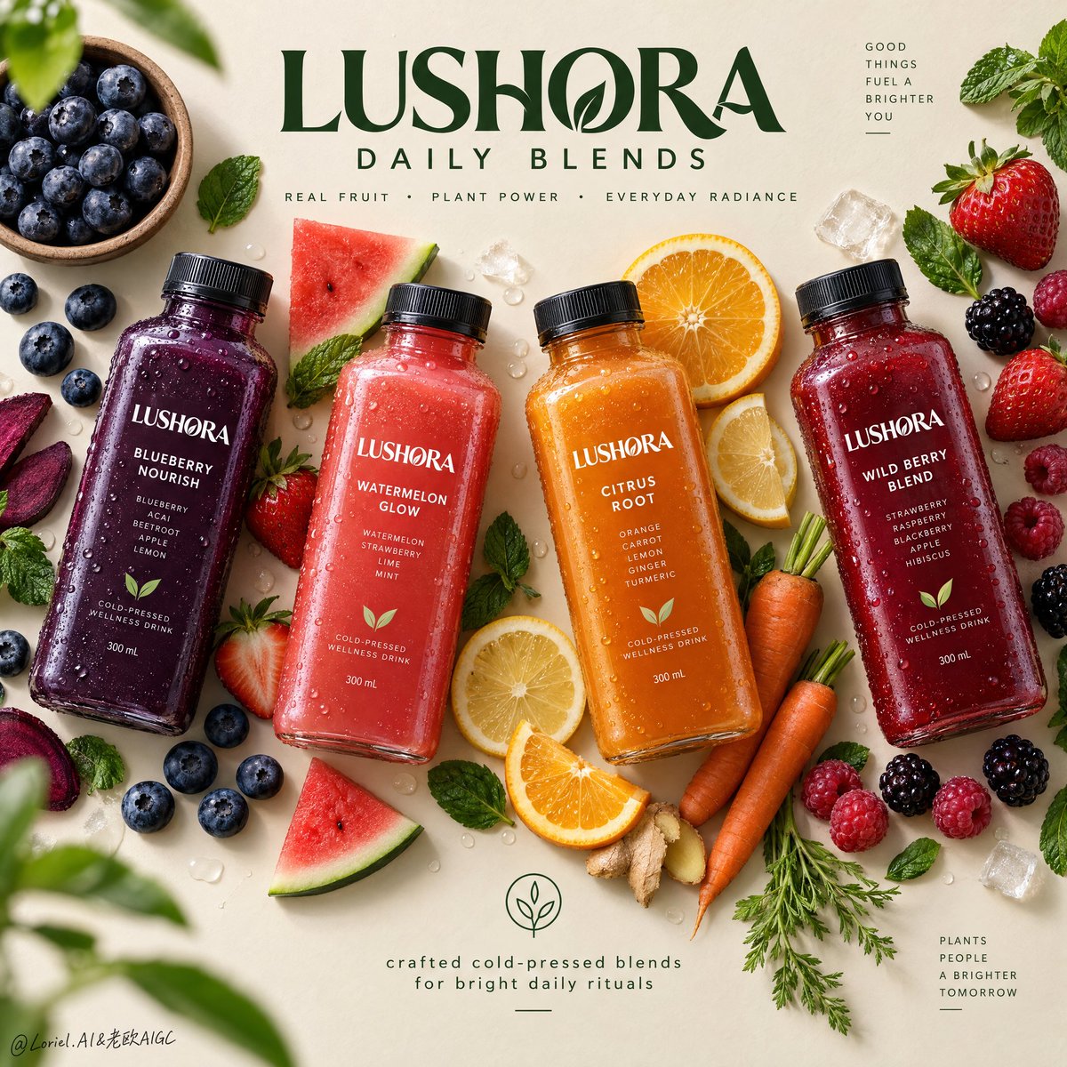
A multi-flavor flat lay feels premium when the ingredients behave like a legend, not decoration.
🌿 four bottles in a diagonal rhythm, each paired with its own tightly grouped ingredients
This makes every flavor readable at a glance: berry with berries, citrus with citrus and carrot, watermelon with mint. The fruit is doing product navigation—not filling empty space.
🫐 clear upper and lower negative-space zones reserved for brand and information
Abundance needs breathing room. By keeping the center edges clean, the labels stay sharp, the flavor colors do the talking, and the layout still feels like a campaign poster—not a crowded grocery table.
GPT- image 2.5 prompt👇
Create a Cannes-level top-down commercial poster for a fictional overseas cold-pressed wellness drink brand, "LUSHORA". Design a clean premium flat-lay on a warm matte oat-cream background, with four hyper-real chilled square bottles arranged in a refined diagonal rhythm across the frame. Fuse premium grocery advertising, editorial food styling, and contemporary exhibition-poster discipline. Keep the bottles as the absolute visual heroes, while fruit, vegetable, and leaf elements form a controlled perimeter frame that supports freshness, flavor identity, and spatial rhythm without clutter.
Use a straight overhead camera with precise poster geometry. Arrange four bottles with slight angle variation for elegance and motion: deep indigo-purple on the left, vivid coral-red left-center, glowing amber-orange right-center, and rich berry-crimson on the right. Preserve strong negative space at the upper center for the master brand mark and at the lower center for a minimal information lockup. The layout should feel balanced, crisp, modern, and campaign-ready.
Each bottle must feel tactile, cold, and commercially believable: thick clear PET or glass walls, realistic cap threading, matte black caps, micro-condensation, varied droplets, visible liquid density, subtle refraction, and sharp premium labels. The labels must read exactly "LUSHORA". Flavor lineup: "BLUEBERRY NOURISH", "WATERMELON GLOW", "CITRUS ROOT", and "WILD BERRY BLEND". The packaging should look globally branded, elegant, healthy, shelf-ready, with consistent hierarchy and clear typography.
Build a flavor halo with highly realistic ingredients placed with curatorial restraint: blueberries in a small natural bowl, loose berries, strawberries with leafy tops, sliced oranges, lemon rounds, raspberries, blackberries, mint leaves, and a few carrot elements for the citrus-root bottle. Keep ingredients visually grouped near their corresponding bottle without messy clusters. Add a few sliced and whole pieces for contrast. Some leaves and berries may sit near the edges as subtle framing accents, with one or two elements softly defocused for shallow depth, while the bottles stay perfectly crisp.
Lighting should be soft premium studio daylight from the upper left, with clean shadow falloff and gentle grounding beneath every bottle and ingredient. Use a controlled palette: 45% warm oat, cream, and sand neutrals; 35% vivid fruit colors from indigo, coral, amber, and crimson liquids; 20% botanical greens and fresh citrus highlights. Increase local contrast on bottle shoulders, droplets, fruit flesh, citrus translucency, berry skins, and mint veins so the image feels bright, tactile, and luxurious. Avoid dull greys, muddy shadows, and heavy black patches.
Materials must read with exquisite clarity: cold slick bottle surfaces, clean label print, soft matte caps, translucent citrus pulp, juicy strawberry flesh, powdery blueberry bloom, glossy berry skins, fresh mint veining, and slightly fibrous carrot texture. The finish should feel like premium health-beverage campaign art: minimal but abundant, bright but controlled, natural but highly designed, with freshness, wellness, appetite appeal, and modern retail sophistication.
Typography must be newly invented and art directed into the composition. At the upper center, place a bold premium custom logotype: "LUSHORA DAILY BLENDS". Beneath it, in smaller clean sans serif: "REAL FRUIT • PLANT POWER • EVERYDAY RADIANCE". At the lower center, add a minimal lockup with a small clean icon and the line "crafted cold-pressed blends for bright daily rituals". Use deep botanical green typography so it feels calm, premium, and naturally integrated with the ingredients. Keep all type elegant, readable, and clear of product labels.
The final image should unify emotional freshness, material richness, and graphic restraint into an international design-poster campaign. Maintain exact four-bottle hierarchy, coherent scale, realistic ingredient-to-flavor logic, clean spacing, crisp labels, premium advertising realism, and top-tier visual discipline. Avoid extra bottles, duplicated fruit, warped packaging, unreadable text, sloppy garnish clutter, broken bottle perspective, muddy background, cheap typography, excessive decorative particles, weak hierarchy, dead black shadows, or drift away from premium fresh wellness beverage advertising.
中文译文
多口味平铺图之所以显得高级,是因为食材扮演的是图例角色,而非单纯装饰。
🌿 四只瓶子以对角线节奏排列,每只瓶身旁边都各自聚集着一组紧实的食材
这样可以让每种口味一眼可读:莓果配莓果、柑橘配柑橘和胡萝卜、西瓜配薄荷。水果承担的是产品导航的功能,而不是用来填补空白。
🫐 上方和下方留出清晰的负空间区域,用于放置品牌和信息
丰盛感需要呼吸空间。保持中心边缘干净,可以让标签保持锐利,让配方的色彩自己说话,整体版面依然像一张广告大片,而非拥挤的杂货摊。
GPT- image 2.5 prompt👇
为一个虚构的海外冷压健康饮品品牌 "LUSHORA" 创作一张戛纳级俯拍商业海报。设计一张简洁高级的平铺图,背景为温暖哑光的燕麦奶油色,四只超写实冰镇方形瓶身以精致的对角线节奏排列于画面中。融合高级食杂广告、编辑级食物造型和当代展览海报的克制感。让瓶子绝对成为视觉主角,而水果、蔬菜与叶片元素组成受控的周界边框,支撑新鲜感、口味识别与空间节奏,避免凌乱。
采用正俯拍相机视角,使用精确的海报几何构图。排列四只瓶子时带有轻微角度变化以呈现优雅与动感:左侧深靛紫、左中鲜珊瑚红、右中发光的琥珀橙、右侧浓郁的莓果绛红。在上方中央保留强力负空间,用于放置主品牌标识;在下方中央保留负空间,用于放置极简信息排版组合。整体布局应呈现平衡、锐利、现代、可直接投放为广告大片的观感。
每只瓶身都必须触感真实、冰感十足,且具有商业可信度:厚实的透明 PET 或玻璃瓶壁、真实的瓶盖螺纹、哑光黑色瓶盖、微冷凝水珠、多样化水珠、可见的液体密度、微妙折射以及锐利的高级标签。标签必须准确读作 "LUSHORA"。口味系列:"BLUEBERRY NOURISH"、"WATERMELON GLOW"、"CITRUS ROOT" 和 "WILD BERRY BLEND"。包装应具备全球化的品牌质感:优雅、健康、可上架、层级一致,字体清晰。
以高度写实的食材构建口味光环,并以策展级的克制感摆放:放入小号天然小碗中的蓝莓、散落的莓果、带叶草莓、橙片、柠檬圆片、树莓、黑莓、薄荷叶,以及为柑橘根口味瓶配的几片胡萝卜元素。让食材在视觉上贴近对应的瓶子,但避免凌乱堆叠。加入少量切片与整颗果实以形成对比。少量叶片和莓果可置于边缘作为细微的框景点缀,其中一两个元素可轻微脱焦以营造浅景深,而瓶子须保持完全锐利。
光线应为来自左上方的柔和高级影棚日光,阴影过渡干净,每只瓶子和每份食材下方都有柔和的接地阴影。配色应有节制:45% 温暖的燕麦、奶油与沙色中性色;35% 来自靛紫、珊瑚、琥珀与绛红液体的高饱和水果色;20% 植物绿与清新柑橘高光。提高瓶肩、水滴、果肉、柑橘通透感、莓果表皮和薄荷叶脉的局部对比,让画面显得明亮、质感细腻且奢华。避免沉闷的灰色、浑浊的阴影和过重的黑色斑块。
材质的可读性需达到极致:冰凉光滑的瓶身表面、干净的标签印刷、柔软哑光的瓶盖、半透明的柑橘果肉、多汁的草莓果肉、覆有粉霜的蓝莓、光泽的莓果表皮、新鲜的薄荷叶脉,以及略带纤维质感的胡萝卜质感。最终观感应如高级健康饮品广告艺术:克制而丰盈、明亮而有序、自然却高度设计化,兼具新鲜、健康、诱人食欲与现代零售格调。
字体须全新设计并艺术化编排进画面之中。在上方中央放置一款大胆的高级定制标志字体:"LUSHORA DAILY BLENDS"。其下方以更小的简洁无衬线字体写:"REAL FRUIT • PLANT POWER • EVERYDAY RADIANCE"。在下方中央,加入一组极简排版组合,含一个简洁小图标与一行文字 "crafted cold-pressed blends for bright daily rituals"。使用深植物绿色字体,让整体观感沉稳、高级且自然融入食材。保持所有字体的优雅、可读,并与产品标签保持距离。
最终图像需将情感层面的新鲜感、材质的丰盈感和图形语言的克制感统一为一张国际化设计海报广告。维持严格的四瓶等级、连贯的比例、写实的食材与口味逻辑、干净的间距、锐利的标签、顶级的广告写实主义与视觉纪律。避免出现多余的瓶子、重复的水果、变形的包装、无法辨认的文字、随意的装饰堆叠、错误的瓶身透视、浑浊的背景、低级字体、过度的装饰颗粒、缺失的主次关系、死黑的阴影,或偏离高级新鲜健康饮品广告的方向。
来源与署名
原文由 @ou_zhen599 发布在 X:查看原推文。 本页逐字保留原文并提供机器翻译的中文解读;版权归原作者所有。
同工具的更多提示词
- 高级编辑海报制作说明 每一张上传的照片都必须独立制作成一张独立的高级编辑海报,绝不能将多张照片拼合到同一设计中。使用严格的 3:4 纵向画布,在正中央水平分割…@AiwithLariab
- 当每个瓶子都服从同一套网格时,产品家族就会显得很昂贵。 🍓 恰好十只完全相同的方形肩部瓶子,均匀水平排列成一行 一致性是视觉上的承诺。统一的高度、瓶盖比例、标…@ou_zhen599
- 创作一幅温馨感人的双面板竖版拼贴画,灵感源自怀旧的童年摄影与手工绘制的儿童蜡笔画。 上面板 — 照片级真实照片:抓拍一张超写实的欢乐孩童照片,展现孩子在美丽的…@j_smeaton99
- 超现实摄影风格的街景,发生在一场强度不可思议的强风暴中。中景宽幅、视平线视角的城市人行道镜头。前景:一位身穿西装的商人紧紧抱住一根黑色铸铁路灯柱,身体水平悬空…@TomLikesRobots
- GPT Image 2.5 on ChatGPT 提示词; 以上传的照片为确切的身份参照。保留女孩的面部特征、脸型、发型以及自然的外貌。 生成一张照片级写实风…@mehvishs25
- 超写实 IMAX 级 Netflix 风格的电影感台球肖像,9:16 竖构图。使用上传的图片作为主要视觉参考,保留精确的面部特征、比例和标志性细节。打造一位身…@imGopalTiwari