一条液体丝带的作用不止是增加动感——它可以编排整场campaign的节奏。
分享链接 · https://openimages.ajiang.me/p/2108586694253670712/
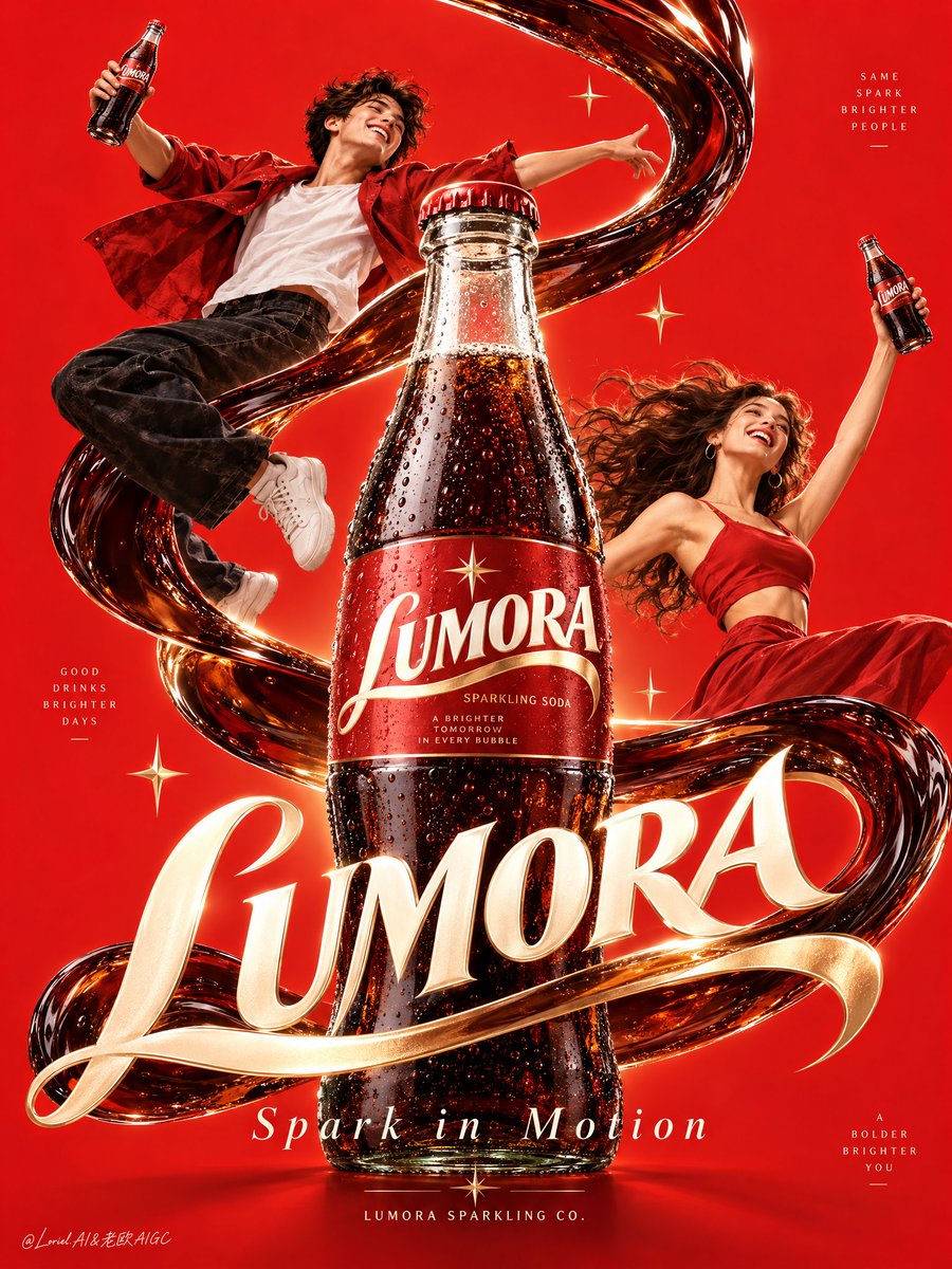
color_palette · vibrantcolor_palette · warm-tonescomposition · centeredmood · elegantmood · joyfulquality_flags · embedded-text
提示词(原文,逐字保留)
A liquid ribbon can do more than add motion—it can choreograph the whole campaign.
🥤 single cola ribbon forming a controlled S-curve around the hero bottle
The curve gives the eye a route: into the frame, around the product, then down toward the wordmark. Keep it smooth and deliberate; messy splash language would weaken the poster’s elegance.
✨ figures positioned on opposite sides of the bottle, gestures following the liquid arc
This makes the people feel pulled into the same force as the soda. They add celebration and scale, while the centered bottle still reads as the source of the energy.
GPT- image 2.5 prompt👇
Create a campaign-ready vertical poster ad for a fictional overseas sparkling soda brand, "LUMORA". Fuse a hyper-real physical glass soda bottle with a refined high-graphic poster system, keeping the bottle as the absolute visual hero. Build the composition on a pure saturated vermilion-red background with strong negative space, two youthful figures orbiting the product in celebratory upward motion, and a sculptural cola-like liquid ribbon forming a dominant elegant S-curve through the frame. The feeling should be joyful, magnetic, premium, and globally iconic, with the cleanliness of a contemporary design-exhibition poster and the lift of a major beverage campaign.
Place one enlarged hero bottle in the center-lower focal zone, dominant over both figures. The bottle is a classic curved clear glass soda bottle filled with dense dark sparkling cola, with realistic glass thickness, natural meniscus, micro-condensation, precise cap geometry, crisp highlights, and a premium printed label with the exact brand name "LUMORA". The product must feel tactile, manufactured, collectible, and physically believable. Two smaller matching bottles are held by the figures as supporting echoes, never competing with the hero bottle.
The figures are youthful, stylish, and full of motion, simplified into elegant poster choreography rather than cluttered realism. One arcs upward on the upper left, the other opens outward on the mid-right, creating a balanced diagonal counter-rhythm around the hero bottle. Their gestures feel spontaneous and euphoric, with hair and garments following the liquid flow, graceful anatomy, clean fingers, and coherent bottle grip. Their expressions are bright and celebratory, but visually secondary to the bottle and wordmark.
The liquid ribbon is the central spatial guide: glossy dark cherry-cola to near-black, edged with crimson translucency and warm cream reflections, weaving behind the figures, curling around the bottle, and integrating with the typography. It should feel between real fluid motion and art-directed brand sculpture: smooth, controlled, bold, and clean. Add only a few tiny star-like spark accents and minimal glints. No random particles, messy splashes, or clutter.
Typography must be newly invented and integrated as a graphic object. Place a large custom script wordmark "LUMORA" across the middle-lower area, partially interlocked with the liquid S-curve and hero bottle while keeping the label readable. Add the campaign line "Spark in Motion" below, and a minimal bottom seal: "LUMORA SPARKLING CO." Typography should feel luminous, elegant, sculptural, and compositionally fused with the image, not pasted on top.
Use a tightly controlled palette: 70% vivid vermilion, scarlet, and crimson; 20% cola brown, oxblood, and near-black depth; 10% warm cream, pale peach, and subtle gold highlights. Shape the lighting with glossy bottle reflections, soft graphic shadow control, clean highlight roll-off on glass and liquid, and enough tonal separation to give the hero bottle dimensional authority without dirty blacks or muddy areas. Materials must read clearly: transparent polished glass, dense sparkling soda, silky liquid ribbon, matte-soft clothing, smooth skin, and sharp print edges.
The final finish should feel like a Cannes-level beverage poster: bold, iconic, minimal yet emotionally charged, with product-first hierarchy, clean spatial grammar, disciplined abstraction, and premium material realism. Keep the frame elegant, bright, graphic, and instantly legible. Ensure correct bottle proportions, readable label, coherent anatomy, clean hands, crisp script lettering, unified style language, and strong central impact. Avoid warped bottles, malformed fingers, duplicated limbs, tangled liquid shapes, unreadable text, logo distortion, weak hierarchy, muddy shadows, dirty textures, cheap font treatment, accidental brand resemblance, over-rendered clutter, or illustration drift away from the premium poster system.
中文译文
一条液体丝带的作用不止是增加动感——它可以编排整场campaign的节奏。
🥤 单条可乐液体带在主瓶身周围形成一道受控的S形曲线
这条曲线为视线规划了一条路径:进入画面、绕产品一周,再向下落向品牌字标。保持曲线顺滑而克制;飞溅的杂乱语言会削弱海报的优雅感。
✨ 人物分立于瓶身两侧,手势沿液体弧线流动
这让人物仿佛被同一种力量与汽水一起牵引。他们带来庆祝感与体量感,同时居中的瓶身仍作为能量的源头而存在。
GPT- image 2.5 prompt👇
为虚构的海外气泡汽水品牌 "LUMORA" 创作一张可直接投放的竖版campaign海报广告。将一张超写实的实体玻璃汽水瓶与一套精致的高图形感海报系统融合,让瓶身成为绝对的主角。构图基于纯净、高饱和的朱红底色,配以强烈的负空间,两个年轻人物以庆祝式的上升动势环绕产品,一条具雕塑感的可乐状液体带以一道主导而优雅的S形曲线贯穿画面。整体气质应当欢快、富有磁力、高端且具全球辨识度,兼具当代设计展海报的洁净感与重磅饮料campaign的升腾感。
将一只放大的主角瓶身置于中下部焦区,凌驾于两个人物之上。瓶身为经典的弧形透明玻璃汽水瓶,盛满浓稠的深色气泡可乐,具备真实的玻璃厚度、自然的液面、细微的凝结水珠、精确的瓶盖几何形态、锐利的高光,并配以印有精确品牌名 "LUMORA" 的高端印刷标签。产品必须具备触感、可制造、可收藏、完全可信的物理感。两个人物各持一只尺寸较小的同款瓶身作为呼应点缀,绝不与主角瓶身争抢视觉重心。
人物年轻、时髦、充满动感,被简化为优雅的海报式群舞,而非堆砌的写实。一位在左上方向上弧线跃起,另一位在中右方向外展开,在主角瓶身周围形成平衡的对角反向节奏。他们的手势显得自然且欢欣,发丝与衣物沿液体流动方向飘动,解剖结构优雅,手指干净,持瓶姿态合理。表情明亮喜庆,但在视觉上居于瓶身与字标之下。
液体带是核心的空间引导线索:光亮的深樱桃可乐色近黑,边缘带绛红半透明与温润奶油色反光,穿过人物身后,缠绕瓶身,并与字体融为一体。它应介于真实流体运动与艺术指导下的品牌雕塑之间:顺滑、受控、果断、洁净。仅添加少量星状亮光点缀与极简闪光。不要随机的颗粒、杂乱的飞溅或拥挤元素。
字体必须全新发明,并作为图形对象融入画面。将大型定制手写体字标 "LUMORA" 放置在中下部区域,部分与液体S曲线及主角瓶身相互穿插,同时保持标签可读。在其下方添加campaign标语 "Spark in Motion",以及极简的底部印记:"LUMORA SPARKLING CO."。字体应显得明亮、优雅、具雕塑感并与画面在构图上融为一体,而非浮贴于表面。
采用严格控制的色彩比例:70% 鲜艳的朱红、猩红与绛红;20% 可乐棕、酒红与近黑的深度;10% 温润奶油色、淡桃色与细节点缀的淡金。通过光亮的瓶身反光、柔和的图形化阴影控制、玻璃与液体上干净的高光过渡来塑造光影,并以足够的明度分离赋予主角瓶身立体权威感,避免脏黑或浑浊区域。材质必须读感清晰:透明抛光玻璃、浓稠气泡汽水、丝滑液体带、哑光柔软衣物、顺滑肌肤、锐利的印刷边缘。
最终成品应感觉如戛纳级别的饮料海报:大胆、标志性、极简却饱含情绪张力,具备产品优先的层级、干净的空间语法、克制的抽象与高端的材质写实感。保持画面优雅、明亮、图形化、一目了然。确保瓶身比例准确、标签可读、解剖合理、双手洁净、手写体字形清晰、风格语言统一、中心冲击力强。避免瓶身变形、手指畸形、肢体重复、液体形态纠缠、文字无法辨识、标志扭曲、层级薄弱、阴影浑浊、质感脏乱、廉价字体处理、意外的品牌相似感、过度渲染造成的杂乱,或偏离高端海报系统的插画漂移。
来源与署名
原文由 @ou_zhen599 发布在 X:查看原推文。 本页逐字保留原文并提供机器翻译的中文解读;版权归原作者所有。
同工具的更多提示词
- 能量不来自滑板。能量来自罐头抢走了相同的视角。 ⚡ 产品距离镜头仅几英寸,在低角度动作镜头中显得巨大无比 这让罐头在不停止动作的情况下掌控画面。骑手在背景中保…@ou_zhen599
- 超写实 IMAX 级 Netflix 风格电影感霓虹时尚肖像,9:16 竖版。使用上传的图片作为主要视觉参考,精确保留面部身份、比例和标志性特征。创作一位女性…@imGopalTiwari
- 创作一张令人惊叹的、照片般真实的超现实主义照片:一根巨大的金属拉链部分地拉开一个普通现实世界环境的表面,揭示出[COUNTRY / CITY / LANDMA…@Naiknelofar788
- 【主体】 × 手机后置镜头主观视角意外脱手坠落 × 同次坠落连续九连拍 × iPhone失败多连拍 × 9:16竖版九宫格 × 夸张广角透视 × 随机旋转机位…@DeepBlueX0
- 为 [国家 / 城市 / 当地菜品 / 食物主题] 制作一张高级的 3:4 竖版编辑级美食艺术海报。 仅限文本生成图像。 仅根据书写的菜品或食物主题生成整个构…@Goodmanprotocol
- Create a premium FULL-FRAME 4:5 vertical miniature 3D travel-poster illustratio…@Goodmanprotocol