Nano Banana 2.1 vs GPT 2.5:正是这类提示语最能凸显两者之间的差异。
分享链接 · https://openimages.ajiang.me/p/2108531675554525517/
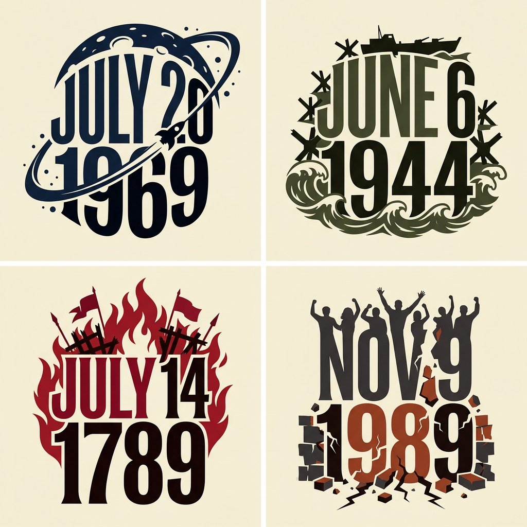
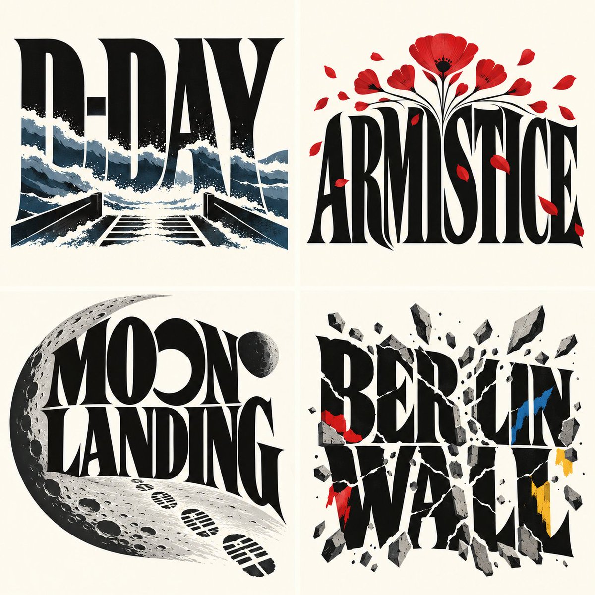
color_palette · high-contrastcolor_palette · warm-tonescomposition · multi-panelquality_flags · multi-panel-layoutquality_flags · typography-heavysubject_type · graphic-design
提示词(原文,逐字保留)
Nano Banana 2.1 vs GPT 2.5: now this is the kind of prompt that brings out the difference between these two.
2x2 grid, do this for 4 days that changed history
FORMAT: wide landscape, 16:9
Create a compact conceptual typographic artwork displaying the subject in uppercase. Combine expressive custom lettering with ONE subject-specific visual motif, forming a single unified graphic silhouette on warm ivory.
DESIGN FOUNDATION — KEEP FIXED
Make the word the dominant graphic structure, spanning almost the entire artwork.
Draw tall, tightly fitted, high-contrast uppercase display-serif letters with exaggerated proportions: broad strokes, narrow openings, concave sides, sharp flared terminals, and stretched curves.
Shape the word as a whole. Vary letter widths and heights, subtly bending the top and bottom contours to fit the surrounding motif. Keep spelling and readability intact.
Render the letters as flat, solid, opaque shapes with crisp edges. Choose black, ivory, or white according to contrast. Keep letter faces untextured.
CONCEPT INFERENCE — CHANGE WITH THE SUBJECT
Identify the subject’s central visual quality. Translate it into ONE coherent motif and ONE organizing behavior, such as repetition, flowing expansion, compression, branching, or gradual transformation.
Build the entire image by developing that motif. Choose it for its expressive shape and relationship to the subject.
Express meaning through contour, rhythm, scale, spacing, and color. Do not assemble a collection of topical objects.
INTEGRATION
Fuse the motif with the word’s outer silhouette. Let it emerge from selected letter edges, extend above or below the lettering, and define meaningful white openings.
When a human profile is appropriate, simplify it into an elegant silhouette. Let it share a boundary with the word or motif. Avoid realistic portrait detail.
Keep most letter faces unobstructed. The motif should create a deliberate outer contour and a few strong internal relationships.
STYLE CALIBRATION
For HUMANITY:
Use a sequence of overlapping human profile silhouettes, with varied contours and a progression from black through medium gray to pale gray. Arrange them rhythmically across the upper portion of the word. Integrate dark profiles into the outer ends of the composition. Keep the lettering black and the treatment restrained, predominantly flat, and monochrome.
For CREATIVITY:
Use one continuous system of flowing, curled, vividly colored ribbons resembling sculpted liquid pigment. Form sweeping crests, spiral tips, and fine internal grooves in cyan, deep blue, magenta, orange, and yellow. Integrate a simplified profile into the left boundary. Place large white lettering across the darker central region. Confine smooth shading and highlights to the colored curls.
For other subjects:
Infer an equally economical motif and treatment. Preserve the same custom typography, unified silhouette, clean background, and limited visual vocabulary. Do not automatically repeat faces or colorful ribbons.
DETAIL AND DEPTH
Use clean silhouette edges and broad readable shapes. Concentrate fine detail inside the chosen motif.
Any shading should describe the motif’s local curvature. Keep the overall work a graphic illustration without a camera perspective, staged environment, or physical pedestal.
EXCLUSIONS
No miniature worlds, buildings, landscapes, crowds, realistic heads, floating symbolic objects, prop collections, or scenes inside letters.
No stone lettering, metallic lettering, beveled text, extruded letter blocks, cast shadows, distressed surfaces, or cinematic lighting.
COMPOSITION
Center the complete artwork with clear ivory margins. Keep its outer shape compact and intentional.
At thumbnail size, the viewer should immediately perceive the word and one visual idea. Remove anything that competes with those two readings.
Output one finished artwork containing only the subject word.
中文译文
Nano Banana 2.1 vs GPT 2.5:正是这类提示语最能凸显两者之间的差异。
2x2 网格,为 4 个改变历史的日子各做一张
格式:宽幅横构图,16:9
创作一幅紧凑的概念性字体艺术作品,以大写字母展示主题。将富有表现力的定制字形设计与一个特定于主题的视觉母题相结合,在温暖的象牙白底色上形成一个统一的图形轮廓。
设计基础 — 保持固定
让文字成为主导的图形结构,跨越几乎整幅作品。
绘制高大、紧排、高对比度的大写展示衬线字母,比例夸张:粗笔画、窄字怀、凹形侧边、锋利的喇叭形收尾与拉伸的曲线。
将整个词作为一个整体来塑造。变化字母的宽度与高度,微妙地弯曲上下轮廓以契合周围的母题。保留正确的拼写与可读性。
将字母渲染为扁平、实心、不透明的形状,边缘清晰。根据对比度选择黑色、象牙色或白色。保持字母面无纹理。
概念推断 — 随主题变化
识别主题的核心视觉特质。将其转化为一个统一的母题和一种组织行为,例如重复、流动扩展、压缩、分支或渐进变形。
通过发展该母题来构建整个图像。根据其表现力形状与主题的关系进行选择。
通过轮廓、节奏、尺度、间距与色彩表达意义。不要拼凑一组主题性物体。
整合
将母题与文字的外部轮廓融合。让它从选定字母的边缘浮现,向字母上方或下方延伸,并界定有意义的白色开口空间。
当侧面人像轮廓合适时,将其简化为优雅的剪影。让它与文字或母题共享边界。避免写实的肖像细节。
保持大部分字母面不被遮挡。母题应营造出明确的外部轮廓与几处强烈的内部关系。
风格校准
对于 HUMANITY:
Use a sequence of overlapping human profile silhouettes, with varied contours and a progression from black through medium gray to pale gray. Arrange them rhythmically across the upper portion of the word. Integrate dark profiles into the outer ends of the composition. Keep the lettering black and the treatment restrained, predominantly flat, and monochrome.
对于 CREATIVITY:
Use one continuous system of flowing, curled, vividly colored ribbons resembling sculpted liquid pigment. Form sweeping crests, spiral tips, and fine internal grooves in cyan, deep blue, magenta, orange, and yellow. Integrate a simplified profile into the left boundary. Place large white lettering across the darker central region. Confine smooth shading and highlights to the colored curls.
对于其他主题:
Infer an equally economical motif and treatment. Preserve the same custom typography, unified silhouette, clean background, and limited visual vocabulary. Do not automatically repeat faces or colorful ribbons.
细节与深度
Use clean silhouette edges and broad readable shapes. Concentrate fine detail inside the chosen motif.
Any shading should describe the motif’s local curvature. Keep the overall work a graphic illustration without a camera perspective, staged environment, or physical pedestal.
排除项
No miniature worlds, buildings, landscapes, crowds, realistic heads, floating symbolic objects, prop collections, or scenes inside letters.
No stone lettering, metallic lettering, beveled text, extruded letter blocks, cast shadows, distressed surfaces, or cinematic lighting.
COMPOSITION
Center the complete artwork with clear ivory margins. Keep its outer shape compact and intentional.
At thumbnail size, the viewer should immediately perceive the word and one visual idea. Remove anything that competes with those two readings.
Output one finished artwork containing only the subject word.
来源与署名
原文由 @Gdgtify 发布在 X:查看原推文。 本页逐字保留原文并提供机器翻译的中文解读;版权归原作者所有。
同工具的更多提示词
- Gemini Nano Banana 2 与 Nano Banana 2.1 在 @GeminiApp 上的对比 提示词 👇 一位身着利落黑色西装、搭配挺括白…@pictsbyai
- { "vibe_title_en": "Botanical Apathy", "master_prompt": "一张超现实的、高级的时尚人像,主角散发着「高…@timedoctor_nft
- 2x2 网格,16:9,为 4 部著名漫画执行以下效果:等距 3D 微缩立体场景,其中单词 "[$WORD]" 本身就是景观:每个巨大的 3D 字母都被改造成…@Gdgtify
- 使用 Nano Banana 2 制作 @weryai 试用 : https://t.co/BuFfvx9NJG 提示词 👇 竖版构图,超写实编辑级旅行摄影…@dreamydigiarts
- 电影剧照,一位韩国女性身处豪华酒店套房,头部后仰,嘴巴大张,呈紧张尖叫或狂喜的表情,黑色头发飞扬。她剧烈旋转,在整个画面中产生浓重的运动模糊效果。低角度拍摄…@bmx_ai13
- 感受正午的专注。 **PROMPT** 在不改变照片中女性外貌(确切的面部身份)的前提下,一张大幅的 4/5 比例 8K 影棚人像,带闪光灯的夜景拍摄。 女性…@oye_samia