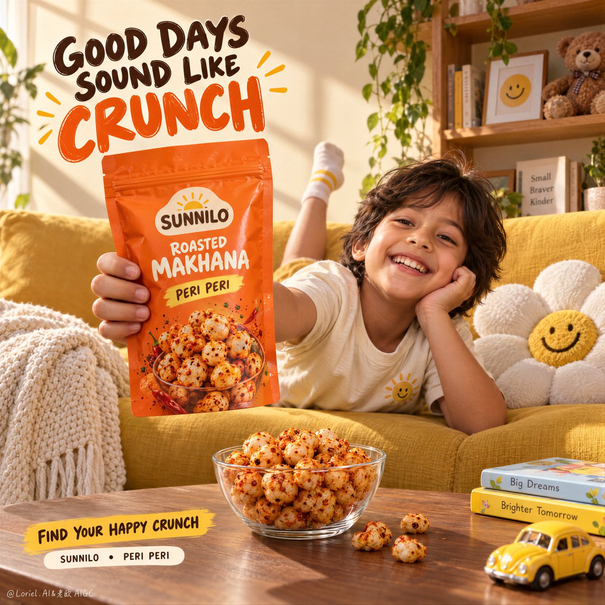
这个家庭瞬间之所以奏效,是因为零食袋占据了离镜头最近的位置。
分享链接 · https://openimages.ajiang.me/p/2105636915517280746/
color_palette · warm-tonescomposition · low-anglecomposition · negative-spacequality_flags · embedded-textscene · indoor-homesubject_type · food-drink
提示词(原文,逐字保留)
The family moment works because the pouch gets the closest seat to the camera.
🍊 snack pouch held in the left-center foreground, fully facing the lens, with the hand grip visible but never covering the logo or flavor name
This makes the pack read first, even inside a warm lived-in scene. The child supports the story without becoming the advertisement.
🌿 match the seasoned makhana on the pouch artwork to the bowl: irregular puffed shapes, porous surfaces, and uneven peri-peri dust
The product promise feels credible when the real food repeats the package image. You see one snack world, not a pack plus unrelated props.
GPT- image 2.5 prompt👇
Create one finished vertical 4:5 lifestyle advertising poster for SUNNILO, a fictional roasted makhana snack brand. The featured product is a real orange resealable pouch of SUNNILO Peri Peri Roasted Makhana, and it must be the sharpest, most commanding object in the image.
Use a warm sunlit family living room shot from a low coffee-table viewpoint with a moderately wide lens. In the middle ground, one cheerful child around 8 years old lounges diagonally across a golden-yellow sofa, wearing a cream T-shirt with a small sunshine emblem, mustard shorts, and white socks with thin yellow stripes. One leg lifts casually behind the sofa back. The child smiles toward camera and extends one hand forward, holding the pouch close to the lens. Keep the arm connection natural, with a believable grip and five correct fingers. The pouch sits in the left-center foreground, occupying about one quarter of the image, with its full front panel, top seal, and lower corners visible.
Design the pouch as a credible manufactured snack package: vivid tangerine-orange flexible film, sealed edges, resealable top, slight crinkles under the fingers, correct thickness, subtle satin reflections, and a stable printed front. The original SUNNILO logo is a compact cream badge with a small rising sun. Print only: “SUNNILO”, “ROASTED MAKHANA”, and “PERI PERI”. Add a restrained photo-style cluster of seasoned makhana near the lower front. Do not add nutrition or health claims.
On the coffee table in the lower center, place a clear glass bowl filled with roasted makhana. Each piece should have an irregular puffed shape, porous surface, and uneven reddish-orange peri peri seasoning. Let three or four pieces spill naturally beside the bowl. The bowl food must match the pouch image. Keep the glass realistic with thickness, refraction, highlights, and contact shadow, but secondary to the pouch.
Set details: a textured cream throw over the sofa arm at lower left, a soft white flower cushion with a small yellow smiling center beside the child, and at the right rear a simple wooden shelf with a few books, trailing plants, a small framed smile icon, and a teddy bear, all softly out of focus. Near the lower right edge, include two thin children’s books and a small yellow toy car. No extra people, products, or clutter.
Reserve the upper-left wall as generous negative space for the three-line English headline:
“GOOD DAYS
SOUND LIKE
CRUNCH”
Set the first two lines in expressive dark cocoa hand lettering and make “CRUNCH” the largest word in warm orange. Use rounded custom letterforms, subtle cream edging, disciplined spacing, and a few small drawn accents. The type follows the wall perspective, stays crisp and readable, and does not overlap the child’s face or the pouch. At the bottom left, add a small warm-yellow brushstroke with “FIND YOUR HAPPY CRUNCH”, and beneath it one clean cream pill containing only “SUNNILO • PERI PERI”. No retailer logos, websites, or extra slogans.
Use strong late-afternoon sunlight from the upper left, casting broad diagonal window shadows across the pale apricot wall. The pouch receives a soft key and narrow warm edge light so it separates from the yellow sofa. Keep visible dark-to-light depth in folds, shelf recesses, under the bowl, and beneath the child’s arm, with no crushed blacks. Palette hierarchy: orange pouch first, golden sofa second, cream wall and textiles third, dark cocoa typography as contrast. The mood is spontaneous, playful, appetizing, and warmly lived-in.
Combine premium commercial product photography with natural lifestyle photography: realistic skin texture, plausible fabric folds, true package printing, accurate food texture, refined glass optics, gentle depth of field, and clean compositing. Child anatomy is natural and age-appropriate, with structurally correct face, limbs, hands, and fingers. All visible text is spelled exactly as specified. No real person’s name appears anywhere in the image.
中文译文
这个家庭瞬间之所以奏效,是因为零食袋占据了离镜头最近的位置。
🍊 零食袋置于左中前景,完全朝向镜头,握持的手部可见,但绝不能遮挡 logo 或口味名称
这让包装在温暖的生活化场景中仍然第一眼被读懂。孩子支撑着故事,却不会成为广告本身。
🌿 让袋身图案上的调味炸莲子与碗中的实物一致:不规则的膨化形状、多孔表面、以及不均匀的 peri-peri 调料粉
当真实食物复刻了包装图像,产品承诺就变得可信。你看到的是一个零食世界,而不是一个包装加一堆无关道具。
GPT- image 2.5 prompt👇
为虚构烘烤炸莲子(roasted makhana)零食品牌 SUNNILO,创作一张成品纵向 4:5 生活方式广告海报。主角产品是一包真实的橙色可重新封口 SUNNILO Peri Peri Roasted Makhana 袋装零食,它必须是画面中最清晰、最具掌控力的物体。
采用一张温暖阳光下的家庭客厅照片,从低视角的茶几位置拍摄,使用中等广角镜头。中景中,一个约 8 岁、开朗的孩子斜倚在一张金黄色沙发上,穿着带小太阳图案的奶油色 T 恤、芥末黄短裤,以及带细黄条纹的白袜。一条腿随意抬起搭在沙发靠背后面。孩子朝镜头微笑,伸出一只手向前,将袋装零食举到镜头附近。手臂连接要自然,握姿可信,五根手指正确。袋装零食位于左中前景,约占画面四分之一,可见完整正面、顶部封口和下部边角。
将袋装零食设计成像样可信的工业化零食包装:鲜亮的橘橙色柔性薄膜、封边、可重新封口的顶部、手指下方轻微褶皱、正确的厚度、细微的缎面反光,以及稳定的印刷正面。原创 SUNNILO logo 为带小太阳的紧凑奶油色徽章。仅印刷:“SUNNILO”、“ROASTED MAKHANA”和“PERI PERI”。在靠下的正面加一处克制的写实风格调味炸莲子簇。不要添加营养或健康宣称。
在下方中央的茶几上,放置一个装满烘烤炸莲子的透明玻璃碗。每颗都应有不规则的膨化形状、多孔表面、以及不均匀的红橘色 peri peri 调味。让三到四颗自然散落在碗边。碗中的食物必须与袋身图案一致。玻璃要保持真实质感——有厚度、折射、高光和接触阴影,但要让位于袋装零食。
场景细节:左下沙发扶手上搭一条带纹理的奶油色披巾,孩子旁边放一个带小黄色笑脸花蕊的柔软白色花朵靠垫,右后方一个简约木质书架,上面有几本书、垂吊绿植、一幅带笑脸的小相框,以及一只泰迪熊,都柔和失焦。在右下边缘附近,放两本薄薄的童书和一辆小黄色玩具车。不要多余的人物、产品或杂物。
将左上墙面留作充足的负空间,承载三行英文主标题:
“GOOD DAYS
SOUND LIKE
CRUNCH”
前两行使用表现力强的深可可色手写字体,“CRUNCH”作为最大的词,使用温暖橙色。使用圆润的定制字形、细微的奶油色描边、克制的间距,以及少量手绘小装饰。字体跟随墙面透视,保持清晰可读,且不与孩子的脸或袋装零食重叠。在左下添加一道小而温暖的黄色笔刷,上面写“FIND YOUR HAPPY CRUNCH”,下方放一个简洁的奶油色胶囊,仅含“SUNNILO • PERI PERI”。不要零售 logo、网址或额外标语。
使用强烈的午后阳光从左上方打入,在淡杏色墙面上投下宽大的斜向窗影。袋装零食接收柔和的主光和一道窄暖边缘光,使其从黄色沙发中分离出来。在褶皱、书架凹处、碗下和孩子手臂下方保持可见的暗到亮层次,不要压死黑。配色层级:橙色袋装零食优先,金色沙发其次,奶油色墙面与织物第三,深可可色字体作为对比。氛围是自然、俏皮、开胃,且温暖生活化的。
融合高端商业产品摄影与自然生活方式摄影:真实的皮肤质感、可信的布料褶皱、真实的包装印刷、准确的食物质感、精致的玻璃光学、柔和的景深,以及干净的合成。孩子解剖结构自然且符合年龄,面部、四肢、手部和手指结构正确。所有可见文字拼写完全按指定。画面任何位置均不得出现真实人名。
来源与署名
原文由 @ou_zhen599 发布在 X:查看原推文。 本页逐字保留原文并提供机器翻译的中文解读;版权归原作者所有。
同工具的更多提示词
- 你看到的是一个进球射门画面。这个提示词真正在控制的是一次"可食用的撞击"。 🥅 白色球门网紧紧裹住炸圈,网线绷紧,菜品颗粒挤压,结点清晰可见,并涉及拉伸的绳索…@ou_zhen599
- 奢侈品香氛的视觉画面会在所有辅助元素都与瓶身共享同一垂直轴线时变得更加安静。 🌸 一朵大型半透明花朵放置在瓶身后方并略高于瓶身,花瓣向外展开,不越过标签或瓶盖…@ou_zhen599
- 报纸之所以有效,是因为它不是道具——它是海报里面的海报。 🗞️ 报纸在画面左上中央被举起朝向镜头,通过强制透视放大,自行车与骑行者沿对角线向后退 促销内容先于…@ou_zhen599
- 香水香调系列广告应改变瓶身之外的世界——而非瓶身本身。 🍯 三个面板中重复同一居中瓶子、比例、瓶盖与标签处理;只改变瓶子周围的香调环境 瓶子成为视觉主脊。观看…@ou_zhen599
- 仍在完善这个提示词,但我仍然无法得到一个让我满意的结果……继续吧!😅 GPT Image 2.5 : 图像类型: 创建一张照片写实风格的编辑人像。 构图: 腰…@VIBEQUIRKLABS
- 使用上传的参考照片中的男士作为主要视觉参考,创作一幅逼真的肖像。准确保留他的面部、身份、自然面部特征、皮肤质感和整体外貌。他盘腿坐在地板上,穿着男性化的黑色T…@Alisina_ai