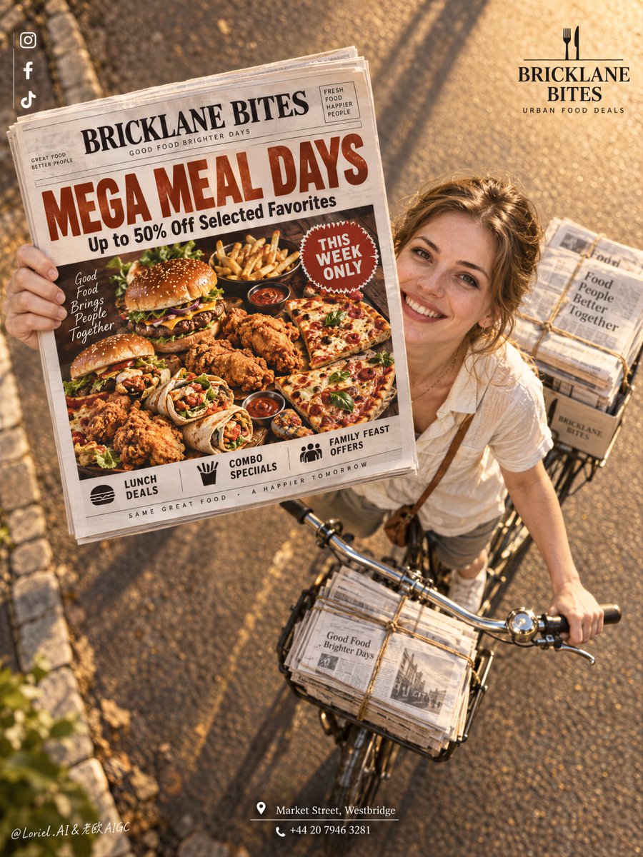
报纸之所以有效,是因为它不是道具——它是海报里面的海报。
分享链接 · https://openimages.ajiang.me/p/2105605352905650201/
color_palette · warm-tonescomposition · dynamic-diagonalcomposition · high-anglehuman_attributes · hands-prominenthuman_attributes · long-hairlighting · golden-hour
提示词(原文,逐字保留)
The newspaper works because it is not a prop—it is the poster inside the poster.
🗞️ newspaper lifted toward the lens in the upper-left center, enlarged by forced perspective, with the rider and bicycle receding diagonally behind it
The promotion reads before the street scene. You get a believable delivery moment without sacrificing the food offer’s legibility.
🍔 treat the newspaper front page as a complete food-ad layout: one oversized headline, one hero platter, one compact urgency badge
This keeps the offer instantly scannable even at a distance. The print feels like a real promotional object, not texture pasted over a photograph.
GPT- image 2.5 prompt👇
A premium restaurant promotion poster for fictional dining brand BRICKLANE BITES, merging street charm, material precision, and graphic clarity into one image. Preserve the exact structure: a dramatic high-angle overhead view of a bicycle moving along a warm sunlit road, an adult Western white girl looking up and smiling while extending a newspaper directly toward the camera, tied newspaper bundles on the bicycle, a small brand mark in the upper right, a clean vertical social-icon strip in the upper left, and a centered address block near the bottom. The newspaper front page remains the absolute visual leader.
The girl is photoreal, adult, naturally attractive, and believable, with realistic skin texture, subtle pores, natural lips, soft facial structure, correct head-neck-shoulder proportion, elegant hands with five normal fingers, believable wrists and elbows, natural posture, and no distortion. She wears a simple light cream short-sleeve shirt with relaxed summer styling, authentic rather than fashion-forward. She rides the bicycle and looks up with a bright persuasive smile, but stays secondary to the newspaper and its promotion.
The camera angle is critical: a top-down three-quarter overhead shot, with the bicycle diagonally crossing the lower right quadrant and the newspaper lifted toward the lens in the upper-left-central area, creating a bold forced-perspective moment. The road is warm and glowing with golden-hour sunlight, long soft shadows, subtle edge stones, and clean depth. The bicycle is classic and practical, with realistic metal handlebars, front tied bundles, rear stacks of paper, and believable weight balance. The whole image should feel like Orbit, Transit, and Port fused together: emotionally inviting, materially exact, and graphically elevated.
The newspaper front page is fully redesigned in English as a restaurant mega-discount promotion. Use a bold premium food-ad layout with a large appetizing hero spread of burgers, fried chicken, loaded fries, wraps, and pizza slices arranged in a dramatic overhead tray or platter, with rich warm highlights, crisp fried texture, glossy sauces, and irresistible realism. Use one giant original English headline such as “MEGA MEAL DAYS” or “BIG BITES, SMALLER PRICES”, plus one strong support line such as “Up to 50% Off Selected Favorites”. Add only a few smaller clean sub-lines like “Lunch Deals”, “Combo Specials”, “Family Feast Offers”, and one compact badge like “This Week Only”. Keep the newspaper typography sharp, readable, premium, and uncluttered.
Branding is minimal and elegant. Upper right: a clean BRICKLANE BITES logo with a short descriptor such as “Urban Food Deals”. Upper left: minimal social icons aligned vertically. Bottom center: one refined English address-and-contact block such as “Market Street, Westbridge” and one phone line. Outside the newspaper, keep text restrained so the printed promo page carries most of the communication.
Lighting is warm, cinematic, and commercially precise: golden-hour key light from the upper side, soft facial glow on the girl, crisp highlights on the newspaper edges, readable print contrast, gentle metallic reflections on the bicycle handlebar, and strong volume without muddy shadows or clutter. Color hierarchy: 55% warm amber road and sunlight, 25% cream and white newspaper tones, 20% rich food colors including red, golden brown, lettuce green, and sauce accents. Materials must feel hyperreal and tactile: printed paper grain, folded newspaper edges, twine-bound stacks, metal bicycle parts, realistic skin, cotton shirt fabric, crisp fried crust, glossy sauces, and clean commercial food photography embedded in the newspaper design. The final image should feel like a Cannes-level food-promo campaign fused with a street-distribution photograph: persuasive, warm, premium, clean, and highly readable.
中文译文
报纸之所以有效,是因为它不是道具——它是海报里面的海报。
🗞️ 报纸在画面左上中央被举起朝向镜头,通过强制透视放大,自行车与骑行者沿对角线向后退
促销内容先于街景被读到。你获得了一个可信的投递瞬间,却没有牺牲美食优惠的可读性。
🍔 将报纸头版视为一整版完整的美食广告版面:一个超大的标题、一个主菜拼盘、一个紧凑的紧迫感徽章
这让优惠即使在远处也能一眼扫读。它不是贴在照片上的纹理,而是一个真正存在的促销实物。
GPT- image 2.5 prompt👇
一张为虚构餐饮品牌 BRICKLANE BITES 制作的高端餐厅促销海报,将街头质感、材质精度与平面清晰度融合在同一张图像中。保持完全相同的结构:戏剧性的高角度俯视视角下,一辆自行车行驶在一条温暖阳光的公路上,一位成年西方白人女孩抬头微笑,将一份报纸直接伸向镜头;自行车上挂着一捆捆扎好的报纸;右上角有一个小型品牌标识,左上角是一条简洁的纵向社交图标条;靠近底部的居中位置是地址信息块。报纸头版仍然是绝对的视觉主角。
女孩的形象要照片级真实,成年,天生好看且可信:真实的皮肤质感、细微毛孔、自然唇色、柔和的面部结构、正确的头颈肩比例、优雅的双手(五个正常手指)、可信的手腕与肘部、自然的体态,没有任何变形。她穿着简单的浅米色短袖衬衫,风格是放松的夏季造型,真实而非时尚前卫。她骑着自行车,抬头露出明亮且具说服力的笑容,但视觉上仍处于报纸及其促销内容的次要位置。
镜头角度至关重要:俯视四分之三角度的鸟瞰构图,自行车斜穿右下象限,报纸在左中上方被举起朝向镜头,形成一个大胆的强制透视瞬间。公路温暖、发着金光,长长的柔和阴影,路边石缘细微且干净,景深清晰。自行车经典实用,金属车把逼真,前部捆扎成束的报纸、后部堆叠的报纸,整体配重可信。整张图像应让人感受到 Orbit、Transit 和 Port 三者融合的感觉:情感上引人入胜,材质上精确,画面上高雅。
报纸头版需用英文完整重新设计为一份餐厅超大折扣促销版面。使用大胆高端的美食广告版面,布置一份大尺寸且诱人的主菜大拼盘——汉堡、炸鸡、堆料薯条、卷饼、披萨片——以戏剧性的俯视托盘或大盘方式排列,带有丰富温暖的高光、松脆的炸物纹理、光亮的酱料以及不可抗拒的真实感。使用一个原创的巨型英文主标题,例如 “MEGA MEAL DAYS” 或 “BIG BITES, SMALLER PRICES”,再加一句有力的辅助标题,例如 “Up to 50% Off Selected Favorites”。再添加少数干净的小副标题,例如 “Lunch Deals”、“Combo Specials”、“Family Feast Offers”,以及一个紧凑的徽章,例如 “This Week Only”。报纸上的字体保持锐利、可读、高端且不拥挤。
品牌呈现极简而优雅。右上角:一个简洁的 BRICKLANE BITES 标志,配以简短的描述语,例如 “Urban Food Deals”。左上角:极简的社交图标,纵向对齐。底部居中:一段精致的英文地址与联系信息,例如 “Market Street, Westbridge”,以及一行电话号码。报纸之外的文字保持克制,让印在报纸上的促销页面承载大部分信息。
光线温暖、电影感,并具备商业级别的精度——金色时刻的主光来自上方一侧,女孩面部有柔和的光晕,报纸边缘有清晰的高光,文字印刷对比度清晰易读,自行车车把有柔和的金属反光,整体立体感强烈但没有浑浊的阴影或杂乱。色彩层级:55% 温暖琥珀色的路面与阳光,25% 米色与白色报纸色调,20% 浓郁的食物色彩,包括红色、金棕色、生菜绿与酱料点缀色。材质必须超写实且有触感:印刷纸纹、折叠的报纸边缘、麻绳捆扎的纸捆、自行车金属部件、真实皮肤、棉质衬衫布料、松脆的炸物外壳、光亮的酱料,以及嵌入报纸设计内的专业商业美食摄影。成片应让人感觉像戛纳级别的美食促销大片与街头发报照片的融合:有说服力、温暖、高端、干净,并且高度可读。
来源与署名
原文由 @ou_zhen599 发布在 X:查看原推文。 本页逐字保留原文并提供机器翻译的中文解读;版权归原作者所有。
同工具的更多提示词
- 仍在完善这个提示词,但我仍然无法得到一个让我满意的结果……继续吧!😅 GPT Image 2.5 : 图像类型: 创建一张照片写实风格的编辑人像。 构图: 腰…@VIBEQUIRKLABS
- 你看到的是一个进球射门画面。这个提示词真正在控制的是一次"可食用的撞击"。 🥅 白色球门网紧紧裹住炸圈,网线绷紧,菜品颗粒挤压,结点清晰可见,并涉及拉伸的绳索…@ou_zhen599
- 超写实 IMAX 级 Netflix 风格水彩时尚插画,9:16 竖版。使用上传的图片作为主要视觉参考,保留完全相同的面部特征、比例和标志性细节。画面中创建一…@imGopalTiwari
- 这个家庭瞬间之所以奏效,是因为零食袋占据了离镜头最近的位置。 🍊 零食袋置于左中前景,完全朝向镜头,握持的手部可见,但绝不能遮挡 logo 或口味名称 这让包…@ou_zhen599
- 一张高端复古旅行海报,以 [Country/City Name](国家/城市名称)为主题,中央放置一台大型平板电脑,屏幕中展示一座手工制作的 3D 立体纸艺微…@Shorelyn_
- 奢侈品香氛的视觉画面会在所有辅助元素都与瓶身共享同一垂直轴线时变得更加安静。 🌸 一朵大型半透明花朵放置在瓶身后方并略高于瓶身,花瓣向外展开,不越过标签或瓶盖…@ou_zhen599