包装不应是产品的唯一证明——把一种原料变成一座地标。
分享链接 · https://openimages.ajiang.me/p/2104571190430126429/
camera_lens · macrocamera_lens · shallow-depth-of-fieldcolor_palette · earthycomposition · centeredcomposition · wide-shotlighting · natural-daylight
提示词(原文,逐字保留)
The pack should not be the only proof of product—turn one ingredient into a landmark.
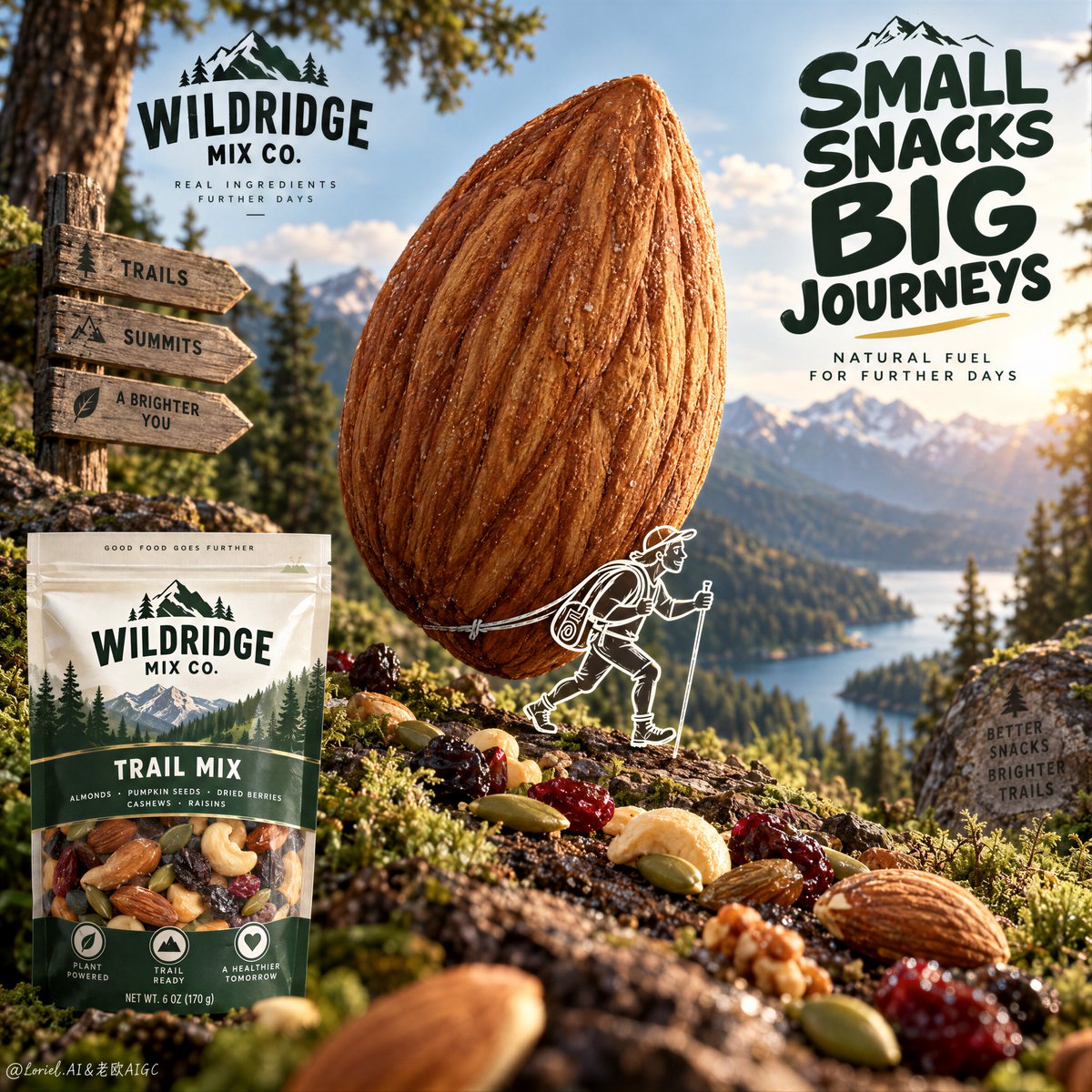
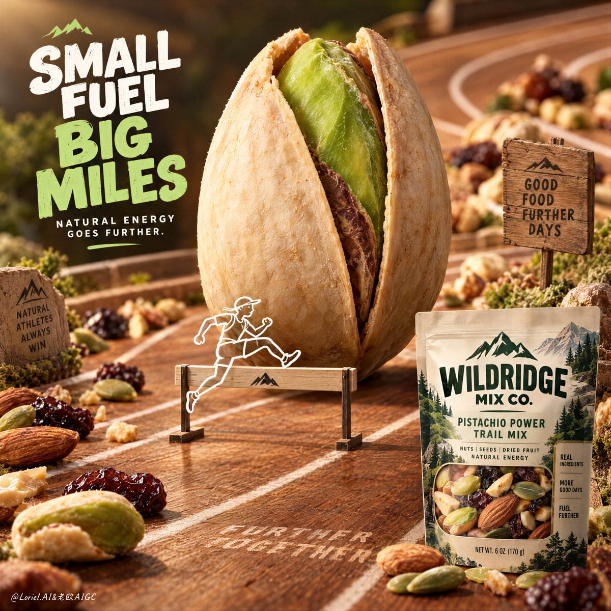
🌿 Enlarge one hero ingredient into a central monument, while preserving its real texture: ridges, asymmetry, dry surface, and natural flaws.
The food becomes an icon at first glance without losing its appetite appeal.
🪽 Add one small line-drawn explorer interacting with the ingredient, then keep the real retail pack quiet in a corner.
The illustration gives the product a story, while the pack confirms what the viewer can actually buy.
GPT- image 2.5 prompt👇
Create the definitive Orbit + Transit + Port final poster for the fictional international trail-snack brand WILDRIDGE MIX CO. Preserve the exact whimsical product-led architecture of the reference, but refine it into a cleaner, sharper, more collectible campaign master visual with stronger ingredient hierarchy, more elegant illustration integration, and a clearer retail-pack read. Keep the same essential structure: one giant upright almond at the center like a natural monument, one small white line-drawn explorer character interacting with it as if carrying it like an expedition pack, a premium macro forest-floor ground plane beneath, a guided path of real trail-mix ingredients crossing the image, and one crisp packaged snack product anchored in the lower-left corner. The final result must feel adventurous, healthy, premium, and unmistakably commercial, with the food product remaining the absolute hero.
The absolute hero is the monumental almond at center. Render it in extreme photoreal macro detail, upright and slightly dominant over the surrounding world, with rich shell ridges, believable asymmetry, warm toasted brown tone, dry tactile surface, and subtle natural imperfections. It must read instantly as a real edible ingredient enlarged into an icon. The almond should feel monumental enough to become the core symbol of the poster, but still appetizing and materially accurate. It reads first from across the room.
Integrated around the almond is one small white line-drawn trail explorer character, walking forward with a hiking stick and carrying the almond as if it were a giant backpack. The illustration must be crisp, charming, and intentionally branded, like a premium mascot sketch printed into the campaign world. It must remain secondary to the almond and never turn the image into a cartoon. The relationship between the line character and the almond should communicate that the snack is built for endurance, movement, and long-haul adventure.
The ground plane must feel like a premium macro trail environment rather than a simple tabletop. Use dark bark-like stone, forest moss, tiny leaf fragments, subtle soil texture, and slightly damp natural detail, all rendered in shallow macro depth. Across this surface, arrange real trail-mix ingredients in a loose path that guides the eye through the frame: pumpkin seeds, raisins, dried berries, nut fragments, and other believable snack components. These ingredients must feel edible, texturally varied, and naturally scattered, but still compositionally controlled. They support the almond hero without competing with it.
Typography must be newly invented and entirely English only. Do not copy any wording from the source image. Place one bold playful headline block in the upper-right quadrant using a rounded but premium display type, communicating the idea of adventure-packed fuel, trail energy, or portable endurance. Add one short supporting line near the lower-right only if it helps clarify the product promise. Typography must feel graphic, clean, and brand-smart, never overwhelming the almond. A small refined brand lockup near the upper-left is acceptable if useful, but all text remains secondary to the product monument.
The packaged product is essential and must be clearly visible in the lower-left corner as the retail anchor. Render a premium snack jar or pouch with newly invented English-only branding for WILDRIDGE MIX CO., including a clean label, natural trail-food cues, and realistic shelf-ready packaging materials. The pack must feel commercially exact and readable, with believable transparency or printed wrap behavior if appropriate. It should confirm what the product is without stealing dominance from the giant almond.
Lighting must be tactile, warm, and natural, like filtered outdoor sunlight passing through a forest opening. Use soft directional light to reveal almond ridges, glossy raisin skin, matte seed surfaces, moss texture, and packaging detail. Build gentle highlights and controlled earthy shadows so the image feels appetizing, healthy, and grounded. Avoid muddy darkness, flat food-photography blandness, or harsh flash. The scene should feel like a miniature expedition built from real ingredients.
Use a disciplined 60/30/10 palette hierarchy: 60% forest green, bark brown, moss darks, and earthy ground atmosphere, 30% warm almond brown and seed-gold ingredient accents, 10% clean white illustration lines and packaging highlights. The palette must feel organic, premium, and immediately ownable as a brand world.
Material semantics are critical. The almond must feel dry, textured, and real. The seeds and dried fruit must feel naturally varied and edible. The moss and bark ground must feel tactile and slightly moist. The packaging must feel premium and shelf-real. The white line explorer must feel crisp, intentional, and graphic. Every element should reinforce that this is a trail-snack campaign where adventure is literally built from the product ingredients.
Orbit priority: maximize first-glance impact through the triad of giant almond monument, tiny explorer illustration, and ingredient trail path. Transit priority: make the poster clearly expandable into a full WILDRIDGE MIX CO. universe of walnut chapters, cashew chapters, berry variants, protein blends, energy-bar companions, and outdoor endurance editions while preserving the same monument-ingredient grammar. Port priority: remove all unnecessary forest clutter, reduce copy to the minimum useful amount, preserve strong negative control around the almond, and compress the image into a rare, internationally polished snack campaign key visual.
Quality target and structured exclusions: photoreal food-advertising poster, exact almond shell realism, realistic seeds and dried fruit, believable package design with invented English-only branding, clean white line illustration, no random letters, no toy-like almond, no cartoon food styling, no muddy greens, no cluttered forest background, no messy composition, no style drift, no AI artifacts, no watermark, no real brand names, no real person names.
中文译文
包装不应是产品的唯一证明——把一种原料变成一座地标。
🌿 将一种主角原料放大为中央纪念碑,同时保留其真实质感:纹路、不对称、干爽表面与自然瑕疵。
食物在第一眼就成为标志,却不失食欲吸引力。
🪽 加入一个小型线稿探险者与原料互动,然后将真正的零售包装安静地放在角落。
插画赋予产品一个故事,而包装则确认观众实际可以购买的东西。
GPT- image 2.5 prompt👇
为虚构的国际徒步零食品牌 WILDRIDGE MIX CO. 创作最终的 Orbit + Transit + Port 定稿海报。保留参考图精确的、以产品为主导的奇趣建筑结构,但要将其精炼为更干净、更锐利、更具收藏价值的战役主视觉,拥有更强的原料层级、更优雅的插画整合,以及更清晰的零售包装可读性。保持同样的基本结构:中央一棵如自然纪念碑般直立的巨型杏仁、一个与之互动的小型白色线稿探险者角色(仿佛像背一只远征背包一样背着它)、下方一片精致的宏观森林地表、一条真实什锦干果原料路径横贯画面,以及左下角锚定的一个清晰包装零食产品。最终效果必须感觉冒险、健康、精致,并且毫无疑问地商业化,食品保持绝对的英雄地位。
绝对的英雄是中央那座纪念碑式的杏仁。以极端的摄影级宏观细节渲染它,直立并略微凌驾于周围世界之上,拥有丰富的壳纹、可信的不对称感、温暖的烘焙棕色调、干爽的触感表面,以及细微的自然不完美。它必须一眼就读起来像一个被放大成标志的真实可食用原料。杏仁应足够纪念碑式以成为海报的核心象征,但仍保持诱人且材质准确。它在房间另一头就能最先被读到。
围绕杏仁整合一个小型白色线稿徒步探险者角色,手持登山杖向前行走,仿佛把杏仁当作一只巨型背包背负。插画必须清晰、迷人且有意品牌化,如同印入战役世界的一张精致吉祥物素描。它必须保持次于杏仁的位置,永远不让画面变成卡通。线稿角色与杏仁之间的关系应传达出该零食是为耐力、移动与长途冒险而生。
地表必须感觉像精致的宏观徒步环境,而非简单的桌面。使用深色树皮状石块、森林苔藓、微小叶片碎片、细微土壤纹理,以及略湿的自然细节,全部以浅层宏观景深渲染。在这表面上,安排真实什锦干果原料形成一条松散的路径,引导视线穿过画面:南瓜籽、葡萄干、干燥浆果、坚果碎片以及其他可信的零食成分。这些原料必须感觉可食用、质感多样、自然散落,但仍构图受控。它们支撑杏仁英雄,而不与之竞争。
字体必须全新发明且完全仅使用英文。不要复制源图中的任何措辞。在右上象限放置一个大胆、俏皮的标题块,使用圆润而精致的展示字体,传达冒险满载的能量、徒步能量或便携耐力的概念。如果有助于阐明产品承诺,可在右下角附近添加一条简短的辅助文字。字体必须感觉图形化、干净且品牌聪明,永远不要压倒杏仁。左上角附近如有用可放置一个小型精致的品牌锁定组合,但所有文字仍次于产品纪念碑。
包装产品至关重要,必须清晰可见地放在左下角作为零售锚点。渲染一个精致零食罐或袋,配以全新发明的、仅英文的 WILDRIDGE MIX CO. 品牌,包括干净的标签、自然徒步食品暗示,以及真实的可上架包装材料。包装必须感觉商业精确且可读,如合适应具有可信的透明感或印刷包裹行为。它应确认产品的身份,却不让巨型杏仁失去主导地位。
光线必须有触感、温暖且自然,如同穿过林间开口的过滤户外阳光。使用柔和定向光来揭示杏仁纹路、葡萄干的油亮表皮、哑光籽表面、苔藓纹理与包装细节。构建柔和的高光与受控的大地色阴影,让画面感觉诱人、健康且踏实。避免浑浊的黑暗、平淡的食品摄影感,或刺眼的闪光。场景应感觉像由真实原料构建的一座微型远征。
使用严谨的 60/30/10 配色层级:60% 森林绿、树皮棕、苔藓深色与大地地面氛围,30% 温暖杏仁棕与籽金原料强调色,10% 干净的白色插画线条与包装高光。配色必须感觉有机、精致,并立即可被认领为一个品牌世界。
材质语义至关重要。杏仁必须感觉干爽、有质感且真实。籽与干燥水果必须感觉自然多样且可食用。苔藓与树皮地面必须感觉有触感且略湿。包装必须感觉精致且上架真实。白色线稿探险者必须感觉清晰、有意且图形化。每个元素都应强化这是一场徒步零食战役——冒险由产品原料真正构建而成。
Orbit 优先级:通过巨型杏仁纪念碑、小型探险者插画与原料路径的三位一体,最大化第一眼冲击力。Transit 优先级:使海报明确可扩展为一个完整的 WILDRIDGE MIX CO. 宇宙,涵盖核桃章节、腰果章节、浆果变体、蛋白混合、能量棒伴侣以及户外耐力版本,同时保留相同的纪念碑式原料语法。Port 优先级:移除所有不必要的森林杂乱,将文案减至最少有用量,在杏仁周围保留强烈的负空间控制,并将画面压缩为一个稀有、国际化的精致零食战役主视觉。
质量目标与结构化排除项:摄影级食品广告海报、精确的杏仁壳写实、真实的籽与干燥水果、带全新发明仅英文品牌的可信包装设计、干净的白色线稿插画、不要随机字母、不要玩具化杏仁、不要卡通食物造型、不要浑浊的绿色、不要杂乱的森林背景、不要混乱的构图、不要风格漂移、不要 AI 瑕疵、不要水印、不要真实品牌名、不要真实人名。
来源与署名
原文由 @ou_zhen599 发布在 X:查看原推文。 本页逐字保留原文并提供机器翻译的中文解读;版权归原作者所有。
同工具的更多提示词
- 食物的宏观质感之所以变得不可抗拒,是因为材质有一个明确的去处。 🍊 将克雷玛(crema)分为三个阶段来呈现:在勺子上隆起成拱形,收窄成一条丝带状倾泻而下,然…@ou_zhen599
- 上传你的图片:上传你的图片以将你自己用作时尚模特。在将你无缝置入场景的同时,精确保留你的身份、五官特征、发型、肤色和自然外观。 创作一幅电影感超现实奢华时尚照…@Goodmanprotocol
- 娇嗔(微蹙眉、轻抿唇、带一点恼意的撒娇神态) × 【事件】 × 宋式美学 × iPhone抓拍 https://t.co/uylxaigsJm@DeepBlueX0
- 超写实 IMAX 级 Netflix 风格沉静室内时尚人像,9:16 竖版。以上传的图片作为主要视觉参考,严格保留面部身份、比例及标志性特征。画面中塑造一位女…@imGopalTiwari
- 为 [COUNTRY / CITY / LOCATION / SUBJECT](国家 / 城市 / 地点 / 主题)创作一张高品质的 4:5 竖版编辑级旅行艺…@Goodmanprotocol
- 豐子愷水墨漫畫 × 【主題】 × 題詩落款 × 宣紙肌理 × 左下深藍色篆刻方印:「深藍」上、「DeepBlue」下 https://t.co/9qdHH3W…@DeepBlueX0