食物的宏观质感之所以变得不可抗拒,是因为材质有一个明确的去处。
分享链接 · https://openimages.ajiang.me/p/2104557885598622161/
camera_lens · macrocolor_palette · monochromecolor_palette · warm-tonescomposition · close-upmood · luxuriousscene · studio
提示词(原文,逐字保留)
Food macros become irresistible when the material has somewhere to go.
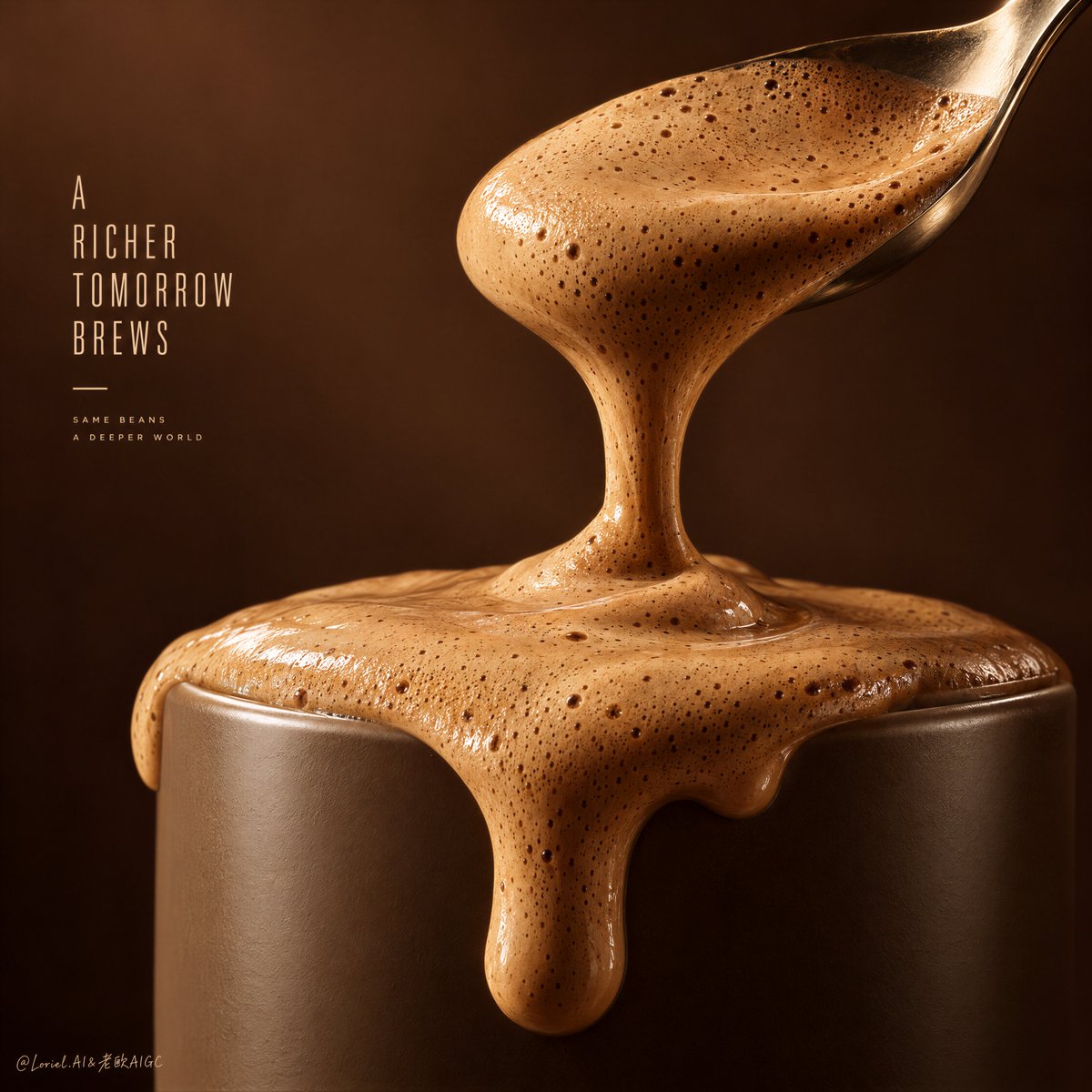
🍊 Stage the crema in three states: domed on the spoon, narrowing into a ribbon, then pooling and spilling over a thick cup rim.
You can read the foam’s weight and viscosity from the sequence, so the pour feels inevitable rather than decorative.
🧊 Keep the cup matte and the background dark; place the soft highlights on bubble ridges and the shoulders of each drip.
The crema becomes the brightest, most tactile surface in the frame, while the vessel holds the composition steady.
GPT- image 2.5 prompt👇
Create the definitive Orbit + Transit + Port final poster for the fictional international coffee innovation house CREMA CODE. Preserve the exact macro-teaser architecture of the reference, but refine it into a rarer, sharper, more collectible campaign master visual with stricter material hierarchy, cleaner monochrome control, and a more irresistible crema event. Keep the same essential structure: one oversized premium spoon suspended above the composition, a dense ribbon of velvety coffee crema descending from the spoon, a monumental cylindrical cup cropped in the lower frame, thick foam overflowing the rim in sculptural gravity-led drips, a warm monochrome espresso field, and only the lightest possible English teaser typography. The final result must feel like a luxury coffee poster built entirely from tactile appetite and material seduction.
The absolute hero is the crema itself. Render the foam, pour, spill, and surface texture in extreme macro photorealism so the viewer feels the thickness, softness, and aerated density instantly. The spoon must hold a heavy, glossy layer of whipped coffee foam that stretches downward into one clean central pour, landing on the cup top and pushing over the rim in one or two voluptuous, gravity-real drips. The crema must feel dense, velvety, and freshly whipped, with micro-bubbles, silky sheen, soft peaks, delicate pore structure, and rich caramel-tan depth. It must read as the primary subject before spoon, cup, or text.
The spoon should be cropped large in the upper-right to upper-middle area, angled diagonally downward with elegant tension. It must feel like a real premium utensil: warm brushed metal, soft refined highlights, smooth contour, believable weight, and controlled reflections. The spoon is the delivery mechanism of desire, but it remains secondary to the flowing crema itself.
The cup must be cropped close and monumental in the lower frame, functioning like a minimalist cylindrical pedestal for the overflow moment. It should feel ceramic, matte-satin, weighty, and color-tuned to the brown palette so the crema spill remains the brightest and most tactile contrast. The rim must be clean, thick, and precise. The spill pattern should feel physically inevitable, not decorative, with one dominant front drip and secondary side softening if needed. The cup is support architecture for the crema event.
The composition must be radically reduced and poster-driven. No extra props, no beans, no steam clouds, no café environment, no lifestyle cues. The image should behave like a material study or edible sculpture, where spoon, flow, rim, and spill create all emotional force. Preserve generous clean space on the left for a minimal teaser line, but let the crema dominate the frame from first glance.
The background must remain a pure warm espresso-to-mocha monochrome field with soft tonal gradients and no environmental detail. It should feel atmospheric but flat enough to support the macro product study. The emptiness is part of the luxury. Keep it clean, dense, and quiet.
Typography must be newly invented and entirely English only. Do not copy any wording from the source image. Use at most one short teaser phrase placed vertically or stacked on the left in a condensed premium sans-serif, hinting at richness, texture, or taste revelation. One tiny accent line or micro-tag near the top is acceptable only if it strengthens the poster rhythm. If the image becomes stronger with less typography, reduce it to the minimum. The copy must feel like a high-end launch teaser, never packaging copy.
Lighting must be exceptionally controlled and product-sensitive. Use soft warm side-front illumination to reveal foam structure, micro-bubbles, silky sheen, spoon curvature, and cup volume. Build delicate tonal gradients across the crema so it feels dimensional, edible, and alive. Keep highlights smooth and luxurious, with no oily glare and no watery flatness. The image should feel intimate, rich, warm, and expensive.
Use a disciplined 60/30/10 palette hierarchy: 60% warm espresso, mocha, and coffee-brown atmosphere, 30% lighter caramel-tan crema tones, 10% warm metallic spoon highlights and tiny typographic accents. The palette must feel monochrome, controlled, and appetite-driven.
Material semantics are critical. The crema must feel thick, foamy, velvety, and freshly whipped. The spoon must feel metallic, smooth, and premium. The cup must feel ceramic and substantial. The drips must feel gravity-real, glossy, and delicious. Every element should reinforce that this is a luxury coffee campaign where one perfect crema overflow becomes the entire brand promise.
Orbit priority: maximize first-glance impact through the triad of spoon, descending crema ribbon, and overflowing cup rim. Transit priority: make the poster clearly expandable into a full coffee universe of espresso, latte foam, cold brew mousse, caramel crema, mocha cloud, and seasonal flavor chapters while preserving the same macro ritual grammar. Port priority: remove all nonessential narrative and props, preserve the monochrome field, minimize typography, and compress the image into a rare, internationally polished luxury coffee campaign key visual.
Quality target and structured exclusions: photoreal macro coffee poster, realistic foam micro-bubbles, believable gravity flow, realistic spoon geometry, realistic ceramic cup edge, readable invented English typography only if used, no random letters, no muddy browns, no watery liquid texture, no plastic sheen, no cluttered background, no extra props, no cartoon style, no style drift, no AI artifacts, no watermark, no real brand names, no real person names.
中文译文
食物的宏观质感之所以变得不可抗拒,是因为材质有一个明确的去处。
🍊 将克雷玛(crema)分为三个阶段来呈现:在勺子上隆起成拱形,收窄成一条丝带状倾泻而下,然后在厚实的杯沿处汇聚并溢出。
从这个序列中可以读出泡沫的重量与黏度,让倾倒看起来像是必然发生的重力事件,而非装饰性动作。
🧊 保持杯身的哑光质感与背景的深沉;将柔和的高光放置在气泡的棱脊上和每一道滴落物的“肩部”位置。
这样克雷玛就成为画面中最明亮、最具触感的表面,而杯子则稳定地支撑整个构图。
GPT- 图像 2.5 提示词👇
为虚构的国际咖啡创新品牌 CREMA CODE(克雷玛密码)打造一张终极的 Orbit + Transit + Port 定稿海报。保留参考图中精确的宏观预告构图骨架,但将其精炼为更罕见、更锐利、更具收藏价值的战役主视觉,并采用更严格的材质层级、更干净的 monochrome 控制,以及更具诱惑力的克雷玛事件。保持相同的核心结构:一把超大尺寸的优质勺子悬于画面上方,一道浓密的丝带状丝绒咖啡克雷玛从勺子倾泻而下,一只巨型圆柱形杯子裁切于画面下半部,厚重的泡沫以雕塑般受重力引导的滴落溢出杯沿,整体为暖色 espresso 单色场,仅用最克制的英文字体作为预告文字。最终成品应感觉像是一张完全由触感食欲和材质诱惑构建的奢华咖啡海报。
绝对主角是克雷玛本身。以极致的宏观照片写实主义渲染泡沫、倾倒、溢出与表面质感,使观者在第一眼就能感受到其厚度、柔软度与充气密度。勺子必须盛着厚重的、有光泽的打发咖啡泡沫,并向下拉伸为一道干净的核心倾倒,落在杯顶并以一至两股丰满而符合重力逻辑的溢出推过杯沿。克雷玛必须感觉致密、丝绒般柔滑、刚刚打发好,具备微气泡、丝缎光泽、柔和峰尖、细腻的孔隙结构,以及浓郁的焦糖棕褐色深度。它必须在勺子、杯子和文字之前被识别为第一主体。
勺子应以大尺寸裁切于画面右上方至中上区域,沿对角线向下倾斜,带有优雅的张力。它必须像一把真正的高级餐具:温暖的拉丝金属、柔和精细的高光、平滑的轮廓、可信的重量,以及克制的反射。勺子是欲望的输送机制,但仍次于流动的克雷玛本身。
杯子应紧密裁切并以纪念碑般的尺度占据画面下半部,作为溢出时刻的极简圆柱形基座。它应具有陶瓷感、哑光缎面、厚重的分量感,并被调色到与棕色色板对齐,使克雷玛溢出成为最明亮、最具触感的对比。杯沿必须干净、厚实而精确。溢出形态应感觉是物理必然的结果,而非装饰性的;如有需要,可保留一道主要的前方滴落和次要的侧面柔化。杯子是支撑克雷玛事件的建筑结构。
构图必须被极度精简并以海报为核心。无额外道具,无咖啡豆,无蒸汽云,无咖啡馆环境,无生活方式暗示。图像应表现得像一份材质研究或可食用雕塑,由勺子、流体、杯沿与溢出共同构成全部情感张力。左侧保留充裕的干净空间以容纳极简的预告文字行,但让克雷玛从第一眼起就主宰画面。
背景必须保持纯净的暖色 espresso 至 mocha 单色场,带有柔和的色调渐变,且无任何环境细节。它应具有氛围感,但又足够平展以支撑宏观产品研究。留白本身即是奢华的一部分。保持其干净、致密与安静。
字体必须是全新自创的,且全部为英文。不要复制原图中的任何措辞。左侧最多可使用一句简短的预告短语,以竖排或堆叠形式置于左侧,采用一种压缩型高级 sans-serif,暗示丰盈、质感或味觉揭示。顶部可接受一条极小的辅助线或 micro-tag,仅当其强化海报节奏时使用。如果减少字体能让画面更强,请将其压缩到最少。文字必须像高端发布会的预告语,而非包装文案。
光线必须被极为克制且对产品敏感。使用柔和的暖色侧前方照明,揭示泡沫结构、微气泡、丝缎光泽、勺子弧度与杯体体积。在克雷玛上构建细腻的色调渐变,使其感觉立体、可食用且充满活力。保持高光平滑而奢华,避免油亮的眩光与水感扁平化。图像应感觉亲密、丰盈、温暖且昂贵。
采用克制的 60/30/10 色彩层级:60% 暖色 espresso、mocha 与咖啡棕氛围,30% 较浅的焦糖棕褐色克雷玛色调,10% 温暖金属色勺子高光与极小的字体点缀。色彩必须感觉 monochrome、受控且由食欲驱动。
材质语义至关重要。克雷玛必须感觉厚实、泡沫状、丝绒般柔滑且刚打发好。勺子必须感觉金属、平滑且高级。杯子必须感觉陶瓷且厚重。滴落必须感觉符合重力、有光泽且诱人。每一个元素都应强化这是一场奢华咖啡战役,其中一次完美的克雷玛溢出即成为整个品牌承诺。
Orbit 优先级:通过勺子、下落的克雷玛丝带与溢出杯沿的三位一体,最大化第一眼冲击力。Transit 优先级:在保留相同宏观仪式语法的前提下,使海报可清晰扩展为一个完整的咖啡宇宙,涵盖 espresso、拿铁泡沫、冷萃慕斯、焦糖克雷玛、mocha 云以及季节性风味章节。Port 优先级:移除一切非必要叙事与道具,保留 monochrome 场,最小化字体,并将图像压缩为一张罕见的、国际化的、打磨过的奢华咖啡战役主视觉。
质量目标与结构化排除:照片写实宏观咖啡海报,真实的泡沫微气泡,可信的重力流动,真实的勺子几何造型,真实的陶瓷杯沿,如使用字体则需为可读的自创英文,避免随机字母、避免浑浊的棕色、避免水状液体质感、避免塑料光泽、避免杂乱的背景、避免额外道具、避免卡通风格、避免风格漂移、避免 AI 伪影、避免水印、避免真实品牌名、避免真实人名。
来源与署名
原文由 @ou_zhen599 发布在 X:查看原推文。 本页逐字保留原文并提供机器翻译的中文解读;版权归原作者所有。
同工具的更多提示词
- 娇嗔(微蹙眉、轻抿唇、带一点恼意的撒娇神态) × 【事件】 × 宋式美学 × iPhone抓拍 https://t.co/uylxaigsJm@DeepBlueX0
- 包装不应是产品的唯一证明——把一种原料变成一座地标。 🌿 将一种主角原料放大为中央纪念碑,同时保留其真实质感:纹路、不对称、干爽表面与自然瑕疵。 食物在第一眼…@ou_zhen599
- 为 [COUNTRY / CITY / LOCATION / SUBJECT](国家 / 城市 / 地点 / 主题)创作一张高品质的 4:5 竖版编辑级旅行艺…@Goodmanprotocol
- 上传你的图片:上传你的图片以将你自己用作时尚模特。在将你无缝置入场景的同时,精确保留你的身份、五官特征、发型、肤色和自然外观。 创作一幅电影感超现实奢华时尚照…@Goodmanprotocol
- 超现实专业电影级时尚摄影,一位年轻女性,留着长长的浅棕色头发,柔软波浪,自然蓬松。她穿着一件酒红色酒红色连衣裙,采用挂脖款式,腰部和胸部有大型玫瑰形褶皱细节…@TaliaAariz
- 超写实 IMAX 级 Netflix 风格沉静室内时尚人像,9:16 竖版。以上传的图片作为主要视觉参考,严格保留面部身份、比例及标志性特征。画面中塑造一位女…@imGopalTiwari