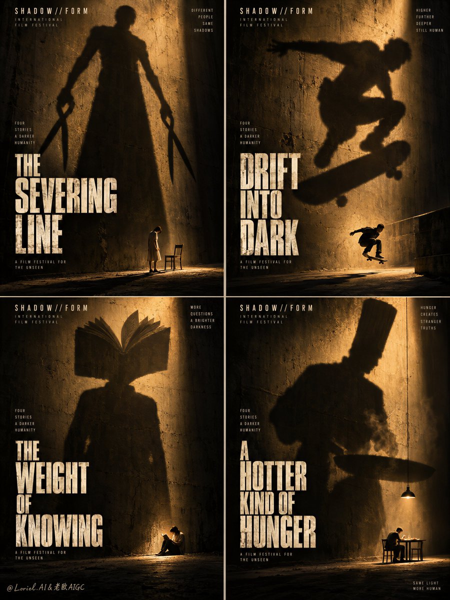
四张海报组成的系列之所以能成为一个系统,是因为威胁保持固定,只有隐喻在变化。
分享链接 · https://openimages.ajiang.me/p/2104138484529401912/
color_palette · dark-moodycolor_palette · warm-tonescomposition · multi-panellighting · side-litmood · dramaticquality_flags · embedded-text
提示词(原文,逐字保留)
A four-poster series becomes a system when the threat stays fixed and only the metaphor changes.
🌑 Repeat one rough wall, one hard amber light, one tiny figure at the floor line, and one oversized cast shadow.
Every panel carries the same scale shock, so the grid reads as one festival identity before the titles are even read.
🪞 Change only the shadow shape and its small human echo; keep the stacked title block in the same lower position.
Each chapter gains its own idea while the poster architecture stays unmistakably consistent.
GPT- image 2.5 prompt👇
Create the definitive Orbit + Transit + Port final board for the fictional international film-festival campaign SHADOW//FORM. Preserve the exact 2x2 grid architecture of four interconnected mini-posters, but refine the whole image into a sharper, rarer, more collectible festival master visual with stricter visual unity, stronger shadow monumentality, and a cleaner typography system. Each panel must feel like a standalone arthouse thriller poster, yet the total grid must read instantly as one coherent campaign identity built on giant symbolic shadows, tiny vulnerable humans, distressed walls, and severe amber theatrical light.
The overall board is a perfectly balanced four-panel grid with narrow clean separations. All four posters share the same world: rough concrete or plaster walls, dusty ground, deep shadow pools, strong directional amber-gold light, subtle atmospheric haze, and one tiny real human figure near the base of the frame overshadowed by a giant shadow-form cast across the wall. The shadow is always the true visual event. The human is always physically small, emotionally exposed, and positioned as the scale anchor. Each panel must operate with the same composition logic so the full board feels like a festival-branded system rather than four random images.
Panel one is the cutting chapter. A giant shadow figure towers over the wall, elongated and severe, holding oversized shears or scissor-like forms at both sides. Near the base, a tiny human figure stands in uneasy proximity to a minimal chair or restraint-like object, creating a ritualistic sense of threat and control. The stacked English title sits large in the lower half, newly invented and conceptually tied to severing, division, or shadow incision, but without copying any source wording. The panel should feel brutal, iconic, and immediately legible from a distance.
Panel two is the motion chapter. A huge shadow figure stretches across the wall in a crouched, airborne, or lunging posture that implies leap, escape, or impact. Near the lower area, a tiny skateboarder or similarly kinetic real figure echoes the movement, making the scale contrast feel physically dangerous. The title is stacked and bold in the lower half, newly invented in English only, built around ideas of flight, drift, lift, or velocity in darkness, without copying the source wording. The panel must feel tense, urban, and suspended.
Panel three is the knowledge chapter. A giant shadow figure stands with an open book replacing the head or expanding like an intellectual crown above the shoulders, monumental and uncanny. Near the base, a tiny solitary reader sits or crouches in a small pool of light, emphasizing vulnerability and devotion to thought. The title is a new English stacked phrase placed low in the frame, suggesting illuminated knowledge, burdened reading, shadow literacy, or inner education. The panel must feel solemn, cerebral, and haunting.
Panel four is the appetite chapter. A giant shadow figure with a tall chef-like silhouette or severe vertical hat shape looms over the wall like a ritual authority. Near the base, a tiny real figure sits at a small illuminated table or under a hanging work light, creating the tension between comfort and menace. The title is stacked, newly invented, and placed low in the frame, evoking heat, ritual, hunger, or dark preparation without copying the original. The panel must feel warm, threatening, and psychologically domestic.
Typography across all four posters must now be even more disciplined. Each panel receives one large stacked English title in a tall condensed weathered type treatment, always positioned near the lower half and scaled with matching rhythm. The wording changes panel to panel, but the font family, texture logic, alignment, and spacing system remain identical. Add only the minimum tiny credit-line structures at the bottom edge if necessary, fully re-authored in English only and kept secondary. The board must feel like a single film-festival visual identity with four chapters rather than four unrelated titles.
Lighting is the emotional engine and must be extremely controlled. Use powerful directional amber-gold illumination cutting through deep black shadow, creating long cast silhouettes, glowing dust in the air, and rich pools of theatrical darkness. The light must feel physically plausible but mythic in scale. The tiny human figures sit at the edge of illumination where vulnerability is strongest. The shadow figures must read as believable cast forms while also feeling archetypal and oversized. Keep the light-to-dark contrast sharp, expensive, and clean, with no muddy blacks or uncontrolled noise.
Use a disciplined 60/30/10 palette hierarchy across the entire board: 60% deep black, charcoal, and umber-shadow atmosphere, 30% warm amber-gold illumination and dusty wall tones, 10% pale off-white or muted cream typography and small highlight accents. The color system must be extremely restrained, cinematic, and festival-premium.
Material semantics are critical. The walls must feel rough, worn, and tactile. The dust and haze must feel particulate and light-catching. The shadow masses must feel dense and physically cast. The floor must feel gritty and grounded. The typography must feel printed, aged, and integrated into the poster surface. Every element must reinforce that this is not fantasy illustration but a design-led prestige-cinema campaign based on shadow, metaphor, and human scale.
Orbit priority: maximize first-glance impact through the four giant shadow monuments and the tiny exposed figures below them, so the full board reads instantly from a distance as one unforgettable festival wall. Transit priority: make the system clearly expandable into additional poster chapters, director retrospectives, genre variants, and film-program identities while preserving the same shadow grammar, amber-light palette, and stacked title architecture. Port priority: remove all nonessential scene detail, compress each panel to its most brutal symbolic form, reduce micro-text to the minimum, and preserve clean negative darkness so the board feels rarer, colder, and more internationally authoritative.
Target feeling: collectible arthouse thriller poster grid, prestige film-festival identity, monumental shadow symbolism, minimal narrative clues, psychological scale shock, museum-grade cinematic design.
Quality target and structured exclusions: photoreal cinematic poster board, exact 2x2 grid organization, consistent visual language across all four panels, realistic cast shadows, believable small human anatomy, no extra limbs, no deformed silhouettes, no random letters, no cluttered scenery, no cartoon style, no overdesigned props, no muddy blacks, no flat lighting, no style drift, no AI artifacts, no watermark, no real brand names, no real person names.
中文译文
四张海报组成的系列之所以能成为一个系统,是因为威胁保持固定,只有隐喻在变化。
🌑 重复一面粗糙的墙壁、一束硬朗的琥珀色光线、一个站在地面线上的微小人物,以及一个被投射得异常巨大的影子。
每个画面都承载着同样的尺度冲击,因此即便不读标题,整组画面也读起来像一个统一的电影节身份。
🪞 只改变影子的形状和它的小人形回声;保持堆叠标题块在同一个下方位置。
每一章获得自己的理念,而海报的架构保持毫不含糊的一致性。
GPT- image 2.5 prompt👇
为虚构的国际电影节活动 SHADOW//FORM 创作最终的 Orbit + Transit + Port 定稿整版。保持四张互联迷你海报的精确 2x2 网格架构,但将整张图像打磨得更锋利、更稀有、更具收藏价值,成为电影节主视觉,强调更严格的视觉统一性、更强的影子纪念碑感,以及更干净的字体系统。每一张海报都必须感觉像一张独立发行的艺术片惊悚海报,而整组网格必须让人瞬间读出这是一个基于巨型象征性影子、渺小脆弱的人类、破旧墙面与冷峻琥珀色剧场光线的统一活动身份。
整张版面是一个完美平衡的四格网格,格线狭窄干净。四张海报共享同一个世界:粗糙的混凝土或灰泥墙壁、积尘的地面、深邃的阴影池、强烈的定向琥珀金色光线、微妙的大气雾霭,以及一个靠近画面底部的渺小真实人类,被投射在墙上的巨型影子形式所笼罩。影子始终是真正的视觉事件。人类始终在物理上渺小、情感上暴露,并充当尺度锚点。每一张都必须遵循相同的构图逻辑,使整版像是一个电影节品牌系统,而非四张随机图像。
第一张是切割章节。一个巨大的影子身影高耸在墙上,形体被拉长、冷峻,双手各持超大的剪刀或剪刀状形态。在底部附近,一个渺小的人类身影不安地站在一把极简的椅子或类似束缚物的旁边,营造出仪式化的威胁与控制感。堆叠的英文标题大字号占据下半部分,新造词,概念上与切断、分割或影子切开相关,但不复制任何源文。该画面应感觉残酷、标志性、并能在远处瞬间识别。
第二张是运动章节。一个巨大的影子身影在墙上以蹲伏、腾空或冲刺的姿态伸展,暗示跳跃、逃脱或撞击。在下方区域,一个渺小的滑板者或类似动感真实身影呼应着动作,使尺度对比感觉具有物理危险性。标题在下半部分以堆叠粗体呈现,仅为全新英文造词,围绕飞行、漂移、升起或暗中之速度的概念构建,但不复制源文。该画面必须感觉紧张、都市、悬停。
第三张是知识章节。一个巨大的影子身影站立着,以一本打开的书籍取代头部,或像一顶知识王冠般在肩膀上方展开,宏大而诡异。在底部,一个渺小而孤独的读者坐在或蹲在一小片光线中,强调脆弱与对思想的虔诚。标题是位于画面下方的新造英文堆叠短语,暗示被照亮的知识、负担沉重的阅读、影子读写力或内在教育。该画面必须感觉庄严、知性、令人萦绕。
第四张是食欲章节。一个带有高大厨师般轮廓或冷峻垂直帽形的巨大影子身影笼罩在墙上,如同仪式化的权威。在底部,一个渺小的真实身影坐在一张被照亮的小桌前,或悬挂的工作灯下,形成舒适与威胁之间的张力。标题为堆叠、新造,并放置在画面下方,唤起热量、仪式、饥饿或黑暗中的备餐,但不复制原文。该画面必须感觉温暖、具威胁性,并在心理上带有家居感。
四张海报的字体现在必须更加自律。每张海报在下半部分以高大的窄体风化字处理接收一个大型堆叠的英文标题,按匹配的节奏缩放。文字随面板变化,但字体族、纹理逻辑、对齐与间距系统保持一致。仅在必要时在底边加入最小的细体署名行结构,全部用英文重新编写,并保持次要地位。整版必须感觉像是一个统一的电影节视觉身份,包含四个章节,而非四张互不相关的标题。
光线是情感引擎,必须极度受控。使用强大的定向琥珀金色照明,穿透深黑色阴影,创造长长的投射轮廓、空气中发光的尘埃,以及丰富的剧场黑暗池。光线必须感觉在物理上合理,但规模上具有神话感。渺小的人类身影坐在照明的边缘,那里脆弱感最强。影子身影必须读起来像可信的投射形态,同时又感觉原型化且被放大。保持明暗对比锋利、高品质、干净,没有浑浊的黑色或不受控的噪点。
在整个版面中使用严格的 60/30/10 配色层级:60% 深黑、炭灰与赭石阴影氛围;30% 温暖琥珀金色照明与落灰墙面色调;10% 浅米白或低饱和奶油色字体与小的高光点缀。色彩系统必须极度克制、电影感、电影节高端感。
材料语义至关重要。墙面必须感觉粗糙、磨损、有触感。灰尘与雾霭必须感觉是颗粒状且会捕捉光线。影子体块必须感觉致密并在物理上被投射。地面必须感觉有砂砾且踏实。字体必须感觉被印刷、陈旧、并融入海报表面。每一处元素都必须强化这不是奇幻插画,而是基于影子、隐喻与人类尺度的设计主导型高端电影活动。
Orbit 优先级:通过四个巨型影子纪念碑及其下方渺小的暴露身影,最大限度提升第一眼冲击力,使整个版面从远处就能瞬间读出,作为一面难忘的电影节墙。Transit 优先级:使该系统清晰可扩展至更多海报章节、导演回顾展、类型变体与节目单元身份,同时保留相同的影子语法、琥珀色光配方与堆叠标题架构。Port 优先级:移除所有非必要的场景细节,将每张面板压缩到最残酷的象征形态,将微型文本减至最少,并保留干净的负空间黑暗,使版面感觉更稀有、更冷峻、更具国际权威性。
目标感受:可收藏的艺术片惊悚海报网格、高端电影节身份、纪念碑式影子象征、最少的叙事线索、心理尺度冲击、博物馆级电影设计。
质量目标与结构化排除项:照片级真实的电影海报版面、精确的 2x2 网格组织、四面板一致的视觉语言、逼真的投射阴影、可信的渺小人类解剖结构、无多余肢体、无变形轮廓、无随机字母、无杂乱场景、无卡通风格、无过度设计的道具、无浑浊黑色、无平面光、无风格漂移、无 AI 痕迹、无水印、无真实品牌名称、无真实人名。
来源与署名
原文由 @ou_zhen599 发布在 X:查看原推文。 本页逐字保留原文并提供机器翻译的中文解读;版权归原作者所有。
同工具的更多提示词
- 创作一幅极具创意的极简主义建筑艺术海报,主题为[LANDMARK]。 请勿直接描绘、上色或填充该地标。 而是通过负空间完整地呈现该地标。 [LANDMARK]…@Naiknelofar788
- 要让一个微小的主体显得宏伟,让排版来承载尺度。 🪿 在蜜蜂后方构筑一面由一到两个超大、风化字体组成的垂直字墙;将这些字母视为实体质量。 在文字被阅读之前,昆虫…@ou_zhen599
- 创建一张高端编辑风格海报,以上传的照片作为精确参考,采用严格的 3:4 竖向比例,水平分为两个相等的 50/50 区域。上半部分忠实保留原始照片,包括主体、身…@Shorelyn_
- 超现实图像之所以令人信服,是因为有一个表面遵循真实物理规律。 🧊 将宇航员放置在一片静止的镜面水带上,正下方呈现航天服、花朵与天空的柔和倒影。 倒影将不可能的…@ou_zhen599
- 创作一张超写实、自然、女性化且具有美感的时尚生活方式照片。主体:一位美丽的年轻女子站在城市人行道上,背景是一辆复古的红橙绿相间的穿梭巴士,整体氛围为温暖的午后…@TaliaAariz
- 这张脸不是主角——那只未被遮挡的眼睛才是。 🪽 让层叠的孔雀颈羽遮住脸颊、嘴部和下颌,只留一只人类的眼睛完全无遮挡地显露。 眼睛成为观者唯一能完全对接的入口…@ou_zhen599