一个巨大的产品只有在细小的事物也愿意保持细小的时候才成立。
分享链接 · https://openimages.ajiang.me/p/2103487449888637394/
color_palette · vibrantcomposition · centeredhuman_attributes · long-hairlighting · studio-lightquality_flags · embedded-textsubject_type · fashion-person
提示词(原文,逐字保留)
A giant product only works when the small things agree to stay small.
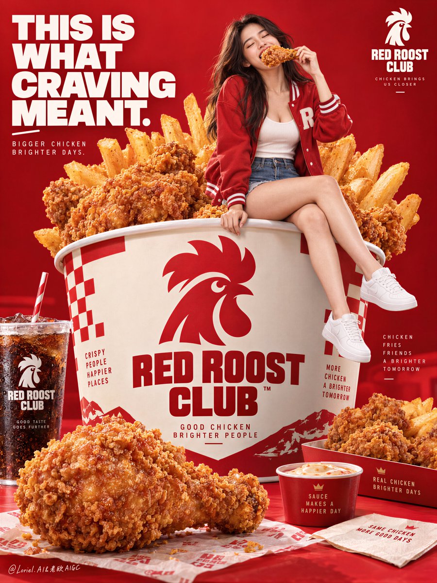
🪿 Scale the hero bucket beyond normal life, then add one seated person as a human-size cue.
The meal reads as monumental at once, while the figure makes that exaggeration instantly believable.
🍊 Push drinks, sides, and extra chicken to the outer lower edge; repeat the same red-and-cream brand system.
You still get abundance, but every smaller item frames the bucket instead of competing with it.
GPT- image 2.5 prompt👇
Create a flagship fast-food campaign poster for a fictional international fried-chicken brand named RED ROOST CLUB, designed as a single vertically composed master key visual that fully merges Orbit, Transit, and Port into one best solution: emotionally explosive, system-expandable, and curatorially reduced. The image must feel like a Cannes-level food advertisement, a collectible street-food print, and a globally premium retail launch poster at once.
The absolute hero is one monumental fried chicken bucket meal positioned in the central lower-middle of the frame, scaled so large it reads like an edible monument. The bucket must dominate the page through size, abundance, texture, and appetite impact. Render a bold branded paper bucket with newly invented English-only identity graphics, crisp print finish, clean structural edges, and a premium red-and-cream design system. The bucket overflows with massive golden fried chicken pieces and a fan of thick fries rising behind them like a crown. The chicken must feel brutally appetizing: jagged irregular crust, deep crunchy relief, rich golden-brown breading, tiny hot-oil sheen, and dense juicy weight. One oversized foreground chicken piece should sit near the bottom edge to amplify scale and create immediate first-glance hunger.
Place one mature young woman seated lightly on the upper rim of the giant bucket as the emotional lifestyle anchor and scale cue. She is joyful, spontaneous, and caught in the act of biting into one oversized fried chicken drumstick. Her body must never overpower the meal; she exists to intensify desire and communicate scale. She wears a youthful premium casual look: a red varsity-style jacket, pale inner top, denim shorts or skirt, and clean white sneakers. Her pose is relaxed but lively, with torso leaning slightly forward into the bite, one leg subtly advanced, the other relaxed, expression bright and genuinely delighted. Anatomy must be realistic and elegant: correct head-neck-shoulder ratio, natural mature chest gravity, believable torso and pelvis structure, smooth hip-to-thigh connection, correct hands with five fingers gripping the chicken naturally, realistic skin elasticity, subtle skin texture, and no mannequin stiffness.
The background is a pure high-pressure brand-red advertising field with slight tonal modulation and subtle depth, not a literal restaurant scene. Any environmental cues must remain highly abstracted and secondary, just enough to keep the page dimensional without competing with the product. The entire poster should read as a constructed commercial stage: giant bucket at center, seated woman near upper center, extra food weight in the foreground, and only a few restrained supporting items at the far edges.
Add a tightly controlled set of secondary meal props in the lower third to support the hero bucket without diluting it: one cold cola cup with lid and straw, one creamy side dish or sauce bowl, one tray with a few additional chicken pieces, and perhaps one dipping sauce packet or condiment note. These elements must be smaller, pushed outward, and compositionally subordinate, functioning as rhythm and abundance rather than separate heroes. Keep the scene rich but not cluttered.
Typography must be entirely newly invented in English only. Do not copy any words from the source image. In the upper-left, place one bold campaign headline such as "THIS IS WHAT CRAVING MEANT." or another equally strong line, set in a clean powerful white sans-serif, optionally paired with one softer handwritten accent phrase if it strengthens the hierarchy. In one top corner, place a small fictional brand lockup. Keep all copy sparse and graphic. The type must behave as part of the poster architecture, sitting in the red negative space and never interfering with the face or the food silhouette.
Orbit: the poster must hit instantly through giant edible scale, the bite moment, and the pure-red branded pressure, making the viewer crave the meal in a single glance. Transit: the structure must feel expandable into a full campaign system where different bucket builds, combo sets, seasonal sides, sauces, and limited editions can all inherit the same product-dominant stage logic. Port: remove every nonessential environmental or narrative detail so the final image remains sharp, rare, clean, and collectible, with no restaurant clutter, no crowd, and no wasted visual information.
Lighting must be bright, warm, and appetite-driven. Use a frontal commercial key with slight top shaping so the fried crust reveals maximum relief, the fries glow golden, the bucket graphics stay crisp, and the woman’s expression remains luminous. Add subtle bounce from below to keep the foreground chicken, tray items, and lower brand details readable. Shadows should be soft, controlled, and grounding. The food must feel hot, fresh, crunchy, and immediate, never greasy in a dirty way and never flat.
Use a disciplined 60/30/10 palette hierarchy: 60% brand red field and surrounding visual pressure, 30% golden fried chicken and fries warmth, 10% cream-white bucket accents, skin tones, cola brown, and small highlight notes. The image must feel loud in appetite but exact in design, with no muddy reds and no dead black masses.
Material semantics are critical. The chicken must feel intensely crisp, thickly breaded, juicy beneath the crust, and freshly fried. The fries must feel hot, dry, and salted. The bucket must feel like real printed paperboard with structural integrity. The cola cup must feel cold and commercial. Sauces and side dishes must feel rich and edible. Wardrobe fabrics must feel casual and tactile. Skin and hair must remain natural and alive. Typography must feel like premium printed campaign design on a real poster surface.
The final image should read as a pure fast-food desire poster where giant product scale, joyful bite, and branded red-stage architecture are fused into one exact commercial object. It must be photoreal, product-dominant, globally premium, and unforgettable from first glance to final read.
Quality target and structured exclusions: photoreal only, correct female anatomy, realistic hands with five fingers, no extra fingers, no missing fingers, no fused fingers, no broken wrists, no distorted face, no warped bucket geometry, no fake chicken texture, no weak crust detail, no unreadable text, no random letters, no restaurant clutter, no muddy red field, no dead black blocks, no style drift, no AI artifacts, no watermark, no real person names, no real brand names.
中文译文
一个巨大的产品只有在细小的事物也愿意保持细小的时候才成立。
🪿 将主角炸鸡桶的尺度放大到超越日常生活的程度,再加入一位坐姿人物作为参照尺寸。
餐点立刻读起来像一座丰盛的纪念碑,而这个人物让这种夸张瞬间变得可信。
🍊 将饮料、配菜与额外的炸鸡推到画面外侧下边缘;沿用同一套红与奶白品牌色系。
你依然能感受到丰盛,但每一件更小的物件都在框住炸鸡桶,而非与之争夺视线。
GPT- image 2.5 提示词👇
为一个虚构的国际炸鸡品牌 RED ROOST CLUB 创作一张旗舰级快餐活动海报,作为一张纵向构图的主关键视觉,将 Orbit(轨道)、Transit(延展)与 Port(精选)完整融合为一个最佳方案:情感爆裂、系统可延展、经策展式精简。图像须同时具备戛纳级别的食品广告感、可收藏的街头食物版画感,以及全球高端零售发布海报感。
绝对的主角是一只位于画面中下部的纪念碑式炸鸡桶套餐,尺度被放大到读起来像一座可食用的纪念碑。炸鸡桶必须通过体积、丰盛感、质感和食欲冲击力支配整个画面。绘制一个带有全新英文字体品牌标识图形的醒目品牌纸桶,印刷工艺锐利、结构边缘干净、采用高端红与奶白设计系统。纸桶中溢出大量金黄色炸鸡块,厚薯条如皇冠般在后方展开。炸鸡必须具有强烈的食欲感:参差不齐、不规则的脆皮、深邃酥脆的浮雕感、浓郁金棕色面包糠、细微热油光泽,以及饱满多汁的重量感。在靠近画面底缘的位置应放置一只放大版前景炸鸡块,以放大尺度并制造第一眼即引发的饥饿感。
将一位成熟年轻女性轻盈地坐在巨大纸桶的上沿,作为情感化生活方式锚点和尺度参照。她愉悦、自发,恰好处于咬下一只超大的炸鸡腿的瞬间。她的身体绝不能压过餐点本身;她的存在是为了强化渴望并传达尺度。她穿着年轻化的高端休闲造型:一件红色学院风夹克、浅色内搭、牛仔短裤或短裙,以及干净的白色运动鞋。姿态放松而生动,躯干微微前倾向咬的动作,一条腿稍稍前伸、另一条放松,笑容明亮、真诚愉悦。解剖结构须真实优雅:正确的头颈肩比例、成熟自然的胸部重力、可信的躯干与骨盆结构、流畅的髋到大腿过渡、双手各五指自然握住炸鸡、真实的皮肤弹性、细腻的肤质,避免人偶般的僵硬感。
背景为纯品牌红色的高气压广告色场,带有轻微色调过渡与微妙纵深,而非具象餐厅场景。任何环境暗示都必须高度抽象、次要,仅足以保持画面维度感而不与产品竞争。整张海报应被读作一个被构建的商业舞台:中央为巨型炸鸡桶,上中部为坐姿女性,前景为额外的食物重量感,最边缘仅有少量克制的辅助元素。
在画面下三分之一加入一组严格控制的次级餐点道具,以支撑主角炸鸡桶而不削弱其地位:一杯带盖与吸管的冰可乐、一份奶油色配菜或蘸酱碗、一份带有少量额外炸鸡块的托盘,以及或许一包蘸酱或调味提示。这些元素须更小、被推向外侧、在构图上处于从属地位,承担节奏与丰盛感而非独立主角。保持画面丰盛但不杂乱。
字体须全部为全新英文自造。不要复制源图中的任何文字。在左上角放置一句醒目的活动标题,例如 "THIS IS WHAT CRAVING MEANT." 或同样有力的语句,使用干净有力的白色无衬线字体,可选择性搭配一句更柔和的手写点缀短语以加强层级。在一个顶角放置一个小型虚构品牌徽标组合。所有文字须稀少而图形化。字体应作为海报建筑的一部分存在于红色负空间中,绝不能干扰面部或食物轮廓。
Orbit(轨道):海报须通过巨大的可食用尺度、咬下的瞬间与纯红品牌压迫感实现第一眼命中,让观看者一眼即渴望这餐。Transit(延展):结构须让人感觉可以延展为完整的活动系统,使不同的炸鸡桶组合、套餐组合、季节配菜、酱料与限定款都能继承同一套产品主导舞台逻辑。Port(精选):移除一切非必要的环境或叙事细节,使最终图像保持锐利、稀有、干净、可收藏,没有餐厅杂乱、没有人群、没有浪费的视觉信息。
光照须明亮、温暖、以食欲为导向。使用正面商业主光配合轻微顶部塑形,让酥脆外壳展现最大浮雕感、薯条闪耀金色、炸鸡桶图形保持锐利、女性表情保持明亮。从下方加入微妙反弹光,以保持前景炸鸡、托盘物品和下方品牌细节的可读性。阴影应柔和、受控并具有落地感。食物必须感觉热腾腾、新鲜酥脆、即刻诱人,绝不能是脏兮兮的油腻,也不能是扁平的。
使用严格的 60/30/10 色彩层级:60% 品牌红色色场与周围视觉压力,30% 金黄炸鸡与薯条的暖色,10% 奶白色炸鸡桶点缀、肤色、可乐棕色以及小面积高光点缀。图像须在食欲上响亮、在设计上周正,没有浑浊的红色、没有死黑的色块。
材质语义至关重要。炸鸡必须强烈酥脆、面包糠厚实、脆皮下多汁、新鲜出锅。薯条须滚烫、干爽、带盐感。炸鸡桶须像真实印刷纸板,结构稳固。可乐杯须冰冷且具商业感。酱料与配菜须浓郁诱人。服装面料须休闲且具触感。肌肤与头发须自然且鲜活。字体须如真实海报表面上印制的精致活动设计。
最终图像应被读作一张纯粹的快餐欲望海报,将巨大产品尺度、愉悦的咬食瞬间与品牌红色舞台建筑融合为一个精确的商业对象。须达到照片写实、产品主导、全球高端,从第一眼到最终阅读皆难忘。
质量目标与结构化排除项:仅限照片写实;正确女性解剖结构;真实双手各五指;无多余手指;无缺失手指;无粘连手指;无断裂手腕;无扭曲面部;无畸变炸鸡桶几何;无伪造炸鸡质感;无薄弱脆皮细节;无可读性差的文字;无随机字母;无餐厅杂乱;无浑浊红色色场;无死黑色块;无风格漂移;无 AI 痕迹;无水印;无真实人名;无真实品牌名。
来源与署名
原文由 @ou_zhen599 发布在 X:查看原推文。 本页逐字保留原文并提供机器翻译的中文解读;版权归原作者所有。
同工具的更多提示词
- 你看到的是一罐汽水的倾倒画面。这个提示实际上是在控制一条单一的视觉阅读路径。 🪽 超大号易拉罐采用强制透视,以一道连续的弧线向底部中央的玻璃杯中倾倒。 眼睛首…@ou_zhen599
- 一张美食海报可以展示完整菜单,而无需让每件单品都处于焦点位置。 🧊 让主推卷饼在前景保持极致锐利清晰;将其余变体高高置于其后方深处,做柔和的深度虚化。 背景产…@ou_zhen599
- 这张海报之所以有效,是因为字体保持冷静,而咬下的瞬间却狂野奔放。 🧊 预留一条干净的垂直字体轨道;所有广告文案都置于一个不中断的色块之中。 这为视线提供了一个…@ou_zhen599
- 创建一张高端、超写实的全身Y2K时尚编辑大片照片,画面中是一位拥有可爱俏皮美学的年轻女性,在专业白色摄影棚中拍摄。 人物: 年轻女性,留着柔软蓬松的波浪状淡紫…@j_smeaton99
- 为 [COUNTRY / LOCATION / SUBJECT](国家 / 地点 / 主题)制作一张高级感的 4:5 竖版超高清微缩世界海报。 纯文生图(TE…@Goodmanprotocol
- 角色参考表,干净的白色背景,16:9,照片级写实风格,所有面板使用相同的光照与色彩分级。身份来自所附自拍:一位年轻女性,有着凌乱的及肩铜橙色与赤褐色卷发,发尾…@abxxai