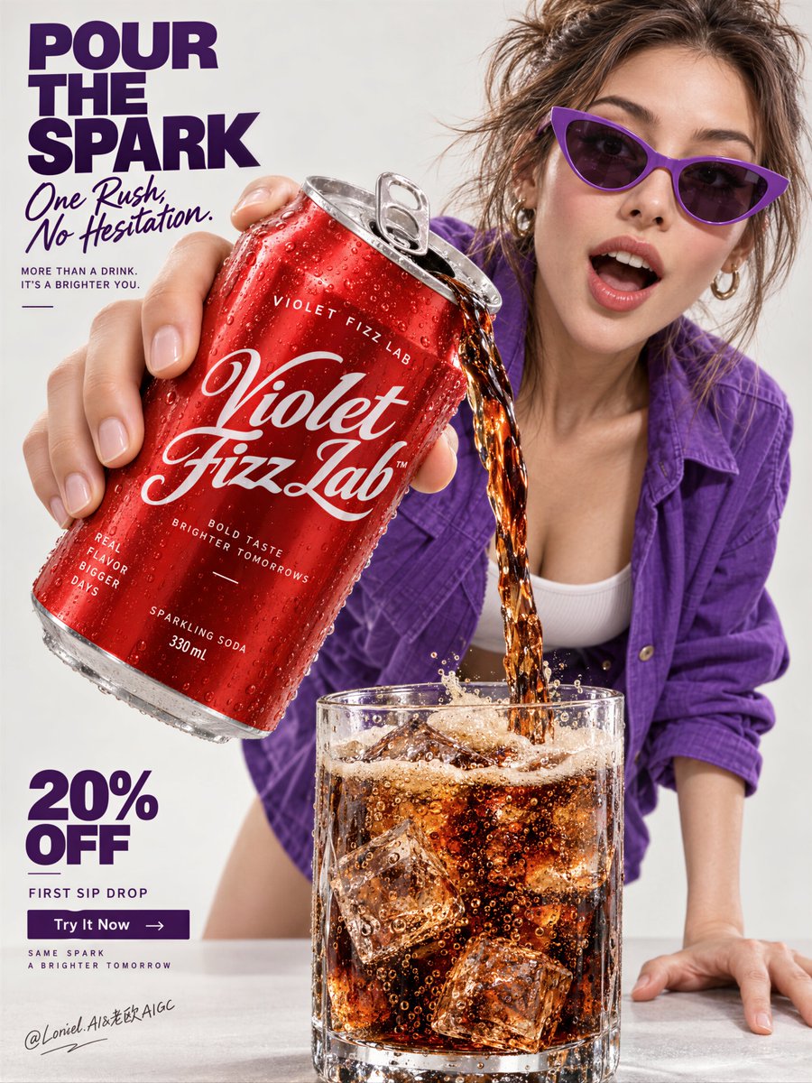
你看到的是一罐汽水的倾倒画面。这个提示实际上是在控制一条单一的视觉阅读路径。
分享链接 · https://openimages.ajiang.me/p/2103480817209283058/
color_palette · warm-tonescomposition · dynamic-diagonalcomposition · extreme-close-uphuman_attributes · hands-prominenthuman_attributes · long-hairhuman_attributes · sunglasses
提示词(原文,逐字保留)
You’re seeing a soda pour. The prompt is actually controlling a single reading path.
🪽 Oversized can in forced perspective, pouring in one continuous arc into a bottom-center glass.
The eye reads can → liquid → ice before anything else. The pour turns a static product shot into a clear visual route.
🧊 Keep the model behind the product and reserve one clean left column for type and offers.
This preserves the can as the hero while the person adds attitude and the copy stays instantly scannable.
GPT- image 2.5 prompt👇
Create a flagship beverage campaign poster for a fictional international soda house named VIOLET FIZZ LAB, designed as a single vertically composed master image that fully merges Orbit, Transit, and Port into one best solution: emotionally immediate, structurally expandable, and curatorially sharp. The image must feel like a Cannes-level soda advertisement, a collectible pop-commercial print, and a globally premium launch visual at once.
The absolute hero is one oversized chilled soda can thrust toward the camera in dramatic forced perspective, occupying the upper-left to center-left foreground as the dominant product mass. The can is held in one realistic hand and tilted downward, pouring a rich stream of dark sparkling soda into a tumbler below. The can must feel hyper-real and premium: bright lacquered red aluminum body, icy condensation droplets, crisp seam lines, believable pull-tab opening, tiny handling dents, sharp metallic highlight rolloff, and newly invented English branding in elegant white script and clean utility sans. The can must read instantly as cold, pressurized, refreshing, and commercially irresistible.
The liquid action is the central motion event and must be physically convincing. A continuous glossy stream of deep caramel-black soda flows from the can in a smooth twisting arc into a clear tumbler glass at the bottom-center foreground. The soda must show amber translucency at the edges, rising carbonation, sparkling internal bubble trails, bright highlights, and a lively foam crown blooming at the top of the glass. Inside the tumbler, include hard transparent ice cubes with trapped bubbles, crisp refraction, slight melting edges, and believable condensation on the glass wall. The glass supports the refreshment story, but always remains secondary to the can.
Place one mature young woman in the right-middle and upper-right field, leaning forward behind the product with bold pop-fashion energy and immediate attitude. She wears a saturated violet-purple overshirt or jacket over a pale inner top, paired with minimal lower styling mostly outside the crop. Add sharp violet cat-eye sunglasses or similarly iconic eyewear that reinforces the brand color identity. Her posture is interactive and kinetic: one hand extended forward holding the can close to lens, the other planted on the surface for balance, torso leaning into the action as if presenting the pour directly to the viewer. Her expression is open, surprised, impressed, and charismatic. Anatomy must be realistic and elegant: correct head-neck-shoulder proportion, natural mature chest gravity, believable torso and pelvis structure, smooth limb relationships, realistic hands with five fingers, subtle skin elasticity, faint natural dimpling, and no mannequin stiffness.
The composition must preserve the strongest structural logic of the reference while elevating it: bold typography architecture on the left, monumental product in forced perspective, action pour into glass at the bottom, and fashion-driven human figure behind the hero object. The can is first read, the liquid second, the woman third, the glass fourth, and typography locks the page together. Keep the whole layout extremely immediate and ad-ready.
The background is a pale premium studio field, somewhere between warm off-white, light stone, and soft neutral grey, with enough tonal shaping to prevent flatness but no environmental scene at all. This is a pure graphic advertising space. Use a disciplined 60/30/10 palette hierarchy: 60% light neutral studio field and skin tones, 30% lacquered red product and cola-brown liquid energy, 10% saturated violet-purple wardrobe and typographic accents. The red-violet contrast must feel memorable, contemporary, and brandable.
Typography must be entirely newly invented in English only. Do not copy any text from the source image. Build a strong left-column headline in the upper-left with bold sans and one contrasting script or softer line, such as "POUR / THE / SPARK" paired with a line like "one rush, no hesitation" or another sharper brand thought. Below it, place one short supporting sentence that frames the drink as the main event. In the lower-left corner, create a compact promotional block such as "20% OFF" or "FIRST SIP DROP", followed by one small CTA line like "Try It Now". Typography must be crisp, spacious, and integrated into the available negative space, never touching the face or the can silhouette.
Orbit: the image must hit instantly through the forward-thrust can, the living soda stream, and the fashion-pop presence of the woman. Transit: the structure must feel campaign-expandable, allowing multiple flavor variants, colorways, wardrobe accents, offer blocks, and can designs to operate inside the same hero-pour system. Port: remove all nonessential décor so the final poster remains clean, collectible, and internationally elevated, with no kitchen scene, no tabletop clutter, no unnecessary props, and no visual noise.
Lighting must be bright, commercial, and materially exact. Use a clean frontal key with a slight side bias so the aluminum can gleams, the soda stream remains readable, the ice catches sharp internal highlights, and the woman’s face stays expressive and luminous. Add soft bounce from below to preserve clarity in the tumbler and lower layout. Shadows should be soft-edged and controlled, enough to ground the product and glass without making the page heavy. The overall lighting should feel cold-refreshing, polished, and premium.
Material semantics are critical. The can must feel like chilled printed aluminum. The soda must feel sparkling, dense, and fresh. The ice must feel hard, transparent, and cold. The glass must feel thick, weighty, and clean. The shirt and sunglasses must feel tactile and fashion-driven. Skin and hair must remain natural and alive. Typography must feel like premium printed campaign design layered over a real photographic poster.
The final image should read as a high-energy beverage desire poster where can, pour, glass, gesture, and left-side graphic language are fused into one exact commercial object. It must be photoreal, product-dominant, contemporary, and unforgettable at first glance.
Quality target and structured exclusions: photoreal only, correct female anatomy, realistic hands with five fingers, no extra fingers, no missing fingers, no fused fingers, no broken wrists, no distorted face, no warped can geometry, no broken liquid physics, no fake ice, no muddy soda, no unreadable text, no random letters, no environmental clutter, no dead black blocks, no flat lighting, no style drift, no AI artifacts, no watermark, no real person names, no real brand names.
中文译文
你看到的是一罐汽水的倾倒画面。这个提示实际上是在控制一条单一的视觉阅读路径。
🪽 超大号易拉罐采用强制透视,以一道连续的弧线向底部中央的玻璃杯中倾倒。
眼睛首先读到的是易拉罐 → 液体 → 冰块,然后才会注意其他。倾倒动作把一张静态的产品照片转化为一条清晰的视觉动线。
🧊 让模特站在产品后方,并在左侧保留一列干净的区域用于排版与促销信息。
这样既保留了易拉罐作为主角的地位,又让人物提供态度,同时让文案可以一眼扫读。
GPT- image 2.5 prompt👇
为一家名为 VIOLET FIZZ LAB 的虚构国际汽水品牌创作一张旗舰级饮料 campaign 海报,作为一个单幅纵向构图的主画面,将 Orbit、Transit、Port 完全融合为一个最佳方案:情绪上极具冲击力、结构上可延展、策展感锐利。这张图必须同时让人感觉是戛纳级别的汽水广告、可收藏的流行商业印刷品,以及全球高端的发布主视觉。
绝对的主角是一罐超大、超冰的汽水,以戏剧性的强制透视直冲镜头,占据左上至中左的前景,作为主导的产品体量。易拉罐被一只写实的手握着并向下倾斜,将一道浓郁的深色气泡汽水倒入下方的玻璃杯。易拉罐必须有超写实和高端质感:明亮的漆面红色铝制罐体、冰冷的凝结水珠、清晰的接缝线、可信的拉环开口、细微的握持凹痕、利落的金属高光过渡,以及用优雅的白色手写体和干净的无衬线字体全新发明的英文品牌标识。易拉罐必须一眼就读出冰冷、加压、清爽,以及商业上的不可抗拒。
液体动作是核心运动事件,必须在物理上令人信服。一道连续的、富有光泽的深焦糖-黑色汽水从罐口以平滑扭转的弧线流入前景底部中央的一只透明平底玻璃杯。汽水必须在边缘呈现琥珀色的透光感、上升的气泡、闪烁的内部气泡轨迹、明亮的高光,以及在杯口绽放的活泼泡沫冠。在玻璃杯内,加入坚硬透明的冰块,含被锁住的气泡、清晰的折射、轻微融化的边缘,以及玻璃杯壁上可信的凝结水。玻璃杯服务于清爽故事,但永远处于易拉罐的次要位置。
在右中及右上区域放置一位成熟的年轻女性,身体前倾位于产品后方,带有大胆的流行时尚能量和即时的态度。她身穿饱和的紫罗兰色外衬衫或夹克,内搭浅色上衣,下半身以极简的造型处理,大部分位于画面裁切之外。加入锐利的紫罗兰色猫眼太阳镜或同等的标志性眼镜,以强化品牌色彩识别。她的姿态互动而动感:一只手向前伸出,将易拉罐举到镜头近处,另一只手撑在台面上保持平衡,身体前倾,仿佛直接把倾倒动作呈现给观众。她的表情应是开放的、惊讶的、被感动的、有魅力的。解剖结构必须写实而优雅:正确的头颈肩比例、自然的成熟胸部重力、可信的躯干与骨盆结构、流畅的四肢关系、写实的五指双手、细微的皮肤弹性、隐约自然的细纹,绝不能有假人般的僵硬。
构图必须保留参考图最强的结构逻辑并加以提升:左侧的大胆字体架构、强制透视的纪念碑式产品、底部倒入玻璃杯的动作倾倒,以及位于主角物体后方的时尚驱动型人物。阅读顺序为:先易拉罐,再液体,再女性,再玻璃杯,最后由字体将整页锁合。保持整体布局极强的即时性与广告就绪状态。
背景是一面浅色高端摄影棚场域,介于暖调米白、浅石色与柔和中性灰之间,有足够的色调塑造来避免平坦感,但完全不出现任何环境场景。这是一个纯粹的图形广告空间。使用严谨的 60/30/10 配色层级:60% 浅中性摄影棚场域与肤色,30% 漆面红色产品与可乐棕色液体能量,10% 饱和紫罗兰色服装与字体点缀。红色与紫罗兰色的对比必须令人难忘、当代且具有品牌化潜力。
字体必须全部为全新发明的英文。不要复制原图中的任何文字。在左上建立强劲的左栏标题,使用粗体无衬线搭配一句对比鲜明的手写体或更柔和的语句,例如 “POUR / THE / SPARK” 配以 “one rush, no hesitation” 之类的语句,或其他更锐利的品牌主张。其下方放置一句简短的支撑句,将饮品框定为主事件。在左下角创建一个紧凑的促销区块,例如 “20% OFF” 或 “FIRST SIP DROP”,并在其后跟一句简短 CTA,例如 “Try It Now”。字体必须清晰、留白充足,并融入可用负空间,绝不能触及人脸或易拉罐的轮廓。
Orbit:图像必须通过前冲的易拉罐、流动的汽水柱和女性的时尚流行气质实现瞬间击中。Transit:结构必须具有 campaign 可延展性,允许多种口味变体、配色、服装强调、促销区块以及易拉罐设计在同一“英雄倾倒”系统内运作。Port:去除所有非必要装饰,使最终海报保持干净、可收藏、国际级提升,无厨房场景、无桌面杂物、无多余道具,也无视觉噪声。
光线必须明亮、商业化、材质精确。使用干净的前方主光并略带侧偏,让铝罐闪耀、汽水柱保持可读性、冰块捕捉锐利的内部高光、女性面部保持表现力与明亮感。从下方添加柔和的反弹光,以保持玻璃杯与下方布局的清晰度。阴影应柔和且受控,足以让产品和玻璃杯“落地”,又不让画面显得沉重。整体光线应感觉冰冷清爽、打磨精致且高端。
材质语义至关重要。易拉罐必须有冰镇印刷铝的质感。汽水必须有气泡感、浓稠感和新鲜感。冰块必须有坚硬、透明和冰冷感。玻璃杯必须有厚重、稳实与洁净感。衬衫与太阳镜必须有触感与时尚驱动感。皮肤与头发应保持自然且有生命力。字体应像是叠加在真实摄影海报上的高端印刷 campaign 设计。
最终图像应读作一张高能量的饮料欲望海报——易拉罐、倾倒、玻璃杯、姿态与左侧图形语言融合为一个精确的商业对象。它必须是照片级真实、产品主导、当代且令人一眼难忘。
质量目标与结构化排除项:仅照片级真实、正确的女性解剖、写实的五指双手、无多余手指、无缺失手指、无粘连手指、无扭曲手腕、无变形面部、无扭曲罐体几何、无破坏液体物理、无假冰、无浑浊汽水、无不可读文字、无随机字母、无环境杂乱、无死黑块、无平淡光线、无风格漂移、无 AI 伪影、无水印、无真人姓名、无真实品牌名。
来源与署名
原文由 @ou_zhen599 发布在 X:查看原推文。 本页逐字保留原文并提供机器翻译的中文解读;版权归原作者所有。
同工具的更多提示词
- 这张海报之所以有效,是因为字体保持冷静,而咬下的瞬间却狂野奔放。 🧊 预留一条干净的垂直字体轨道;所有广告文案都置于一个不中断的色块之中。 这为视线提供了一个…@ou_zhen599
- 一个巨大的产品只有在细小的事物也愿意保持细小的时候才成立。 🪿 将主角炸鸡桶的尺度放大到超越日常生活的程度,再加入一位坐姿人物作为参照尺寸。 餐点立刻读起来像…@ou_zhen599
- 为 [COUNTRY / LOCATION / SUBJECT](国家 / 地点 / 主题)制作一张高级感的 4:5 竖版超高清微缩世界海报。 纯文生图(TE…@Goodmanprotocol
- 一张美食海报可以展示完整菜单,而无需让每件单品都处于焦点位置。 🧊 让主推卷饼在前景保持极致锐利清晰;将其余变体高高置于其后方深处,做柔和的深度虚化。 背景产…@ou_zhen599
- GPT Image 2.5 将一张真实照片转化为一本安静的画册封面。 Prompt 使用 GPT Image 2.5 创作一张精致的 3:4 纵向编辑艺术海报…@saniaspeaks_
- 创建一张高端、超写实的全身Y2K时尚编辑大片照片,画面中是一位拥有可爱俏皮美学的年轻女性,在专业白色摄影棚中拍摄。 人物: 年轻女性,留着柔软蓬松的波浪状淡紫…@j_smeaton99