当旅行者成为画面中最渺小的存在时,宏大的目的地也会显得亲密。
分享链接 · https://openimages.ajiang.me/p/2103065285968511113/
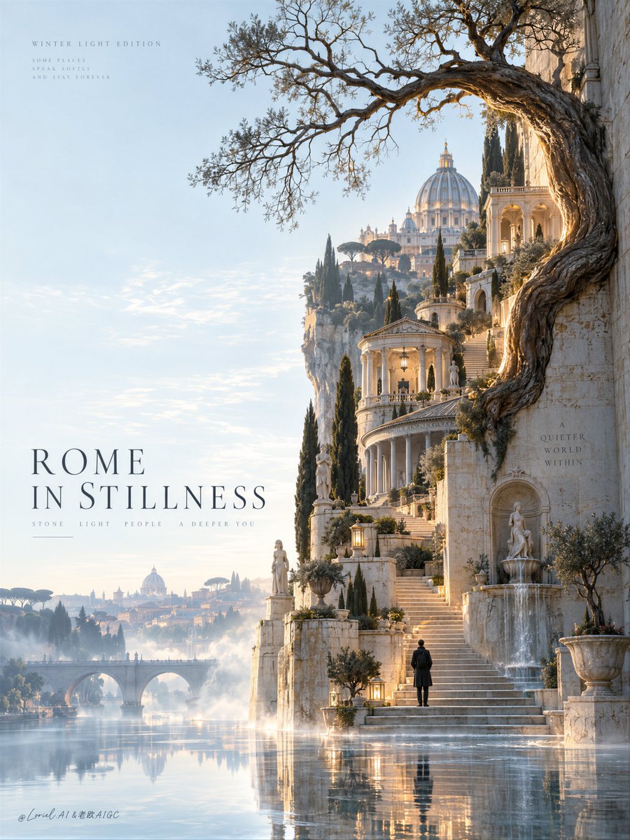
composition · negative-spacecomposition · wide-shotlighting · golden-hourmood · dreamymood · elegantquality_flags · embedded-text
提示词(原文,逐字保留)
A grand destination can feel intimate when the traveler is the smallest thing in the frame.
🌳 Let one ancient tree and layered stone architecture occupy the right side, while the left remains pale open sky. The asymmetry gives the place a sense of quiet scale.
🕯️ Place one solitary figure at the base of the stairs and repeat warm lantern reflections through the water. Small human presence turns spectacle into a place you can imagine entering.
GPT- image 2.5 prompt👇
Create a premium destination advertising poster for a fictional international travel brand named ROMA ETERNA, designed as a single vertical flagship image where Rome is transformed into a poetic architectural pilgrimage of silence, ascent, and light. The final image must merge Orbit, Transit, and Port into one unified best solution: emotionally magnetic, structurally expandable, and curatorially reduced. It should feel like a Cannes-level tourism campaign, a collectible gallery travel print, and a museum-grade editorial city poster at once.
Build the entire composition around one dominant sinuous organic-architectural gesture on the right half of the frame. From the upper right, an ancient Roman cypress-olive tree emerges from a pale travertine wall, its trunk flowing downward in one elegant calligraphic curve before dissolving into a vertical procession of stepped Roman terraces. The tree must feel noble, weathered, and almost sacred, with fine leafless branches extending horizontally into the upper field like drawn ink-lines. A narrow band of warm amber light traces the bark and the inner edge of the wall, making this single gesture the emotional spine and immediate visual hook of the poster.
Within the descending stair architecture, embed a sequence of miniature Roman structures and distilled landmark fragments, all rendered in a highly refined and photoreal way: small domed belvederes inspired by St. Peter’s dome, arched terrace loggias, classical stair landings, travertine pavilions, fountain niches, lanterns, cypress court edges, sculptural viewpoints, and subtle echoes of the Pantheon and Roman hilltop gardens. These structures must feel unmistakably Roman yet radically simplified, as if the essence of Rome has been compressed into a sacred vertical ascent. The architecture must remain elegant and coherent, never toy-like, never crowded.
Near the lowest landing, place one very small solitary traveler standing still and facing upward into the illuminated ascent. The figure is not the hero but the emotional measure of wonder, scale, and inward pilgrimage. Keep the traveler refined and minimal, dressed in dark understated clothing, with no distracting detail.
The base of the composition dissolves into shallow reflective water and luminous mist, creating a threshold between memory and reality. The lowest steps, the traveler, and the Roman structures should mirror softly into the water with slight distortion. The atmosphere must remain calm, weightless, and expensive, never foggy in a messy way. The left half of the poster is dominated by vast pale blue-white negative space, giving the image rarefied breathing room and making the right-side gesture feel even more powerful.
Typography inside the image must be entirely in English only. Do not use any Chinese characters and do not copy any text from the source image. Place one elegant destination title on the lower left, such as "ROME IN STILLNESS" or another equally elevated phrase, set in a refined serif with generous spacing and collector-poster dignity. Near the upper left, add one tiny whisper line such as "Winter Light Edition" or a similarly poetic seasonal note. Include one or two very small editorial micro-lines in pale grey English only, functioning as atmospheric design texture rather than literal information. All typography must feel museum-grade, sparse, and fully integrated into the composition, never loud, never touristic, never corporate.
Rome is the unquestioned hero product. The emotional promise is not crowded sightseeing, but timeless stillness, sacred stone, contemplative ascent, Mediterranean light, and inner arrival. The image should read instantly: one immense field of silence, one glowing tree-curve, one stair of distilled Roman architecture, one tiny traveler, one elegant English title.
Orbit must heighten first-glance emotional pull through solitude, glow, and cinematic awe, making the poster feel like an immediate invitation into a rare private Rome. Transit must make the structural idea expandable into a broader city-series campaign where each destination is reduced to one iconic organic-architectural gesture while Rome remains uniquely defined by travertine, domes, fountains, and hilltop procession. Port must strip away every nonessential element so the image remains calm, sculptural, premium, and collectible, with no decorative clutter and no brochure logic.
Lighting is subtle and extraordinary. Use a cool pale winter-blue atmosphere across the entire poster, contrasted by a narrow warm amber-gold illumination tracing the tree trunk, stair edges, and selected Roman rooftops. This warm-cool opposition must create holiness, depth, and material presence while preserving silence. Shadows should be soft, elongated, and nearly dissolved into mist. The overall image must feel luminous, still, and globally premium.
Material semantics are essential. The wall and terraces must read as pale travertine, aged marble, and smooth Roman plaster with believable wear, edge definition, and quiet luxury. The tree bark must feel ancient, dry, and lightly burnished by light. The water must feel glassy and delicate. The mist must be airy and physically plausible. The tiny Roman structures must remain precise, photoreal, and architecturally coherent. Typography must feel like finely printed editorial matter on a premium poster surface.
Use a disciplined 60/30/10 palette hierarchy: 60% pale blue-white atmosphere, parchment mist, and cool ivory stone; 30% travertine beige, Roman plaster, weathered marble, and muted cypress-brown; 10% warm amber glow, restrained terracotta roof accents, and tiny dark human-scale details. The image must feel cold and luminous, minimal but emotionally full.
The final poster should read like a luxury travel icon where Rome is distilled into one unforgettable upward motion of nature, stone, light, and silence. It must be photoreal, elegant, internationally premium, and structurally exact from first glance to final read.
Quality target and structured exclusions: photoreal only, perfect architectural coherence, no warped buildings, no broken stair geometry, no toy-city effect, no cluttered tourist montage, no unreadable typography, English text only, no random letters, no muddy fog, no dead black blocks, no cheap fantasy styling, no style drift, no AI artifacts, no watermark, no real person names, no real brand names.
中文译文
当旅行者成为画面中最渺小的存在时,宏大的目的地也会显得亲密。
🌳 让一棵古树与层层叠叠的石质建筑占据画面右侧,左侧则保留淡雅的留白天空。这种不对称赋予场景一种宁静的尺度感。
🕯️ 在阶梯底部放置一个孤寂的人影,并将温暖灯笼的倒影在水面上反复延伸。渺小的人迹将奇观化作一个你可想象步入的场所。
GPT- 图像 2.5 提示词👇
为虚构的国际旅游品牌 ROMA ETERNA 创作一幅高端目的地广告海报,以一张竖向旗舰画面呈现,将罗马转译为一段关于静默、攀升与光线的诗意建筑朝圣之旅。最终画面须将 Orbit、Transit 与 Port 融合为一个统一的最佳方案:情感上极具吸引力、结构上可延展、策展般地克制精简。它应同时呈现戛纳级别的旅游传播感、可收藏的画廊旅行版画感,以及博物馆级的编辑城市海报感。
将整幅构图建立于画面右半部一个主导性的、蜿蜒有机的建筑姿态之上。自右上角起,一棵古罗马的柏树-橄榄树从淡色洞石墙中生出,树干以一道优雅的书法式曲线向下流淌,随后消融于一层层罗马阶梯式露台所构成的纵向行列。树必须显得高贵、饱经风霜、近乎神圣,纤细无叶的枝条如同墨线般横向伸入上方空间。一道狭窄的温暖琥珀光线沿树皮与墙体内侧延展,使这一姿态成为海报的情感脊梁与第一眼的视觉钩子。
在下行的阶梯建筑之中,嵌入一序列微缩的罗马结构与凝练的地标片段,皆以高度精炼且逼真的方式呈现:受圣彼得大教堂穹顶启发的小型穹顶观景亭、拱形露台凉廊、古典阶梯平台、洞石亭榭、喷泉壁龛、灯笼、柏树庭院边缘、雕塑般的观景点,以及万神殿与罗马山顶花园的隐约回响。这些结构必须明确可辨为罗马,却又被极度简化,仿佛罗马的精髓已被压缩进一次神圣的纵向攀升。建筑须始终保持优雅与连贯,绝不可显得玩具化,绝不可拥挤。
在最低一处平台旁,安置一位极为渺小的独行者,静默伫立,面朝光之攀升上行。此人并非主角,而是惊奇、尺度与内在朝圣的情感度量。行者须精炼而极简,身着深色低调衣装,无任何干扰性细节。
构图的底部消融于浅水与发光薄雾之间,形成记忆与现实之间的门槛。最末几级台阶、行人以及罗马建筑应在水中柔和地倒映出,并带有轻微的失真。氛围须保持平静、失重、贵气,绝不可呈现杂乱混浊的雾感。海报左半部由广袤的淡蓝白色留白主导,为画面提供稀薄而珍贵的呼吸空间,使右侧的姿态更显有力。
画面内的字体排印须全部使用英文。不要使用任何中文字符,也不要复制原图中的任何文字。在左下方放置一行优雅的目的地主标题,例如 "ROME IN STILLNESS",或一句同等高度的措辞,以精炼的衬线字体排印,留白宽裕,具收藏海报的庄重感。在左上方添加一行微小的低语式文字,例如 "Winter Light Edition",或一句同等诗意的季节性提示。再以淡灰色英文加入一到两行极小的编辑性微文字,作为氛围性的设计肌理,而非字面信息。所有字体须具博物馆级别的克制感,稀疏而完全融入构图,绝不喧闹,绝不旅游宣传式,绝不企业化。
罗马是毋庸置疑的主角产品。其情感承诺并非拥挤的观光,而是永恒的静谧、神圣的石头、沉思的攀升、地中海的光线,以及内在的抵达。画面应在瞬间被读懂:一片巨大的静默之场,一道发光的树之弧线,一段被凝练的罗马建筑阶梯,一位渺小的行者,一个优雅的英文标题。
Orbit 须通过孤独、辉光与电影般的敬畏感,强化第一眼的情感牵引,使海报仿佛是一封即刻发出的邀请,引向一个罕有的私密罗马。Transit 须使此结构理念可延展为一个更宏大的城市系列传播——每个目的地被还原为一个标志性的有机建筑姿态,而罗马则由洞石、穹顶、喷泉与山顶行列而独特定义。Port 须剔除一切非必要的元素,使画面保持平静、雕塑感、高端、可收藏,无装饰性堆砌,也无宣传册式的逻辑。
光线须微妙而非凡。全幅采用偏冷的淡冬日蓝色调,对比以一道狭窄的暖琥珀金色光照,沿树干、阶梯边缘以及选定的罗马屋顶延展。这种冷暖对峙须在保留静默的同时,营造神圣感、纵深感与物质的实在性。阴影应柔和、细长,几乎溶入薄雾。整体画面须发光、宁静、具备全球高端感。
材质语义至关重要。墙体与阶梯须呈现为淡色洞石、老化大理石与平滑的罗马灰泥,带有可信的磨损、清晰的边缘与安静的奢华感。树皮须显得古老、干燥,并被光线轻微打磨。水面须光滑而细腻。雾气须轻盈并符合物理可信性。微缩的罗马结构须保持精确、逼真,且建筑上连贯。字体排印须如印刷精良的编辑性文字,落于一张高端海报的表面之上。
采用严格的 60/30/10 配色层级:60% 为淡蓝白色氛围、羊皮纸薄雾与冷象牙石材;30% 为洞石米色、罗马灰泥、风化大理石与低饱和的柏木褐;10% 为温暖琥珀辉光、克制的赤陶屋顶点缀,以及微小的深色人体尺度细节。画面须呈现冷峻而发光的质感,克制却情感丰盈。
最终海报应如一枚奢华的旅行图腾,罗马被蒸馏为一次自然、石头、光线与静默之中不可遗忘的向上运动。它须逼真、优雅、国际级高端,并在从第一眼到最后一眼的阅读中保持结构上的精准。
质量目标与结构化排除项:仅逼真风格、完美的建筑连贯性、无扭曲的建筑、无破损的阶梯几何、无玩具城市感、无杂乱的旅游蒙太奇、无不可读的字体排印、仅英文、无随机字母、无浑浊的雾气、无死黑色块、无廉价奇幻风格、无风格漂移、无 AI 痕迹、无水印、无真实人物姓名、无真实品牌名。
来源与署名
原文由 @ou_zhen599 发布在 X:查看原推文。 本页逐字保留原文并提供机器翻译的中文解读;版权归原作者所有。
同工具的更多提示词
- 一个由四张抓拍黑白街头摄影作品组成的 2x2 网格,整体 16:9,照片之间留有细窄的白色间隔。每幅画面取自不同的城市、一天中的不同时段以及不同的天气——请选…@Gdgtify
- 一个美妆版面之所以更有说服力,是因为每一处裁切都在验证主张的不同维度。 🖤 将睫毛膏管身与刷头在画面中央放大呈现,然后让一笔光泽感十足的黑色膏体环绕其周。产品…@ou_zhen599
- { "prompt": { "type": "photorealistic_full_body_mirror_selfie", "subject": { "d…@ChatGPTindia_
- 超写实 IMAX 级 Netflix 风格电影感人像,9:16 竖构图。以上传的图片作为主要视觉参考,精确保留面部身份、比例与标志性特征。一位女性斜坐在一张深…@imGopalTiwari
- 根据所附社交媒体个人资料,创作一张 4:5 比例的高级时装广告海报,画面中该人物自然地走在涉谷街头,身边带着 3–5 只原创怪物伙伴。 个人资料仅作为视觉灵感…@Goodmanprotocol
- 微缩工人让超大护肤品显得精心打造——但前提是他们的动作必须能解释产品本身。 🪜 给每位工匠一个清晰的任务:爬上瓶盖、擦拭瓶身、采摘花瓣、搬运乳霜、或照料石质底…@ou_zhen599