为“Destination Sketchbook(目的地写生簿)”系列创作一幅高端的 4:5 竖版插画。以马特宏峰(Matterhor…
分享链接 · https://openimages.ajiang.me/p/2101231179752165607/
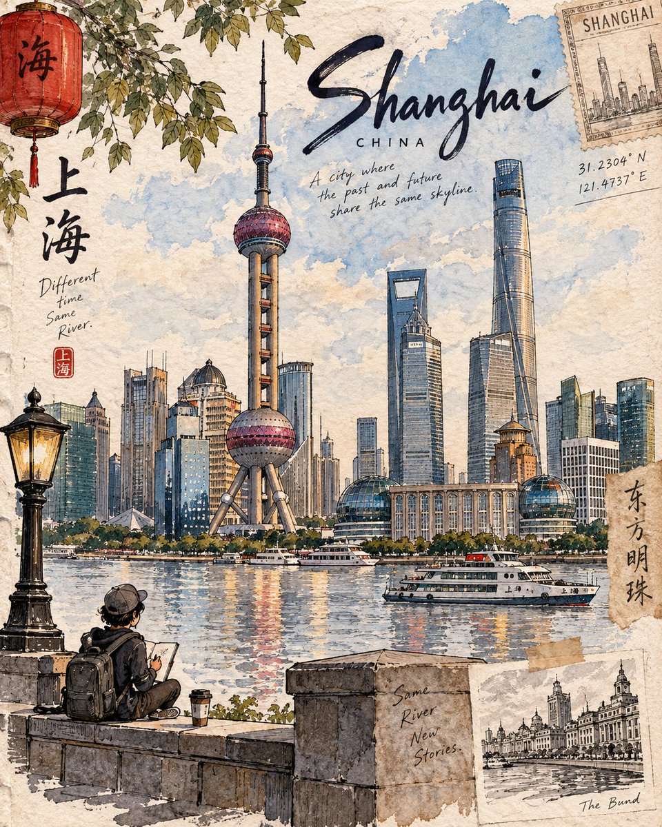
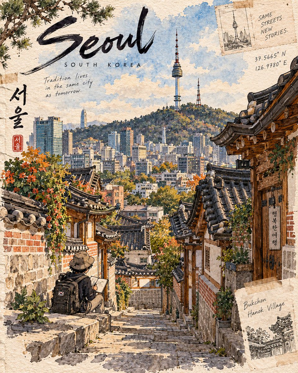
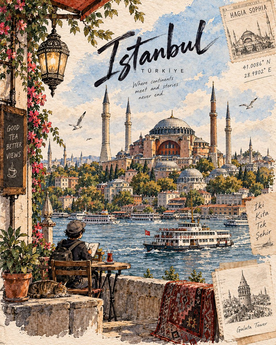
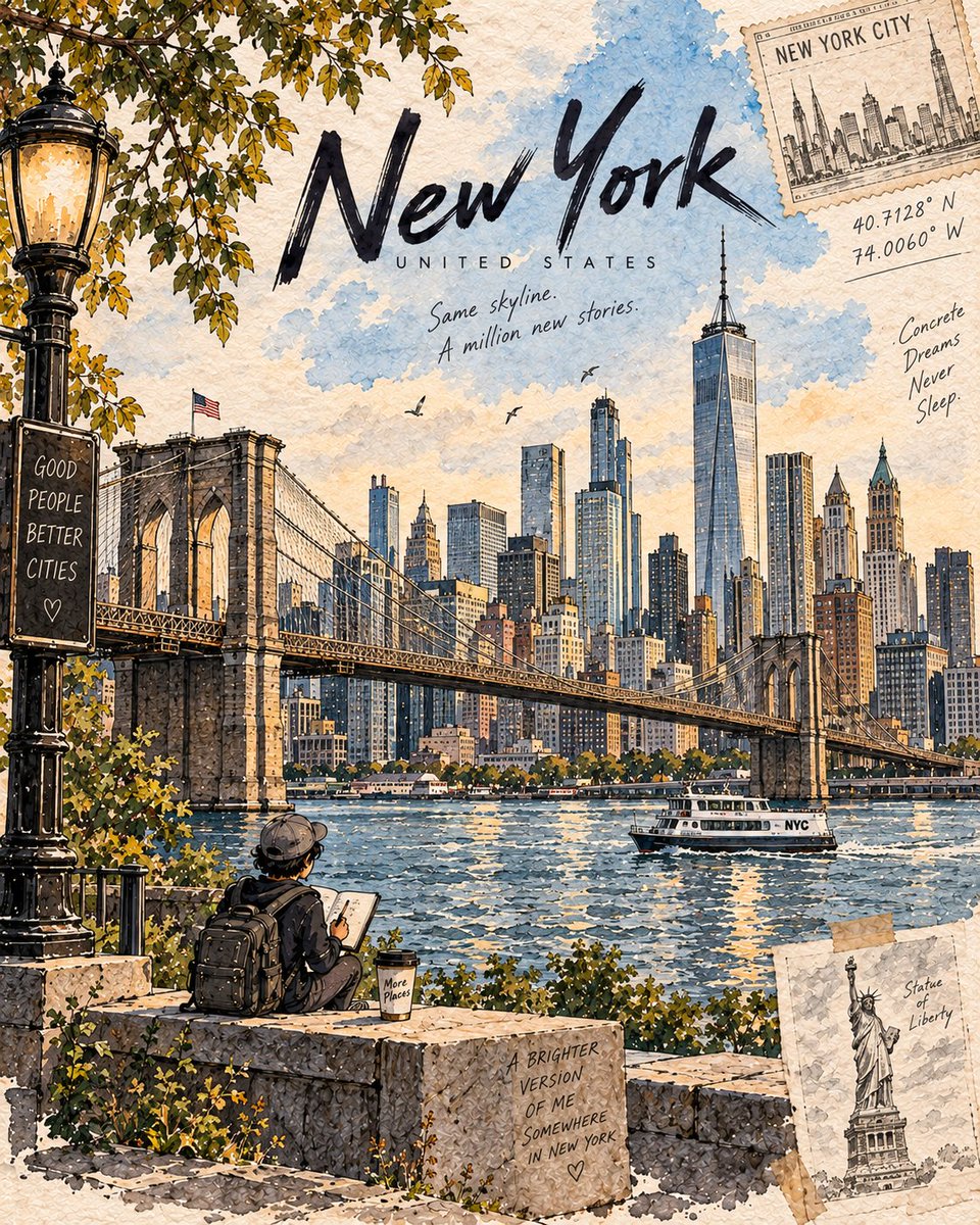
color_palette · mutedcolor_palette · warm-tonescomposition · rule-of-thirdsmood · nostalgicscene · cityscapesubject_type · character
提示词(原文,逐字保留)
Create a premium 4:5 vertical illustration for the “Destination Sketchbook” series. Use the Matterhorn artwork as the series DNA, not as a literal template.
For [DESTINATION], identify its most distinctive and authentic landmark or place and build the entire scene around it. Prioritize geographic accuracy: landmark, architecture, terrain, vegetation, water, geology, culture, and viewpoint must naturally belong together and be realistically observable from one location. Never create composite landmarks or mix attractions from different places.
COMPOSITION: One dominant hero landmark with 60–70% visual emphasis, strong foreground–middle–background depth, generous negative space, and exactly ONE tiny cute chibi traveler occupying 8–12% of the frame. The traveler should naturally explore, sketch, sit, walk, or observe—not pose for the viewer. Use destination-specific foreground details.
STYLE: Hand-painted travel-journal artwork with expressive dark ink lines, varied line weight, loose watercolor/gouache washes, warm off-white paper, visible grain, subtle pencil marks, imperfect brush edges, natural paint bleeds, and restrained imperfections. It should feel personally observed, tactile, intimate, and handmade—not photorealistic, glossy, vector-like, or generically AI-watercolored.
Make each destination visually unique through its architecture, vegetation, geology, materials, weather, light, culture, textures, and viewpoint, while preserving the same artist identity. Avoid generic tourism clichés and decorative elements unless genuinely relevant.
TEXT: Minimal handwritten editorial lettering:
[LANDMARK NAME]
[LOCATION, COUNTRY]
Optionally add 1–2 short, location-specific observations.
COLOR: Naturally derived from the destination and season. Restrained watercolor palette, subtle accents, visible paper, no neon, excessive contrast, glossy gradients, or artificial cinematic grading.
FINAL: The destination must be immediately recognizable, geographically coherent, landmark-dominant, authentically detailed, and unmistakably part of the Destination Sketchbook series.
OUTPUT: 4:5 vertical premium hand-drawn travel-journal illustration.
中文译文
为“Destination Sketchbook(目的地写生簿)”系列创作一幅高端的 4:5 竖版插画。以马特宏峰(Matterhorn)画作作为系列 DNA,而非字面模板。
针对 [DESTINATION],识别其最具辨识度且真实的地标或地点,并围绕它构建整个场景。优先保证地理准确性:地标、建筑、地形、植被、水体、地质、文化与视角必须自然融为一体,并且可在一个地点真实观察到。绝不要拼凑地标或将不同地点的景点混搭在一起。
构图(COMPOSITION):一个主导的“主角”地标占据 60–70% 的视觉比重,具备强烈的前景—中景—背景纵深,留白充足,并恰好有 ONE 个小巧可爱的 chibi 旅行者占据画面的 8–12%。旅行者应自然地探索、写生、坐着、行走或观察——而不是面对镜头摆姿势。使用目的地特有的前景细节。
风格(STYLE):手绘旅行手帐风格作品,使用富有表现力的深色墨线、变化丰富的线条粗细、松散的水彩/水粉晕染、暖调米白纸张、可见的纸张纹理、细腻的铅笔痕迹、不完美的笔刷边缘、自然的颜料晕染与克制的瑕疵。应呈现出亲历观察般、触感细腻、私密、手作的感觉——而非照片写实、光滑、矢量感或泛 AI 水彩感。
通过建筑、植被、地质、材质、天气、光线、文化、质感与视角让每个目的地视觉上独一无二,同时保持同一艺术家的风格统一。除非真正相关,否则避免通用旅游俗套与装饰元素。
文字(TEXT):极简的手写编辑性文字:
[LANDMARK NAME]
[LOCATION, COUNTRY]
可选择性地加入 1–2 句针对该地点的简短观察描述。
色彩(COLOR):自然源自目的地与季节。克制的水彩配色,细腻点缀,可见纸感;不要霓虹色、过度对比、光泽渐变或人为的电影感调色。
最终要求(FINAL):目的地必须一眼可辨、地理逻辑自洽、以地标为主、细节真实可考,并明显属于 Destination Sketchbook 系列。
输出(OUTPUT):4:5 竖版高端手绘旅行手帐风格插画。
来源与署名
原文由 @Goodmanprotocol 发布在 X:查看原推文。 本页逐字保留原文并提供机器翻译的中文解读;版权归原作者所有。
同工具的更多提示词
- 超写实 IMAX 级 Netflix 风格电影感人像,9:16 竖版。使用上传的图片作为主要视觉参考,精确保留面部身份、比例和标志性特征。打造一位美丽的成年女…@imGopalTiwari
- 你第一眼看到的是森林。巧妙之处在于,它始终保持着气流的样子。 🌿 宽阔、半透明的冷雾丝带直接从出风口向下飘落,并扩展为一股集中的气流柱 景观的感觉是由机器释放…@ou_zhen599
- 创建一个超现实主义的球形全景图,展现一座迷人的 [CITY NAME],其最具标志性的地标建筑自然地环绕在一个微型行星般的表面上。整个城市应自然地包裹在球形景…@Shorelyn_
- 季节的变化最能打动人心,当一切静止,唯有氛围流转。 🪽 重复完全相同的主视觉网格:左侧人像,右侧开阔的标题区域,固定的导航、标签与按钮位置 四张幻灯片在尚未阅…@ou_zhen599
- 超写实IMAX级别Netflix风格电影感人像,9:16竖版。以所上传的图像作为主要视觉参考,保留完全一致的面部身份、比例及标志性特征。创作一位美丽的成年女性…@imGopalTiwari
- 视觉系统不是重复,而是一套能够经受主题变换的规则。 🧊 在每一页幻灯片中,锁定左上角的标志、右上角的导航、淡雅的雾色调色板、精细的衬线字体,以及极简的滑动条提…@ou_zhen599