GPT 图像 2 在 chatGpt 上
分享链接 · https://openimages.ajiang.me/p/2092221482139349307/
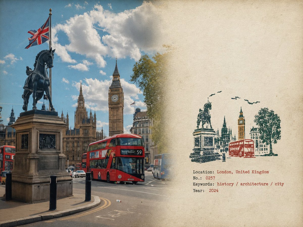
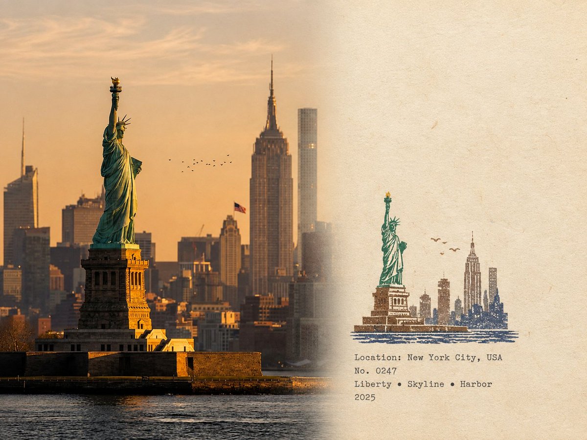
color_palette · earthycolor_palette · mutedcomposition · multi-panelcomposition · wide-shotmood · nostalgicquality_flags · embedded-text
提示词(原文,逐字保留)
GPT image 2 on chatGpt
Prompt 👇
Rubber Stamp Travel Field Notes Poster — Natural Realism Version
Create a separate “Rubber Stamp Travel Field Notes Poster” for each photo I upload. Output each photo individually. Never create a collage or combine multiple photos.
Use a 4:3 landscape composition with a natural visual transition between the original photograph on the left and the aged-paper field-note area on the right. Do not add an obvious dividing line.
LEFT — ORIGINAL PHOTOGRAPH
The left side should occupy roughly 58% of the frame.
Keep the uploaded photograph visually authentic and recognizable. Preserve the original subject, perspective, terrain, architecture, plants, people, spatial relationships, natural light, shadows, textures, and overall atmosphere.
Do not redesign or reinterpret the photograph.
Only apply a very subtle editorial photo treatment: gentle tonal balancing, restrained color grading, slightly softened highlights, and extremely fine natural film grain. It should still look like a real photograph taken on location rather than an AI-generated image.
Natural cropping is allowed if needed to fit the 4:3 layout, but do not stretch, distort, move, replace, or redraw the main subject.
Avoid excessive sharpness, HDR effects, artificial clarity, cinematic color grading, or overly perfect details.
RIGHT — AGED PAPER FIELD NOTES
The right side should occupy roughly 42% of the frame.
Use warm off-white, slightly aged paper with a believable physical texture. Include very subtle paper fibers, fine grain, faint handling marks, and a matte surface.
Keep large areas completely unprinted.
The paper should feel like a real sheet from an architect's travel notebook or field journal, not a designed poster background.
Avoid overly strong stains, decorative textures, vintage filters, or artificial grunge.
SMALL RUBBER STAMP
Study the uploaded photograph and identify only the few visual features that make the location immediately recognizable.
Reduce them into a compact, imperfect multi-color rubber stamp impression.
Do not reproduce the photograph element by element.
Simplify aggressively and retain only the most meaningful visual relationships:
- distinctive architecture and silhouette
- important roof, tower, dome, arch, or structural shape
- mountain or terrain contours
- shoreline or road direction
- a few recognizable trees or vegetation forms
- simplified settlement layers
- one or two important foreground shapes when visually relevant
Remove crowds, cars, dense windows, repetitive buildings, tiny vegetation, decorative objects, and insignificant background details.
The result should look like something a traveler could have actually carved into a small rubber stamp, not a miniature illustration of the entire photograph.
Place the stamp in the lower-middle portion of the right paper area, occupying approximately 30–38% of the right section's height.
Keep generous blank paper around it.
Do not enlarge it into a large illustration.
STAMP COLOR & PRINT CHARACTER
Extract approximately 2–4 muted spot colors naturally from the original photograph.
Possible colors include:
- carbon black
- deep green
- brick or muted red
- ochre
- slate blue
- taupe or earthy brown
Do not force these colors if the photograph suggests a different restrained palette.
Each color should appear as a separate physical ink layer.
Make the print feel genuinely handmade:
- slightly uneven pressure
- tiny gaps in the ink
- dry areas
- paper showing through
- rough carved edges
- irregular line thickness
- small contour breaks
- granular ink texture
- faint ghosting
- slight natural color-layer misregistration
- subtle edge variation
The imperfections should be small and believable, as if the stamp was pressed onto paper by hand.
Avoid perfectly aligned digital layers, smooth vector edges, clean gradients, or artificially exaggerated distress.
The stamp should look physically printed, not digitally illustrated.
FIELD-NOTE TYPOGRAPHY
Generate a small amount of text based only on the actual location and imagery in the photograph:
Location — English name
No. — Number
Three short English keywords
Gregorian calendar year
Place the text below or beside the stamp within the available whitespace.
Use a small, understated typewriter or archival field-note style.
The typography should have very slight mechanical irregularity, as though typed or printed on an old field notebook.
Keep it quiet and secondary to the photograph.
Spell the location and all words correctly.
Do not add slogans, brands, tourist phrases, decorative quotes, or unnecessary text.
OVERALL REALISM
The finished image should feel like a real travel photograph mounted beside a small handmade field stamp on an architect's personal notebook page.
Prioritize subtle physical realism over visual perfection.
The photograph should remain the strongest visual element.
The stamp should feel like a small fragment of memory extracted from the photograph rather than a second illustration.
Use restrained contrast, natural imperfections, believable paper texture, and slightly imperfect printing.
The final result should feel quiet, tactile, documentary, collectible, and genuinely handmade.
Avoid
Obvious dividing lines, circular seals, postage-stamp borders, perforations, wax seals, sticker layouts, souvenir-card designs, generic travel templates, smooth vector logos, polished digital illustrations, cartoon styling, 3D rendering, plastic textures, glossy gradients, excessive saturation, HDR effects, excessive text, decorative clutter, overly clean geometry, perfectly aligned ink layers, dense miniature architecture, or any alteration/redrawing of the original photograph.
中文译文
GPT 图像 2 在 chatGpt 上
提示 👇
橡皮章旅行田野笔记海报 —— 自然写实版
为我上传的每张照片分别创建一张“橡皮章旅行田野笔记海报”。逐张单独输出。绝不制作拼贴,也不要将多张照片合并。
采用 4:3 横构图,左侧原始照片与右侧做旧纸张田野笔记区域之间要有自然的视觉过渡。不要加入明显的分隔线。
左侧 —— 原始照片
左侧约占画面的 58%。
保持上传照片视觉上真实可辨。保留原始主体、视角、地形、建筑、植物、人物、空间关系、自然光线、阴影、质感以及整体氛围。
不要重新设计或重新解读照片。
仅施加非常克制的编辑级照片处理:轻微的色调平衡、含蓄的调色、略微柔化的高光,以及极其细腻的自然胶片颗粒。它仍应看起来像一张在现场拍摄的真实照片,而非 AI 生成的图像。
为适配 4:3 版式,必要时可进行自然裁切,但不要拉伸、扭曲、移动、替换或重绘主体。
避免过度锐化、HDR 效果、人工清晰度、电影感调色或过于完美的细节。
右侧 —— 做旧纸张田野笔记
右侧约占画面的 42%。
使用偏暖的米白、略带陈旧感的纸张,并具备可信的物理质感。包括非常细微的纸纤维、细腻的颗粒、极淡的拿取痕迹,以及哑光表面。
大面积区域保持完全空白。
纸张应像建筑师旅行笔记本或田野日志中的一页真实纸张,而非设计的海报背景。
避免过重的污渍、装饰性纹理、复古滤镜或人为做旧。
小型橡皮章
研究上传的照片,仅识别让该地点一眼可辨的几个视觉特征。
将它们缩减为一枚紧凑、不完美的多色橡皮章印记。
不要逐元素复刻照片。
大胆简化,只保留最具意义的视觉关系:
- 标志性的建筑与轮廓
- 重要的屋顶、塔楼、穹顶、拱门或结构造型
- 山脉或地形轮廓
- 海岸线或道路走向
- 几棵可辨识的树木或植被形态
- 简化的聚落层次
- 当视觉上相关时,一两个重要的前景形状
移除人群、汽车、密集的窗户、重复的建筑、微小的植被、装饰物件以及无关紧要的背景细节。
结果应像一位旅行者真正可以在一枚小橡皮章上刻出的东西,而不是整张照片的微缩插画。
将印章放置在右侧纸张区域的中下部,高度约占右侧区域的 30–38%。
周围保留充足的空白纸面。
不要把它放大成大幅插画。
印章颜色与印刷质感
从原始照片中自然提取约 2–4 种柔和的专色。
可选颜色包括:
- 碳黑
- 深绿
- 砖红或暗红
- 赭石
- 石板蓝
- 灰褐或大地棕
若照片暗示的是其他克制的配色,则不要强行套用以上颜色。
每种颜色应作为独立的物理油墨层出现。
让印刷品感觉真正手工制作:
- 轻微不均的压力
- 油墨中的细微断墨
- 干涩区域
- 纸纹透出
- 粗粝的雕刻边缘
- 不规则的线条粗细
- 细小的轮廓断裂
- 颗粒状油墨质感
- 极淡的鬼影
- 轻微自然的色层错位
- 细微的边缘变化
这些不完美应当小而可信,仿佛印章被人手压印在纸上。
避免完美对齐的数字图层、平滑的矢量边缘、干净的渐变或人为夸大的做旧。
印章应看起来是物理印制的,而非数字绘制的。
田野笔记字体
仅根据照片中的实际地点与图像生成少量文字:
Location —— 英文地名
No. —— 编号
三个简短的英文关键词
公历年份
将文字放置在印章下方或旁边的可用空白处。
采用小巧、含蓄的打字机或档案田野笔记风格。
字体应有非常细微的机械不规则感,就像在旧田野笔记本上打字或印刷而成。
保持低调,作为照片的次要元素。
正确拼写地名与所有单词。
不要添加口号、品牌、旅游短语、装饰性引文或多余文字。
整体真实感
成品应像一张真实的旅行照片被贴在建筑师私人笔记本页上,旁边是一枚小型手工田野印章。
优先考虑微妙的身体真实感,而非视觉完美。
照片应保持为最强的视觉元素。
印章应感觉像是从照片中提取出的一小块记忆碎片,而不是第二张插画。
使用克制的对比、自然的不完美、可信的纸张质感与略微不完美的印刷。
最终结果应感觉安静、有触感、纪实、可收藏,并真正手工制成。
避免
明显的分隔线、圆形徽章、邮票边框、齿孔、火漆印、贴纸版式、纪念卡设计、通用旅行模板、平滑矢量标志、精细的数字插画、卡通风格、3D 渲染、塑料质感、光泽渐变、过度饱和、HDR 效果、过多文字、装饰性杂乱、过于干净的几何形态、完美对齐的油墨层、密集的微缩建筑,以及任何对原始照片的改动或重绘。
来源与署名
原文由 @MahnoorAi12 发布在 X:查看原推文。 本页逐字保留原文并提供机器翻译的中文解读;版权归原作者所有。
同工具的更多提示词
- 使用 GPT image 2 创建 提示 ↓ 为 {{CITY_NAME}} 创作一张高级插画旅行明信片,采用精致的日本旅游杂志美学风格。 自动研究并确定该城…@saniaspeaks_
- 参考图中成年女性的电影级超写实极特写镜头,严格保持身份一致性,精确还原其面部特征与比例。她躺在床上,将一只大型白色毛绒兔紧紧贴在脸颊。70–80% 侧脸构图…@MissDelulu9
- { "resolution": "8K", "style": "超写实商业产品摄影", "composition": { "subject": "碳酸饮料罐"…@KrevixAi
- GPT Image 2 on ChatGPT 提示词 一张 9:16 比例的垂直工作室人像。镜头大约从腰部向上取景,带有轻微的相机倾斜或动感对角线构图。主体居…@harboriis
- 用 GPT IMAGE 2 + seedance 2.5 制作了这个视频,渠道: Prompt ⤵️ Part 1. 30秒 + part 2. 15秒 =…@ElsaSofia__AI
- 一张写实、高细节的中景照片:一位年轻的南亚女性坐在一只华贵的蓝色印度孔雀旁边,场景在户外。女性留着带柔和高光的深棕色长发,身穿白色传统设计师款 Anarkal…@juliaevee