使用 GPT image 2 创建
分享链接 · https://openimages.ajiang.me/p/2092211629232468073/
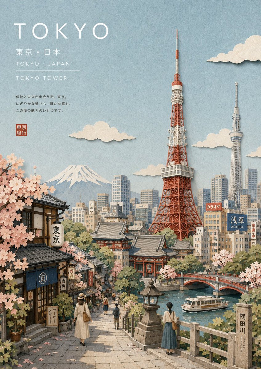
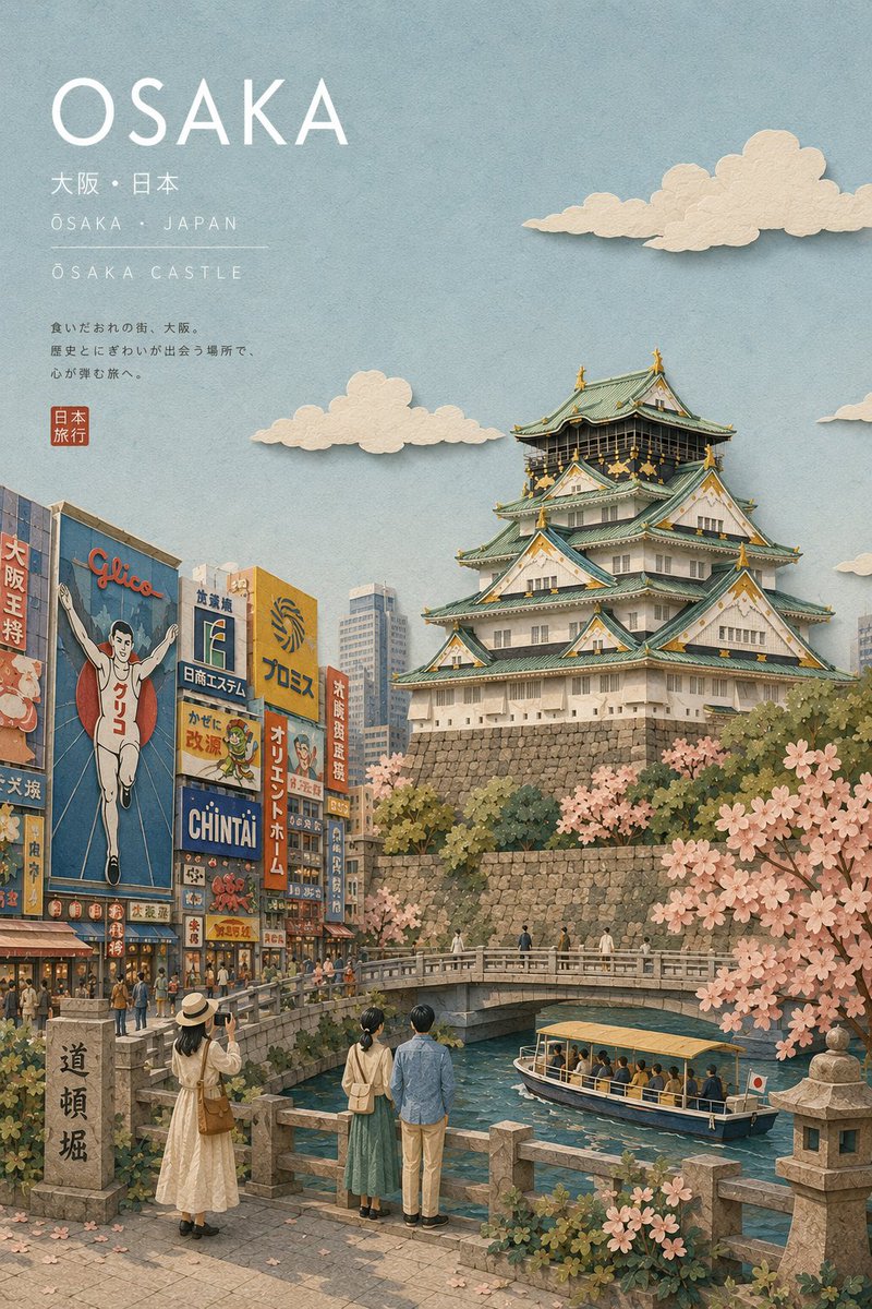
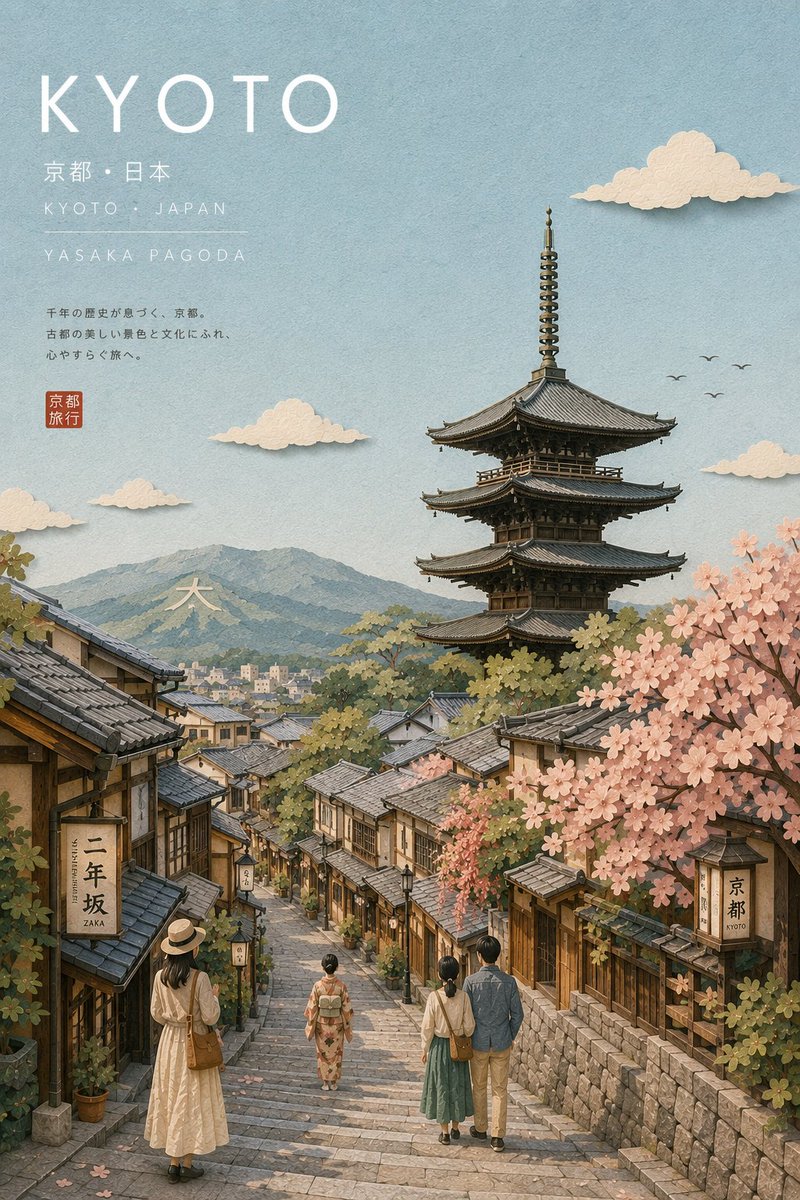
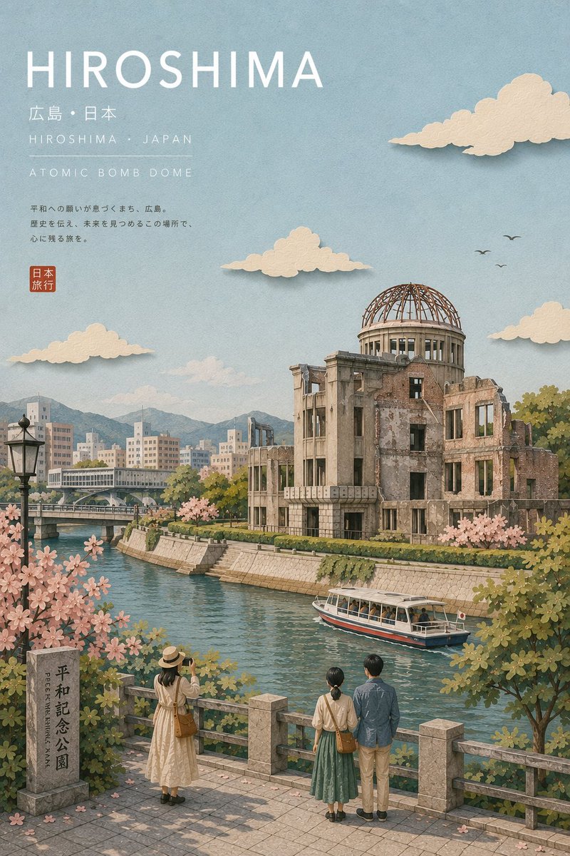
camera_lens · 50mm-standardcolor_palette · mutedcomposition · high-anglecomposition · negative-spacelighting · soft-lightmood · nostalgic
提示词(原文,逐字保留)
Created with GPT image 2
Prompt ↓
Create a premium illustrated travel postcard for {{CITY_NAME}} in a refined Japanese tourism-magazine aesthetic.
Automatically research and determine the city’s country, local-language name, most iconic landmark, authentic surrounding environment, distinctive local architecture, geography, vegetation, transportation, and secondary visual details. The landmark must be geographically accurate and instantly recognizable.
Visual style: elegant Japanese travel editorial illustration, handcrafted layered paper collage combined with delicate gouache and watercolor textures, sophisticated Japanese tourism brochure aesthetic, calm and poetic atmosphere, refined composition, tactile matte paper, subtle handmade edges, soft physical paper shadows, delicate atmospheric depth.
Composition: premium postcard. Use a cinematic elevated viewpoint with the iconic landmark as the main focal point. Surround it with accurately styled local buildings, streets, waterfronts, hills, mountains, parks, or other authentic geographic elements appropriate to the city. Keep the upper portion spacious with generous negative space for typography.
Color palette: soft powder blue, warm ivory, cream, muted sage, dusty green, pale beige, soft gray, restrained terracotta. Low-to-medium saturation, gentle tonal transitions, no harsh contrast.
Architecture: precise and believable local architecture with carefully simplified shapes, accurate proportions, characteristic materials and rooflines. Avoid generic buildings and random skyscrapers.
People: include only a few tiny simplified paper-cut travelers and pedestrians naturally interacting with the environment—walking, sightseeing, sitting, or looking toward the landmark. They should provide scale without becoming the focus.
Nature: delicate layered foliage, subtle trees, grasses and regional vegetation appropriate to the city. Add water, mountains, coastline, rivers, or other geographic features only when genuinely associated with the location.
Typography: place elegant minimalist Japanese editorial typography in the upper-left with generous spacing:
- CITY NAME — large uppercase geometric sans-serif
- LOCAL CITY NAME · COUNTRY/REGION — small refined sans-serif
- PRIMARY LANDMARK — small uppercase text with wide letter spacing
Typography should feel integrated into the artwork, not like an overlay.
Lighting: soft natural daytime light, slightly hazy atmosphere, gentle matte highlights, subtle layered shadows, peaceful and nostalgic mood.
Material: high-quality matte art paper, fine tactile grain, layered paper construction, delicate watercolor pigment variation, slightly imperfect handcrafted cut edges, premium offset-print character.
Camera feel: 40–50mm equivalent, natural perspective, minimal distortion, strong foreground/midground/background separation, carefully art-directed travel photography composition translated into an illustration.
Overall mood: quiet, elegant, contemplative, authentic, sophisticated Japanese travel magazine, collectible destination postcard, premium tourism campaign quality.
Avoid: photorealistic photography, CGI, plastic rendering, flat vector art, anime, cartoon caricature, generic skyline, inaccurate landmark, fictional architecture, geographically impossible scenery, duplicated buildings, excessive people, oversized people, neon colors, oversaturation, harsh black shadows, glossy surfaces, clutter, excessive outlines, random text, misspelled typography, watermark, logo, border, frame, UI elements.
Generate the entire scene dynamically from {{CITY_NAME}} while maintaining this exact refined Japanese tourism-magazine visual identity.
中文译文
使用 GPT image 2 创建
提示 ↓
为 {{CITY_NAME}} 创作一张高级插画旅行明信片,采用精致的日本旅游杂志美学风格。
自动研究并确定该城市的所属国家、本地语言名称、最具标志性的地标、真实的环境氛围、独特的当地建筑、地理特征、植被、交通方式以及次要视觉细节。地标必须在地理上准确且一眼可辨。
视觉风格:优雅的日本旅行编辑插画,结合手工分层纸质拼贴与细腻的水粉与水彩质感,呈现出精致的日本观光手册美学,气氛平静而诗意,构图考究,触感的哑光纸面,微妙的手工边缘,柔和的纸质物理阴影,细腻的氛围深度。
构图:高级明信片。使用电影感的俯视视角,以标志性建筑作为主要焦点。其周围搭配风格准确的当地建筑、街道、滨水区、山丘、山脉、公园或其他与该城市相符的真实地理元素。画面上部留出宽敞的负空间以容纳文字排版。
色彩搭配:柔和的粉蓝、温暖象牙白、奶油色、低饱和度鼠尾草绿、灰绿、淡米色、柔灰色、克制的赤陶色。低至中等饱和度,色调过渡柔和,避免强烈对比。
建筑:精准且可信的当地建筑造型,形状经过精心简化,比例准确,体现特色材料与屋脊线条。避免通用建筑和随机的摩天大楼。
人物:仅加入少量简化的小型剪纸风格旅行者和行人,自然地与环境互动——行走、观光、坐着或望向地标。他们应提供比例参考,而不应成为画面焦点。
自然:细腻的分层树叶、若隐若现的树木、草地以及与该城市相符的区域植被。仅当与地点真实相关时,才加入水、山脉、海岸线、河流或其他地理特征。
排版:在左上角以宽敞的间距放置极简优雅的日式编辑排版:
- CITY NAME — 大号大写几何无衬线字体
- LOCAL CITY NAME · COUNTRY/REGION — 小号精致无衬线字体
- PRIMARY LANDMARK — 小号大写字体,字距宽
排版应与画面融为一体,而非叠加在表面之上。
光线:柔和的白天自然光,略带朦胧的氛围,温柔的哑光高光,细微的分层阴影,营造宁静而怀旧的情绪。
材质:高品质哑光美术纸,细腻的触感纹理,分层纸质结构,精致的水彩颜料变化,略不完美的手工裁切边缘,高级胶印质感。
镜头感:40–50mm 等效焦距,自然透视,极小畸变,前景/中景/背景分离明显,将精心策划的旅行摄影构图翻译为插画。
整体氛围:宁静、优雅、沉思、真实、精致的日本旅行杂志风格,可收藏的目的地明信片,高级旅游宣传品质。
避免:照片写实摄影、CGI、塑料感渲染、扁平矢量插画、动漫、卡通漫画风格、通用天际线、不准确的地标、虚构建筑、地理上不可能的风景、重复建筑、过多人物、人物比例过大、霓虹色、过度饱和、生硬黑色阴影、光泽表面、杂乱、过多轮廓线、随机文字、拼写错误的排版、水印、标志、边框、相框、UI 元素。
根据 {{CITY_NAME}} 动态生成整个场景,同时严格保持这种日本旅游杂志的视觉特征。
来源与署名
原文由 @saniaspeaks_ 发布在 X:查看原推文。 本页逐字保留原文并提供机器翻译的中文解读;版权归原作者所有。
同工具的更多提示词
- { "resolution": "8K", "style": "超写实商业产品摄影", "composition": { "subject": "碳酸饮料罐"…@KrevixAi
- GPT 图像 2 在 chatGpt 上 提示 👇 橡皮章旅行田野笔记海报 —— 自然写实版 为我上传的每张照片分别创建一张“橡皮章旅行田野笔记海报”。逐张单…@MahnoorAi12
- 用 GPT IMAGE 2 + seedance 2.5 制作了这个视频,渠道: Prompt ⤵️ Part 1. 30秒 + part 2. 15秒 =…@ElsaSofia__AI
- 参考图中成年女性的电影级超写实极特写镜头,严格保持身份一致性,精确还原其面部特征与比例。她躺在床上,将一只大型白色毛绒兔紧紧贴在脸颊。70–80% 侧脸构图…@MissDelulu9
- 根据提供的参考图,创作一张充满活力、电影感且逼真的图像。仅将参考图用于整体角色、氛围、构图和时尚美学——请创建一个全新的原创场景。 一位美丽的年轻女性,留着自…@afrinxai
- GPT Image 2 on ChatGPT 提示词 一张 9:16 比例的垂直工作室人像。镜头大约从腰部向上取景,带有轻微的相机倾斜或动感对角线构图。主体居…@harboriis