将每张上传的照片作为唯一的视觉参考。为每张照片创建一个独立的、高端的编辑海报,并单独输出。不得合并图像或制作拼贴画。
分享链接 · https://openimages.ajiang.me/p/2108786023245488373/
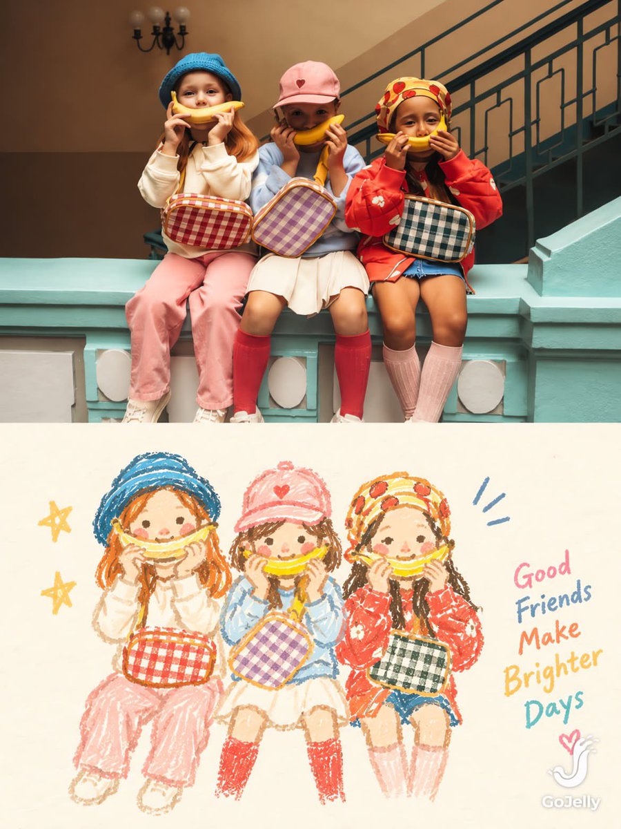
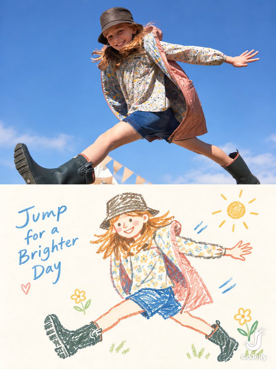
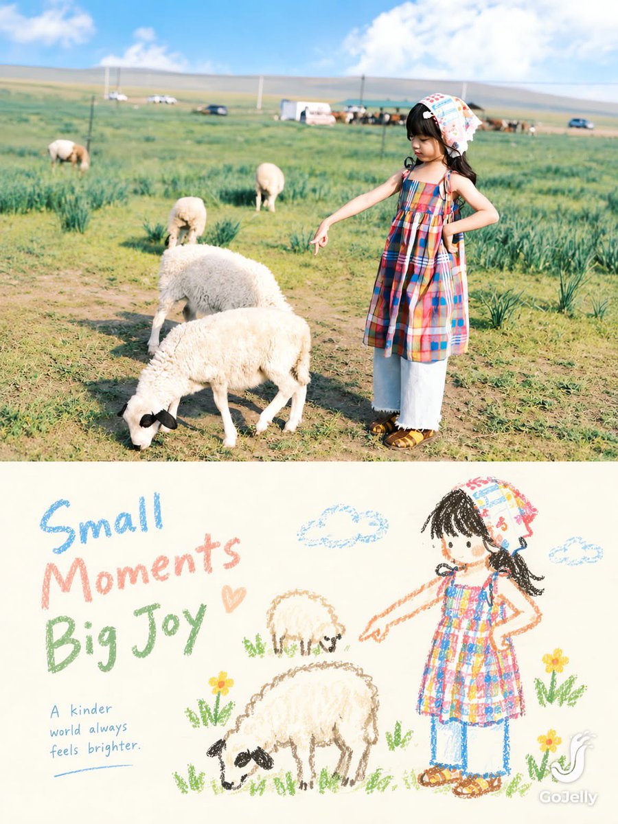
color_palette · pastelcomposition · negative-spacehuman_attributes · headwearhuman_attributes · long-hairmood · playfulquality_flags · embedded-text
提示词(原文,逐字保留)
SOURCE & OUTPUT
Use each uploaded photo as the sole visual reference. Create one independent, high-end editorial poster per photo and output each separately. Never combine images or create a collage.
FORMAT & LAYOUT
Use a strict vertical 3:4 composition divided into two exactly equal horizontal halves (50/50).
UPPER HALF — ORIGINAL PHOTOGRAPH
Preserve the original photograph faithfully, including the subject’s identity, facial features, structure, pose, proportions, natural texture, lighting, and color atmosphere. Apply only subtle premium editorial color grading for an art-magazine or exhibition-photography aesthetic. If necessary, extend only the surrounding background naturally to fit the frame. Never distort, replace, or redesign the subject.
LOWER HALF — PASTEL CRAYON MEMORY
Reinterpret the photograph as a minimalist, retro paper-texture pastel crayon doodle. Identify the scene’s most memorable subject, pose, relationships, direction, emotional tone, and visual essence. Reconstruct only these defining elements rather than copying every object or illustrating the entire scene.
Use thick, loose, grainy, hand-drawn chalk-and-crayon outlines with dry pigment texture, subtle breaks, faded patches, imperfect edges, slight hand wobble, and naturally rounded stroke endings. Add only a few simple pastel color blocks, stripes, dots, or scribbles to suggest essential details. Avoid realistic volume, detailed rendering, and excessive shading.
COMPOSITION & NEGATIVE SPACE
Keep the illustration small and visually balanced within the lower half, surrounded by generous empty space. Position the subject naturally according to the original photograph, allowing asymmetry, off-center placement, suspended elements, or partial cropping where appropriate.
Include only a few tiny environmental clues or abstract doodles, drawn in the same rough, simplified crayon style. Keep them minimal, imperfect, and contour-based. Prioritize breathing room, scale contrast, visual rhythm, and intentional emptiness. Never overcrowd the composition.
BACKGROUND & COLOR PALETTE
Use a bright, near-white paper background: ivory, cream white, pale off-white, soft apricot white, or very light gray-white. Add only subtle paper fibers and fine grain. Keep the background clean, bright, and clearly lighter than the illustration. Avoid dirty gray, dark yellow, or aged brown paper.
Extract 2–4 defining colors from the original photograph and reinterpret them as fresh, soft pastel crayon tones, such as peach pink, apricot orange, cream yellow, mint green, sky blue, or pale lavender. Use sufficiently distinct coral, blue, blue-green, warm orange, or violet outlines for clear contrast. Maintain a gentle, playful, emotionally warm, and refined palette.
OPTIONAL TEXT
Add only a tiny handwritten note if it genuinely enhances the composition. Keep it sparse, legible, secondary, and unobtrusive. Never use decorative text as filler.
FINAL AESTHETIC
Create a sophisticated editorial poster combining authentic photography above with a reduced, recognizable, hand-drawn memory of the same scene below. The illustration should feel airy, naive without being childish, playful without looking cheap, and minimal without losing the photograph’s identity or emotional meaning. Emphasize expressive linework, selective color, paper texture, asymmetry, and negative space.
NEGATIVE PROMPT
No collage, multiple photos in one image, unequal split, distorted subjects, altered identities, full realistic redraws, excessive detail, dense backgrounds, polished vector art, glossy digital rendering, 3D effects, oil painting, thick impasto, heavy crayon buildup, muddy colors, dirty or aged paper, realistic shading, sticker icons, decorative mini illustrations, clutter, overcrowding, ornamental dividers, logos, watermarks, UI elements, or gibberish text.
中文译文
将每张上传的照片作为唯一的视觉参考。为每张照片创建一个独立的、高端的编辑海报,并单独输出。不得合并图像或制作拼贴画。
格式与布局
采用严格的纵向 3:4 构图,水平等分为两半(各 50%)。
上半部分 —— 原始照片
忠实保留原始照片,包括主体的身份、面部特征、结构、姿态、比例、自然纹理、光线和色彩氛围。仅应用微妙的高级编辑调色,呈现艺术杂志或展览摄影的美学。如有必要,仅自然延伸周围背景以适应画面。不得扭曲、替换或重新设计主体。
下半部分 —— 粉彩蜡笔记忆
将照片重新诠释为极简、复古纸质感、粉彩蜡笔风格的涂鸦。识别场景中最令人难忘的主体、姿态、关系、方向、情感基调和视觉本质。仅重构这些定义性元素,而不是复制每个物体或绘制整个场景。
使用粗犷、松散、有颗粒感的手绘粉笔与蜡笔轮廓,带有干燥的颜料质感、细微的断裂、褪色的斑块、不完美的边缘、轻微的手抖和自然圆润的笔触收尾。仅添加少量简单的粉彩色块、条纹、圆点或涂鸦,以暗示必要细节。避免真实的体积、精细的渲染和过度阴影。
构图与留白
插画在下半部分保持小巧且视觉平衡,周围留有充足的空白。根据原始照片自然定位主体,适当时允许不对称、偏离中心、悬浮元素或部分裁切。
仅包含少量微小环境提示或抽象涂鸦,采用相同粗犷、简化的蜡笔风格绘制。保持极简、不完美、轮廓化。优先考虑呼吸感、比例对比、视觉节奏和刻意的留白。不得让画面过度拥挤。
背景与色彩
使用明亮的近白色纸张背景:象牙白、奶油白、淡灰白、柔杏白或非常浅的灰白色。添加细微的纸纤维和细颗粒。保持背景干净、明亮,并明显比插画更亮。避免脏灰色、深黄色或老化的棕色纸张。
从原始照片中提取 2–4 种定义性色彩,并重新诠释为清新柔和的粉彩蜡笔色调,例如桃粉、杏橙、奶油黄、薄荷绿、天蓝或淡薰衣草。使用足够区分度的珊瑚色、蓝色、蓝绿色、暖橙色或紫色轮廓以确保清晰对比。保持柔和、俏皮、情感温暖且精致的配色。
可选文字
仅当真正增强构图时才添加一小段手写注释。保持稀疏、可读、次要且不突兀。不得使用装饰性文字作为填充。
最终美学
创建一张精致的编辑海报,上方是真实的摄影,下方是同一场景的精简、可识别、手绘记忆。插画应感觉通透、天真却不幼稚、俏皮却不廉价、极简却保留照片的身份或情感意义。强调表现性线条、选择性色彩、纸质纹理、不对称和留白。
负面提示
不要拼贴、单图中多张照片、不均匀分割、扭曲主体、改变身份、全面写实重绘、过多细节、密集背景、精致的矢量艺术、光泽的数字渲染、3D 效果、油画、厚涂厚重的蜡笔堆积、浑浊色彩、脏污或老化纸张、写实阴影、贴纸图标、装饰性迷你插画、杂乱、过度拥挤、装饰性分隔线、标志、水印、UI 元素或乱码文字。
来源与署名
原文由 @Sairah_0 发布在 X:查看原推文。 本页逐字保留原文并提供机器翻译的中文解读;版权归原作者所有。
同工具的更多提示词
- { "task": "image_generation", "style": "Photorealistic luxury fashion editorial…@AiwithLariab
- { "prompt": { "style": "电影级黑白双重曝光时尚摄影", "aspect_ratio": "9:16", "subject": { "t…@AiwithLariab
- 穿着彩色泳装的美女在海滩边酒吧。 CR : X via @AI_Money_club 1. Banana 2.1 via API no ref 2. GPT…@tealdog2
- 超写实摄影风格的编辑杂志封面,画面中是一位富有创意的韩国女性,身着随性全黑装扮,眼睛紧贴 Sony A7R VI 微单相机的取景器,相机配有硕大的 G Mas…@ZephyraLeigh
- 1. 打开 Gemini / Grok / GPT Image 2.0 2. 上传你的照片 3. 复制提示词 4. 生成 5. 提示词 提示词 👇👇 一张超逼…@ShamshadMa75100
- 以上传的图片作为主要的视觉参考。创作一幅高端极简风格的编辑类艺术海报,将照片写实风格的自然摄影与精致的手绘墨水插画相结合。 构图:严格采用 2:3 竖版格式…@Sairah_0