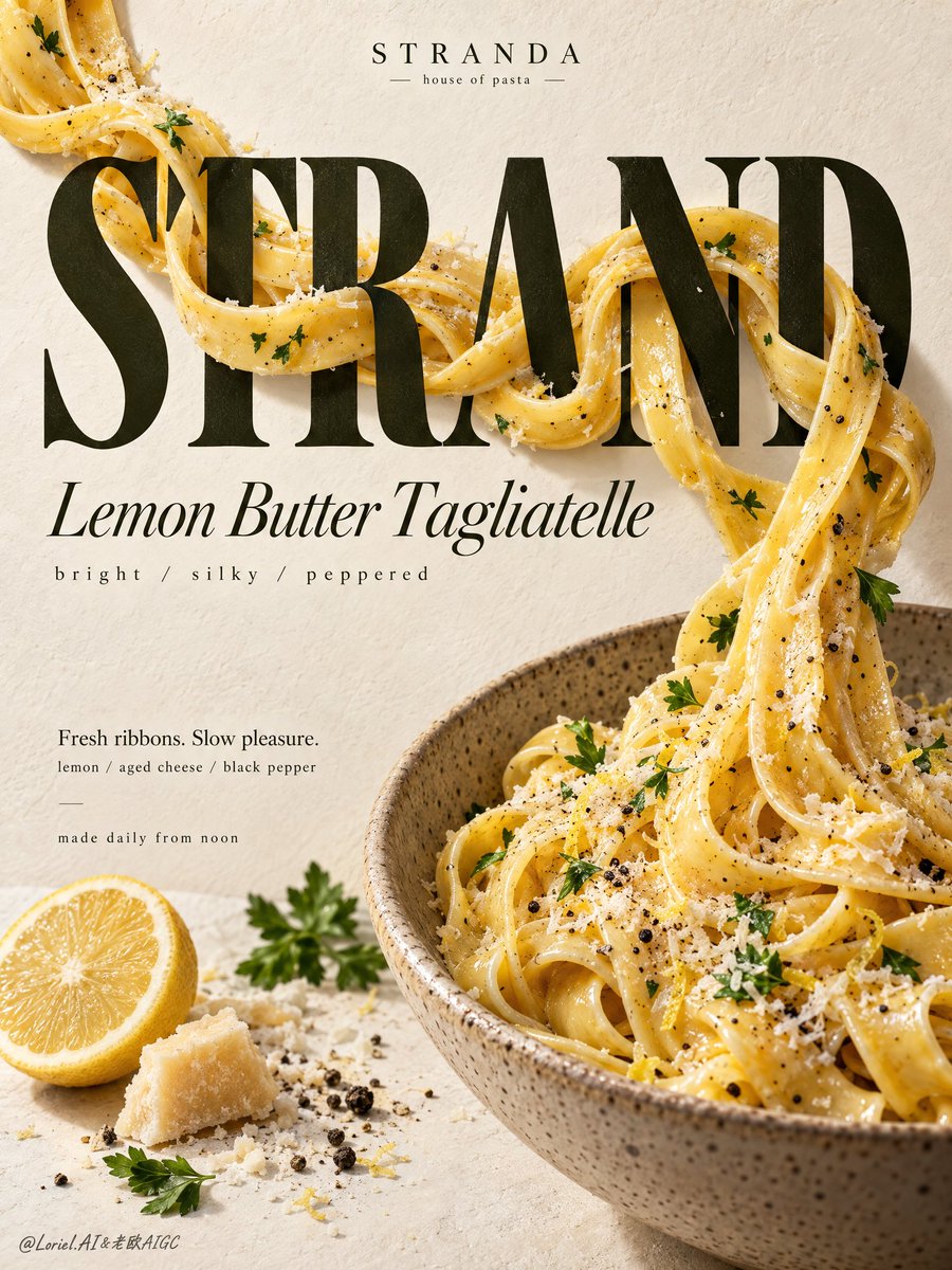
不要让食物摆放在字体之上。让食物打断字体。
分享链接 · https://openimages.ajiang.me/p/2108253336592171180/
color_palette · high-contrastcolor_palette · warm-tonescomposition · close-upcomposition · dynamic-diagonallighting · soft-lightmood · elegant
提示词(原文,逐字保留)
Don’t let food sit on top of type. Make it interrupt the type.
🧈 tagliatelle threading in front of, behind, and through oversized serif letterforms
This creates real visual tension: the pasta hides part of a letter, then reappears with a highlight. The word stops being a label and becomes part of the dish.
🍋 pasta ribbon flowing from the headline into a partially cropped ceramic bowl
The noodle now has a destination. Your eye follows one continuous path—from title to sauce to bowl—so the poster reads as one gesture instead of type placed above food.
GPT- image 2.5 prompt👇
Create a Cannes-grade vertical poster ad for an original premium pasta brand, STRANDA, built around real tagliatelle physically weaving through typography. Fuse hyper-real pasta, elegant editorial type, and clean gallery-grade food-poster language into one unified commercial composition. The product remains the absolute visual leader, while the noodle-letter interaction is the main conceptual impact point.
Use a refined vertical editorial food-poster layout. Across the upper-middle field, place a monumental dark olive-black serif display word, "STRAND", tall, bold, sculptural, and spanning most of the poster width. Thick glossy ribbons of lemon-butter tagliatelle physically thread across, behind, and through the letterforms with believable overlap, occlusion, drag, and tension. Some strands pass in front catching creamy highlights, some disappear behind stems, some curve through negative spaces and re-emerge, creating a precise reveal-and-conceal rhythm. The noodle flow begins near the upper-left of the title, crosses the central letters, then descends diagonally into a large speckled ceramic bowl in the lower-right quadrant, partially cropped by the frame edge to enlarge presence and maintain poster tension.
The hero dish must be intensely appetizing and highly realistic: silky tagliatelle coated in buttery lemon emulsion, faint zest shimmer, cracked black pepper, finely grated aged cheese, and restrained flat-leaf parsley accents. The noodles should feel elastic, freshly tossed, hand-made, and heavy enough to pull naturally, with visible torsion, thickness variation, and sauce cling. The bowl is warm stoneware with fine speckling, matte glaze, realistic rim thickness, and subtle ceramic depth. Supporting ingredients stay minimal and curated: a half lemon, one small shard of aged cheese, a little cheese dust, a few peppercorns, and a few parsley leaves in the lower-left field, arranged as editorial punctuation rather than clutter.
The background is a warm ivory paper-plaster surface with soft tactile grain, functioning as a luxury print-poster ground rather than a literal kitchen. Keep it distilled and clean but not sterile: enough texture to feel premium and physical, never dirty. Merge three directions into one result: emotional comfort of an inviting plated dish, tactile authority of pasta and ceramic realism, and curatorial restraint of a minimalist design poster. The image should feel abundant yet disciplined.
Use soft directional daylight from the upper-left with controlled studio refinement. Build creamy highlights on the butter-coated noodles, low-relief shadow on the typography, delicate cast shadows where pasta crosses letters, and stronger separation between the dark word block, golden pasta ribbons, and pale ground. Color hierarchy: 60% warm ivory, cream, and soft stone; 30% golden pasta, butter, and toasted cheese tones; 10% dark olive-black typography with restrained citrus yellow and parsley green accents. Contrast should be stronger than a casual menu poster but still elegant, clean, and premium.
Typography must be fully original and treated as graphic architecture. Top center: "STRANDA" with the small line "house of pasta". Main central display word: "STRAND". Beneath it: "Lemon Butter Tagliatelle". Below that: "bright / silky / peppered". In the lower-left text zone: "Fresh ribbons. Slow pleasure." and "lemon / aged cheese / black pepper". Near the bottom-left: "made daily from noon". All text must feel custom-designed, beautifully kerned, spatially integrated, and tonally harmonized with the noodle movement. No crude fonts, no generic heavy black text, no text covering the key pasta interaction or bowl.
Hyper-real food photography merged with high-end editorial poster design, luxury food-ad finish, strong product-first hierarchy, believable gravity and contact, crisp readable text, elegant negative space, clean premium print feel, unified art direction. No clutter, extra dishes, garnish overload, floating noodles, broken strands, warped bowl geometry, unreadable text, muddy background stains, dead black patches, plastic-looking sauce, stiff pasta geometry, cheap menu-board look, style drift, or unnecessary decorative effects.
中文译文
不要让食物摆放在字体之上。让食物打断字体。
🧈 意面在巨大衬线字母前面、后面和中间穿插
这会制造真实的视觉张力:意面遮住字母的一部分,然后带着高光再次出现。单词不再是标签,而成为菜肴的一部分。
🍋 面条丝带从标题流入一个被部分裁切的陶瓷碗
面条现在有了去处。视线沿着一条连续的路径走——从标题到酱汁再到碗——所以海报读起来是一个连贯的手势,而不是把字放在食物上面。
GPT- image 2.5 prompt👇
为原创高端意面品牌 STRANDA 打造一张戛纳级竖版海报广告,围绕真实的意面物理性地穿过排版展开。将超写实意面、优雅的编辑级字体和干净的画廊级食物海报语言融合成一个统一的商业构图。产品是绝对的视觉主角,关键概念点是连续的身体——意面与文字的互动。
采用精致的竖版编辑级食物海报布局。在中上部画面放置一个巨大的深橄榄黑色衬线展示字"STRAND",高大、粗体、雕塑感强,横跨海报大部分宽度。浓稠油亮的柠檬黄油意面丝带物理性地穿过字母前后内外,带有可信的叠压、遮挡、拉扯与张力。有的面条从前面经过,捕捉奶油般的高光;有的消失在笔竖后方;有的穿过负空间弯曲后再次出现,形成精确的显隐节奏。面条流从标题左上方开始,穿过中间的字母,然后沿对角线向下进入右下象限的大号斑点陶瓷碗,被画面边缘部分裁切,以放大存在感并保持海报张力。
主菜必须极其诱人且高度真实:丝滑的意面裹上浓郁柠檬黄油乳化酱汁、淡淡的柠檬皮光泽、碎黑胡椒、细磨的陈年奶酪,以及克制的内敛欧芹点缀。面条应感觉有弹性、刚拌好、手工制作、足够重以自然下垂,有可见的扭转、粗细变化和挂酱。碗是温暖石器质感,带细密斑点、哑光釉面、逼真的边缘厚度和细腻的陶艺深度。配料保持极简且精心挑选:一个半个柠檬、一小块陈年奶酪、少量奶酪粉、几粒黑胡椒和几片欧芹叶,放置在左下角画面,作为编辑式标点而非杂乱。
背景是温暖的象牙色纸张涂裱平面,带柔和的触感颗粒,作为奢华印刷海报的底色,而非字面的厨房。保持精炼干净但不死板:有足够的质感显得高级而具象,绝不能脏。将三个方向合为一体:诱人盘中餐的情感舒适、意面与陶瓷写实主义的触感权威,以及极简设计海报的策展式克制。图像应感觉丰盛但有纪律。
使用来自左上的柔和定向日光,配合受控的工作室精致感。在黄油裹面的面条上建立奶油高光,在字体上建立低浮雕阴影,在意面穿过字母的地方制造细腻的投射阴影,并加强深色词块、金色面条丝带与浅色底色之间的分离。色彩层级:60% 温暖象牙色、奶油色和柔和石材色;30% 金色意面、黄油和烤奶酪色调;10% 深橄榄黑色字体,配以克制的柑橘黄和欧芹绿点缀。对比比普通菜单海报更强,但仍需优雅、干净、高级。
字体必须完全原创,并被视为图形架构。顶部居中:"STRANDA",下方小字"house of pasta"。中部主展示词:"STRAND"。其下:"Lemon Butter Tagliatelle"。再下方:"bright / silky / peppered"。在左下文本区:"Fresh ribbons. Slow pleasure." 和 "lemon / aged cheese / black pepper"。靠近左下角:"made daily from noon"。所有文字必须感觉是定制设计的、精美字距的、空间整合的,并与面条的动态在色调上协调。禁止粗劣字体、通用大块黑字、文字覆盖关键意面互动或碗部。
将超写实食物摄影与高端编辑级海报设计融合,奢华食品广告成品,强产品主导层级,可信的物理重力与接触,清晰可读文字,优雅负空间,干净高级印刷感,统一艺术方向。禁止杂乱、多余餐具、配料堆砌、漂浮面条、断裂面条、碗体几何扭曲、文字不可读、背景污渍浑浊、死黑斑块、塑料感酱汁、僵硬意面几何、低价菜单板观感、风格漂移或不必要的装饰效果。
来源与署名
原文由 @ou_zhen599 发布在 X:查看原推文。 本页逐字保留原文并提供机器翻译的中文解读;版权归原作者所有。
同工具的更多提示词
- 超写实露营地日落画面,年轻女子坐在折叠露营椅上侧身凝视夕阳,黑色长波浪发被微风轻轻吹动,黑色无袖上衣简洁休闲,白色短裤,神态安静放松,中景视角,背景是白色帐篷…@Adam38363368936
- 看似随意缠绕的意大利面,实际上是一根连续的线条,引导着整张海报。 ✨ 从叉子到底部的一根连续的千层面条,具有可信的扭转感和重量感 这为构图提供了一条主线。零散…@ou_zhen599
- 请基于所附参考图像中的女孩,创作一幅超写实的秋季乡村肖像。须完整保留她原本的面部特征、标志性五官、自然比例与整体外貌,不得对其面部进行任何修改或美化。 她站在…@mehvishs25
- { "meta": { "aspect_ratio": "9:16", "orientation": "vertical", "quality": "ultr…@SDDFounder
- 为 [COUNTRY / CITY / LOCATION / SUBJECT](国家 / 城市 / 地点 / 主题)创作一幅 4:5 竖版高端旅行编辑风格艺术…@Goodmanprotocol
- 参考上传的老房子照片,以1:24比例精准复刻为博物馆级超写实实体微缩模型,严格还原建筑结构、屋顶、门窗、墙体及原始环境。精细呈现斑驳墙皮、风化砖瓦、裂缝、青苔…@MrGafish