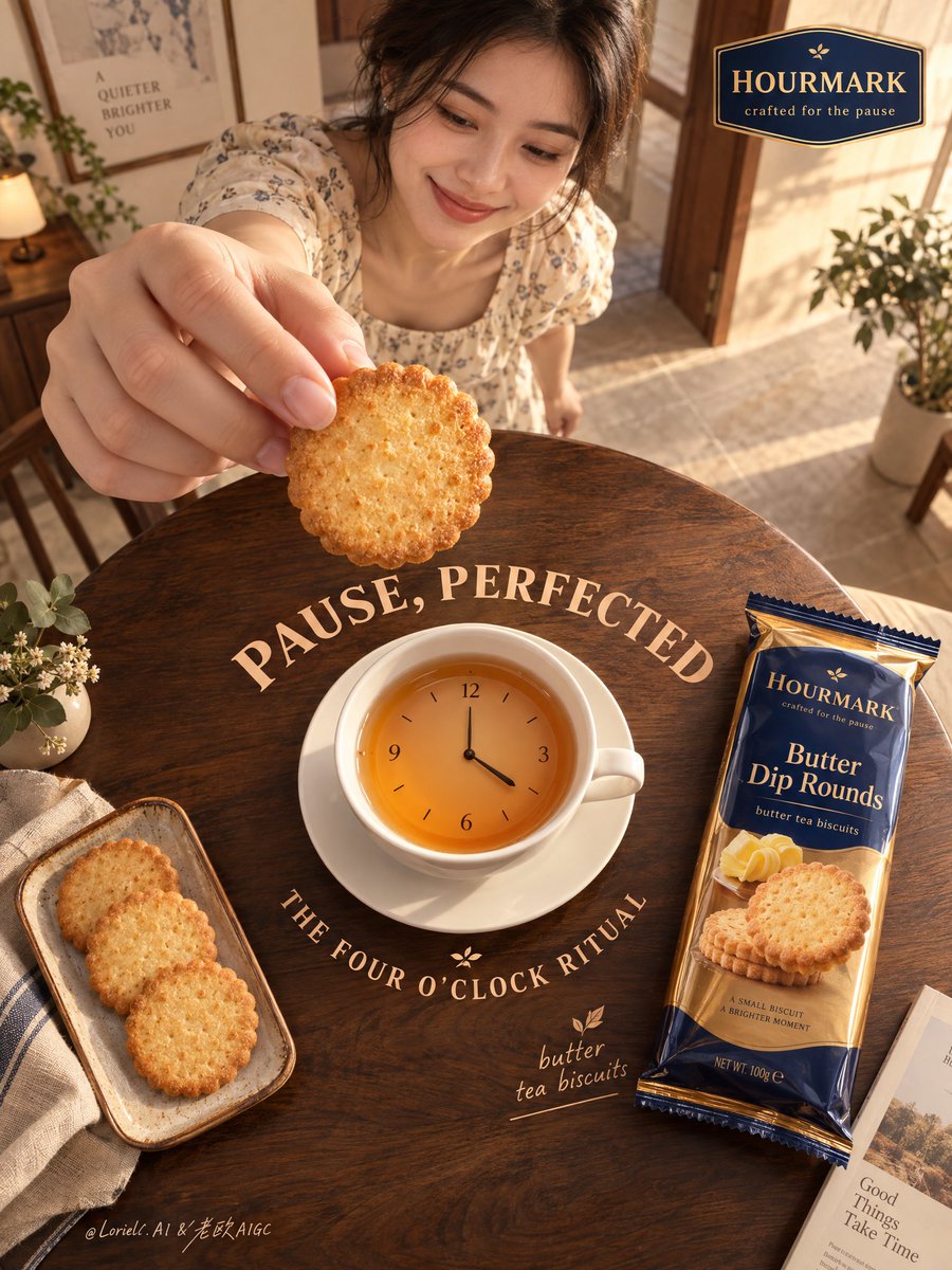
你最先注意到的是饼干。真正让这个概念锁定下来的,是它与“四点钟”之间的垂直关系。
分享链接 · https://openimages.ajiang.me/p/2108178899305955696/
color_palette · warm-tonescomposition · high-anglelighting · golden-hourmood · elegantquality_flags · embedded-textscene · indoor-home
提示词(原文,逐字保留)
You notice the biscuit first. What actually locks the concept in is its vertical relationship with “four o’clock.”
🍊 biscuit held close to lens, directly above the cup-clock
This makes the biscuit feel like the next second before it drops into the tea. The eye travels from the fingers straight into the cup. Don’t just write “holding a biscuit,” or it becomes a generic foreground prop.
🪽 cup seamlessly fused with a minimal analog clock face, set at four o'clock
This gives the brand idea a physical home. Once the cup becomes a clock, afternoon tea stops being background atmosphere and becomes the event itself.
GPT- image 2.5 prompt👇
Create a Cannes-grade vertical poster ad for an original overseas biscuit brand, HOURMARK, with Butter Dip Rounds as the absolute hero. Preserve the exact logic of a high-overhead ultra-wide lifestyle poster: a large round dark walnut table fills the lower two-thirds as the main stage; at its center, a white ceramic teacup fused with a minimal analog clock face forms the conceptual core. In the upper frame, a smiling young woman stands beyond the table, secondary in scale, reaching from the upper-left toward the camera, delicately holding one biscuit very close to the lens directly above the cup-clock, freezing the instant before dipping. On the right side of the table, place the premium biscuit pack diagonally, fully readable. On the lower-left, place a small tray with three extra biscuits. Preserve the circular composition, the foreground-to-center-to-product visual loop, generous negative space, and elegant tabletop typography rhythm.
Set this in a refined domestic interior edited into a premium lifestyle set: blush clay and muted butter-cream walls, warm walnut furniture, pale stone floor, sparse indoor greenery, framed wall art, and one open doorway with soft depth. Keep the environment realistic but gallery-clean so nothing competes with the product. The woman should feel authentic, warm, and approachable, with natural dark hair, an understated ivory floral dress, and a relaxed smile toward the biscuit and cup. She is emotional context only, never stronger than the product.
The hero biscuit must look hyper-real and edible: crisp baked pores, scalloped edge, golden toasted gradient, dry buttery surface, believable thickness, subtle crumbs. The packaging must feel premium and physically convincing, in amber gold, deep cobalt, and brushed copper, with realistic laminated reflections, precise crimped edges, clean print registration, and premium FMCG proportions. The walnut tabletop shows rich grain and soft specular rolloff. The cup-clock is smooth white ceramic with a matte dial and slim dark hands; the tea surface shows controlled amber reflection and a gentle meniscus.
Use late-afternoon four-o’clock light as the narrative anchor. Main light enters from the right-back side, soft but directional, wrapping across the fingers, biscuit texture, cup rim, and pack edges. Build refined contrast so the product gains volume and authority. Add subtle floor bounce and environmental fill to avoid dead blacks. Keep shadows warm, transparent, and clean. Color system: 60% warm cream, blush clay, pale stone; 30% walnut brown, toasted biscuit gold, amber tea; 10% cobalt and copper accents on the pack and selected graphic details. The overall image should feel premium, tactile, calm, and sharply art-directed.
Typography must be original, not copied, and integrated as graphic composition within the scene. In the top-right, place a small premium logo badge reading "HOURMARK" with the micro-line "crafted for the pause". Around the cup-clock and tabletop arc, integrate custom rounded display lettering in warm cream and apricot tones: "PAUSE, PERFECTED" and "THE FOUR O'CLOCK RITUAL". Near the pack, place a small elegant product note: "butter tea biscuits". Typography should feel polished, sculpted, and spatially embedded, sharing the same light and color logic, never flat black text, and never blocking the biscuit, hand, or packaging.
Commercial poster finish, hyper-real product rendering, product-first hierarchy, elegant perspective, believable anatomy, unified light logic, clean negative space, coherent object contact, subtle luxury print sensibility, refined advertising concept, museum-clean composition, high material readability. No clutter, random particles, decorative crystals, floating objects, duplicated products, broken fingers, warped biscuit geometry, malformed hands, unreadable or gibberish text, pack distortion, perspective collapse, muddy haze, dirty shadows, dead black patches, overdone CGI gloss, style drift, irrelevant props, extra branding, human name, or cheap poster effects.
中文译文
你最先注意到的是饼干。真正让这个概念锁定下来的,是它与“四点钟”之间的垂直关系。
🍊 饼干贴近镜头,正悬浮在杯形时钟的正上方
这让饼干感觉像是在落入茶杯之前的那一秒。视线会从手指直接滑入杯中。不要只写“拿着一块饼干”,否则它就变成了一个普通的前景道具。
🪽 杯子与一个极简的模拟时钟表盘无缝融合,设定在四点钟
这为品牌理念提供了实体归宿。一旦杯子变成时钟,下午茶就不再是背景气氛,而是事件本身。
GPT- image 2.5 prompt👇
为原创海外饼干品牌 HOURMARK 创作一张戛纳级别的竖版海报广告,以 Butter Dip Rounds 为绝对主角。严格保留高俯视超宽幅生活方式海报的逻辑:一张大型深色胡桃木圆桌占据画面下方三分之二,作为主舞台;桌面中央,一个白色陶瓷茶杯与极简模拟时钟表盘相融合,构成本片概念核心。在画面上部,一位微笑的年轻女性站在桌子后方,体量次级,主于画面朝向镜头,从左上方伸手,精致地将一块饼干贴近镜头,悬于杯形时钟正上方,定格即将蘸取前的瞬间。桌子右侧斜放高档饼干包装,文字完全可读。左下角放置一个小托盘,上面摆着三块额外饼干。保留圆形构图、前景—中心—产品的视觉回路、充裕的留白,以及优雅的桌面字体节奏。
场景设定在一个精致的室内空间,被编辑成一个高级生活方式影棚:腮红土陶色与柔和黄油奶油色墙面、暖色胡桃木家具、淡色石材地面、稀疏的室内绿植、墙上的装框艺术品,以及一扇敞开的有柔和纵深的门洞。环境保持真实但如画廊般洁净,使任何东西都不与产品争抢。女性气质应真实、温暖、亲切,拥有自然的深色头发,身穿一件低调的象牙白花裙,对饼干和杯子投以放松的微笑。她只是情感氛围的衬托,存在感永远不能强过产品。
主角饼干必须看起来超真实且诱人:酥脆的烘焙气孔、花边边缘、金黄烘烤渐变、干燥的奶油表面、可信的厚度、细微的碎屑。包装必须感觉高档且物理可信,采用琥珀金、深钴蓝与拉丝铜色调,具有真实的覆膜反光、精确的压花封口边缘、干净的印刷套准,以及高端 FMCG 比例。胡桃木桌面展现丰富木纹与柔和的镜面渐隐。杯形时钟是光滑的白色陶瓷,带有哑光表盘与纤细的深色指针;茶汤表面呈现克制的琥珀色反射与柔和的弯月面。
以午后四点的光线作为叙事锚点。主光从右后方进入,柔和但有方向性,掠过手指、饼干肌理、杯沿与包装边缘。营造精致的对比,使产品获得体积感与权威感。添加微妙的地板反弹光与环境补光以避免死黑。保持阴影温暖、透明、干净。色彩体系:60% 暖奶油色、腮红土陶色、淡色石材;30% 胡桃木棕、烤饼干金、琥珀茶色;10% 钴蓝与铜色点缀于包装及选定的图形细节上。整体画面应呈现高级、触感细腻、平静、且极具艺术指导性的气质。
字体必须是原创而非挪用,并作为图形构图融入场景。右上角放置一个小巧的高档徽标,文字为 "HOURMARK",下方小字为 "crafted for the pause"。围绕杯形时钟与桌面弧线,采用定制圆润展示字体,以暖奶油与杏色调融入:"PAUSE, PERFECTED" 与 "THE FOUR O'CLOCK RITUAL"。在包装附近,放置一行优雅的小号产品说明:"butter tea biscuits"。字体应感觉精致、有立体感、与空间融合,共享相同的光线与色彩逻辑,绝不可出现扁平黑字,也绝不能遮挡饼干、手部或包装。
商业海报级完成度、超真实产品渲染、产品优先的层级、优雅的透视、可信的人体结构、统一的光线逻辑、洁净的负空间、一致的物体接触、微妙的高档印刷质感、精炼的广告理念、博物馆般洁净的构图、高材质可读性。杜绝杂乱、随机颗粒、装饰性水晶、漂浮物体、重复产品、断裂的手指、变形的饼干几何、畸形的手、不可读或乱码文字、包装变形、透视塌陷、浑浊雾感、脏阴影、死黑斑块、过度的 CGI 塑料感、风格漂移、跑题的道具、多余的品牌信息、人名或廉价海报特效。
来源与署名
原文由 @ou_zhen599 发布在 X:查看原推文。 本页逐字保留原文并提供机器翻译的中文解读;版权归原作者所有。
同工具的更多提示词
- 创作一幅迷人的儿童绘本风格插画,主题为[LANDMARK],灵感源自复古活动手册的美术作品。将这座地标置于明亮、梦幻的乡村或自然环境中,使用柔和的手绘黑色轮廓…@Naiknelofar788
- 【主体】 × 【身体不同部位】肌肤 × 浅浮雕压痕 × 局部红晕 × 浅宽凹压痕签名“DeepBlue” 说明: 压痕由外力形成,作画主体随肌肤曲面自然变形…@DeepBlueX0
- iPhone 18夜晚直闪抓拍,一位成年东方性感女性独自行走在深山老林中,修身吊带短裙,长发微乱,冷白闪光照亮人物与前景,四周树林幽深漆黑、薄雾弥漫,氛围惊悚…@MrGafish
- 超写实电影感肖像:一位年长的亚洲陶瓷艺术家坐在堆满杂物的工坊里,双手沾满湿润的粘土,正在陶轮上塑形一只细颈花瓶;午后的阳光透过布满灰尘的窗户洒入,形成丁达尔光…@BernieCheuinbf
- 3D 纸艺卷纸浅浮雕画,描绘一位没有五官的女性[SUBJECT/POSE,例如:正在高踢腿的舞者 / 迈着动态步伐的时尚模特]。 她戴着宽檐[HAT COLO…@yourPlugAI
- 为 [COUNTRY / CITY / LOCATION / SUBJECT](国家 / 城市 / 地点 / 主题)创作一幅 4:5 竖版高端旅行编辑风格艺术…@Goodmanprotocol