一张性能海报能否成功,取决于运动员传递出感觉,而产品掌控整体画面。
分享链接 · https://openimages.ajiang.me/p/2107495290689486881/
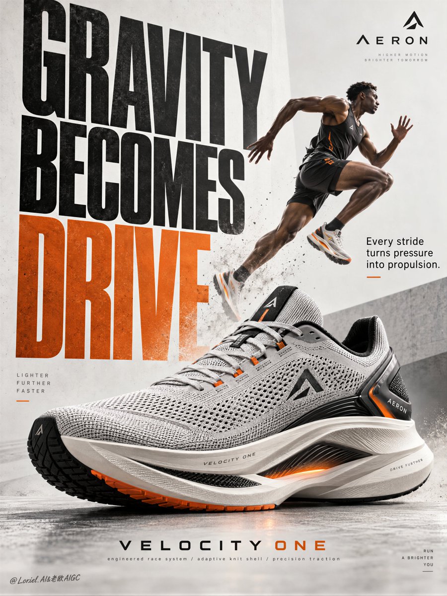
color_palette · high-contrastcomposition · dynamic-diagonallighting · studio-lightmood · energeticquality_flags · typography-heavysubject_type · fashion-person
提示词(原文,逐字保留)
A performance poster works when the athlete sells the feeling, but the product owns the frame.
🪽 “oversized hero sneaker in the lower center, three-quarter profile; athlete reduced to a smaller diagonal stride above it”
The shoe becomes the first read. The runner supplies speed and proof without competing for the purchase decision.
✨ “keep the runner’s lifted knee, extended leg, and dust trail aimed toward the shoe’s toe-to-heel axis”
Motion now lands on the product. The athlete and the typography both direct attention into the engineered details.
GPT- image 2.5 prompt👇
Create a Cannes-level poster ad for fictional premium performance footwear brand AERON, combining narrative athletic tension, engineered material realism, and minimalist curatorial graphic design in one unified image. Build the poster around one hyperreal hero sneaker as the absolute visual anchor, fused with monumental typography and one motion-driven athlete accent, translating speed, pressure, balance, and release into a clean but forceful commercial image.
Use a vertical full-bleed poster with strict poster-design logic and rule of thirds inside a typographic architecture. Preserve the exact structure: oversized condensed letters, large controlled negative space, strong scale contrast, and one figure intersecting the type field. The hero sneaker dominates the middle-to-lower center in a three-quarter side profile, large enough to control the composition. Behind and partly around it, stack a monumental vertical title column as a graphic wall, with one secondary text block and one minimal brand zone creating rhythmic pauses. The image must feel editorial, sharply weighted, and highly legible from distance.
The product is the fictional AERON VELOCITY ONE, a premium race trainer rendered as a real commercial object: engineered knit upper, ventilated mesh zones, tension-wrapped lacing, molded heel frame, sculpted superfoam midsole, carbon-response plate suggestion, segmented traction rubber, subtle reflective trims, and a minimal geometric logo mark. Preserve accurate footwear anatomy, believable manufacturing precision, realistic seam logic, crisp edge definition, authentic sole thickness, and premium industrial finish.
Introduce one secondary athlete as a kinetic narrative accent rather than the hero: a lean elite runner captured in suspended stride, body diagonally stretched upward through the typography, with one knee lifted, one leg extended, arms naturally counterbalancing motion, and gaze focused forward. The athlete remains smaller than the shoe and functions as a motion vector. Anatomy must be correct, fingers normal and separated, limbs proportionate, gravity believable, posture elegant, and cast shadow physically consistent. The athlete should feel like a frozen instant of breakthrough, not a decorative sticker.
Use an abstract poster-space environment rather than a literal location: a refined mineral white and pale concrete-grey field with subtle paper grain, faint tonal falloff, and soft spatial depth created through overlap, scale, and controlled shadows. No clutter, no random props, no useless particles. If motion energy is needed, suggest it through directional water mist, soft sole dust, or aerodynamic blur traces tightly integrated around the product and athlete, always clean and intentional.
Lighting is a coherent studio-commercial setup: soft frontal key light from upper left, low-intensity side fill from camera right, restrained rim separation on the shoe edges, and delicate shadow pooling beneath athlete and product to anchor them. If the frame risks looking flat, increase tonal contrast through gentle chiaroscuro rather than harsh black blocks. Palette: 60% mineral white, pale concrete grey, and soft paper ivory; 30% deep charcoal, graphite, and asphalt black; 10% kinetic burnt orange shifting toward signal amber. The orange should energize the main typography and one micro-accent on the product or layout.
Materials must feel hyperreal and tactile: dry engineered knit texture, micro-perforated mesh clarity, semi-matte polymer supports, subtle rubber sheen, precise embossed logo details, clean reflective trim response, and realistic sole geometry. Typography should feel like premium editorial print integrated into the space, with crisp matte ink edges, refined overlap, and elegant depth through shadow and layering. Add faint contemporary print grain and controlled photographic sharpness, keeping the product recognition zones razor clear while softer surrounding areas preserve sophistication.
Use only English and original advertising copy. Main title: “GRAVITY BECOMES DRIVE”. Support line: “Every stride turns pressure into propulsion.” Brand mark: “AERON”. Model line: “VELOCITY ONE”. Micro information: “engineered race system / adaptive knit shell / precision traction”. Set the oversized condensed sans-serif title vertically behind and alongside the athlete and shoe, with selected letter cropping for tension; place the support line in a smaller clean sans-serif block near the mid-right; keep the brand mark minimal near the top edge; align model line and micro information near the lower margin with disciplined spacing, elegant hierarchy, and safe margins. Typography must avoid the product recognition zone and harmonize with the lighting environment.
Output: a polished, hyperreal, commercially deployable poster where the product remains unquestionably dominant, the athlete intensifies motion, and the typography becomes structural design. The result must feel sharp, premium, clean, and contemporary, with no visual mud, dead black patches, layout clutter, unreadable text blocks, malformed anatomy, extra or fused fingers, broken limbs, distorted footwear proportions, unstable perspective, inconsistent shadows, dirty textures, or style drift. No real person names, no existing brand names, and no invented packaging claims beyond what is visually supported.
中文译文
一张性能海报能否成功,取决于运动员传递出感觉,而产品掌控整体画面。
🪽 “在画面中下方放置放大的主视觉运动鞋,呈四分之三侧面;将运动员缩小为斜向迈步的姿态,安排在鞋的上方”
鞋子成为视觉的第一落点。跑者提供速度与说服力,却不争夺购买决策。
👇 “保持跑者抬起的膝盖、伸展的腿部,以及扬起的尘土方向,对准鞋子的从头到尾轴线”
动作最终落在产品上。运动员与排版字体都将注意力引向工程细节。
GPT- image 2.5 提示词👇
为虚构的高端性能鞋履品牌 AERON 创作一张戛纳级别海报广告,在同一统一画面中融合叙事性运动张力、工程化材质真实感与极简策展式平面设计。以一只超写实主视觉运动鞋作为绝对视觉锚点构建海报,融合纪念碑式字体排版与一个由动势驱动的运动员点缀,将速度、压力、平衡与释放翻译为干净却有力的商业图像。
使用一张严格遵循海报设计逻辑的纵向满版海报,并在字体排版架构内遵循三分法。精确保留以下结构:放大且压缩的字母、宽敞且受控的留白、强烈的尺度反差,以及一个与字阵相交的人物。主视觉运动鞋以四分之三侧面在画面中下部居中占据主导,尺寸足以掌控整个构图。在其后方及部分环绕处,堆叠一座纪念碑式纵向标题柱作为图形墙,配合一个排版文字块与一个极简品牌区,营造节奏性停顿。图像必须呈现编辑设计感,重量感锐利,并具备远距离高度可读性。
产品为虚构的 AERON VELOCITY ONE,一款高端竞速训练鞋,以真实商业物体呈现:工程化针织鞋面、通风网眼区域、张力包裹系带、模塑后跟框架、雕刻型超泡沫中底、碳响应板暗示、分段式抓地橡胶、细腻反光饰条,以及一个极简几何 logo 标志。保留准确的鞋履解剖结构、可信的制造精度、真实的接缝逻辑、清晰的边缘定义、真实的鞋底厚度,以及高端工业质感。
引入一名次要运动员作为动势叙事点缀,而非主角:一名精瘦的精英跑者,捕捉于悬浮跨步瞬间,身体斜向上延伸穿过排版字体,一条腿抬起、另一条腿伸展,双臂自然地反向平衡,目光注视前方。运动员体量小于鞋子,作为动势向量存在。解剖必须准确,手指正常且分开,四肢比例匀称,重力可信,姿态优雅,投影在物理上一致。运动员应呈现为突破瞬间的定格,而非装饰贴纸。
使用抽象的海报空间环境,而非具象场景:精致的矿物白与浅水泥灰底色,叠加细微的纸张颗粒、轻微的色调渐隐,并通过交叠、比例与受控阴影营造柔和的空间纵深。无杂乱、无随机道具、无多余颗粒。如需动势能量,通过方向性的水雾、柔和的鞋底扬尘或贴近产品与运动员整合的气动模糊痕迹来表现,始终保持干净且有意图。
光线采用统一的影棚商业布光:来自左上的柔和正面主光、来自右边的低强度侧面补光、对鞋边缘克制的轮廓光分离,以及在运动员与产品下方细腻的阴影聚拢以稳定画面。如画面有变平风险,通过柔和的明暗对比来提升色调反差,而非生硬的黑块。色调比例:60% 矿物白、浅水泥灰与柔和纸白;30% 深炭灰、石墨灰与沥青黑;10% 动势感的燃橙,向信号琥珀过渡。橙色应为主排版字体与产品或画面中的一个微观强调点注入能量。
材质必须呈现超写实与触感:干燥的工程化针织纹理、清晰的微孔网眼、半哑光聚合物支撑、细腻的橡胶光泽、精确的浮雕 logo 细节、干净的反光饰条响应,以及真实的鞋底几何。排版字体应呈现高端编辑印刷融入空间的感觉,边缘是清晰的哑光油墨,通过阴影与叠层形成精致的交叠与纵深。加入轻微的现代印刷颗粒与受控的摄影锐度,在产品识别区保持锋利清晰,同时让周围柔和区域保持高级感。
仅使用英语与原创广告文案。主标题:“GRAVITY BECOMES DRIVE”。辅助文案:“Every stride turns pressure into propulsion.”。品牌标志:“AERON”。型号行:“VELOCITY ONE”。微观信息:“engineered race system / adaptive knit shell / precision traction”。将放大压缩的无衬线主标题竖排,置于运动员与鞋子的后方与侧旁,配合精选字母的裁切以制造张力;辅助文案使用较小且干净的无衬线字体,置于中右部;品牌标志极简置于顶部边缘附近;型号行与微观信息沿下边距对齐,遵守严格的间距、优雅的层级与安全边距。排版字体必须避开产品识别区,并与光线环境协调。
输出:一张精致、超写实、可商用的海报,其中产品保持无可争议的主导地位,运动员强化动势,排版字体成为结构性设计。成果必须感觉锐利、高端、干净、当代,绝无视觉脏块、死黑斑、布局杂乱、不可读文字块、解剖错误、多余或粘连手指、断裂四肢、鞋具比例失真、透视不稳、阴影不一致、纹理污浊或风格漂移。不出现真实人名、不出现既有品牌名称,亦不超出可视支撑范围捏造包装宣称。
来源与署名
原文由 @ou_zhen599 发布在 X:查看原推文。 本页逐字保留原文并提供机器翻译的中文解读;版权归原作者所有。
同工具的更多提示词
- 超现实的产品之所以能变得时髦,是因为每一个荒诞的部位都仍然遵循着产品自身的解剖结构。 🍊 “两段完整的果皮作为定制西裤腿,剥出的象牙色果心作为躯干,保留果柄作…@ou_zhen599
- ChatGPT / GPT Image 2.5 创建一个忠于源画面的照片级真实感竖向复刻作品,画幅比例为 1122:1493。提供的图像决定主体的身份、肤色、…@RougeHalo_AI
- 使用 Scenario MCP 制作:https://t.co/olnd5CGRBv 角色设定经过了三次迭代。 1. 设计 提示词 (GPT Image 2.…@Scenario_gg
- ChatGPT / GPT Image 2.5 按 1017:1272 的比例创作一张忠于原片的写实竖版复刻作品。所提供照片决定人物的身份、肤色、身材比例、发…@RougeHalo_AI
- 护肤品的呈现之所以更具说服力,是因为护理方式与肌肤问题使用了同一种“物理语言”。 🪽 “将浸满精华的半透明生物纤维素薄纱,以轻薄叠层的方式覆于真实的冬季肌肤纹…@ou_zhen599
- 一张四分之三身、中景的编辑风格照片捕捉到一位20岁的亚洲女性坐在一家潮流咖啡馆内的小圆桌旁。她身穿一件合身的米白色针织毛衣和一条剪裁讲究的牛仔牛仔裤。她富有光…@aivoxyy