品牌名称 = NIKE 担任专注于为 Instagram 和数字广告打造大胆、面向青年受众品牌内容的社交媒体艺术总监与数字拼贴艺术家…
分享链接 · https://openimages.ajiang.me/p/2107026522842542418/
composition · dynamic-diagonalcomposition · full-bodymood · energeticquality_flags · embedded-textquality_flags · typography-heavysubject_type · fashion-person
提示词(原文,逐字保留)
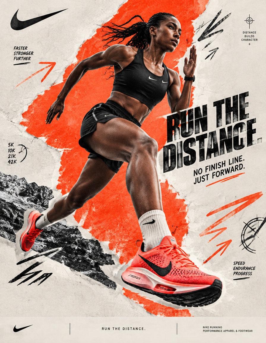
BRAND NAME = NIKE Act as a Social Media Art Director and Digital Collage Artist specializing in bold, youth-oriented brand content for Instagram and digital campaigns. PHASE 1: CONCEPTUAL FRAMEWORK Create a dynamic digital collage that merges high-performance running photography with graphic design chaos. This is controlled athletic rebellion — a composition that feels spontaneous, explosive, and expressive while maintaining strong Nike brand coherence. Aesthetic direction: * Anti-polished * Raw textures * Layered imperfections * Youth-driven visual noise * High confidence, high movement energy Visual language: Torn edges, aggressive brush strokes, grain overlays, hand-drawn running marks, directional arrows, speed lines, and bold Nike-inspired color blocking. PHASE 2: MODEL & PHOTOGRAPHY * Subject: One elite adult runner, age 20–30 * Pose Energy: 80% attitude, 20% natural (full sprint, explosive stride, leaning forward, airborne transition — NEVER static) * Outfit: Performance running apparel aligned with NIKE * Hero Product: One key Nike running shoe, clearly visible as the visual anchor * Photography Style: Editorial sports photography cutout * Background Removal: Clean, sharp extraction * Camera Angle: Slight low angle (hero perspective) * Crop: Full body or 3/4 body, with running shoe clearly visible PHASE 3: COLOR BLOCKING FOUNDATION * Primary Color Blob: Large organic Nike-inspired shape (40–60% of frame) * Color Selection: 1 dominant Nike-inspired high-energy accent color — vivid electric red/orange * Shape Style: Irregular, hand-painted / torn paper (NO perfect geometry) * Texture: Brush grain / noise (15–25% opacity) * Placement: Behind or wrapping around runner (must frame, not hide the runner or shoe) PHASE 4: GRAPHIC ELEMENTS LAYER Add 3–5 abstract elements: Element types: * Hand-drawn speed marks * Directional arrows * Running trajectory lines * Circular impact marks * Texture overlays (dust, grain, fabric, noise) * Minimal athletic measurement symbols Rules: * Colors: 2–3 total (black + off-white + electric red/orange accent) * Placement: Asymmetric (top-left + bottom-right bias) * Scale: Small (5%) + medium (15%) * Avoid center clutter * Keep imperfect, handmade feel PHASE 5: TYPOGRAPHY INTEGRATION * Logo: Upper-left or upper-right (10–15% width) * Slogan/Headline: “RUN THE DISTANCE.” * Supporting Copy: “NO FINISH LINE. JUST FORWARD.” * Type Style: Bold condensed sans-serif / grotesk / athletic editorial typography * Treatment: Mix straight + slight rotation (2–5°) * Hierarchy: Nike Swoosh → Headline → Supporting copy PHASE 6: TEXTURE & BACKGROUND * Base Layer: Off-white / light grey (NOT pure white) * Color Range: RGB 245–250 (warm neutral) * Texture Options: Paper grain / fabric texture / subtle noise * Rule: Texture should be FELT, not dominant PHASE 7: COMPOSITION RULES * Layout: Asymmetric balance (runner off-center) * Breathing Room: 15–20% negative space * Layering Order: Background → Color blob → Graphics → Runner → Typography * Focal Point: Runner + Nike shoe = 60% Graphics = 40% support * Movement: Strong diagonal flow (top-left → bottom-right OR reverse) The runner must visually travel through the composition rather than simply stand inside it. PHASE 8: BRAND INTELLIGENCE (AUTO-ADAPT) Adapt energy based on NIKE’s sportswear identity: → Sportswear Bold contrast, aggressive motion, louder graphics → Running Explosive movement, aerodynamic visual language, speed lines, performance-driven composition → Youth Culture Raw textures, asymmetric layouts, expressive typography and controlled visual noise → Performance Sharp product visibility, dynamic low-angle photography, athletic realism and strong directional composition The final visual should communicate movement, determination, performance and Nike’s “just do it” attitude without becoming a generic running advertisement. PHASE 9: SOCIAL MEDIA FOOTER (OPTIONAL) * Bottom strip (8–10% height) * Light neutral background * Minimal Nike branding * Small campaign descriptor: “RUN THE DISTANCE.” * Clean grid layout * Keep minimal (contrast to collage) TECHNICAL SPECS: * Aspect Ratio: 4:5 (primary) or 1:1 * Resolution: 2400x3000px+ * Color Mode: sRGB (Instagram optimized) * Sharpness: High detail, slight grain allowed * Output Style: Digital collage mimicking analog craft * Photography Base (before cutout): 85mm lens, f/2.8, shallow depth of field FINAL IMAGE: A premium Nike running campaign poster combining an explosive editorial runner photograph, a hero Nike running shoe, bold athletic typography, raw paper textures, aggressive directional graphics and asymmetric color blocking. The finished artwork should feel like a contemporary Nike campaign discovered on Behance — highly art-directed, energetic, editorial, imperfect, youth-driven and immediately recognizable as Nike.
中文译文
品牌名称 = NIKE 担任专注于为 Instagram 和数字广告打造大胆、面向青年受众品牌内容的社交媒体艺术总监与数字拼贴艺术家。 第一阶段:概念框架 创作一幅动态数字拼贴,将高性能跑步摄影与平面设计的混乱感融合。这是一场有控制的运动反叛——画面既要感觉自发、爆发、富有表现力,又要保持强烈的耐克品牌一致性。 美学方向: * 反精致 * 原始质感 * 层叠瑕疵 * 青年驱动的视觉噪点 * 高自信、高动能 视觉语言:撕裂边缘、激进笔触、颗粒叠加、手绘奔跑标记、方向箭头、速度线以及灵感源自耐克的大胆色块。 第二阶段:模特与摄影 * 主体:一名 20–30 岁的精英成年跑者 * 姿态能量:80% 态度,20% 自然(全力冲刺、爆发性步幅、身体前倾、腾空过渡——绝不静态) * 服装:与 NIKE 风格一致的高性能跑步服 * 核心产品:一双关键的耐克跑鞋,作为视觉锚点清晰可见 * 摄影风格:编辑级运动摄影抠图 * 背景移除:干净、锐利的抠像 * 镜头角度:微仰拍(英雄视角) * 裁切:全身或 3/4 身,跑鞋必须清晰可见 第三阶段:色块基础 * 主色块:大型有机形态的耐克灵感形状(占画面 40–60%) * 色彩选择:1 种主导的高能量耐克灵感点缀色——鲜艳的电光红/橙 * 形状风格:不规则、手绘/撕纸(不要完美几何形) * 质感:笔刷颗粒/噪点(不透明度 15–25%) * 位置:位于跑者身后或环绕跑者(必须起框定作用,不能遮挡跑者或跑鞋) 第四阶段:图形元素层 添加 3–5 个抽象元素:元素类型: * 手绘速度标记 * 方向箭头 * 奔跑轨迹线 * 圆形冲击标记 * 质感叠加(灰尘、颗粒、织物、噪点) * 极简运动测量符号 规则: * 颜色:总共 2–3 种(黑色 + 米白 + 电光红/橙点缀色) * 布局:非对称(左上 + 右下偏置) * 尺寸:小(5%)+ 中(15%) * 避免中心杂乱 * 保持不完美、手工感 第五阶段:字体整合 * Logo:左上或右上(占宽 10–15%) * 标语/主标题:"RUN THE DISTANCE." * 辅助文案:"NO FINISH LINE. JUST FORWARD." * 字体风格:粗体窄长无衬线 / 怪诞体 / 运动编辑字体 * 处理:正放 + 轻微旋转(2–5°)混合 * 层级:耐克 Swoosh → 主标题 → 辅助文案 第六阶段:质感与背景 * 底层:米白/浅灰(非纯白) * 色彩范围:RGB 245–250(暖中性) * 质感选项:纸纹/织物纹理/微妙噪点 * 规则:质感应被"感知到",而非主导画面 第七阶段:构图规则 * 布局:非对称平衡(跑者偏离中心) * 留白:15–20% 负空间 * 图层顺序:背景 → 色块 → 图形 → 跑者 → 字体 * 视觉焦点:跑者 + 耐克鞋 = 60% 图形 = 40% 辅助 * 运动感:强烈对角线流动(左上 → 右下 或 反之) 跑者必须在画面中视觉上"穿越",而不仅仅是站在其中。 第八阶段:品牌智能(自动适配) 根据 NIKE 的运动服饰身份调整能量: → 运动服饰 大胆对比、激进运动、更响亮的图形 → 跑步 爆发性运动、空气动力学视觉语言、速度线、性能驱动的构图 → 青年文化 原始质感、非对称布局、表现力字体与受控的视觉噪点 → 性能 清晰的产品可见度、动态低角度摄影、运动真实感与强烈方向性构图 最终视觉应在不沦为通用跑步广告的前提下,传达出运动感、决心、性能与耐克"Just Do It"的态度。 第九阶段:社交媒体页脚(可选) * 底部条带(高度 8–10%) * 浅中性背景 * 极简耐克品牌呈现 * 小型活动描述:"RUN THE DISTANCE." * 简洁网格布局 * 保持极简(与拼贴形成对比) 技术规格: * 画面比例:4:5(首选)或 1:1 * 分辨率:2400x3000px 及以上 * 色彩模式:sRGB(Instagram 优化) * 锐度:高细节,允许轻微颗粒 * 输出风格:模仿模拟工艺的数字拼贴 * 摄影基础(抠像前):85mm 镜头,f/2.8,浅景深 最终图像:一张高端耐克跑步活动海报,融合爆炸性的编辑级跑者照片、一双主角耐克跑鞋、大胆的运动字体、原始纸张质感、激进的方向性图形与非对称色块。成稿应感觉像是在 Behance 上发现的当代耐克广告——高度艺术指导、充满能量、编辑感、不完美、青年驱动,并立即可识别为耐克。
来源与署名
原文由 @Diplomeme 发布在 X:查看原推文。 本页逐字保留原文并提供机器翻译的中文解读;版权归原作者所有。
同工具的更多提示词
- { "prompt_name": "高对比度黑白工作室人像 – 第1部分(主体)", "usage": { "input_required": "二选一:一个…@SaasJunctionHQ
- 创作一幅高级感的 4:5 竖版旅行写生作品,以[国家 / 城市 / 地点 / 地标]为主题,画在一本小巧的水彩写生本上。 仅限文生图(TXT2IMG)—— 完…@Goodmanprotocol
- 超写实 IMAX 级 Netflix 风格黑暗奇幻超自然电影感人像,9:16 竖版。使用上传的图片作为主要视觉参考,并保留精确的面部身份、比例和标志性特征。塑…@imGopalTiwari
- 保留参考图中女孩的外貌。真实的夜间自拍,使用 iPhone 17 Pro 的前置摄像头拍摄,画面中不出现手机。近景,自然视角。 女孩放松地倚靠坐着,头微微后仰…@mehvishs25
- 创作一张 3:4 比例的高级半写实动漫 × 电影感运动摄影海报,以上传照片中的人物为主角。 身份参考: 仅使用上传的照片作为唯一的身份参考。严格保留人物可辨识…@harboriis
- 平板电脑之所以让人觉得快,是因为道路并没有停在玻璃上。 🏎️ 赛车跑道、动态模糊以及带有方向感的落叶,从屏幕内毫无缝隙地延续到满版的山间环境之中 这让屏幕感觉…@ou_zhen599