当品牌在画面边缘反复出现时,一组四格的酒店餐饮系列广告才会显得统一——而不是每一格都长一个样。
分享链接 · https://openimages.ajiang.me/p/2106756486538182843/
color_palette · dark-moodycomposition · multi-panellighting · low-keymood · luxuriousquality_flags · embedded-textquality_flags · multi-panel-layout
提示词(原文,逐字保留)
A four-panel hospitality campaign feels unified when the brand repeats at the edges—not when every scene looks the same.
🍷 lock the circular logo position, footer information strip, and deep black-crimson-ember palette across every tile
Food, cocktail, menu, and interior can each do a different job, but these fixed anchors make them read as one venue at a glance.
✨ use the same three-part type hierarchy in every panel: expressive script for emotion, tall condensed type for impact, small sans-serif for details
The headlines stay distinct without breaking the system. You get nightlife character with enough structure to feel premium.
GPT- image 2.5 prompt👇
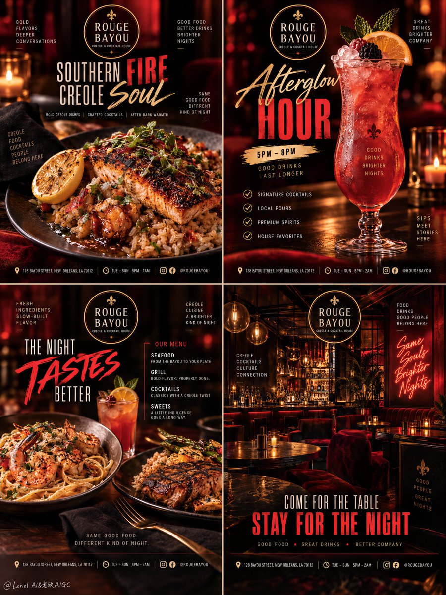
Create a Cannes-level four-panel hospitality campaign poster set for fictional Creole cocktail house ROUGE BAYOU, merging hyper-real food photography, nightlife atmosphere, editorial typography, and luxury restaurant branding into one unified 2x2 campaign grid. The set must feel like one coherent social-media and poster-ready system, not four separate ads. Preserve the exact structure: top-left food hero, top-right cocktail hero, bottom-left menu spread, bottom-right interior mood. All four panels must share one brand world, one logo family, one footer rhythm, and one palette of deep black, crimson red, ember orange, and warm gold.
Overall art direction: premium nightlife hospitality identity, bold but clean, seductive but controlled, with products always leading the frame. Use a consistent circular logo mark reading “ROUGE BAYOU” with the descriptor “CREOLE & COCKTAIL HOUSE”. Typography across the set combines three coordinated layers: elegant handwritten script for emotional words, tall condensed sans-serif for major impact words, and a clean small sans-serif for support details, footer metadata, and menu lists. All copy must be original English, commercially believable, and tightly integrated. The mood is urban, warm, intimate, stylish, and high-energy.
Top-left panel, food hero: a dramatic close food photograph of a premium Creole seafood plate in shallow depth of field, featuring richly seared blackened fish or salmon over seasoned rice, glossy sauce, charred edges, fresh herbs, and a warm lemon wedge. The background is a moody dark restaurant blur with red-black ambience. Logo near the top. Main headline: “SOUTHERN FIRE / CREOLE SOUL”, with one keyword oversized as the bold anchor. Supporting copy suggests bold Creole dishes, crafted cocktails, and after-dark warmth. Footer includes refined address rhythm, opening hours, and subtle icon markers.
Top-right panel, cocktail hero: a tall signature crimson-to-amber cocktail in an elegant curving glass, glowing from within, topped with crushed ice, a citrus slice, and a fresh berry accent, against a dark crimson gradient nightlife backdrop. Logo near the top. Main headline: “AFTERGLOW / HOUR”, with “HOUR” oversized in bold condensed type and “AFTERGLOW” in expressive script. Add a compact brush-stroke schedule badge with original time info, plus a clean checklist of premium drink offerings such as signature cocktails, local pours, and house favorites. The cocktail remains the dominant subject, crystal-clear, richly lit, and tactile.
Bottom-left panel, menu spread: a composed food-and-drink panel with two hero dishes and one secondary beverage in a premium studio-restaurant hybrid setup. One plate may feature seafood pasta or sauced shrimp, the other a grilled Creole entree with rice or roasted sides. Logo near the top. Main headline: “THE NIGHT / TASTES BETTER”, with one keyword oversized in brush-script. Supporting copy emphasizes fresh ingredients and slow-built flavor. A clean side list names menu families such as seafood, grill, cocktails, and sweets. Footer repeats the same address and contact rhythm. Food must look rich, glossy, real, and appetizing without clutter.
Bottom-right panel, interior mood: a cinematic bar-lounge interior with warm pendant lighting, reflective bottle shelves, dark wood tables, plush seating, red ambient glow, and a neon-style wall phrase integrated naturally into the space. The room feels intimate, stylish, and alive, but not crowded. Logo near the top. Main headline in the lower half: “COME FOR THE TABLE / STAY FOR THE NIGHT”, with the second line enlarged in bold red type. Supporting footer text repeats location, hours, and social-handle rhythm. The neon wall phrase should be an original short English vibe line.
Lighting and color unify the whole grid: 60% black, oxblood, deep crimson, and shadowed mahogany; 30% ember orange, cocktail glow, tungsten bar light, and warm food highlights; 10% ivory typography, gold reflections, and small citrus or garnish accents. Every panel must feel luminous and premium, with soft but deliberate falloff, controlled specular highlights, and no muddy blacks, overbuilt neon, or flat surfaces. The red-black hospitality atmosphere stays consistent across all four tiles.
Materials and finish must feel extremely commercial and polished: believable food moisture, char, sauce gloss, herbs, and edible density; glassware with realistic transparency, condensation, refraction, ice detail, and highlight rolloff; and interiors reading clearly as dark wood, polished metal, reflective glass, velvet seating, and warm neon signage. The full set should feel crisp, printed, campaign-ready, and internationally art-directed, with exact consistency in logo family, type rhythm, and footer structure.
Output: one unified 2x2 campaign image with strong panel-to-panel brand consistency, original English wording only, product-first hierarchy inside each tile, exact logo consistency, coherent footer rhythm, no real brand names, no copied slogans, no messy flyer layout, no typography collisions, no unreadable small text, no AI food deformation, no warped glasses, no random decor clutter, no extra human figures dominating the interior, no cheap nightclub poster styling, no low-quality AI texture, and no visual drift across the campaign.
中文译文
当品牌在画面边缘反复出现时,一组四格的酒店餐饮系列广告才会显得统一——而不是每一格都长一个样。
🍷 将圆形徽标的位置、底部信息条,以及深黑-深红-余烬橙的色调锁定在每一格中
食物、人物、菜单、室内各司其职,但这些固定的锚点让人一眼就能读出"这是同一家店"。
✨ 每格使用相同的三级字体层级:感性手写体负责情绪,高挑窄体负责视觉冲击,小号无衬线负责细节信息
主标题保持差异却不破坏整体系统。既保留夜生活的性格,又有足以撑起高级感的结构骨架。
GPT- image 2.5 prompt👇
为虚构的克里奥尔鸡尾酒馆 ROUGE BAYOU 创作一组戛纳级水准的四格酒店餐饮系列海报,将超写实美食摄影、夜店氛围、编辑级字体设计、奢华餐厅品牌,融合到统一的 2×2 系列网格中。整组海报必须像一个连贯的、适配社交媒体与海报投放的系统,而不是四张各自为政的广告。严格保留以下结构:左上美食主视觉、右上鸡尾酒主视觉、左下菜单展示、右下室内氛围。四个画面必须共享同一个品牌世界、同一个徽标家族、同一个底部信息节奏,以及同一套深黑、深红、余烬橙、暖金的色彩体系。
整体美术方向:高端夜店式餐饮品牌识别,大胆但干净,魅惑但克制,产品始终主导画面。使用统一的圆形徽标,主标"ROUGE BAYOU",副标"CREOLE & COCKTAIL HOUSE"。整组字体设计由三层相互呼应的字体构成:优雅的手写体用于感性词汇,高挑窄体无衬线用于核心冲击词,干净的小号无衬线用于辅助细节、底部信息与菜单列表。所有文案必须为原创英文,符合商业可信度,排布严密。基调为都市、温暖、私密、时髦且充满活力。
左上面板,美食主视觉:一张近距特写的克里奥尔高级海鲜料理美食照片,浅景深,主体为盛于调味饭之上的煎得焦香的黑化鱼或三文鱼,亮泽酱汁、微焦边缘、新鲜香草与一片温暖的柠檬角。背景为深色餐厅虚化的红黑氛围。徽标置于顶部。主标题:"SOUTHERN FIRE / CREOLE SOUL",其中一个关键词放大,作为加粗锚点。辅助文案暗示大干面辣克里奥尔菜、手作鸡尾酒与深夜的暖意。底部排入精致的地址节奏、营业时间与克制的图标标记。
右上面板,鸡尾酒主视觉:一杯高身招牌鸡尾酒,色彩由深红过渡至琥珀,使用一只优雅弧线的高脚杯,杯身从内部发光,顶部覆以碎冰、一片柑橘与一颗新鲜莓果点缀,背景为深红色渐变的夜店场景。徽标置于顶部。主标题:"AFTERGLOW / HOUR",其中"HOUR"以加粗窄体放大呈现,"AFTERGLOW"以表现性字体显示。加入一枚紧凑的笔触风格时段徽章,内含原创时间信息,以及一份干净的鸡尾酒品项清单,例如招牌鸡尾酒、本地特调与店家精选。鸡尾酒始终是画面绝对主角,清澈通透,光线饱满,质感触手可及。
左下面板,菜单展示:一个由两份主菜与一杯次要饮品组成的餐饮面板,采用高端摄影棚与餐厅混合布景。一份可为海鲜意面或酱汁虾,另一份为带饭或烤制配菜的克里奥尔烤制主菜。徽标置于顶部。主标题:"THE NIGHT / TASTES BETTER",其中一个关键词以手写笔触字体放大。辅助文案强调新鲜食材与慢炖出的风味。一份干净的侧边清单列出菜单分类,如海鲜、烤肉、鸡尾酒与甜点。底部重复同一地址与联系节奏。菜品必须显得丰盛、油亮、真实、诱人,画面不得杂乱。
右下面板,室内氛围:一个电影感的酒吧休息区室内,温暖吊灯、反光的酒瓶陈列架、深色木桌、柔软座椅、红色环境光,以及一面融入空间中的霓虹风格墙语。空间感觉私密、时髦、生动,但不杂乱。徽标置于顶部。主标题位于面板下半部:"COME FOR THE TABLE / STAY FOR THE NIGHT",第二行以加粗红色字体放大。辅助底部文案重复地址、营业时间与社交账号节奏。霓虹墙语须为原创的短句英文氛围语。
光线与色彩统一整张网格:60% 黑色、酒红、深红、暗影桃花心木;30% 余烬橙、鸡尾酒光晕、钨丝灯光、温暖的食物高光;10% 象牙白字体、金色反光与少量柑橘或装饰点缀。每一格都必须显得明亮而高级,过渡柔和但有意为之,高光受控,不出现脏黑、过度的霓虹堆砌或扁平表面。红黑色的餐饮氛围在四格之间保持一致。
材质与成色必须极具商业感与精致感:可信的食物水分、焦痕、酱汁光泽、香草与可食用的密度;玻璃器皿拥有真实的透明感、水珠、折射、冰块细节与高光过渡;室内清晰呈现为深色木材、抛光金属、反光玻璃、天鹅绒座椅与温暖霓虹标识。整组海报应感觉清晰、印刷感强,达到可直接投放的国际级艺术指导水准,徽标家族、字体节奏、底部结构保持精确一致。
输出:一张统一的 2×2 系列图像,具备强面板间品牌一致性,仅使用原创英文措辞,每格内部以产品为主次的层级关系,徽标精确一致,底部节奏连贯,不出现真实品牌名、不抄袭口号、不凌乱的传单式排版、不出现字体碰撞、不可读的小字、AI 食物形变、扭曲的玻璃杯、随机的装饰杂物、不抢夺室内画面的人类身影、低质夜店海报式样、低质量 AI 纹理,以及整组画面之间的视觉漂移。
来源与署名
原文由 @ou_zhen599 发布在 X:查看原推文。 本页逐字保留原文并提供机器翻译的中文解读;版权归原作者所有。
同工具的更多提示词
- 超写实 IMAX 级 Netflix 风格电影感奢华双重曝光时尚人像,9:16 竖版。以上传的图片作为主要视觉参考,精确保留面部特征、比例和标志性细节。画面中…@imGopalTiwari
- 一位美丽的年轻女子站在海岸边,采用潮汐化学显影工艺(Tideline Chemigraphy)创作——将显影药剂倾倒在海岸水线处,印相在潮水所及之处停止。强烈…@TraffAlex
- { "aspect_ratio": "9:16", "image_type": "超现实超写实高端时尚广告大片", "subject": "一位惊艳动人的25…@Just_Anika_Here
- 超写实 IMAX 级 Netflix 风格电影感低角度烟雾肖像,9:16 竖版。以上传的图片作为主要视觉参考,严格保留面部特征、比例和标志性细节。画面中为一位…@imGopalTiwari
- 创作一张非凡的超写实前卫时尚编辑大片,灵感来自超现实的戏剧性高级定制服装与手工打造幻想工作室摄影。 主体: 一位引人注目的成年女性时装模特,以真实人类的方式拍…@frametheory058
- 由 Token360 制作 · GPT Image 2.5 秋日公园长椅编辑大片——枫光、苹果酒、静谧翻页。 提示词 👇 超写实电影感秋季编辑人像:一位时髦的…@Alyssa4aicreate