岛屿之所以有效,是因为它不是场景——它是瓶身的一个比例参照物。
分享链接 · https://openimages.ajiang.me/p/2106661643153494440/
camera_lens · shallow-depth-of-fieldcolor_palette · warm-tonescomposition · centeredlighting · backlitlighting · golden-hourmood · nostalgic
提示词(原文,逐字保留)
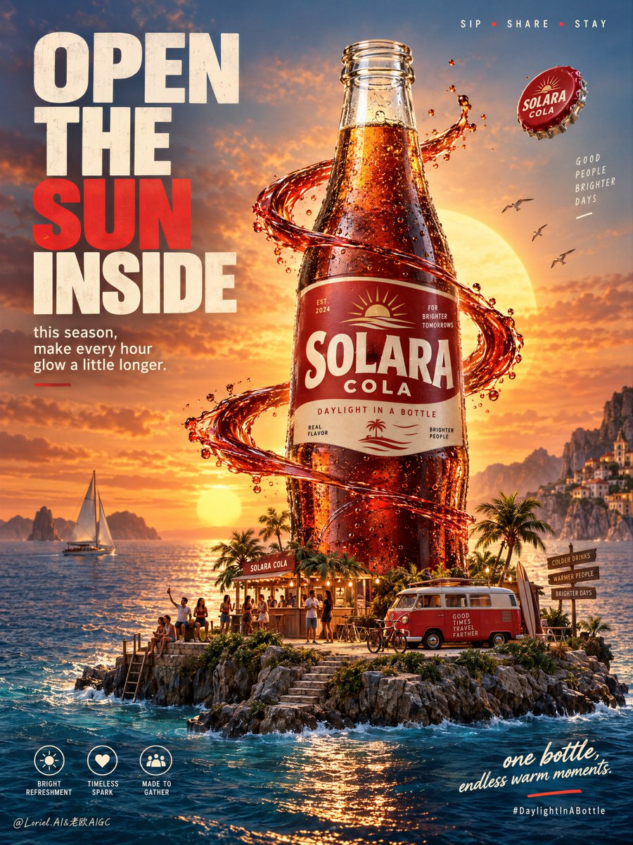
The island works because it is not the scene—it is a scale device for the bottle.
🌅 giant cola bottle in the center-right, with a miniature island world compressed around its base: small kiosk, van, bicycles, and tiny figures
The human-scale details make the bottle feel monumental without needing a second hero. You read a whole summer world, then immediately read the product.
✨ warm sun disk aligned behind the bottle neck, with a red liquid ribbon orbiting the midsection while staying clear of the label
This creates a bright vertical axis from sunset to bottle to island. The motion adds energy, but the pack remains fully legible.
GPT- image 2.5 prompt👇
Create a premium commercial poster for fictional classic cola brand SOLARA COLA, designed as a fusion of real product photography, cinematic lifestyle world-building, and bold graphic advertising. The hero object is a towering glass cola bottle rising from a tiny floating seaside island at golden sunset, presented as the emotional center of an entire micro-world. The bottle must remain the absolute visual leader, while the island, people, vehicles, liquid ribbon, and typography only amplify its desirability and iconic presence.
Use a vertical full-bleed poster with a frontal hero layout and strong product-dominant center-right composition. Preserve the exact structure: a large left-side headline wall, a giant glass cola bottle dominating the middle, a glowing sun disk directly behind the bottle neck, and a miniature island world at the base. The bottle stands tall in the center-right zone, fully readable, with a low horizon line to preserve sky space for atmosphere and small top-line messaging. The left side holds a powerful editorial headline block, and the lower right stays open for a concise emotional closing line. The composition should feel immersive, uplifting, and instantly readable at poster scale.
Design a premium retro-inspired glass cola bottle with deep caramel liquid, realistic embossed glass curvature, vivid condensation droplets, and a clean red-and-cream label system. The fictional brand is “SOLARA COLA”, with the campaign platform “DAYLIGHT IN A BOTTLE”. The bottle must be uncapped, with the glass mouth open and clearly visible. Remove the crown cap from the bottle neck entirely, but keep one single crown cap floating in the air near the upper-right midzone as a secondary accent. It should read as freshly popped, slightly rotating, cleanly separated from the bottle, and clearly subordinate to the hero. The bottle should feel collectible, cold, iconic, and meticulously real, with rich internal glow where the sunset passes through the liquid. The label must be original and unlike existing soda brands.
The bottle stands on a small lush coastal island platform that feels like a condensed world of joy and shared time. Around the base, include a tiny nostalgic van, a compact beach kiosk or terrace bar, a few miniature human figures socializing, one or two bicycles, steps down to the water, and small palm or coastal planting accents. These elements must stay secondary and scale-reinforcing, never crowded. A ribbon-like red liquid or graphic energy band curves around the bottle midsection and arcs outward, suggesting flavor, motion, and connection. The floating cap remains small, clean, and visually subordinate, never competing with the label zone or sunset circle.
Set the scene in a cinematic seaside sunset with a giant warm sun low on the horizon, calm water surrounding the island, and a few birds crossing the glowing sky. The island should feel dreamy yet physically believable, suspended between realism and ad-world fantasy. Use layered depth: large readable bottle in the midground, island details and people at the base, ocean and sunset beyond, headline wall to the left, and soft atmospheric sky above. Keep the image rich but controlled, never chaotic.
Lighting uses a high-impact golden-hour palette with warm-to-cool contrast. Palette hierarchy: 60% sunset gold, amber, cola brown, and glowing warm highlights; 30% deep marine blue, twilight teal, and coastal shadow tones; 10% vivid red brand accents and off-white typography. Main light comes from the sun behind and slightly behind the bottle, creating luminous transmission through the cola, glowing edge highlights, and warm reflections on glass and water. Add soft frontal fill to preserve label readability. The open bottle mouth should catch a subtle specular rim and hint of inner glass thickness. Avoid muddy shadows, dead blacks, or oversaturated tourist colors. The emotional tone is joyful, nostalgic, expansive, and premium.
Materials must feel hyperreal and polished: convincing glass thickness, condensation droplets, subtle label fiber texture, rich internal liquid refraction, a precise cold uncapped rim with wet highlights and believable glass lip detail, a glossy floating cap with slight edge wear, and small but believable island textures such as stone edge, foliage, wood decking, painted kiosk surfaces, van trim, and water foam at the shoreline. The red liquid ribbon should feel like a hybrid of real splash physics and design gesture, glossy, aerodynamic, and visually clean. Keep hero zones extremely crisp and the distant background elegantly soft.
Integrate original English typography as an essential graphic layer. On the left, place a bold stacked headline in a high-impact sans-serif system: “OPEN / THE / SUN / INSIDE”, with one keyword emphasized in richer red. Beneath it, add a smaller support block such as “this season, make every hour glow a little longer.” At the top right, place a tiny lifestyle triplet line like “SIP • SHARE • STAY”. At the lower left, add three compact circular icon-style markers with short descriptors such as “bright refreshment”, “timeless spark”, “made to gather”. At the lower right, place a concise emotional closing line such as “one bottle, endless warm moments.” Add a subtle hashtag or campaign cue near the bottom only if needed. Typography must feel art-directed, balanced, and kept away from the bottle recognition zone.
Output: a full-bleed premium beverage poster with product-first hierarchy, strong campaign readability, cinematic micro-world storytelling, clean graphic order, hyperreal bottle detail, open bottle mouth clearly visible, one single floating cap in the air, no cap attached to the bottle, no real brand names, no copied slogans, no extra oversized bottles, no warped glass shape, no unreadable text, no chaotic crowding, no muddy sunset haze, no dead black areas, no low-quality AI textures, no generic stock-ad feeling, no off-brand packaging, no style drift, and no clutter competing with the hero bottle.
中文译文
岛屿之所以有效,是因为它不是场景——它是瓶身的一个比例参照物。
🌅 巨型可乐瓶位于画面中右部,底部压缩着一个微缩岛屿世界:小凉亭、面包车、自行车和微小的人物
这些人性化尺度的细节让瓶子比本酒瓶更具纪念碑感,而无需第二个主体。你先读到一个完整的世界景,然后立刻读到产品本身。
✨ 暖色太阳盘与瓶口对齐,一条红色液体丝带环绕瓶身中段,同时避开标签区域
这在日落、瓶身和岛屿之间创建了一条明亮的垂直线。运动感增添了活力,但包装仍完全清晰可读。
GPT- 图像 2.5 提示词👇
为虚构经典可乐品牌 SOLARA COLA 创作一张高级商业海报,融合真实产品摄影、电影级生活方式世界构建以及大胆的图形广告。主体对象是一支高耸的玻璃可乐瓶,在金色日落下从一座微小的漂浮海岛上升起,作为整个微观世界的情感中心。瓶子必须保持绝对的视觉主导,海岛、人物、车辆、液体丝带和文字排版都只是放大其作品感和标志性符文的魅力。
采用垂直满版海报,正面主体布局,以及强烈以产品为主的中右构图。保留精确的结构:左侧大型标题墙,中部由巨型玻璃可乐瓶主导,瓶口正后方有一个发光的太阳盘,底座是一个小型的岛屿世界。瓶子高立于中右区域,完全可读,地平线压低以保留天空氛围空间和顶部小型信息。左侧放置有力的编辑性标题块,右下角留空以便放置简洁的情感收束句。整体应具有沉浸感、令人振奋,并且在海报尺寸下能够立即阅读。
设计一款高级复古风格的玻璃可乐瓶,瓶内有深焦糖色液体,逼真的浮雕玻璃曲面,生动的凝结水珠,以及简洁的红米色标签系统。虚构品牌为“SOLARA COLA”,宣传平台语为“DAYLIGHT IN A BOTTLE”。瓶子必须去盖,玻璃瓶口打开并清晰可见。完全移除瓶口上的皇冠盖,但保留一个单独的皇冠盖作为次要点缀,漂浮在右上中部区域的空中。它应读起来像是刚刚弹出、轻微旋转、干净地与瓶子分离,并且明确地作为主角的补充。瓶子应具有收藏感、冰爽感、标志性,且无比真实,夕阳穿透液体之处产生内部生动光晕。标签必须是原创的,不能类似现有的可乐品牌。
瓶子矗立于一座郁郁葱葱的小型海滨岛屿平台上,犹如一个凝聚着欢乐与共享时光的浓缩世界。在基座周围,加入一辆小型怀旧面包车,一个紧凑的海滨小亭或露台酒吧,几位彼此交谈的微缩人物,一两辆自行车,通向水边的台阶,以及少量棕榈或海岸植物装饰。这些元素必须保持次要地位,并强化比例感,绝不拥挤。一条丝带状的红色液体或图形能量带绕着瓶子中段向外弧形展开,暗示着风味、运动感和连接性。漂浮的盖子保持小巧、干净、视觉上从属,绝不与标签区或夕阳光环竞争。
在电影级的海滨日落场景中布置,太阳盘设于海平线上方低低地悬着,平静的海水环抱岛屿,几只飞鸟穿越发光的天空。岛屿应感觉如梦似幻却又真实可信,悬浮于现实主义与广告世界幻想之间。使用分层深度:中景为巨大可读的瓶子,基座有岛屿细节和人物,远处为大海与日落,左侧为标题墙,上方为柔和的氛围天空。保持图像丰富但克制,绝不混乱。
灯光使用高冲击力的黄金时刻调色板,冷暖对比。调色板层次:60% 日落金色、琥珀色、可乐棕色与发光的暖色高光;30% 深海洋蓝、暮色青绿与海岸阴影色调;10% 生动的红色品牌点缀色与米白色字体。主光源来自瓶子后方且稍微偏后方的太阳,在可乐中产生透光发光感,玻璃边缘高光发光,并在玻璃与水上产生温暖反射。添加柔和正面补光以保留标签可读性。打开的瓶口应捕捉到微妙的镜面光边缘和内部玻璃厚度的暗示。避免浑浊的阴影、沉闷的黑色或过度饱和的旅游色。情感基调是欢快、怀旧、宏大而高级。
材质必须具有超写实与精致感:可信的玻璃厚度、凝结水珠、细腻的标签纤维纹理、丰富的内部液体折射、精确冰冷的无盖边缘带有湿润高光与可信的玻璃唇部细节、一只光泽的漂浮盖子带有轻微的边缘磨损,以及小巧而可信的岛屿纹理,例如石质边缘、植被、木质地板、油漆过的小亭表面、面包车装饰以及海岸线的水沫。红色液体丝带应感觉像真实飞溅物理与设计笔触的混合,光滑、空气动力学且视觉干净。主体区域保持极其锐利,远景背景保持优雅柔化。
将原创的英文排版作为必要的图形层整合进来。在左侧,使用高冲击力的无衬线字体系统放置一个大胆的堆叠标题:“OPEN / THE / SUN / INSIDE”,其中一个关键词用更浓重的红色强调。在它下面,添加一个较小的支持语句块,例如“this season, make every hour glow a little longer.”(这个季节,让每一小时都多闪耀一点)。在右上角,放置一条小巧的生活方式三元组行,例如“SIP • SHARE • STAY”。在左下角,添加三个紧凑的圆形图标样式标记,带有简短描述词,例如“bright refreshment”、“timeless spark”、“made to gather”。在右下角,放置一个简洁的情感收束句,例如“one bottle, endless warm moments.”(一瓶,无尽温暖的广阔时刻)。仅在需要时在底部附近添加一个细微的标签或活动提示。排版必须经过艺术指导,平衡良好,并与瓶子识别区域保持距离。
输出:一幅满版高级饮品海报,具有产品优先的层次结构、强大的宣传可读性、电影级微观世界叙事、干净的图形秩序、超出热致瓶身细节、打开的瓶口明显可见、一个单独的漂浮盖子在空气中、瓶上没有连接的盖子、没有真实品牌名称、没有抄袭的口号、没有额外超大尺寸的瓶子、没有变形的玻璃形状、没有无法阅读的文字、没有混乱的拥挤、没有浑浊的日落雾霭、没有沉闷的黑色区域、没有低质量的人工智能纹理、没有一般的库存广告感、没有品牌外包装、没有风格漂移,没有杂物与主角瓶子竞争。
来源与署名
原文由 @ou_zhen599 发布在 X:查看原推文。 本页逐字保留原文并提供机器翻译的中文解读;版权归原作者所有。
同工具的更多提示词
- 飞溅应衬托而非淹没那份放纵。 🍦 一根对角线方向的主棒,咬过的断面对着观众,露出致密的浅色内芯和一条融化的奶油糖(butterscotch)丝带 那一口不只是…@ou_zhen599
- 从高处的阳台俯瞰一座宏伟的维多利亚风格图书馆。房间里恰好有 24 个人:6 人在桌前阅读,4 人在爬梯子,3 人站在壁炉附近,5 人在书架间走动,2 位图书管…@doe_naps
- 创作一张极具美学感、如电影画面般的海报,将 [LANDMARK] 转变为毫无争议的十月氛围——浓郁的焦橙色、深铁锈红、低调琥珀色与暖棕色调,清爽的秋风自然地以…@Naiknelofar788
- 9:16 竖版,普通手机前置摄像头随手抓拍 × 真人 Cosplay × 小舞灵感造型 × 粉紫梦核 × 轻复古手机影像。 一位 23–25 岁、明确成年的漂…@AIVideoHub_
- 创作一幅高端电影感旅行海报,采用精致的双重曝光/剪影拼贴风格。画面中一位时尚年轻成年女性朝画面右侧行走,头戴米色宽檐狩猎帽,配戴深色墨镜,身穿优雅的白色宽松纽…@AiwithLariab
- 制作一张高级电影感旅行海报,采用精致的双重曝光/剪影拼贴风格。一位时尚年轻女性正走向画面右侧,头戴米色宽檐狩猎帽,戴着深色墨镜,身穿优雅的白色宽松纽扣衬衫(袖…@AIwithSajid