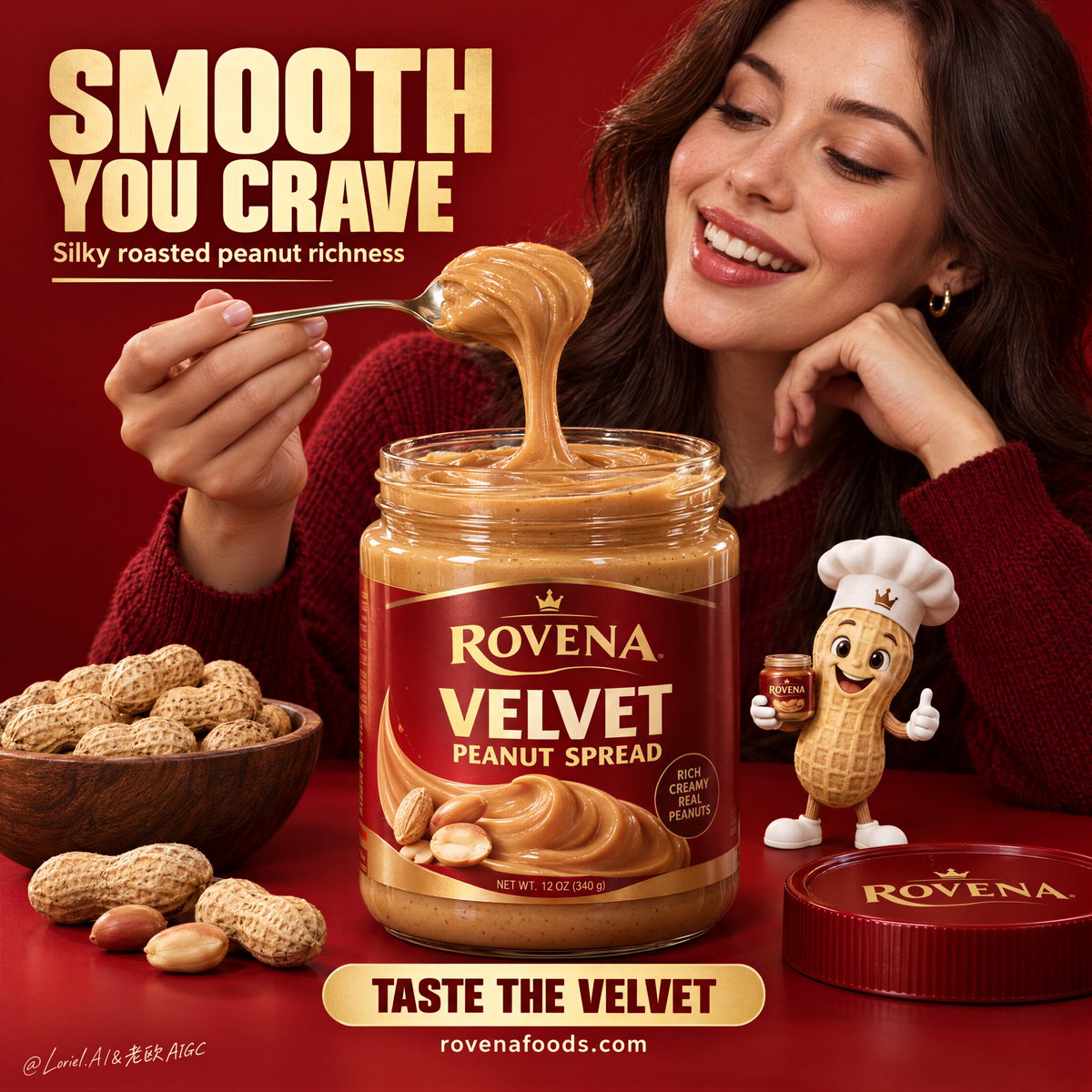
你最先注意到的是那一勺酱。真正的关键在于从勺子到罐子之间那道连续的拉丝——它让酱体显得丝滑、浓郁、值得细细品味。
分享链接 · https://openimages.ajiang.me/p/2104934134284243270/
color_palette · warm-tonescomposition · centeredcomposition · close-uplighting · studio-lightquality_flags · embedded-textscene · studio
提示词(原文,逐字保留)
You notice the spoonful first. The real control is the continuous pull from spoon to jar—it makes the spread feel silky, dense, and worth tasting.
🍊 a smooth continuous ribbon of peanut spread stretching from spoon to jar, plush curved edges, glossy highlights, realistic gravity drag
This stops the scoop from looking like a static blob. You get one readable, slow elastic connection that immediately sells softness and viscosity.
✨ creamy satin peanut spread, rounded folds, velvety gloss, softened micro-granular texture, gentle roasted-nut color variation
Don’t rely on “smooth peanut butter” alone. These material cues keep it refined and tactile while preserving a believable nut-rich texture.
GPT- image 2.5 prompt👇
A bold FMCG food poster for fictional premium peanut spread brand ROVENA, with the product as the absolute visual leader. Keep the same structure: a saturated deep-red monochrome studio background and tabletop, one large open jar of silky peanut spread centered in the foreground, an adult woman in a dark red knit sweater behind and slightly right of the jar, smiling warmly at a spoonful she lifts above it, a small premium peanut mascot at the lower right, a bowl of whole peanuts at the lower left, the lid nearby, and a few loose peanuts along the front edge.
Use a medium close-up frontal advertising shot with strong central weighting, shallow depth separation, negative space in the upper left for the headline and lower center for the CTA. The jar must dominate the hierarchy and feel large, tactile, and desirable. The woman is adult, photoreal, naturally proportioned, anatomically correct, with realistic skin texture, subtle pores, natural lips, soft hair density, correct head-neck-shoulder structure, and elegant hands with five normal fingers, clear joints, natural nails, no deformation. Her expression shows genuine delight and appetite, eyes on the lifted spoonful. Her torso stays secondary and never overpowers the jar.
The spread is the key material event: smoother, softer, silkier, and more refined than ordinary chunky peanut butter, with creamy satin body, rounded folds, velvety gloss, slow elastic pull, softened micro-granular texture, gentle roasted-peanut color variation, and thick luxurious viscosity. The lifted spoonful stretches in a smooth continuous ribbon with plush curved edges, glossy highlights, and realistic gravity drag, while keeping a subtle nut-rich identity, never melted-candy-like. The transparent jar has believable thickness and reflections, filled with dense silky spread. Redesign the packaging fully in English with an original premium system: brand mark “ROVENA”, product name “VELVET PEANUT SPREAD”, and only a few small clean support details, with no excessive claims. The peanut mascot is polished, charming, cleanly modeled, wearing a chef hat and holding a tiny jar, playful but clearly secondary.
Lighting is soft and layered: a large diffused key from upper front-left, controlled fill from the opposite side, smooth highlights on the spoon and jar rim, refined contour light on the woman’s face and hair, and strong material clarity on the spread, with rich volume and no dead black shadows. Color hierarchy: deep campaign red dominant, silky caramel-gold and roasted nut tones secondary, with small cream and metallic accents for text and spoon highlights. The finish is hyperreal, clean, appetizing, poster-ready, and fully coherent as one commercial brand world.
Typography follows the same logic: a large bold English headline block in the upper left, one short supporting line beneath, a strong bottom-center CTA banner, and a small social or website line below. Use original copy only, not source wording. Suggested system: “SMOOTH YOU CRAVE”, “Silky roasted peanut richness”, “TASTE THE VELVET”, “https://t.co/P1ZBjZb8iL”. Use bold condensed sans serif for the headline, smaller support text, and a clean rounded CTA bar. Keep text aligned, graphic, warm cream or golden, integrated into the composition, and always outside the product’s core recognition area.
Vertical poster composition, clean commercial finish, realistic ingredient detail, sharp label design, controlled staging, no copied branding, no extra props, no messy crumbs, no floating objects, no malformed hands, no extra fingers, no distorted face, no warped jar, no broken text, no muddy shadows, no chaotic composition, no anatomy errors, no cartoon drift outside the mascot.
中文译文
你最先注意到的是那一勺酱。真正的关键在于从勺子到罐子之间那道连续的拉丝——它让酱体显得丝滑、浓郁、值得细细品味。
🍊 一条从勺子延伸到罐子的光滑连续花生酱带,边缘蓬松弯曲,带有光泽高光,呈现真实的重力下坠感
这能避免让挖出的酱看起来像一坨静止的色块。你会得到一条清晰、缓慢、富有弹性的连接,立刻传递出柔顺与黏稠感。
✨ 奶油缎面花生酱,圆润的褶皱,天鹅绒般的光泽,柔和的微颗粒质感,烤坚果色的温和变化
不要只靠“smooth peanut butter”这样的描述。这些材质线索能保持画面的精致与触感,同时保留真实可信的坚果丰富质感。
GPT- image 2.5 prompt👇
为虚构的高端花生酱品牌 ROVENA 制作一张大胆的 FMCG 食品海报,产品必须是绝对的视觉主角。保持相同的结构:饱和的深红色单色摄影棚背景与桌面,前景中央摆放一大罐打开的丝滑花生酱,罐子后方偏右是一位身穿深红色针织衫的成年女性,她对着自己举在罐子上方的一勺酱温柔地微笑,右下角是小型高端花生吉祥物,左下角是一碗完整带壳花生,旁边放着瓶盖,前景边缘散落几颗花生。
采用中近景正面广告镜头,中央权重强烈,景深浅分离,左上方留出标题的负空间,下方中央留出 CTA 的负空间。罐子必须在层级中占据主导,显得大、有质感、令人渴望。女性为成年人,写实风格,比例自然,解剖结构正确,皮肤纹理真实,毛孔细腻,嘴唇自然,发量柔和,头颈肩结构正确,双手优雅,五指正常,关节清晰,趾甲自然,没有变形。她的表情流露出真实的愉悦与食欲,目光落在举起的那勺酱上。她的躯干保持次要,绝不抢过罐子的风头。
酱体是关键材质事件:比普通颗粒花生酱更顺滑、更柔软、更丝滑、更精致,拥有奶油缎面般的质地、圆润的褶皱、天鹅绒般的光泽、缓慢的弹性拉丝、柔和的微颗粒质感、烤花生的温和色泽变化,以及浓郁奢华的黏稠度。举起的那勺酱拉伸成一条光滑连续的丝带,边缘蓬松弯曲,带有光泽高光,呈现真实的重力下坠感,同时保留微妙的坚果丰富感,绝不像融化的糖果。透明罐子具有可信的厚度与反光,内部装满浓稠丝滑的酱体。完全用英语重新设计包装,使用一套原创的高端系统:品牌标志 “ROVENA”,产品名 “VELVET PEANUT SPREAD”,仅保留少量干净简短的辅助细节,避免堆砌夸大宣传。花生吉祥物体面精致、可爱,造型干净,戴着厨师帽,手捧一只小罐子,俏皮但明显居于次要位置。
光线柔和且有层次:来自左前上方的大型柔光主光,对面的受控补光,勺子与罐口上的平滑高光,女性面部与头发的精致轮廓光,酱体上的强烈材质清晰度,体积饱满,没有死黑阴影。色彩层级:深红主色调主导,丝滑焦糖金与烤坚果色为辅,文字与勺子高光加入少量奶油色与金属色点缀。成品超写实、干净、诱人,可直接用于海报,构成统一完整的商业品牌世界。
字体遵循同样逻辑:左上方为一大块粗体英文标题块,下方一行简短的辅助文字,底部中央为强有力的 CTA 横幅,再下方为一行简短社交或网址信息。仅使用原创文案,不引用源文本。建议体系:“SMOOTH YOU CRAVE”、“Silky roasted peanut richness”、“TASTE THE VELVET”、“https://t.co/P1ZBjZb8iL”。标题使用粗体窄体无衬线字体,辅助文字较小,CTA 使用干净圆润的横条。文字保持对齐、图形化,使用暖奶油色或金色,融入构图,并且始终避开产品的核心识别区域。
竖版海报构图,干净的商业成片,真实的食材细节,锐利的标签设计,受控的置景,无抄袭品牌,无多余道具,无凌乱碎屑,无漂浮物体,无畸形手部,无多余手指,无扭曲面部,无变形罐体,无破损文字,无浑浊阴影,无杂乱构图,无解剖错误,吉祥物之外无卡通化漂移。
来源与署名
原文由 @ou_zhen599 发布在 X:查看原推文。 本页逐字保留原文并提供机器翻译的中文解读;版权归原作者所有。
同工具的更多提示词
- 创作一张写实风格的高端时尚街头摄影作品,场景设在一处迷人的欧式咖啡馆街道,造型风格仿若超现实却令人信服的1960年代意大利时尚大片。 一位年轻成年女性优雅地侧…@mehvishs25
- GPT 图像 2.5 提示词 为一位原创的成年印度女性创作一张高端时尚工作室肖像,她二十八九岁。从零开始凭空构思这张脸——椭圆形脸型,下颌线条分明,温暖的中棕…@0x_harness
- 当香水瓶被像珠宝一样握住时,它会显得更加珍贵。 ✨ 让一只手从顶部边缘垂直落下,仅让手指合拢握住瓶子的下半部分。 手腕、手与瓶子合为一体,形成一个垂直的图腾…@ou_zhen599
- 中景时尚摄影,模特为非裔美国女性,留着长深波浪卷发,卷发上装饰着色彩缤纷的迷幻图案,戴着饰有色彩缤纷迷幻图案的超大毛皮帽,造型贴合Y2K时尚与新摄政街头美学的…@LANDCASTER_92
- https://t.co/SmWfsHXYvM 使用 GPT Image 2.5 创建一张精致的 3:4 竖版编辑风格艺术海报,以上传的照片作为主要视觉参考…@lovimg_com
- 微缩星球 360°全景 × 唯一真实地球实景环绕 × 行星尺度放大真实【城市地标】 https://t.co/AK7vKvYxDG@DeepBlueX0