当每一种颜色都各司其职时,夏季营销活动会显得更有冲击力。
分享链接 · https://openimages.ajiang.me/p/2103851802408140895/
color_palette · complementarycolor_palette · vibrantcomposition · close-upcomposition · dynamic-diagonallighting · studio-lightquality_flags · embedded-text
提示词(原文,逐字保留)
Summer campaigns feel louder when every color has one job.
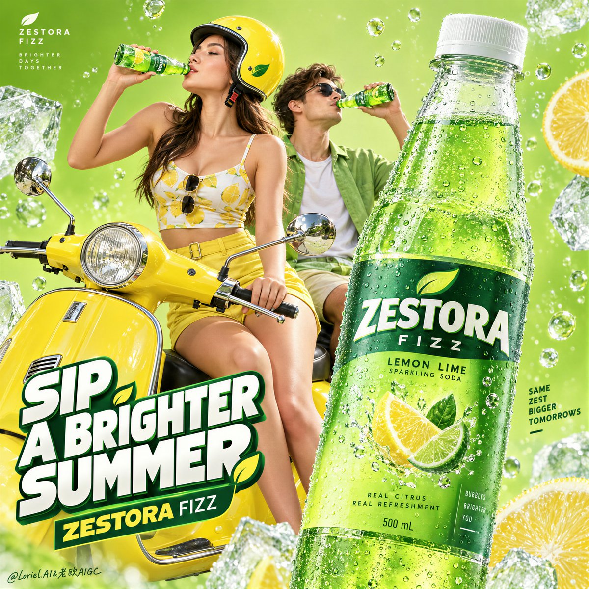
🍋 Use acid lime for the field, bottle green for the product system, and lemon yellow for the scooter and lead figure.
The eye can separate the hero, the lifestyle cue, and the atmosphere instantly, even in a dense frame.
🪽 Repeat bottle green only in small anchors: the companion’s shirt, headline outline, and citrus details.
Those echoes pull the scene back to the product, so the green feels branded rather than randomly decorative.
GPT- image 2.5 prompt👇
Create the definitive Orbit + Transit + Port final poster for the fictional international lemon soda brand ZESTORA FIZZ. The image must preserve the exact commercial architecture of a high-impact summer beverage campaign while refining it into a cleaner, sharper, more collectible global hero poster. Keep the same core logic: acid-lime field, lemon-yellow retro scooter, stylish young couple drinking, one monumental foreground bottle, floating carbonation and ice-cold freshness cues, and one bold stacked typographic block. The final result must feel more premium, more controlled, and more product-led than a typical youth soda ad.
The absolute hero is one oversized lemon soda bottle in the right foreground, pushed closest to camera and dominating the composition through scale, cold realism, and retail clarity. The bottle must read first from across the room. Render it as a sleek transparent bottle with a frosted white cap, filled with vivid sparkling emerald-lime soda and dense fine carbonation. Design newly invented English-only ZESTORA FIZZ branding with elegant premium soft-drink typography, refined citrus icon behavior, crisp flavor hierarchy, and a clean modern packaging system. The bottle surface must show exact transparent plastic behavior, accurate refraction through the liquid, luxurious condensation droplets, sharp label edges, subtle cold gloss, believable micro-reflections, and precise cylindrical perspective. No warped packaging, no muddy label, no fake text behavior. The bottle is the entire campaign anchor.
Near center-left, place a fashionable young woman seated at the front of a glossy lemon-yellow retro scooter, lifting a small chilled glass bottle to her lips in a natural mid-sip pose. Slightly behind and to the right, a young man also drinks from a matching bottle, reinforcing shared summer energy without competing with the hero product. Their function is emotional atmosphere and scale confirmation, not narrative dominance. The woman must remain the stronger visual figure between the two people. She should wear a lemon-yellow and white editorial fashion look with restrained citrus-inspired print language, paired with a coordinated glossy yellow helmet. Her anatomy must be elegant and realistic: correct head-neck-shoulder proportion, natural mature chest gravity, believable torso and pelvis structure, smooth hip-to-thigh transition, naturally full lower-body volume, subtle skin elasticity, faint natural dimpling, realistic hands with five fingers, clean finger spacing, clear knuckles, natural wrist behavior, and no mannequin stiffness. The man wears a fresh lime-green casual look that supports the palette and rhythm without overpowering the heroine or the bottle.
The retro scooter is a lifestyle stage and compositional bridge, not the hero object. It should be a saturated lemon-yellow European-style step-through scooter with polished chrome mirrors, clean headlamp detailing, refined lacquer reflections, and compact iconic geometry. The scooter must support the youthful campaign attitude while remaining secondary to the product and the foreground bottle.
The background must be reduced into a highly controlled acid-lime commercial field with suspended carbonation bubbles, a few oversized ice fragments or frosted freshness accents pushed toward the edges, and subtle citrus-energy atmosphere. Keep it graphic, minimal, luminous, and clean. No literal road, city, landscape, or unnecessary set dressing. This is a poster-space built for product desire, not an environmental scene. Preserve generous negative space so the bottle, figures, and text architecture breathe.
Typography must be minimal, bold, and newly invented in English only. Do not copy any wording from the source image. Use one stacked headline block in the lower-left area as graphic architecture, not as cluttered ad copy. The wording should be short, punchy, and campaign-ready, such as a custom phrase in the spirit of “CHASE THE CHILL” or an equally sharp summer-refreshment line, with the brand name integrated below in a restrained premium way. Add one tiny brand mark in an upper corner. Typography must feel dimensional, crisp, youthful, and internationally polished, with white lettering, deep green framing, and tiny lemon accents if needed. Keep all text secondary to the foreground bottle.
Lighting must be bright, premium, and ultra-clean: a sunny frontal commercial key with slight side shaping so skin, helmet gloss, chrome mirrors, scooter lacquer, and especially bottle condensation all feel dimensional and luxurious. The bottle should carry the sharpest highlight control and the crispest reflective behavior in the frame. Avoid muddy shadows, overexposed whites, or cheap flash aesthetics. The whole image should feel polished, fresh, and expensive.
Use a disciplined 60/30/10 palette hierarchy: 60% acid lime and luminous citrus-green atmosphere, 30% lemon yellow and bottle-green product color, 10% white, chrome, and icy highlight accents. The color balance must feel instantly cold, refreshing, youthful, and globally campaign-ready.
Material semantics are critical. The hero bottle must feel cold, wet, transparent, sparkling, and commercially irresistible. The smaller bottles must feel consistent with the same product family. The scooter must feel lacquered and premium. The helmet must feel glossy and solid. The clothing must feel lightweight and editorial. The skin must feel natural and alive. The ice must feel sharp and frosted. The bubbles must feel suspended and effervescent rather than decorative.
Orbit priority: maximize first-glance desire through the giant cold hero bottle, the lemon-yellow scooter, and the shared drinking gesture. Transit priority: make the poster clearly expandable into a full citrus campaign family with the same layout logic, color logic, and youthful product-stage system. Port priority: remove all unnecessary environmental detail, reduce the text load, strengthen negative space, and compress the image into a rare, graphic, international hero poster with exact product-first hierarchy.
Target feeling: collectible international soda campaign poster, premium summer freshness, graphic youth energy, product worship, modern editorial advertising, clean hierarchy, strong brand memory.
Quality target and exclusions: photoreal beverage advertising image, exact bottle geometry, accurate transparent packaging behavior, readable invented English label design, realistic anatomy, realistic hands with five fingers, correct finger spacing, natural facial structure, believable bottle-to-lips contact, clean scooter perspective, no warped plastic, no broken reflections, no fused fingers, no extra limbs, no distorted faces, no random letters, no muddy greens, no flat dead lighting, no cheap poster clutter, no style drift, no AI artifacts, no watermark, no real brand names, no real person names.
中文译文
当每一种颜色都各司其职时,夏季营销活动会显得更有冲击力。
🍋 用酸柠檬绿(acid lime)做背景场域,用瓶身绿(bottle green)做产品体系,用柠檬黄做滑板车和主角人物。
即便画面信息密集,观众的视线也能瞬间区分主角产品、生活方式线索与整体氛围。
🪽 仅在小锚点处重复瓶身绿:同伴的衬衫、标题描边以及柑橘类细节。
这些呼应将画面拉回产品本身,使绿色显得是品牌化的,而非随机的装饰。
GPT- image 2.5 prompt👇
为虚构的国际柠檬汽水品牌 ZESTORA FIZZ 打造最终的 Orbit + Transit + Port 定稿海报。该图像必须保留高冲击力夏季饮料营销活动的精确商业架构,同时将其精炼为更干净、更锐利、更具收藏价值的全球主视觉海报。保持相同的核心逻辑:酸柠檬绿背景场域、柠檬黄复古滑板车、时尚年轻情侣共饮、一个占据前景的巨型汽水瓶、漂浮的气泡与冰爽新鲜感线索、以及一个醒目堆叠的字体块。最终成品必须比典型的青年汽水广告更高级、更克制、更以产品为主导。
绝对主角是位于右前景的一只超大柠檬汽水瓶,它离镜头最近,通过体量、冷感写实度与零售清晰度主导整个构图。这只瓶子必须在房间另一端也能第一时间被识别。将它渲染为一只光滑的透明瓶,配磨砂白色瓶盖,瓶内充满鲜艳起泡的翡翠酸橙绿汽水与细密气泡。设计全新发明的、仅使用英文的 ZESTORA FIZZ 品牌字体体系,配以优雅高端的软饮字体语言、精炼的柑橘图标表现力、清晰的味觉层级与干净现代的包装系统。瓶身表面必须呈现精确的透明塑料质感、液体透光的准确折射、华贵的凝结水珠、锐利的标签边缘、细腻的冷光泽、可信的高光微反射与精准的圆柱透视。禁止扭曲的包装、模糊的标签或伪造的文字表现。瓶子是整个营销活动的锚点。
在中左偏中位置,安排一位时髦的年轻女性坐在一辆亮面柠檬黄复古滑板车的车头,自然地以中间啜饮的姿态将一只小巧的冰镇玻璃瓶举到唇边。稍后方偏右的位置,一位年轻男子也从同款瓶子中饮用,强化共享的夏日能量而不与主角产品竞争。他们的功能是营造情绪氛围与体量参照,而非主导叙事。女性必须保持在两人之间更强的视觉地位。她应身穿柠檬黄与白色的编辑风造型,搭配克制的柑橘灵感印花语言,配一顶同色调的亮面黄色头盔。她的解剖结构必须优雅而真实:正确的头颈肩比例、自然成熟的胸部重力、可信的躯干与骨盆结构、流畅的髋部到大腿过渡、自然饱满的下半身体积、细微的皮肤弹性、隐约的自然橘皮组织、真实的五指双手、干净的指距、清晰的指关节、自然的手腕动态,且无模特假人般的僵硬感。男子身穿清新酸橙绿的休闲造型,支持整体色彩与节奏,但不压过女主角或瓶子。
复古滑板车是生活方式舞台与构图桥梁,而非主角物体。它应是一辆饱和柠檬黄的欧式踏板型滑板车,配抛光镀铬后视镜、干净的灯组细节、精致的漆面反射与紧凑标志性的几何造型。滑板车必须支持青春的营销态度,但仍居于产品与前景瓶之后。
背景必须被削减为一个高度受控的酸柠檬绿商业色域,内含悬浮的碳酸气泡、少量推向边缘的巨型冰块碎片或磨砂冰爽点缀,以及若有似无的柑橘能量氛围。保持图形化、极简、明亮、干净。不出现具象的道路、城市、风景或多余的置景。这是一个为产品欲望而生的海报空间,而非环境场景。保留充裕的负空间,让瓶子、人物与字体结构呼吸。
字体必须极简、醒目,并全新发明、仅使用英文。不要复制原图中的任何措辞。在左下区域使用一个堆叠的标题块作为图形结构,而非杂乱广告文案。措辞应简短、有力、可直接投入营销,例如灵感类似“CHASE THE CHILL”的自定义短语或同样锐利的夏日清爽口号,品牌名以克制高级的方式整合在下方。在一个上角添加一个极小的品牌标。字体必须具有立体感、清晰、年轻、国际化的精致感,使用白色字体、深绿色框线,必要时配细微的柠檬黄点缀。所有文字均次要于前景瓶子。
光线必须明亮、高端且极致干净:阳光感的正面商业主光,略带侧向塑形,使皮肤、头盔光泽、镀铬后视镜、滑板车漆面,尤其是瓶身凝结水,都显得立体而华贵。瓶子应承载画面中最锐利的高光控制与最清晰的反射表现。避免浑浊阴影、过曝白色或廉价的闪光灯美学。整个图像应感觉精致、清新、昂贵。
使用严格的 60/30/10 色彩层级:60% 酸柠檬绿与发光的柑橘绿氛围,30% 柠檬黄与瓶身绿的产品色,10% 白色、镀铬与冰爽高光点缀。色彩平衡必须瞬间传达冰爽、清新、年轻、并具备全球投放级别的营销成熟度。
材质语义至关重要。主角瓶必须感觉冰凉、湿润、透明、闪耀,且在商业上不可抗拒。较小的瓶子必须与同一产品系列保持一致。滑板车必须感觉漆面精致且高端。头盔必须感觉光亮且扎实。服装必须感觉轻盈且具编辑风。皮肤必须感觉自然鲜活。冰块必须感觉锐利且结霜。气泡必须感觉悬浮且真正充气,而非装饰性。
Orbit 优先级:通过巨型冰爽主角瓶、柠檬黄滑板车与共享的饮用动作,最大化第一眼欲望。Transit 优先级:使海报可清晰扩展为完整的柑橘系营销家族,沿用同一布局逻辑、色彩逻辑与年轻的产品舞台系统。Port 优先级:去除一切多余的环境细节,减轻文字负担,强化负空间,将图像压缩为稀有、图形化、国际化的主视觉海报,并保持精准的产品优先层级。
目标氛围:可收藏的国际汽水营销海报、高端夏日清爽感、图形化的年轻活力、产品崇拜感、现代编辑风广告、清晰的层级、强品牌记忆。
质量目标与排除项:照片级真实感的饮料广告图像、精确的瓶身几何、准确的透明包装行为、可读的全新英文标签设计、真实的人体解剖、五指真实的双手、正确的指距、自然的面部结构、可信的瓶口到唇部接触、干净的滑板车透视、无扭曲塑料、无破碎反射、无粘连手指、无多余肢体、无扭曲面孔、无随机字母、无浑浊绿色、无平板死光、无廉价海报杂乱、无风格漂移、无 AI 伪影、无水印、无真实品牌名、无真实人名。
来源与署名
原文由 @ou_zhen599 发布在 X:查看原推文。 本页逐字保留原文并提供机器翻译的中文解读;版权归原作者所有。
同工具的更多提示词
- GPT Image 2.5 on ChatGPT 提示; 以上传的图片作为主要视觉参考,创作一张精致的 3:4 竖版编辑艺术海报。 构图必须分为两个完美平衡的…@mehvishs25
- 让饱和色彩显得昂贵的最快方式,是给它一片可以对抗的黑暗。 🧊 将画面大部分置于午夜虚空中;只点亮眼睛、面部平面、鳞片,以及精选的花瓣边缘。 颜色因为从黑暗中浮…@ou_zhen599
- 创作一张高端编辑风格美食海报,纵向 4:5。 使用温暖的奶油白/象牙色背景,精致杂志版式,充足的留白,黑色字体,自然的食物色彩,外加一种点缀色:[ACCENT…@Goodmanprotocol
- 课本圆珠笔画 × 教材插图二次涂鸦 × 蓝黑细线排线 × 业余手绘感 × 【主题】 说明: 蓝黑细线排线:蓝黑圆珠笔细线,以排线和重复描线形成明暗。 业余手绘…@DeepBlueX0
- 创作一张高端电影感时尚摄影照片:一位年轻女性自信地站立在现代城市中,采用极低角度仰拍视角拍摄。 主体: 一位年轻成年女性,拥有自然白皙的肌肤,短至中长的波浪棕…@harboriis
- 超写实 IMAX 级别 Netflix 风格黑白强烈电影感肖像,9:16 竖构图。以上传的图片作为主要视觉参考,保留完全一致的面部身份、比例和标志性特征。打造…@imGopalTiwari